What Is a Mockup — The Final Layer of UI Design
Designing UI mockups is a critical part of the design process. They’re a visual representation or screenshot of how the final website or product will look. It’s the first time designers get to see their ideas brought to life with color, typography, and content.
By the end of this article, you’ll understand what a UI mockup is, its anatomy, and best practices for designing UI mockups. We also identify three ways designers create mockups, as well as the pros and cons of each.
Whether you’re using a UI kit, design system, or starting from scratch, UXPin’s code-based design tool allows you to design and edit mockups fast. Sign up for a free trial and see how UXPin can optimize your design workflow.

What is a UI Mockup?
A UI mockup is a visual representation of a final digital product or website, including layout/hierarchy, color, typography, icons, and other UI elements. While mockups are high-fidelity designs, they are static and have no functionality-like a screenshot.
What are Mockups for?
Mockups are a crucial part of the design thinking process because they answer important visual questions (like layout, color, and hierarchy) and allow designers to start high-fidelity prototyping.
Mockups also provide engineers with a visual reference to start the development phase. With UXPin, devs can use Spec Mode to analyze each mockup’s sizing, spacing, grid/layout, colors, and typography.
Mockups also provide:
- Meaningful stakeholder feedback: Thanks to the higher fidelity, mockups require less context than low-fidelity wireframes and sketches, giving stakeholders an accurate representation of the final product.
- Realistic perspective: Mockups reveal problems that might not have been obvious during low-fidelity wireframing–like accessibility considerations, poor color choices, or layout issues.
- Flexibility: It’s easier to make changes to a UI mockup using a design tool than editing code. If designers work with a design system or UI component library, making changes is as easy as swapping components or rearranging the layout.
When to use UI Mockups
Mockups usually follow wireframes and paper prototyping (the low-fidelity phase) in the design process; however, this is not always the case. Designers using established design systems or UI kits often follow handwritten notes to build mockups, skipping the lo-fi phase entirely.
Skipping the low-fidelity phase and going straight to mockups is an advanced technique and requires extensive experience and familiarity with the product, so we always recommend following the traditional methodology of paper>wireframes>mockups>interactive prototypes.
Completing paper prototyping and wireframing first lets you figure out critical aspects like the number of screens, layouts, CTAs, flows, navigation, and information architecture.
With all these pieces in place, generating mockups and moving onto high-fidelity prototyping is much easier and faster.
Anatomy of a Mockup
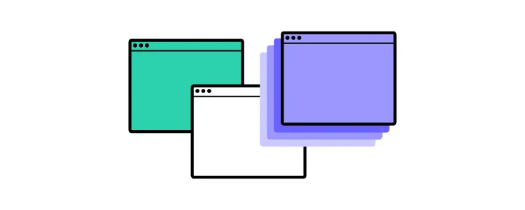
Content Layout
A mockup replaces a wireframe’s boxes and lines with actual content, like images, UI components, and text. This content often dictates the layout (like F-pattern or Z-pattern), as designers decide how to prioritize and fit everything within the screen’s constraints.
It’s common for designers to use dummy images and text for a mockup’s first iteration, which they replace once they start prototyping and testing.
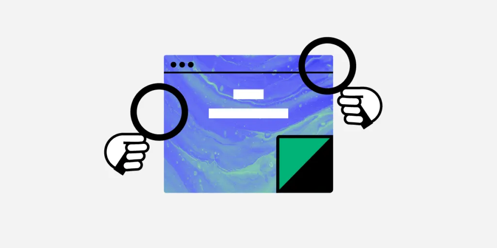
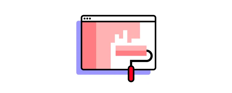
Color & Contrast
Color plays a crucial role in branding, content grouping, hierarchy, and accessibility, while contrast is vital for legibility, usability, and accessibility.
With UXPin’s built-in accessibility features, designers never have to use external tools for color blindness simulation or evaluating contrast against WCAG standards.
Color and contrast can also impact business value. For example, if a CTA doesn’t stand out or is the wrong color, it could adversely affect conversions.
Typography
Designers must never overlook the importance of typography. Mockups are the first opportunity for designers to visualize font choices in context with the rest of the user interface.
Mockups let you explore your typography size, font, style, and spacing–not to mention structural usage for consistency, like how to stylize captions.
Spacing
Spacing and white space are powerful design characteristics. Space improves legibility and helps define visual hierarchy. Designers often use white space to draw attention to important UI elements, like a CTA or product image.
3 Types of Mockups
There are three primary tools for generating mockups–graphic design software, mockup apps, and coded mockups. Each mockup type has its advantages and disadvantages.
Graphic Design Software
Some designers still prefer to build mockups using graphic design software, like Photoshop. The problem with graphic design software is that you can’t add animations or interactions, so you have to recreate the mockups in another application to start prototyping.
Mockup Tools
Specialized user experience design tools like UXPin provide designers with the features to build mockups quickly, especially if they have a component library or design system.
With UXPin, you drag and drop components from your design system or one of our built-in design libraries to build mockups. Designers can also create layouts for different screen sizes like mobile (iOS/Android), tablet, or desktop.
Code
Some technically proficient designers build mockups using HTML, CSS, and Javascript. The benefit of code mockups is there are no surprises at the design handoff. If designers can’t recreate an idea or visual element in code, they can try something else before handing it over to developers.
The downside to code is that it’s time-consuming to build, fix errors, and make changes.
With UXPin’s MUI integration, you don’t have to learn code to design in code. Designers can drag and drop MUI’s React components to build mockups and fully functioning prototypes. Sign up for a free trial and start designing with code using UXPin and MUI’s component library.
Best Practices to Create Mockups
Here are a few best practices for UI design and creating mockups. These principles apply to web design, product design, mobile apps, and other digital user interfaces.
Mobile-First Approach
Mobile-first design prioritizes content while reducing unnecessary features and components. Scaling down from desktop down often leads to inconsistencies or designers making compromises to conform to smaller screen sizes.
Avoid Switching Tools
With comprehensive end-to-end design tools like UXPin, there’s no need to switch apps from wireframing to mockups and prototyping. Switching applications can introduce errors and inconsistencies.
Use a Component Library or UI Kit
Using a UI kit or component library can help designers build, test, and iterate mockups much faster than designing from scratch. Once you have a layout that works, you can customize the components to meet your branding and product requirements.
Don’t Reinvent the Wheel
Industry-standard UI patterns and UX design patterns enhance the user experience by reducing the learning curve of your product or website. For example, most eCommerce websites follow similar UI patterns and layouts to reduce cognitive load and get customers to checkout faster.
Adopt a Minimalist Approach
Cluttered UIs look unattractive and adversely affect the user experience. Designers should always look for ways to reduce UI elements and text to make the most important content stand out.
In The Guide to Interactive Wireframing (these principles also apply to mockups), design professor Tom Green outlines a user-focused procedure for deciding what stays and what goes:
- Build a content inventory of all prospective elements on a page
- Prioritize these elements and remove the ones that aren’t necessary
- Fit the remaining elements into a visual hierarchy based on importance
- Create content blocks based on element categories
- Add and subtract blocks into layouts according to priority
- “Sculpt” designs at each iteration until they start resembling interface objects
Leverage Design Tools
Design tools have tons of features to make designing and prototyping quick and easy. Always read the documentation to learn shortcuts and leverage features to build better mockups.
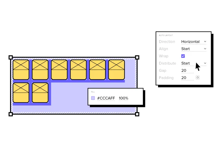
For example, UXPin’s Components feature allows you to save and reuse elements consistently throughout your UI, while Auto-Layout lets you automatically resize, fit, and fill your designs.
Name Files and Layers Properly
It’s easy to get lost in design files with multiple pages, components, assets, and layers. Adopting an organization-standard naming convention helps keep mockups (and the entire project) organized, making handovers, onboarding, and design handoffs much easier.
Designers should also use a standardized method for file storage and documentation, so that team members always know where to look. UXPin allows teams to store your design system, documentation, assets, and design files inside one tool, giving the entire organization access to the project at all times.
3 Tips for Collaborating with Developers on Mockups
UI mockups are essential documents for developers because they determine how to recreate the designs in code. Here are some tips to help smooth the collaboration and handoff process:
- Use Brad Frost’s Atomic Design methodology to explain UI elements from their smallest form to more complex components, templates, and page layouts. Simplifying designs this way allows developers to visualize component structures, making them easier to replicate.
- Highlight interactions and animation and even link to your prototype to give developers clear instructions. Interactivity isn’t evident with static mockups, so context is vital for engineers to develop the digital product correctly.
- Learning development basics can help designers collaborate with engineers better while reducing friction. You don’t have to learn complex programming languages, but basic HTML, CSS, and Javascript will improve collaboration and your design skills.
Ready to get started creating beautiful mockups? Use one of UXPin’s built-in design libraries or start your UI mockup from scratch. Sign up for a free UXPin trial to experience the world’s most advanced code-based design tool.