19 Best Practices for Faster UI Mockups
Creating UI mockups is an essential part of the design process. Designers must take basic low-fidelity wireframes and bring them to life before moving on to high-fidelity prototyping and user testing.
This article explores the best practices designers to improve workflows and design better UI mockups. We’ll also recommend some helpful tools to help with guidance and inspiration.
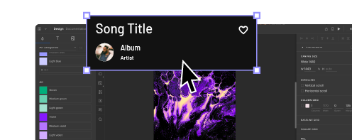
With built-in icon sets and design libraries, UXPin allows UX designers to quickly build wireframes, mockups, and interactive prototypes. Sign up for a 14-day free trial to experience the versatility, flexibility, and speed of code-based design with UXPin.
What are UI Mockups?
A UI mockup is an accurate visual representation of a final product’s screen. UI mockups are visual elements only; they have no functionality, and nothing is clickable. They’re just static mockups. UI designers use color, typography, assets, and actual content to create a final product or website mockup.
19 Best Practices for UI Mockups
Sketch Your Ideas First
Sketching is quick, easy, and risk-free.
Before diving into pixels and grid dimensions, sketch your thoughts to develop the first draft and organize your ideas on the page. Spend time brainstorming and experimenting with different concepts to get the creative juices flowing.
Paper is cheap, and you can sketch ideas wherever you feel most creative and comfortable–like a hammock in the backyard! Sketch different compositions and lay the various templates out for a side-by-side comparison to see which direction appeals the most–it only costs a little time and paper to explore ideas this way.
Start with Mobile Screens
Whether you’re designing mockups, wireframes, or prototypes, always start with the smallest screen and scale to the largest viewport. If you scale the opposite way, you often end up with unnecessary elements or complex layouts that don’t translate well to smaller screens, invariably taking you back to the drawing board!
Getting into a mobile-first design workflow ensures you prioritize the most content and UI elements first. Mobile-first design is also an essential strategy for responsive web design.
Use Wireframing & Prototyping Tools Compatible With Your Mockup Tool
If you’re using separate tools for different aspects of the design process, make sure they’re compatible-ideally you want one tool for wireframing, prototyping, and mockups. You should be able to go straight from mockups into interaction design, adding interactivity, animations, and page transitions to convert mockups into fully functioning prototypes.
UXPin is an end-to-end design tool with features and tools to take you from concept to design handoff fast! The Forms button on the left properties panel lets you choose from inputs, buttons, checkboxes, radios, and more to piece together wireframes in no time at all.
Or, skip wireframes and go straight to mockups with UXPin’s built-in design libraries, including iOS, Material Design (Android), Bootstrap, Foundation, and User Flows. Connect each screen (or Page in UXPin) with advanced interactions to build prototypes that look and function like a coded product. Teams can communicate through UXPin’s Comments, tag coworkers, and even assign comments to specific individuals.
Using a single tool for wireframing, mockups, and prototyping will save time transferring designs while eliminating errors from switching tools.
Sign up for a free trial and discover how UXPin can enhance your design workflow to build better user experiences for your customers.
Review Other Visual Successes
Sometimes the best way to learn is to observe.
Luckily, there are tons of resources for designers to find inspiration. Take advantage of these resources to check the latest trends and how designers approach similar concepts differently.
Here are five great resources for design inspiration:
Remove Unnecessary Elements
Less is more when it comes to UI design. Cluttered user interfaces overwhelm users and severely impact cognitive load, resulting in a poor user experience.
Designers must design based on user research and only add UI elements, patterns, and components users need to complete a given task.
In The Guide to Interactive Wireframing, design professor Tom Green outlines a user-focused procedure for deciding what stays and what goes:
- Build a content inventory of all prospective elements on a page
- Prioritize these elements and remove the ones that aren’t necessary
- Fit the remaining elements into a visual hierarchy based on importance
- Create content blocks based on element categories
- Add and subtract blocks into layouts according to priority
- “Sculpt” designs at each iteration until they start resembling interface objects
Implement a Grid System
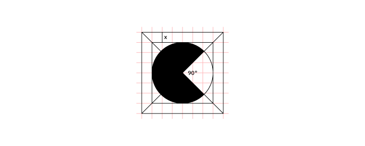
An organized grid system lets designs precisely measure alignments, white space, and content hierarchy to the pixel. Grids are also helpful for designing layouts for different screen sizes, maintaining consistency, and making it easier for engineers to develop the final product.
Take Advantage of Free UI Elements and Icons
Styling each button, icon, and graphic individually will often take longer than the mockup itself. Take advantage of UI kits and icon sets to design mockups faster.
UXPin offers several icon libraries and built-in design systems designers can drag and drop to build user interfaces. There is no need to import external files or install plugins; UXPin provides you with everything you’ll need to start designing mockups right away.
UI Patterns to Improve User Experience
UI patterns are critical for web/mobile apps or website design. These tried and tested patterns solve common usability issues and create familiarity for users to learn the new product quickly.
Designers must apply these patterns carefully and only use them to solve a specific usability problem. Unnecessary UI patterns take up space and could clutter a user interface, introducing further usability issues.
Use Vectors
Vector graphics scale quickly, adapting to high-definition, retina screens at two or three times the size. Designers should use vector files, like SVG format, for logos, icons, and other graphics to ensure that assets are always visually appealing across multiple devices and screen sizes.
Web-safe Typography
Always check your typography is web-safe before you commit to designing mockups. Wherever possible, try to choose from Google Fonts’ massive range of tested web-safe font sets.
If you’re going to use a custom font, make sure it’s web safe and chat to your developers about ways to optimize the delivery using a CDN so that they don’t affect performance.
Color Tools Save Time
Color is a significant factor designers must consider for mockups. Choosing the right color takes time, but luckily there are tons of tools to help you find a palette that’s right for your project.
Here are four awesome free tools we recommend for choosing color palettes:
Make sure your colors follow Web Content Accessibility Guidelines so visually impaired users can navigate and read your content. UXPin’s built-in contrast checker and color blindness simulator allow designers to evaluate user interfaces without leaving the design tool.
Create Reusable Components
Reusable components are a massive time saver and help maintain consistency. For example, you might want to use the same CTA button across multiple screens. You can create a component for the CTA and copy/paste it wherever you need it.
UXPin’s Components have two aspects:
- Master Component, which defines the properties of the Component.
- The Instance Component is a single layer that mirrors the content from its master.
Any changes you make to the Master, copy to all Instances, thus saving time changing or copy/pasting properties manually.
Use Auto-Layout
Another time-saving workflow is auto-layout. Most design tools have an auto-layout feature that lets you group content to resize, fit, and fill your designs automatically.
UXPin’s Auto-Layout works on Flexbox principles which help developers understand the specifications and layout better at the design handoff.
Proper Naming of Files and Layers
Layers and files can quickly become a mess, especially if you’re saving individual layer files.
Whether working solo or in a team, develop a naming convention and system for organizing your files and layers. Following a consistent structure will streamline onboarding, handovers, and design handoffs.
Check out this article on naming conventions from product designer Botond Palkó.
Version Control
Version control is critical if you’re working with a shared design system. How do you know when someone updates the design system? And how do you know if you’re using the most up-to-date version?
Version control allows you to see what version of the design system you’re using and even revert to earlier versions if necessary.
UXPin Merge’s version control system gives you the flexibility to manage your library version for each project. You can freely and easily switch between different versions you’ve added.
Make Files and Assets Accessible
Modern design teams work with remote team members, which means you need to make files, assets, and research materials accessible to everyone. The best option is to use cloud storage like Dropbox or Google Drive–be sure to follow a proper naming convention as outlined above!
UXPin lets you store assets and documentation inside the design tool, making it easier for engineers to find during handoffs. Engineers can also use Spec Mode to inspect properties, measure distances, and view the project’s style guide. By keeping everything in one place, UXPin helps teams reduce the margin for error or the risk of designers forgetting to upload specific files.
Preview on Live Devices
Live previews give you a glimpse of what your designs will look like on multiple devices after the development process.
UXPin’s Preview and Share feature lets you view designs in the browser or mobile devices using UXPin Mirror. You can also use the Auto set Preview Feature, which helps you see how your design behaves when you hit certain resolutions by manipulating the browser’s window.
Test, Test, and Then Test Again
UX design is about testing, making necessary changes, and testing again. It’s an iterative process to expose and solve usability issues so that they don’t end up in the final product.
While testing static mockups doesn’t provide as meaningful results as prototypes, designers can still get feedback on layouts or ask participants what they would expect to happen if they clicked a link or button. Mockups are also great for accessibility testing with visually impaired users to find out they’ve made the correct accessibility decisions.
Elicit the Right Feedback
Feedback can be brutal, but it’s so crucial for UX design. Aside from usability testing, designers should present designs to stakeholders and other team members for feedback. A fresh set of eyes and perspectives could expose things you hadn’t seen or thought of before.
Start Creating Great Mockups!
The most important thing to remember when creating mockups is that you’re trying to solve a human problem–not win a design contest! Consistency and cohesion are also significant factors designers must consider when adding color, typography, icons, assets, and other content.
Most importantly, you need the right tools! UXPin is an end-to-end design solution for designers to go from wireframing to mockups, prototyping, and the final handoff. Designers can also keep assets, documentation, and the org’s design system all in one place!
Ready to start designing UI mockups faster than any other design tool? With higher fidelity and more functionality? Sign up for a 14-day free trial and experience UXPin’s revolutionary code-based design tool.


