The fixed-width approach to website design may have served you well for years, but the process falters when applied to responsive websites.
If you want to design websites responsively, here are the changes required to bring that workflow up to date as we enter the new year. The advice is based on my 15 years as a web designer, agency Creative Director, and design instructor at The University of Rhode Island.
Rethinking the Web Design Process
Updating your workflow for responsive web design starts with rethinking your design process.
Creating static desktop-centric comps in Photoshop, dumping in some placeholder Lorem Ipsum text, and then presenting those comps to a client for their review does not work well in responsive environment because those static design do not show interactivity or the way the user experience will change for different screens.
Photo credit: UXPin
As explained in the free guide Responsive Design Best Practices, a better responsive design requires modern processes like:
- Thinking Content-First and Mobile-First
- Presenting lower-fidelity design options earlier in the process
- Showing responsive prototypes instead of static comps
- Working with the most extreme cases that your design must accommodate
Content-First Design
When a designer creates packaging for a tangible product, they often have a fully-developed prototype (or even the actual product) to create context for their design.
The shape of a product, the weight, and all the use cases are just a few of the factors that the designer will consider during their design process. Without a definitive idea of what a product is, a designer is hard-pressed to create appropriate packaging, yet web designers have had to do just this for years.
Starting a website design without content is like creating packaging design without the product. You can do your best, but who knows if the end content or product will truly fit into what you create?
Photo credit: SOCIALisbetter. Creative Commons.
A website’s design is more than a template into which clients will dump content. Starting with content allows you to decide how to best present it to users. In a responsive environment, starting with content also allows you to prioritize what is most important. This content hierarchy will become critical to the layout decisions you make for the various breakpoints in your responsive website.
Requiring content at the start of a website design process sounds great, but the reality is that clients rarely have their final content at the start of a project. This is fine. You do not need the final, production-ready copy. You simply need an idea of what the content will be and some actual samples of a first draft. This is similar to the packaging designer working with a prototype.
Talk to your clients about content at the very start of a project and bring in whoever is helping them with content strategy. Whether your agency is providing that service or if it is being handled by another team, make them a part of your process immediately. In lieu of a first draft, you can even use copy from competitor sites to start estimating your space constraints.
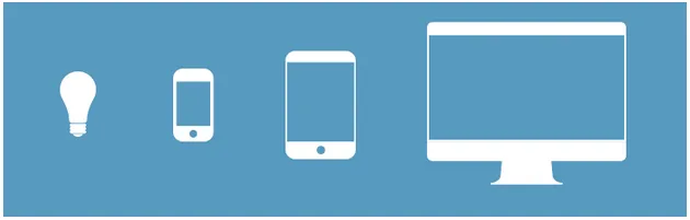
Mobile-First Design
With actual, thought-out content in hand (as opposed to some placeholder Lorem Ipsum text), you are now set up to think about how that content should be presented and prioritized. This is best done by using a Mobile-First approach.
Mobile-First is a departure from the traditional web design process where you would begin with a desktop-centric design layout. Because there is only so much screen real estate to work with, starting small forces you to determine what elements and content are most important. It can also show you what content may not be necessary at all and therefore be eliminated from all versions of the design.
As a result, you scale up an experience that feels 100% rather than degrade an experience down to smaller screen sizes.
During your Mobile-First process, start with wireframes of the site’s content. You can then assign a priority to each section/content in the wireframes. A section’s priority will help you determine how and where to present it for different breakpoints.
Grab design ebooks created by best designers
All for free


Do you want to know more about UI Design?
Download 'Web UI Design for the Human Eye' FOR FREE!
Download e-book for freeUsing Style Tiles
Designers have traditionally used image editors like Photoshop to establish the look and feel of web elements. The problem with this approach is that Photoshop creates very high-fidelity examples of a design when, at the start of a process, you should be focused on bigger-picture decision like typefaces, colors, and interface elements like buttons, menus, and input controls.
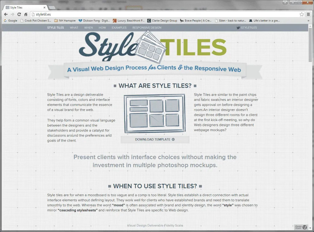
Photo: http://styletil.es/
Using Style Tiles is a better way to present and decide on these design elements. Created by Samantha Warren, “Style Tiles establish a direct connection with actual interface elements without defining layout.”
The process of using these tiles is simple:
- Listen to what the client’s needs and what their brand identity requirements are
- Interpret those needs into decisions you can use in your project
- Define a visual language for the website
- Iterate on those decisions, which you can do far quicker using Style Tiles than if you worked with a series of high-fidelity Photoshop files.
These high-level design elements help you make more informed art direction and design decisions. You can create style tiles in parallel to wireframing since both processes will feed into your prototype and later hi-fi designs.
Responsive Prototypes
Presenting static design comps does not work for responsive websites. Static comps fail to show a design’s true user experience because they cannot change their layout based on screen size the way an actual website will.
To combat this challenge, many designers create a series of comps showing different possible breakpoints. But this can significantly increase the time they spend in the design process, and it does not show a site’s full responsiveness or interactivity.
For responsive websites, you should present actual, responsive examples for a client’s review. This is where responsive prototypes can be valuable to your process.
Using responsive prototypes is not the same thing as designing in the browser, a practice which many web designers feel stifles their creativity. You can still use your graphics program of choice to establish some visual direction and layout choices, but you should then translate those choices into an interactive presentation.
Let’s examine a workflow that incorporates mobile-first responsive prototyping:
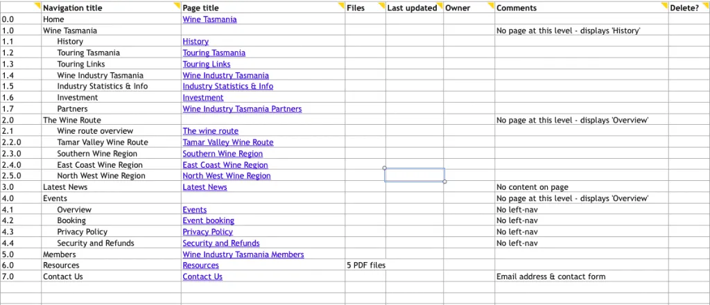
1. Based off whatever rough content exists (as long as it’s not placeholder text), map out your content across the whole site. You can list it out by page, or use this spreadsheet offered by Maadmob.
2. Now that you have your “raw materials”, start prioritizing the content on each page for a mobile viewport. What will your visual hierarchy look like? Consider the 5 common responsive layouts as advocated by Luke Wroblewski.
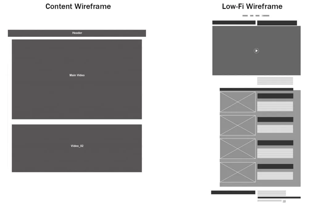
3. With a content hierarchy in mind, start laying out the design with a content wireframe. If you use UXPin, you’d simply start by selecting the 320 viewport. As shown below, the goal is to map out the blocks of content first. Next, add some more detail (the standard boxes and arrows) to carve it into a lo-fi wireframe.
4. You can now add basic interactions so your responsive prototype reflects the core user flows. Buttons and menus should link to their respective pages. By connecting your pages with basic interactions, you’ve created a lo-fi prototype that you can immediately start testing with at least 5 users.
5. To test the prototype, you can either use the built-in tool offered by UXPin or use an outside service like UserTesting.
6. Repeat steps 1-5 as you scale up to larger viewports. Iterate based on the user feedback.
7. Basing the visual design off your style tiles, you can now refine the visual design with Sketch, Photoshop, or whatever tool of choice.
Working With Extreme Cases
When designing web pages, there is a temptation to work on the easiest pages first so that you have some deliverables to show your stakeholders. This quicker turnaround may be nice, but in your design process you should focus on the most challenging and extreme scenarios.
Take the common example of designing a page that displays articles (blogs, press releases, case studies, etc). That page is sure to have a title near the top. What happens to the design when that title is two or three times longer than what you have designed for?
A title that reads:
“Responsive Web Design Tips”
Is going to display in a layout template much differently than one that reads:
“10 Absolutely Essential Tips and Techniques for More Effective and Successful Responsive Website Designs”
Plan for extreme cases like this across all screen sizes. It is not enough to ensure that the extreme case works well on large-screen displays that have ample space. They must also work appropriately on small screen devices and everything in between.
Next Steps
People today expect websites to work on many devices. Responsive web design has gone from a question of “if” we should to “how” we should, and the process is what sets apart successful sites from the rest.
An important part of this process is looking at the workflow that you have used to create static, fixed-width sites and updating your practices to present project deliverables that are in-line with the needs of a responsive, multi-device Web.
If you found this guide useful, you can start refining your responsive prototyping in UXPin with a free trial.