Aspect Ratios: All You Need to Know
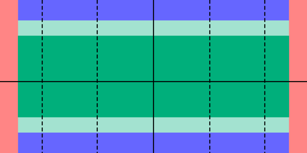
Image-rich content drives website engagement, and making sure those images display properly is a crucial part of good UX design. Whether you’re working with photographs, illustrations, or video, an image that’s stretched, squashed, or poorly cropped makes a poor impression for on-site visitors and affects their overall experience on the site.
Determining aspect ratios for optimal viewing on all kinds of devices can be both a chore and a challenge for designers, but today’s responsive design tools and an array of free aspect ratio calculators can make sure that images and video files are displayed in the best light everywhere.
Designing a website or app full of images? Create prototypes of it with UXPin! It’s an end-to-end solution that will cover your full design process and it doesn’t require any plugins for design handoff. See how easy it is. Sign up for a free trial.

What is Aspect Ratio?
In the most basic way, aspect ratio is the relationship between an image’s width and height. Because aspect ratio reflects an image’s proportions, not its size, the aspect ratio remains the same regardless of size. For example, a square image has an aspect ratio of 1:1, since its height and width are the same. That ratio will hold no matter how large the image is. An image that’s 320x320px will have the same aspect ratio as one that’s 1080x1080px – 1:1.

For images that are not square- that is, horizontal or vertical rectangles of various sizes… Aspect ratio can vary. Common aspect ratios used in photography, video, and other image-based design work include 4:3, 3:2 or 16:9, the basic ratio for many widescreen devices such as televisions and desktop computers.
Although the aspect ratio of an image comes from the relationship of its height and width, multiple subsets of this ratio also help to define image proportions.
Pixel aspect ratio
Pixel aspect ratio (PAR) refers to the proportion of the individual pixels that make up an image. Pixels are typically square, which results in a pixel aspect ratio of 1:1. But images that are optimized for certain types of displays can also have rectangular pixels with an aspect ratio of 4:3 or similar.
Display aspect ratio
Display aspect ratio (DAR) is the most relevant kind of aspect ratio for designers, and it’s the one that’s most commonly associated with the general term. As the name suggests, display aspect ratio refers to the proportions of an image as it appears on screens of various kinds.

Some devices, such as cameras and televisions, have a fixed DAR, so for images to display well on these devices, they need to be optimized for their particular aspect ratio. For example, a typical display aspect ratio for widescreen video to be displayed on a monitor or television screen is 16:9. When images with a different aspect ratio are displayed on these devices, they appear distorted. Digital SLR camera sensors also have a fixed display aspect ratio, which controls how images captured by the camera will be saved and displayed.
Storage aspect ratio
Storage aspect ratio (SAR) is an aspect ratio formula that pertains specifically to encoded digital video files. SAR refers to the width and height relationship in video frame size, and it needs to be consistent across all individual frames in order for the complete video to display properly. In a commonly used formula, SAR x PAR = DAR for most widescreen videos.
Aspect Ratios Affect UI/UX Design
Aspect ratios play an important part in any kind of project that involves capturing and displaying photographs, videos, or other kinds of image-based files in the correct way. For photographers, the camera’s fixed aspect ratio can have a considerable impact on composing a photograph as well as displaying it later on other devices. And for videographers and anyone working with slideshows, animations, and other motion projects, aspect ratio is a key factor for correct display on widescreen and mobile devices.

The shift to responsive web design, which ensures that content displays properly across all devices, helps to resolve a number of problems with setting aspect ratios for individual images. But even in these environments, problems can arise, such as when an image can’t be adjusted for display without compromising either its content or its quality. A simple example is when a square image with a 1:1 aspect ratio needs to fit into a rectangular box on a website page. To accommodate varying image size requirements, proportions, as well as size, may have to be adjusted.
In an increasingly image-driven digital world, videos and images that look even slightly out of proportion contribute to a visitor’s negative impression of a website – and those that are clearly forced into the wrong configurations can even interfere with a site’s usability.
Poorly proportioned product images or a user guide video that’s too stretched to see clearly can affect both a visitor’s willingness and their ability to use the site. Designers, developers and anyone working with images will need to know how aspect ratios work and how to manipulate them for the best visual effect. To streamline the process, a number of aspect ratio calculators, both free and paid, have popped up on the web.
Aspect Ratio Calculators: A Solution
It’s certainly possible to calculate an image’s aspect ratio and resize it manually with the help of some simple mathematics. But that becomes tedious when dealing with many images from multiple sources. With the help of one of the many online aspect ratio calculators, though, you can determine the optimal aspect ratio for any image in a number of different formats, allowing designers to fully optimize each image for optimal viewing.
To use a basic aspect ratio calculator, you’ll need to know the image resolution in pixels and select the type of environment where the image will appear, such as HDTV. The calculator then returns the result as an optimal aspect ratio. This can be especially helpful for video editing, where the video might include slides or images of varying sizes from different sources.
Image Editors have aspect ratio tools
Other image management tools can also help with getting the aspect ratio right. Image editors such as Photoshop and Canva provide templates designed with optimal aspect ratios in mind, suitable for use in typical situations such as designing website banners, headlines, or social media profiles. Most standard video editing software also allows users to determine and adjust aspect ratios of images to be included as individual frames in the video.
Correctly proportioned images that display well and perform properly are a powerful tool for businesses of all kinds. Getting aspect ratios right makes images look good wherever they’re displayed. Whether you’re selling a product, offering a service, creating an online course or something else, photographs, illustrations or video can attract visitors and keep them engaged.
UXPin’s features make it easy to make sure images are sized and proportioned correctly. With Image Fill, you can choose from a variety of settings that allow you to adjust image size or crop the image while preserving its aspect ratio for perfect positioning.
UXPin can help bring designers and developers together for faster, better product development. Sign up for for a free trial today.


