
Is simplicity a real thing? Or is design the pursuit of something else entirely?
A Logic 101 professor once explained to the class I was in that a major factor in screaming matches between people is the lack of a shared definition of a key term. “Clean,” for example, can be measured in degrees. It can mean very different things to people depending on their standards of cleanliness. Then there’s a word like “simple.” Two people can have very different definitions of a word like that. Designers, in particular, most definitely do.
When many of them say “simple,” they mean to describe something incredibly easy to use. When others say it, they’re referencing the relative complexity of a thing, whether it’s a problem, a solution, a piece of code, or something else. To this extent, I admit that what I’m proposing here may be a semantic debate. But it’s an important one, because the word “simple” also gets used in the presence of stakeholders and coworkers who may have no idea what simplicity means in the context of a user’s experience.

Photo credit: Marcin Wichary. Creative Commons.
As designers, we assume we all agree on its meaning. To us, simplicity is a high goal of design. Designers preach that notion to each other. They pass the gospel on to their constituents. They write it in articles. Simplicity is everywhere. And we sure love it when we see it.
But when, exactly, do we see it?
“Simple” is a relative word, granted. It has no definitive value; the simplicity of a thing can only be measured in comparison to something more complex. But for all the times we throw that word around, how often is the thing we’re pointing at actually simpler than something else?
It’s not that simple
Practically every designer who’s used an iPhone relies on it as the hallmark example of simplicity.
This is absurd. The iPhone –which handles phone calls, weather reports, to-do lists, maps, text messages, video, photography, audio recording, games, web use, and about a billion other things – is so far from simple, it’s unbearable to think of the word being applied to it. Besides being incredibly complicated, there is a constant learning curve. Every new app introduces some new way of doing things, just slightly different than all the other apps.
It’s an endless supply of designed pedagogy.
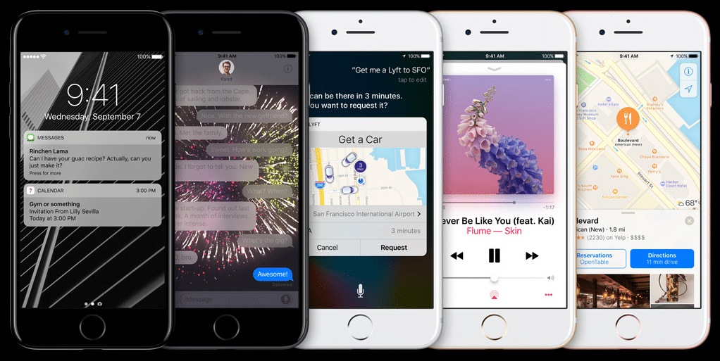
Photo credit: Apple
Nor is the 30-page survey on a dating website “simple.” To the contrary, it’s defined and refined over years of research, based on massive amounts of data, and its success hinges on a giant ball of complicated algorithms.
It’s so not simple.
These things might be sophisticated, beautifully designed, thoroughly considered, and extraordinarily mindful of their users, but one thing they almost certainly could not be called is “simple.”
Getting clear
So what are we talking about when we talk about simplicity?
Clarity.
Not everything can be simple. Not everything can be easy to use. Many apps and services are necessarily complex. Massive eProcurement systems, for example, or enterprise management systems can be incredibly complex. Even iPhone apps can be deviantly hard to use.
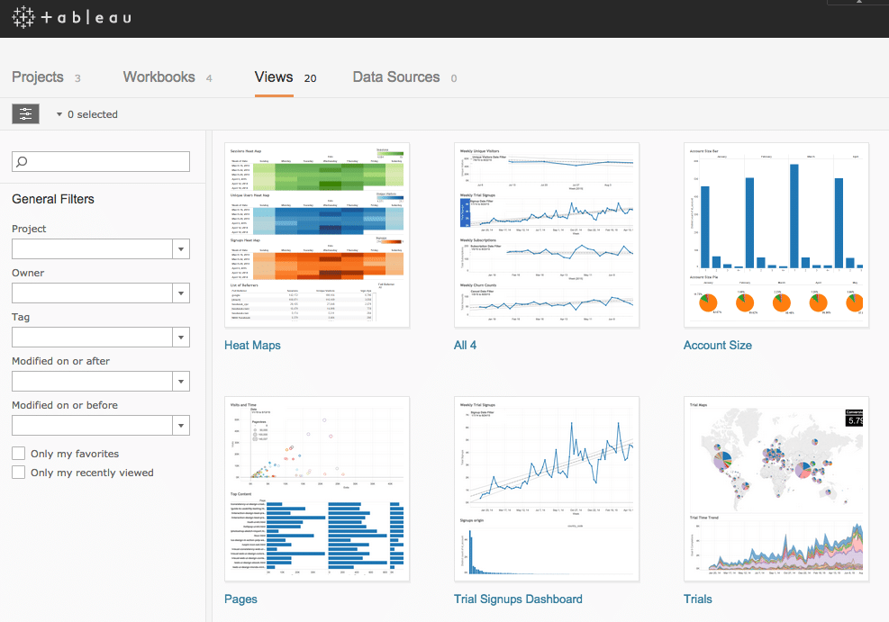
Photo credit: Tableau
But one thing they can all be is clear. No matter how complex a design, no matter how many tasks it supports, how many user roles are accommodated, or how many different ways it offers to perform the same daily actions, each and every screen, each and every detail of those screens can be made clearer.
One of the most common questions I received after I wrote “Designing the Obvious” in 2006 (and its 2nd edition in 2010) was about how to apply its lessons in core web application design principles to enterprise software. Time and time again, I’ve stressed this single point:
You apply them to each and every interaction exactly as you would in a narrow-scope application. The principles all still apply. The system you’re working on may be more complex, but the principles can still then be applied on a micro scale to each screen within it.
Good design improves things no matter the situation.
How clarity is born
All kinds of good design practices can be applied to make the complex appear simple. To create clarity in a design. They include:
Chunking: Breaking apart messy task flows into smaller chunks can slow users down to reduce mistakes, or speed them up to let them fly through mundane tasks. Either way, they mean lowering a user’s cognitive load when trying to assess a new screen and get through it. (UXPin offers some tips on chunking features on page 99 of the free eBook, Interaction Design Best Practices (Vol.1).)

Photo credit: Polyvore
- Headings and labels: Using descriptive headings and labels makes users feel more confident that they are in the right place, understanding things in the right way, and taking the right actions. For headings, be descriptive (“Your contact information”). For button labels and command links, use verb-noun pairs (“Create new prototype,”) and verb phrases (“Start over”).
- Visual hierarchy: Organizing information on a screen to guide the user through it creates a path for comprehension (no matter how complex the task flow).
- Progressive disclosure: This means putting the most common and necessary elements of a task up front and then dispersing everything else into a series of elements which get more and more granular. In the Settings for an app, for example, most people may only need to address a few preferences, while a few may need more additional options. To make this appear simpler, you can show the common options by default, and make the rest accessible by way of an “Advanced Options” menu like Paypal.
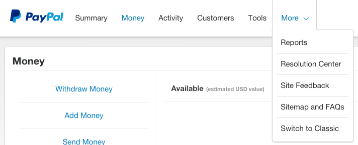
Photo credit: Paypal
- Defaults: When a user has several options for a setting but is most likely to choose one in particular, or when you want the user to choose one in particular for whatever reason, you can enable that option by default. Only a small percentage of users will opt out of the default option. Generally, users think the default option is what the company wanted, so they stick to it. (Crazy, huh?)
- Building less: Introducing fewer features in the first place is, of course, a brilliant way to minimize complexity and confusion. Simply put, there’s less in the interface to deal with, which can make it clearer by default. Do this by erring on the side of saying no to new additions. Every single feature should map clearly to the vision and success metrics for the project, else it gets filed away, usually never to be seen again.
The myth of simplicity is that it’s the real goal of design. That it’s even possible as a goal in every situation. That it’s a useful term for everyone involved in a design effort, or a good way to assess a product.
It’s not. But clarity always is. Is it as clear as it can be? Then no one cares how complex it is.
Build complex things if you need to build complex things. Just put your good design chops to work and make them as clear as you can. It’s the one thing you can do every time.
To learn more about designing clear interfaces, check out the ebook Interaction Design Best Practices (Vol.1). Examples are analyzed from 33 companies like Intercom, Medium, Google, and Bose.
This article was originally published on Wired.

