Design System – Principles of Success
On the surface, building a design system is a matter of designing a collection of elements, components, text styles, and colors. But the truth is it’s a more complex procedure. Building, managing, and scaling a design system requires principles and direction.
This article was inspired by the webinar about Design System with Carola Cassaro, which outlined the process of building a design system, including the principles that guide teams and decision-making. We have another webinar coming up in May! We will talk about building and scaling enterprise design systems with Amber Jabeen. Join the webinar for free.
In Defending Your Design System, we feature our revolutionary code-based design technology, UXPin Merge. Merge allows you to create a single source of truth between design and development by syncing code components from a repository to UXPin’s editor. Sign up for a free trial and see Merge in action with our MUI integration.
What are Design System Principles?
Principles define the why and purpose of building your organization’s design system. These principles guide decision-making and explain how the design system’s creators want team members to use the system.
A design system’s principles also streamline onboarding by helping new team members understand the company’s vision and priorities.
“Design principles are the guiding light for any software application. They define and communicate the key characteristics of the product to a wide variety of stakeholders including clients, colleagues, and team members. Design principles articulate the fundamental goals that all decisions can be measured against and thereby keep the pieces of a project moving toward an integrated whole.” – Luke Wroblewski, Product Director at Google
Carola Cassaro, Director of Product Management at Work & Co, and part of the team responsible for building and launching IKEA’s design system Skapa, broadly outlines design system principles as:
- Single source of truth: Centralized resource that’s easy to access and relevant to its users
- Inclusive & collaborative: Speaks to a wide audience, uses shared terminology, and fosters the exchange of ideas
- Modular & reusable: Solves the majority (80%) of UX problems so that teams have more time to innovate
- Living & breathing: Evaluated and evolved over time
Why Do You Need Design System Principles?
Building a design system is like building any other product. Without a set of principles guiding your decisions, you end up with the same problems your design system is supposed to solve, like design drift, conflicting opinions, and team friction.
With clearly defined principles, team members work together to solve design problems with shared purpose and consistency.
A Guide to Establishing Principles for a Design System
Back in 2015, UXPin used a five-step process to define its design system’s principles. The process is still relevant today.
Step 1 – Find product analogies
To avoid copying direct competitors, look for inspiration from successful products and brands outside your product category. The goal is to identify core values and qualities you want your product to have. What do you want people to experience when using your product?
For example, a red Ferrari might represent wealth, speed, exclusivity, status, and innovation. List these analogies and your reasons for choosing each one.
Step 2 – Find design principles in analogous products
Go through your list of product analogies and identify the qualities that make these products successful. Also, why do you want your product to have these qualities?
For example, a red Ferrari represents status. How does it do that for people? A simplistic answer would be its cost. But there’s so much more that gives a Ferrari status, like craftsmanship, quality parts, attention to detail, rarity, personalization, Formula 1, and the brand’s legacy.
Step 3 – Make the list real with existing user research
Connect the reasons for your choices with your product’s user research. Do user pain points contradict what you want your product to be?
For example, you want your product to be as simple and intuitive as an iPad, but users complain that they battle to use features or complete tasks.
Step 4 – Build value statements
Sort your analogies and reasons, prioritizing those most frequently mentioned by users to make value statements.
We want our product to be like [complete with your product analogy] because it [complete with the reason] and it’s important to [our users/me/us].
Using one of Marcin’s examples: “We want our product to be like a white Porsche 911 from the 80s because it brings the feeling of timeless quality and it’s important to us.”
Step 5 – Abstract your principles
Now remove the product references from your value statements to make them applicable to your design system.
For example, “we want our product to bring a feeling of timeless quality.”
From this five-step process, UXPin’s team developed seven design principles:
1. No distractions. Every redundant piece of the interface (lines, buttons, shadows, animations) is a source of distraction. As such, it should be eliminated to empower users’ creativity with a well-architected and inspiring design tool.
2. Design-centric. Users’ designs should lie at the center of UXPin. Our interface should be unobtrusive to the point of transparency.
3. Adaptive interface. UXPin’s interface should act according to the context of use. All the ‘inactive’ features should remain completely hidden until the user can use them (no inactive buttons and links!)
4. Space. UXPin’s interface should create a peaceful atmosphere, triggering users’ creativity. This ambiance can be shaped by leaving a lot of space around every piece of interface. The cluttered interface is the source of stress that produces cortisol and adrenaline; both block our creative powers.
5. Inspiration. UXPin design should inspire and, as such, can’t be a derivative of design of other SaaS apps. We should strive for an original aesthetic inspired by the best products ever created (some of the sources of our inspiration: Fountain Pen Pilot Vanishing Point Matte Black, speakers Harman Kardon Sound Stick, record player Pro-ject, speakers DALI Zensor).
6. Interactive Consistency. Interface components, icons, and fonts should be consistent to create a predictable experience.
7. Predictable Architecture. UXPin’s architecture must be predictable and natural. Features should be placed in the right context for new users to discover easily. Example of predictable architecture: canvas settings should be placed next to the canvas.
Over the years, UXPin has found these principles prevent:
- Endless subjective discussion
- Unclear design requirements
- Inconsistency at the most fundamental level
Finding Inspiration and Examples From Adele
Adele is a UXPin initiative that features an A-Z Design Systems Repository. Inspired by the 70’s design system pioneer Adele Goldberg, Adele by UXPin aims to encourage people to develop principle-driven design systems using inspiration from the world’s leading organizations.
The directory breaks each design system down into 31 categories, including components, framework, brand guidelines/principles, color palette, typography, grid, accessibility, documentation, and more.
Adele also provides links to each of these categories (where applicable), so you can quickly find references and inspiration. For the purposes of this article, we’ll outline the principles from four established design systems.
Estonia – Brand Estonia
As a country that’s marketing itself as “the world’s most digitally advanced society” and strategies to attract startups and remote workers like e-Residency and its Digital Nomad Visa, it’s no surprise that Estonia has one of the world’s best governmental design systems.
Brand Estonia comprises of three core messages or principles that designers must use to introduce Estonia:
- Digital society: Estonia is the first country to function as a digital service. Our citizens and e-residents can get things done fast and efficiently.
- Independent minds: Estonia’s biggest asset is our people.
- Clean environment: Estonia has a lot of untouched nature and a low population density. This is very rare in today’s world. We know how to care for our environment and we are proud of it.
Estonia also has 11 primary industries or products, each with its principles that align with the country’s three core messages.
Coupled with messaging are Brand Estonia’s copy and design guidelines which define the country’s character in three words: Nordic, Surprising, and Smart. The visual language must always be:
- Clean: as in uncluttered with unnecessary information and confusing typography
- Simple: because we like to leave enough space around text and images – making them more legible and emphasizing only the essential
Brand Estonia is a wonderful example of how designers can use the nation’s values (or company culture) to define its design system’s principles succinctly.
Atlassian Design System
Atlassian’s design language resource provides teams with guidelines “to create simple, intuitive and beautiful experiences.”
The design system team has separated the guidelines into six categories:
- Brand: reflects who we are and how we want our users to feel when they use our products
- Foundations: the visual elements needed to create engaging layouts and end-to-end user experiences
- Content: covers our voice and tone, and the mechanics of our grammar, and style
- Components: each component meets a specific interaction or UI need, and has been specifically created to work together to create patterns and intuitive user experiences
- Patterns: best-practice solutions help users achieve their goals and help ensure consistency across experiences
- Resources: a collection of tools, kits, plugins, and guides to help simplify the creation process for our users
Within each category are several subcategories where Atlassian uses a sentence or two to reinforce the company’s principles. For example, under Brand, they have Mission: Our mission is to unleash the potential in every team.
Atlassian demonstrates that with clear design system principles, you can develop a complex suite of products with remarkable consistency and seamless integration.
Salesforce – Lightning Design System
Design system professionals often point to Lightning as an example of simplistic cohesion and consistency. Lightning’s guidelines are as comprehensive as the design system itself, with documentation for every component and layout.
Salesforce outlines four code principles behind its design system:
- Clarity: Eliminate ambiguity. Enable people to see, understand, and act with confidence
- Efficiency: Streamline and optimize workflows. Intelligently anticipate needs to help people work better, smarter, and faster
- Consistency: Create familiarity and strengthen intuition by applying the same solution to the same problem
- Beauty: Demonstrate respect for people’s time and attention through thoughtful and elegant craftsmanship
Salesforce’s goal for Lightning is to create a design system that allows team members to focus on their core tasks and responsibilities:
“The Salesforce Lightning Design System includes the resources to create user interfaces consistent with the Salesforce Lightning principles, design language, and best practices. Rather than focusing on pixels, developers can focus on application logic, while designers can focus on user experience, interactions, and flows.”
If you’re having trouble defining your design system’s principles, start by identifying a high-level goal and working your way down from there.
Stack Overflow – Stacks
Stack Overflow divides Stacks’ guidelines into four categories: Product, Email, Content, and Brand. Under Brand is where the company outlines its design system’s principles.
Stacks emphasizes four brand principles that “represent the approach and opinion all things Stack Overflow should have.”
- Focused: Designs should focus the person on what’s important at hand. Designs should focus on the central goal, pushing distractions and interruptions to the side until the stated goal is completed.
- Welcoming: Our designs shouldn’t feel “members only,” but inviting and approachable. Designs should be intentional and intuitive, not be some secret codex for users to decipher. While the subjects developers talk about may seem impersonal, our design approach shouldn’t be.
- Purposeful: Everything in its right place. Our designs might be packed with information, but everything should be purposeful. Don’t add extraneous data or ornamentation, as it might distract people from the central goal at hand.
- Five percent fun: We’re quirky, not corny. We enjoy the long joke. Our humor is dry and pops up in unexpected, but appropriate, places. We’re “business in front, party in the back.”
Stack Overflow also provides its teams with guidelines for copywriting and visuals. The design system team does a fantastic job of using simple language to describe the company’s principles, including images and graphics to clarify messaging.
UXPin Merge – The Ultimate Design System Tool
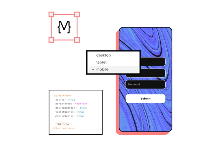
Building a design system is one thing. Managing and scaling it takes governance and proper tools. UXPin Merge lets you sync your design system from a repository to the design editor so designers can build fully functioning prototypes using code components.
This single source of truth means all teams, including product, design, and development, use exactly the same design system components to build products. When engineers update the repository, UXPin automatically syncs the changes and notifies all teams.
Build, manage, and scale your design system with the world’s most advanced design system technology. Sign up for a free trial to experience UXPin and Merge with React components from MUI.