Landing Page UI – How to Ensure User Friendly Design
Whether you design an ecommerce store or a simple website, landing pages are essential part of web design. They are often the first point of interaction between a potential customer and a brand. And you know what they say about first impressions – you can only make them once!
Therefore, in terms of landing page UI, it’s important that it’s both user friendly and gives visitors a unique feel. In this article, we’re going to discuss how you can design a landing page that is both appealing to the user and drives conversion rates.
What Does a User-Friendly Design Mean?
‘User friendly’ means an interface design that’s simple to use.
It all began back in the 1970s.
As computers continued to grow in popularity, a gulf appeared between those who could code – the primary way to design interfaces with a program – and those who couldn’t. With the market reaching a broader audience, it became essential to build programs that these new users could actually use.
Arguably, the biggest jump in user friendly design at that time came with the release of the Apple Lisa, i.e., the first publicly available computer with a graphical user interface (GUI), which is still with us today.
Today, developers, UI and UX design teams continue to perfect the user friendly experience. Especially nowadays when poor or ‘user-unfriendly’ design choices can hurt business.
A refined, user friendly web design should make the experience of using a website easier. Users should have no problems with navigating a website, a mobile app, or a game without having much cognitive load. The website should be fluid, intuitive, uncomplicated, and quick. And a UX design should be seamless and consistent across devices.
This calls for a question:
How to Design Landing Page UI?
We’re going to take a look at two stages – UI design and landing page testing. Let’s start with the former, that is the design stage where we will create a landing page.
Master the UI Design Stage
Let’s say you’re done with UX design. Either you completed this stage or you got help from a UX designer who created the Information Architecture of the landing page based on user research and other factors.
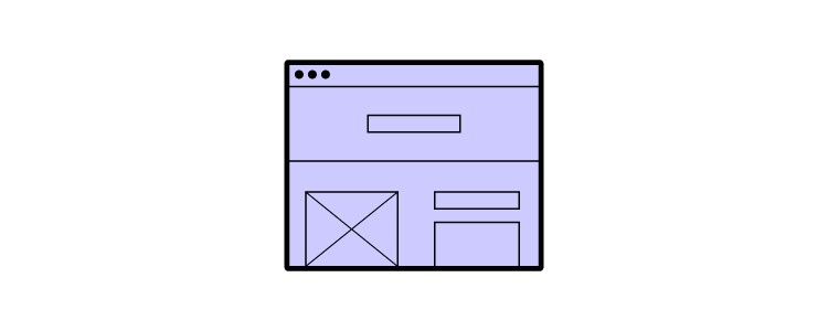
In the UI design stage of creating the landing page UI take care of the look of the landing page and interactions of all UI elements.
1. Trigger the right emotions by using the right color, typography, and images
Your brand is one of the most important assets you have – a way of differentiating yourself from the competition in a crowded market. Your company’s color palette, slogans, tone should all speak to the user. So should the imaginery, because as you might have heard a picture is worth a thousand words. All in all, a landing page should align with the visuals.
According to design tool Canva, ‘research shows that up to 85% of consumers believe color is the biggest motivator when choosing a particular product, while 92% acknowledge visual appearance as the most persuasive marketing factor overall.’
As you begin figuring out your landing page design, ask:
- What message do you want to communicate?
- What emotions do you want to convey?
- What personality do you want to display?
For example, if your company creates homemade arts and crafts, you’re going to want users to feel warm and cosy. Respectively, if you operate a high-powered real estate agency, color palette, typography, and images will underline the values you want to convey, for example, professionalism, experience, and success.
2. Make sure it’s both desktop and mobile-friendly
There are around 29 billion connected devices in the world. By 2023, that figure’s estimated to be 31 billion. Your landing page should work on all of them. Not just because, in the US alone, 211 million Google searches were performed on mobile in 2020. Also, not only because ‘unresponsive’ websites harm your SEO rankings. Nor due to the fact that 63% of all organic Google searches are on mobile.
Namely, it’s also because a responsive, mobile-friendly design creates a positive user experience whatever device your users are on.
That being said, mobile responsiveness should be a consideration early on. This gives you time to assess the visuals on your site, like color, images, and even placements to make sure they’ll work or translate to different screen sizes and devices.
3. Acknowledge the power of images on user’s attention
As visual creatures, we’re drawn to images – particularly faces and moving vehicles; a primal response. Our brains tell us ‘this might be important’, so we subconsciously sit up and take notice.
Use this to your advantage when planning your landing page UI.
You can often direct the user’s attention to a specific part of the page, such as a CTA, with good image choice. One way is to use the image of someone looking in that direction. Our eyes then naturally follow their gaze. Just the same way that, when you see a chap on the street staring up at the sky, you’ll instinctively look up, too.
However, this isn’t always a fool-proof method for website design page UI. Some designs can have the reverse effect. This is particularly apparent when websites use an image to break-up the interface, which can also break the flow.
4. Use common UI elements
Familiarity is a really good way to keep your designs user friendly. Your design language should be consistent across your site or an ecommerce store, which makes it a lot easier and more efficient for users to navigate your page or site.
As tempting as it is, there is no need to reinvent the wheel. Instead, think of it like ‘levelling up’ the user. By deploying UI design principles like this, you can essentially ‘educate’ to in use skills across your entire site, not just your landing page.
If you don’t have it already, build a comprehensive UI kit with all the elements, so you can keep your design consistent and re-use the same elements instead of building them from scratch all of the time. Follow our guide on UI kits for creating quicker mockups.
5. Choose the right interface elements
You’ll want to use familiar interface elements, too. Think of the humble search bar or the hamburger menu. Users see these components every day, on millions of websites and ecommerce stores, so they already know how to use them and the expected outcome.
There are plenty of interface elements you can use, including:
- Input controls like text fields, radio buttons, toggle switches, and date fields
- Navigational components like breadcrumb trails, tags, and paginations
- Informational components like icons, notifications, and progress bars
- Containers
On occasion, you’ll come across two elements that both achieve the same objective.
For instance, you could use radio buttons or drop-down lists to gain information from a user. At this point, you’ll need to assess how each element impacts the user friendliness of the landing page. A drop-down list may save space on the web page, but it does make the data more difficult to parse.
If you need a landing page design template, see our blog post that goes through the elements of the best LP designs, such as designing testimonial boxes and other ingredients of a perfect landing page: Landing Page Design Trends That Increase Conversion.
6. Use the right UI design tools
You’re probably fizzing with ideas. You can’t wait to crack on with creating new design projects that have a positive impact on your users. To make sure your vision aligns with the end-product, use UI software that simplifies the process – from that initial idea to the on-going improvements. Let’s be honest, there is always feedback to listen to and changes to make. Choosing the right UI software helps speed up this part of the process.
UXPin is a great product design tool for creating interactive UI designs (among others, it offers states, conditions, interactions, and variables). You can keep all your designs and manage the entire design process through the tool (from simple wireframes all the way through to fully-interactive prototypes).
UXPin also offers Merge technology, which helps designers prototype with fully interactive components, meaning that you don’t have to design from scratch and add interactions over and over again. You can design interfaces using the same components that devs build products with. This means easier design-development handoffs, as both sides already have the components in the code, removing the need for constant back-and-forth communication.
Tips for Landing Page Testing
Best designers know that the work doesn’t stop with launching the site. You need to test the landing page to know if it works or not. The most popular way of doing that is through conducting A/B testing or compiling data via heatmaps or session recordings.
1. Run A/B tests
Once your design is up-and-running, it’s time to see just how user friendly your landing page UI really is. That means creating two versions of your page, running tests with users, and seeing which shows better conversions, sign-ups, or whatever goal you have.
If you feel conversions are too low, no-one is signing up to your webinar, requesting that ebook, or downloading a mobile app, A/B tests may tell you what’s behind that. There are a lot of things you can test, be it headers, imagery, colors, but remember to test one element at a time to get best results.
Continue running tests. Refine the ‘winning’ A/B test, create two more versions, and again, let users determine which one really works for you (they know best, after all). If you need any tips on running an A/B test, check our recent guide A/B testing in UX Design.
2. Use heatmaps and session recordings
As part of your testing, make use of heatmaps and session recording tools. These give you amazing insights into how users are viewing and using your landing page. It may be hard to take at first – especially when you’ve spent so long on a design – but know that this data will help you build a stronger, more successful end-product.
Look for trends and patterns. If users are spending too much time looking in the wrong places, and ignoring the elements with real business value, such as a CTA button, then see where changes can be made.

Not all landing pages perform poorly based on UI design alone. But using heatmap and recording tools will give you a better idea of where the issue lies, and how to fix it. It may be that you’re asking for a credit card and your users aren’t ready to commit to purchase yet or maybe the header is too big and it pushes the CTA button way too low on the page.
What’s now?
In today’s digital marketplace, creating user friendly experiences is critical, this also includes product page UI. With so many options just a click, tap, or app away, users are free to find the experiences that suit them.
As customer expectations continue to rise – and 58% of global users say they’ll ditch a brand that doesn’t meet these expectations – it’s the perfect time to place users at the heart of everything you do. This is as much a cultural shift as a technological one. A shift you can start today with UI software that delivers on your users’ expectations.
Begin your UI journey with a single, unified vision. A design that has a clear look and feel, aligned to your own brand; a design that conveys a clear message; a design that’s as easy to use whether your users are old enough to remember buying the original Apple Lisa, or they’ve only just bought their first smartphone. If you’re looking for a tool that will help you create unforgettable user experiences, then request access and check out UXPin Merge.

