Responsive Design with UXPin Merge
Responsive websites, mobile-friendly designs, adaptive images are crucial for user experience. So, being able to responsively design prototypes without using multiple layouts for different screen sizes is an extremely powerful and time-saving feature. It’s something that many people have wanted and thanks to the power of Merge, you can do just that by using actual React components to design with code.
Want to use the power of Merge yourself? – get access here. After the verification process and the setup, you can start your responsive prototyping! Just remember that Merge uses Git and you won’t need any integration with GitHub as it doesn’t matter where your data is stored – use whatever codebase location you want!

The Responsive Design Problem
A common requirement of modern prototyping tools is the ability to toggle between different device types and have the components in the prototype automatically adjust to fit the available space. This responsive design feature is something that is not present by default in UXPin (and many other prototyping tools either). You often end up having to create several responsive layouts, one for each device size you want to test. This approach isn’t very interactive, it kills productivity, especially when designing for mobile devices and responsive sites is something that you do on a daily basis. It just isn’t in line with an efficient design process.
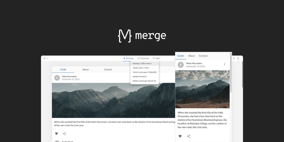
Using the Material UI library, we can show an example of this limitation. You can see in the video below that the Grid component is meant to span 12 columns on x-small and 6 on small devices, but there is no relationship between this layout component and the underlying UXPin canvas, and so, the changes don’t reflect on the canvas when resizing the component.
All Material UI components are responsive from the start but, by default, UXPin Merge can’t use the component’s media queries as the canvas is essentially fixed in size. So, even if you did a window refresh to change the size of the canvas then it wouldn’t reflect in the components layout, leaving you with a basic design.
The Power of Merge – Designing With Code Solution
Enter UXPin Merge. Since Merge allows you to design with real React code, what if you just made your coded components responsive? When designing with code you can reap the rewards of the endless possibilities that freedom affords you. You are no longer tied down by the same limitations that a vector-based design tool presents you, instead, using a combination of your imagination and some intuitive programming, you are free to unshackle yourself and code past these limitations. That’s the real power of Merge.
So to provide a solution to the responsive prototyping issue, we just need to create a component that can adapt to different device sizes, then we can use this as a parent component in our prototype that manages the layout of all the components on the canvas. This post will show you how to create such a component, so that you can make your coded Design System responsive today.
Creating a Responsive Component
First, we create a React component named DeviceViewer, that functions as a wrapper, passing props and styles to a nested resizable IFrame component. When components are nested in the IFrame, they’re no longer dealing with static canvas size, so all media queries, responsive properties, and styling will work perfectly, allowing us to test responsive prototypes without making multiple pages!
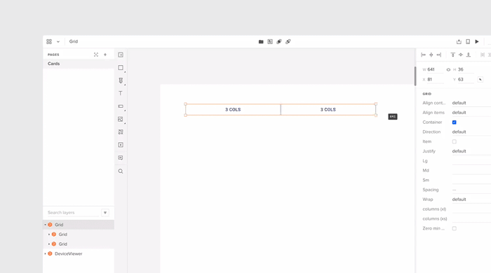
The image below shows the simplified structure of DeviceViewer and a breakdown of how it works will follow.
const useStyles = makeStyles((theme) => ({···
}));

function DeviceViewer(props) {
 const classes = useStyles(props);
 const [frameWidth, setframeWidth] = React.useState(0);
 const [frameHeight, setframeHeight] = React.useState(0);
 const [deviceView, setdeviceView] =
 React.useState(props.defaultView);

 React.useEffect(() => {···
 }, [props]);

 const handleChange = (event) => {
   setdeviceView(event.target.value);
 };

 const setViewportDimensions = () => {···
 };

 const IFrameResize = () => {···
 };

 return (
   <div className={classes.root}>
     <Grid···
     <Box pb={3}>
       <IFrame···
     </Box>
   </div>
 );
}
As you can see, it’s a fairly simple React component using the Material UI library. It has all the general architecture, it has styles, states, onChange event handlers, and the return statement structuring the HTML elements.
Inside the return statement, we have the Grid, Box, and IFrame components. The Grid component is the dropdown list of selectable viewport sizes (desktop, mobile, tablet, etc). The Box is essentially just a styling wrapper for containing the IFrame component.
useEffect()
Using useEffect and default props, the device view size is changed on state load and update, each time passing nested component props and styles from the previous IFrame to a new one.
The if statement (shown below in pseudo-code) determines which styling to add to the canvas depending on if the user is in the editor or preview mode of UXPin.
React.useEffect(() => {
   setdeviceView(props.defaultView);

   // We’ve redacted this code for readability
   // UXPin mode change CSS handling
   if (in EDITOR mode)) {
     // remove drop-down styling
   } else if (in PREVIEW mode)) {
     // Change canvas margin properties
   }
 }, [props]);
handleChange()
To keep track of the device size when updating the IFrame, we pass the drop-down target value to an onChange handler function referencing drop-down list values.
const handleChange = (event) => {
   setdeviceView(event.target.value);
 };
setViewportDimensions()
You can hard code these values like we have done in setViewportDimensions or pass them in as json if you need dynamic canvas sizes.
const setViewportDimensions = () => {
   switch (deviceView) {
     case "desktop":
       setframeWidth(1280);
       return;
     case "tablet":
       setframeWidth(768);
       setframeHeight(1024);
       return;
     case "tablet-landscape":
       setframeWidth(1024);
       setframeHeight(768);
       return;
     case "mobile":
       setframeWidth(375);
       setframeHeight(667);
       return;
     case "mobile-landscape":
       setframeWidth(667);
       setframeHeight(375);
       return;
     default:
       return;
   }
 };
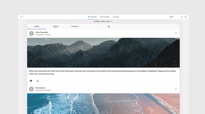
When in UXPin preview mode this is what the select menu populated from the setViewportDimensions would look like.

IFrameResize()
IFrameResize is run from the IFrame component on state load and update. IFrameResize calls setViewportDimensions to resize the IFrame based on the state props, then clones the current IFrame (#target), passing its props and styles to the new IFrame. When the new IFrame is loaded, the components which were passed as props are then arranged within the new IFrame dimensions.
For the actual IFrame component and comparing it to the docs, it’s got all the props needed to pass data and CSS through to the children components that will be nested within. The sandbox tag is added to allow Frame to communicate with the canvas itself.
The FrameContextConsumer is where it takes all the jss and inserts the css rules into the designated location and passes that through to the children components.
That’s essentially it, just a wrapper component (DeviceViewer) passing properties to the IFrame component that allows for child elements to be updated and changed without refreshing the page or changing the layout directly.
Summary
Comparing this solution to other design tools on the market, UXPin Merge is such an exciting proposition. In Merge, you don’t have to create or edit plugins or call APIs to add additional features or functionality to your design tools. Instead, anything that can be coded in a live React component can be used in exactly the same way in Merge, so you are free to make dynamic and intuitive components that help enhance your team’s design process and take care of responsive web design in no time. The possibilities are endless.
As UXPin Merge matures and an ever-increasing list of companies decide to adopt it in their design workflow, we are starting to see many interesting and exciting use cases that go beyond what even we imagined when we first created the feature. Like this case – thanks to Jack Behar and Taylor team we could tell you about this innovative responsive solution.
Hopefully, this post has got your creative juices flowing, and maybe you have one or two interesting ideas for React components that you would like to code and add to your Merge library. Have an idea how to make the most of Merge? Share your thoughts and ideas with our diverse UXPin community!
Want to find out more about Merge or would like to try it for yourself?