Spammers, scammers, and identity thieves — the world is a scary place.

Photo credit: Down the Rabbit Hole. Creative Commons.
It falls on the individual site or app to prove its credibility through the product design and design of marketing assets (like landing pages). Designers just can’t expect the users to trust them with blind faith.
In this piece, we’ll discuss the best practices for ensuring that your product says what it does and does what it says.
The following piece is an excerpt from the free guide The Elements of Successful UX Design.
First Impressions Matter
You only get one chance — and about ten seconds — to make a good first impression. The Nielsen Norman Group recounts a study citing that users will leave your site within 10-20 seconds unless you can prove your worth. That means you don’t have much time to establish credibility and clearly communicate your value.
A different study from Stanford proves that, for web users at least, visuals are the number one factor in determining credibility. Combining the two studies shows just how important your landing page’s visual are to establishing trust, as quickly as possible.
Polished aesthetics and intuitive usability are the two base ingredients for building trust. Good usability instills confidence, while the eye candy increases desire to use the site or app.
Even if your interface strives for a progressive style (perhaps applying asymmetry), you still must create a sense of order. Clean interfaces composed of universal UI patterns are stupidly simple to use.
Consistency
A good practice all around, consistency is strongly linked to reliability. That is to say, inconsistency suggests disorganization and incompetence.
Consistency manifests itself in two different forms. First, your design must be externally consistent with users expectations and prior experience. Secondly, your design be internally consistent with itself through strict adherence to style guidelines (e.g. using the same icon styles, button shapes, etc.).
You can achieve external consistency through careful user research, proper UI patterns, and usability testing. You can achieve internal consistency by checking:
- The same styles and color schemes across different pages or screens.
- Layout and navigation consistency means features are always in the same place, such as a search option always in the upper-right corner.
- Functional consistency means visuals reflect the same function across the whole design, such as a green button always meaning Save.
To help maintain consistency throughout the entire site or app, and more importantly so that every team member is on the same page, try compiling a style guide.
Quality Assurance
It’s difficult to nail down all performance issues while you’re still in the designing and building phases. Once the final product is ready (or a late-stage prototype) conduct a thorough quality assurance check. This involves going through every page or section of content to make sure there are no errors and everything behaves as it’s supposed to.
The two common areas to examine in a quality assurance check are:
- Functionality — All interactive buttons work. This includes clickable functions and features, but also more subtle aspects, such as hover-triggered animations and gesture controls.
- Proofreading — Typos and grammar mistakes scream untrustworthy — think of a typical spam email. Comb through all text to eliminate all errors, and hire a professional if your English is not up to the task.
Quality assurance may seem like an unnecessary step, especially if you’re behind schedule. But chances are there’s a least one or two errors you missed during production, and if you don’t catch them, your users will.
On a related note, no product is infallible. If you anticipate any downtime, notify users well in advance (at least 1 week) of the maintenance windows.
No False Buttons
As a rule, only buttons should look like buttons.
False buttons frustrate the user, who waste time clicking them. The mistrust will spread to your whole design since users will think twice before interacting with other elements.
Don’t outline words or phrases in a box unless the user can click on it.
No Dark Patterns
As the name suggests, dark patterns are designed to trick users into actions that make the company more money.

While tempting for short-term gains, they always damage the brand in the long run. You might be able to fool the user once or twice, but once they realize the deception, you’ll probably never earn their trust back.
- Never sneak items into a user’s shopping cart upon checkout.
- If users pay for a certain set of actions (e.g. 20 usability tests per month), don’t allow for more actions than what a user paid for, then demand payment or you’ll lock the account. Hostage-taking is never a viable UX strategy.
- On a more subtle yet equally sinister note, don’t design difficult opt-outs (like forcing users to take multiple steps to cancel an account).
To learn more, check out UX Designer Harry Brignull’s excellent collection of dark patterns. The gallery is a cautionary tale for designers and companies alike.
Quick Case Study: Chase
For banks and financial institutions, trust is paramount.
The layout for Chase’s site is not only visually appealing, it’s also self-explanatory. They don’t rely on their name alone for credibility. The design isn’t groundbreaking, but you don’t need a completely original design to appear trustworthy.
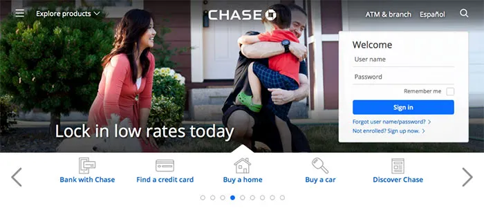
Photo credit: Chase
Notice the basic visual logic at work:
- A readable sans-serif typeface with soft edges creates a feeling of comfort and hospitality.
- The tasteful icons appear friendly and designed by professionals.
- The login/signup window — a likely first step — is given visual priority by clearly standing out from the photo behind it. The form’s rounded edges also draws attention to the content while feeling safer since the brain has evolved to see sharp edges as a threat.
- The top navigation menu offers more options without cluttering, thanks to smart spacing, a hamburger icon, and an expandable search feature.
- The brand’s use of blue colors strikes the right emotional notes as it creates a sense of safety and reliability.
- The stock photograph feels candid, not a posed cardboard cutout.
When you see the landing page, you just seem to know that this company knows what they’re doing. You feel a sense of structure, which leads to a sense of safety.
Discussions around visual details like grid alignment, colors, and typography depend on far more than one’s personal taste. When they match the mindset of your user, you’ve already carved a clear path towards conversions.
For a bottom-line example of how smart visual choices lead to more revenue, check out this story of how Airbnb improved host profitability by investing in HD photos to appear more credible.
Conclusion
The tactics we outlined aren’t necessarily exclusive to digital design. These are the best practices that have emerged over centuries of businesses trying to distinguish themselves through honesty.
If you design a credible product but don’t appear trustworthy to users, few people will take the plunge. On the other hand, if you design a product full of dark patterns and present it in the best light possible, you’ll end up with plenty of angry users. For long-term success, you must instill confidence through the product design and the UX created by your marketing assets.
For more practical design advice, check out the free 109-page guide The Essential Elements of Successful UX Design. Best practices are explained based on analyzing 24 examples from companies like Slack, Apple, and others.
Feature photo credit: Peter Morville