
Fitting user testing into a two-week sprint isn’t the easiest task. In my experience, that’s usually an understatement.
The window of opportunity to act on insights rapidly shrinks until you’re suddenly faced with a “last resort” situation—needing input but unable to observe users with the product.
When you need feedback but access to your customers isn’t possible or time is short, testing with internal users (surrogate testers) may prove more valuable than you expect. At some point, you will need to test actual users, but internal stand-ins help you gain momentum until then.
To evaluate when and how internal testing should happen (and steer clear of the pitfalls), here’s how to get started.

“Internal testing surrogates can give you great feedback on the functionality and sentiment surrounding your designs”
When Does Dogfooding Make Sense?
Internal user testing (dogfooding) is most valuable when there’s greater concern for qualitative feedback and less for validity.
As shown by Slack’s design process in the Real-Life UX Processes e-book, dogfooding is all about cost- and time-conscious design insights.
Is your project right for internal testing? Make sure it falls in line with these criteria.
- If the product is very general or covers a very wide range of the market.
- Your co-workers resemble your user personas.
- A concept needs functional testing to validate if the interactions work as designed.
- You need to map participants’ mental models of use with the product.
- You need buy-in from stakeholders to understand how people might react to your designs.
- You need quick wins to justify the budget for formal user research.
Remember, your goal is to get results quickly. Don’t spend hours on data only your desk drawer will see.
Eating Our Own Dogfood
One of the biggest challenges we faced as a team on BostonGlobe.com is understanding how readers consume digital news. We needed to present the breadth of our content in an appealing way to maximize recirculation (percentage of users who read more than one article per visit).
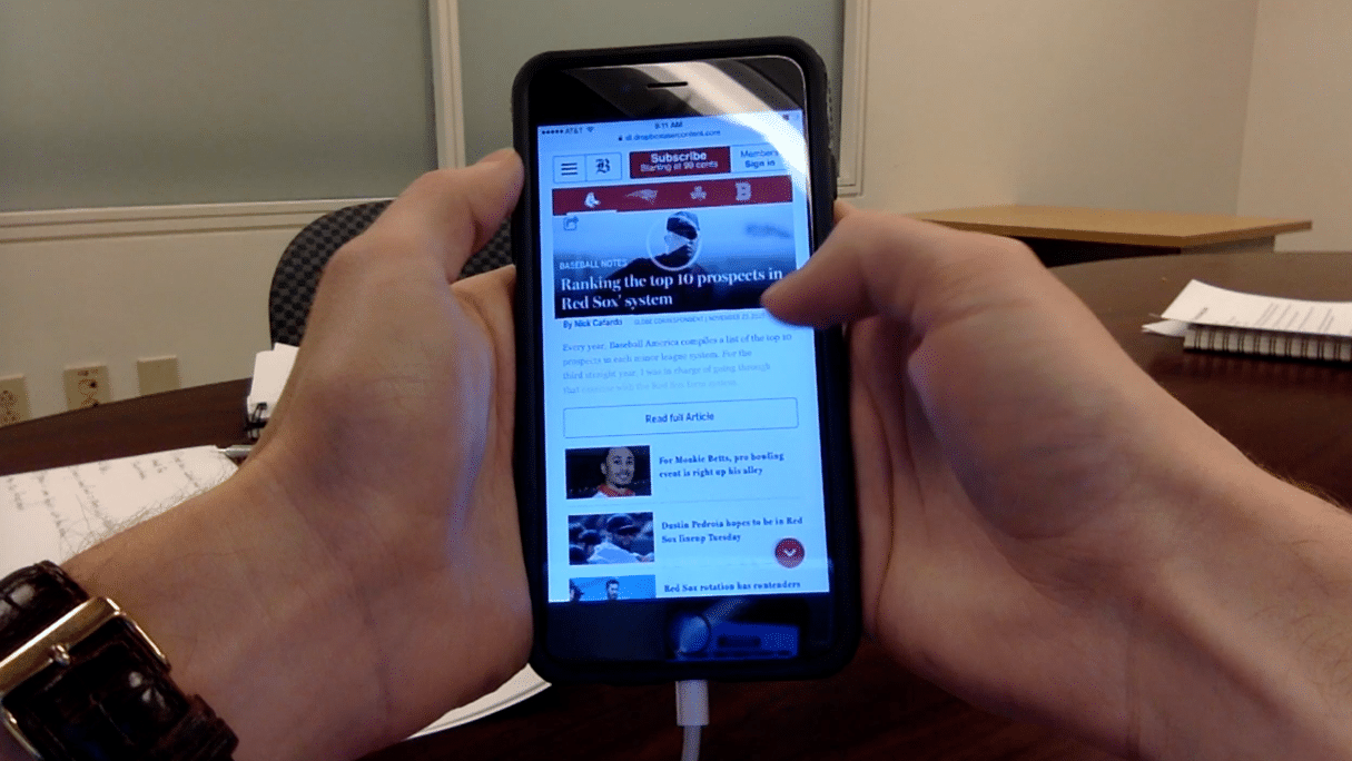
For a recent internal test of a new “Sports” vertical on Boston Globe.com, we conducted mobile testing on 17 candidates internally sourced from 13 different departments. Participants were asked to complete prompted tasks and open-ended questions. We also asked them to rate the usefulness, effectiveness, and desirability of features.
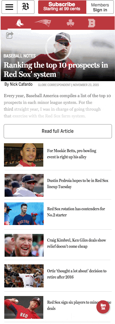
For this project we needed a way to test functionality around new navigation that uses Red Sox, Patriots, Celtics, and Bruins logos as navigation elements (to drive more circulation between team fronts) and a fly-in menu bottom with additional articles to drive recirculation.
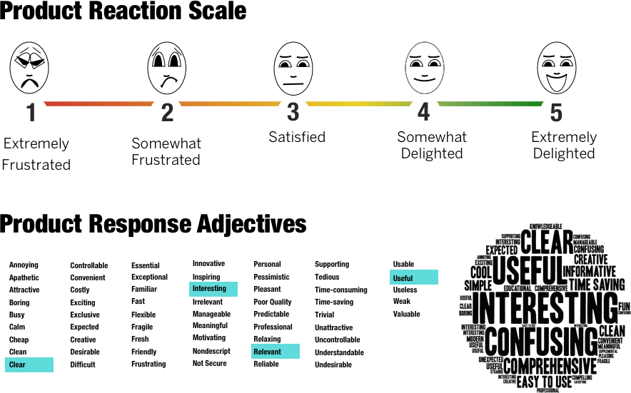
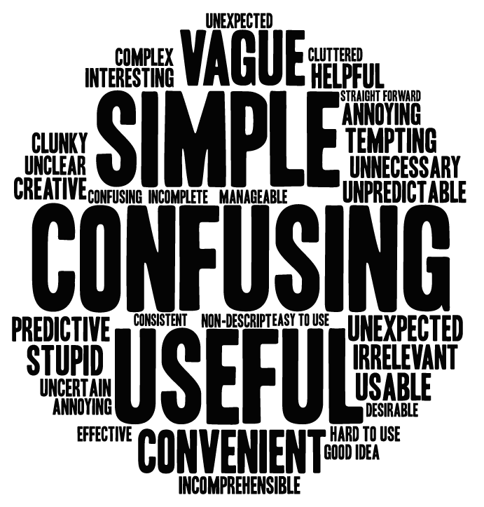
RITE testing (Rapid Iterative Testing and Evaluation) was also used to test alternative designs. We then collected reactions (feature and product level) in the form of a product reaction scale and adjectives, which we visualized in a word cloud.
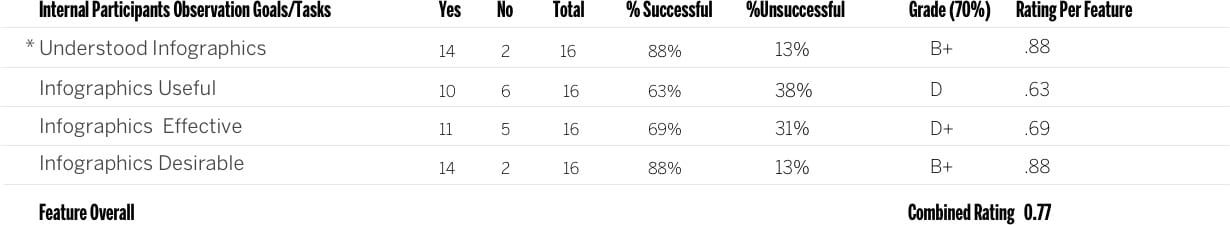
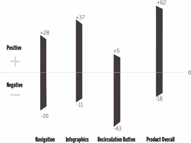
Mobile sports section features tested and ratings by feature
The Results Of Our Internal Test
The results of our internal testing (example tables below with ratings for each feature) showed a number of areas for UX improvements.
Navigation
A fully functional prototype used for testing was built to test the major features and variations in the recirculation button and gauge reaction before product launch.
Navigation Ratings
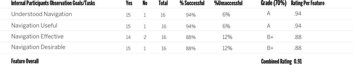
The rating table covers the three UX benchmarks: usefulness, effectiveness and in this case. I chose desirability instead of satisfaction because asking participants if something is satisfying sets a sub-standard bar for the quality of the feature or product. Instead, we aim for delight.
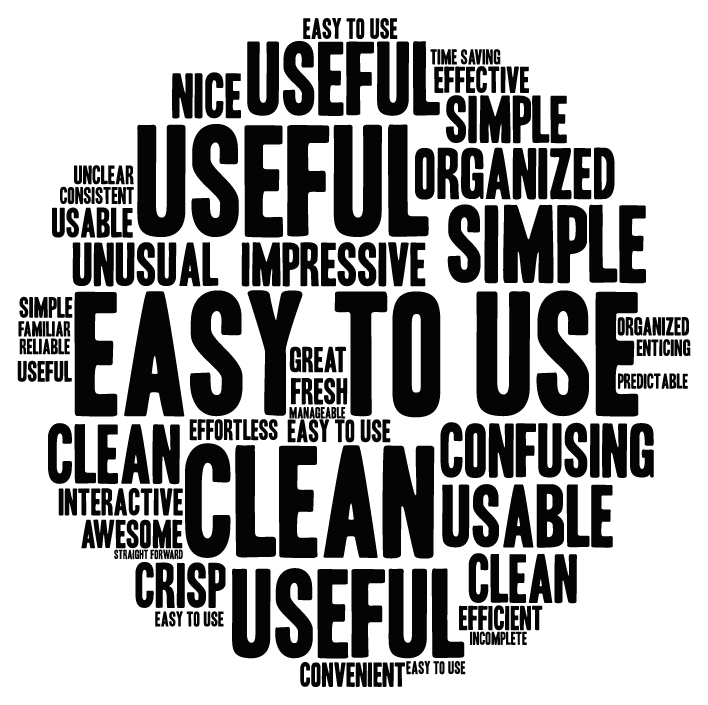
Word cloud used to visualize common words used in qualitative user feedback.
Findings
- No clear indication of section front. If a user comes in on a featured article
- Participants described the feeling of being trapped or limited if not looking for the big four Boston teams.
Infographics
Differences in your sample size between tests can skew your results. Don’t trust the data alone to inform design decisions. Proper due diligence includes checking your qualitative data and adjectives for a complete product perspective.

Feedback word cloud
Findings
- Participants thought the infographics default state should be visible without having to click to view.
- Participants overlooked the infographics, often confusing them
for advertisements.
Recirculation Button

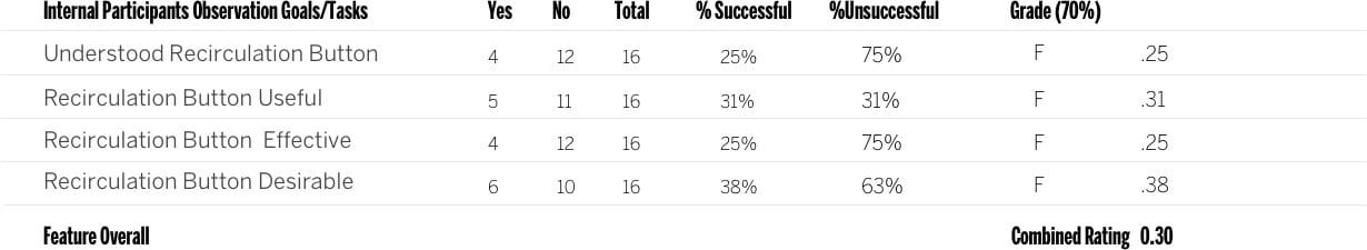
- 4/17 people describe this feature with negative comments
- 16/17 participants noticed and understood how the navigation worked at first glance (their mental model matched the interaction)
- Slowing down the animation between the sections helped to communicate different states.
Participants found it difficult to recognize the difference between an article they chose to read and a truncated article that served as a landing page (truncated article with recirculation articles at the top of the page). Furthermore, if a reader had chosen the same article as the featured article the hero images were the same so there was some confusion understanding the differences between these pages. If a reader clicked the section logo it would take them to the same article only truncated. Participants explained they expected to see a team landing page which from a UX perspective makes sense because participants didn’t automatically understand that the article was serving as the landing page. To them, it just looked like another article.
Positive to negative word association based on adjectives in user feedback.
How We Pivoted
Like many companies that are dealing with time constraints ultimately it was decided to release an MVP to get the product out and see how our readers responded. Once the design was out in the wild our team waited and looked at a two-week post-launch analytics report and a feedback form that was launched at the same time.
What we found was a bit disheartening when we discovered that exit rates increased on sub-section fronts. While the results were not what we had hoped for they still served as an important lesson to test as early as possible. The later you test, the more difficult it becomes to adapt and pivot.
The report validated many of the concerns from our testing results. For example, the recirculation button was clicked on less than 1% of articles and our testing showed that participants didn’t find the recirculation button a valuable feature and many didn’t understand or use positive adjectives to describe their experience. 3/17 people understood this feature at first glance and 81% or 22/27 had negative comments about the feature.
Luckily, as we launched iterations of the recirculation feature, qualitative feedback improved alongside the quantitative feedback. The language participants used to describe features started changing. Words like “simple” and “easy began to spring up which also corresponded with the ratings scales for gathering quantitative feedback.
How to Run Insightful Internal Testing
The secret is maintaining momentum.
Think about testing like an iterative sketch. Your test won’t be perfect – but remember, the clock is ticking. Test your prototypes with coworkers that possess varying and often overlapping needs—just like your real users.
Minimum number of coworkers to test
While the minimum is 5, I try to use common sense.
Our team recently reduced the participants from 25 to 15 without loss in the quality of insights. We also recruited across different business segments to give the test as much variability as we needed.
Frequency of Internal Testing
Besides A/B testing, we run internal tests on nearly all features in our product roadmap. The length of tests depends on the complexity of the problem. We normally run testing in blocks – for this project, we ran our test over three days.
Now, we typically start testing with lo-fi prototypes during concept exploration. We iterate almost immediately after the first test to prepare for our second round. We may test up to three different iterations in the first round.
For example, we may test a button with an icon with one participant, and one with text on the next participant. If a design is glaringly problematic, simply omit it from the testing as soon as a pattern supports your assumption.
Most of the time, issues will surface after the first few participants. We also found it best to debrief after each session instead of hours later when you’re trying to recall important points from notes or recordings.
Takeaways
In closing, let’s review the benefits of internal testing:
- Backing for UX initiatives. When new to a role, you need to quickly show the value of your work. By sharing your knowledge of testing with those around you, they become “true believers” in your work.
- Speed of delivery. Testing your prototypes on internal users helps you iron out issues quickly. All your results will be compiled quickly and summaries can be written at the end (preferably immediately post-testing), and then compiled in a summary in one day.
- Education and feedback. Internal testing with surrogates helps you it i cterate and understand the strengths and weaknesses of your own testing processes.
- Saves time and money. Show your stakeholders the quick wins. When managers see tangible results at little to no cost, you’re in a better position to sell them on a test with real users.
For advice on testing with users, I highly recommend checking out The Guide To Usability Testing by UXPin.
You’ll find useful tips, as well as guidelines and pitfalls you may encounter along the way.

