Web Accessibility Guide – Everything Designers Should Consider and Implement

Billions of people visit websites every day, some are able-bodied and others are not. How does a designer ensure that everyone can access and use their website? The answer is web accessibility.
Build accessible prototypes with UXPin, a design tool that has a built-in contrast checker and more. Explore all the features during a free trial. Sign up for a free UXPin’s trial.

Why is Web Accessibility Important?
Web accessibility is designing websites that can be used by people who have disabilities like low vision, color blindness, blindness, cognitive disabilities, deafness or hearing impairment, and mobility impairments.

Web accessibility is important because it makes websites responsive to the needs of all users. At the moment, there are more than 1 billion people who have disabilities in the world while in the United States, 61 million people live with disabilities. When you design websites with accessibility in mind, you make your creations available to people who have disabilities.
Accessible web design is not just a ‘nice to have’ it is required by law in countries such as the US, Israel, Canada, the United Kingdom among others. In fact, 2,000 website accessibility lawsuits were filed in the United States in 2019 alone.
Research has shown that there is a strong business case for accessible website design because it improves SEO rankings, increases customer satisfaction, improves usability, and increases the reach of a website.
POUR – The 4 Web Accessibility Standards
According to the Web Content Accessibility Guidelines (WCAG) put forward by the Website Accessibility Initiative (WAI) of the World Wide Web Consortium (W3C), web content must be POUR.
This means it has to fulfill the following principles:
- Perceivable Information
- Operable UI and Navigation
- Understandable Information and UI
- Robust Content and Reliable Interpretation
Perceivable Information Principles
All the Information and UI components must be presented in a way that all users can understand in different ways. There should be no invisible or difficult to understand information or UI elements.
Here are the guidelines that your design must follow to fulfill this principle:
- Alternative text for all content that is not text such as pictures and graphics. This ensures that non-text content can be transformed into other forms like speech, braille, or larger fonts.
- Give alternatives such as subtitles and closed captions for all time-based media such as videos and animations.
- Create adaptable content that can be presented in a variety of ways such as a simple layout without interfering with its structure.
- Make it simple for users to see and hear your content by differentiating between your foreground and background.
Operable UI and Navigation Principles
This principle requires that your website’s UI components and navigation can be operated easily without a mouse and it should not require interactions that a user cannot do.
Here’s how to make your web design operable:
- Make all functionalities keyboard accessible.
- Give your users ample time to interact with your content.
- Avoid designing content (flashing elements) that can cause seizures.
- Give users ways to find out where they are, navigate your site, and find the content that they are looking for.
Understandable Information and UI Principles
You should ensure that users can understand how your site’s user interface works and the information presented on your site.
Here’s how to accomplish that:
- Ensure that the text on your site is easy to read and understand.
- Create and present web pages that work in predictable ways.
- Make it easy for users to avoid and correct input mistakes on your website.
Robust Content and Reliable Interpretation Principles
Robust content is content that can be interpreted accurately by assistive technologies such as screen readers. Your content should continue being accessible to and compatible with these assistive devices even as their technologies evolve.
For each of the WCGA principles, there is a success rating of either A (minimum rating), AA (good), and AAA (gold standard).
What Makes Websites Accessible? Use Cases and Examples
Here are some changes that you can make to your web designs to make them accessible.
Color Contrast
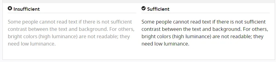
When designing your website ensure that there is enough contrast between the background color and the foreground text. The principles of color contrast also apply to buttons, the text that’s on images, and other UI elements.
Color contrast has a significant impact on how easy it is for users to read the content on your website. Low contrast makes it difficult for people with low vision to read. According to the WCAG, the minimum acceptable contrast ratio is 3:1 while the gold standard is 7:1.
UXPin has a color contrast checker that helps you ensure that your designs are up to WCAG standards. The tool also lets you view your design the way people with the eight different types of color blindness would.
An example of the difference that color contrast makes from W3C.
Alternative text
For each image and graphic, provide descriptive alternative text that passes on the same meaning as seeing the text. Screen readers read this alternative text for visually impaired people so avoid using numeric descriptors or those that do not convey any meaning.
Additionally, for time-based media such as video or audio recordings, provide closed captions and transcripts that have visible links. This also applies to icons, buttons, tables, and graphs.
You can present alternative text using the <alt> tag or use captions to provide context.
Easy to read content
Users interact with websites primarily through text content. This makes it important to use simple language that is free of jargon and uncommon words, WCAG requires that websites use language that is at a “lower secondary level” to make it as accessible as possible.
You can use tools such as the Hemmingway App to determine the readability level of your website copy.
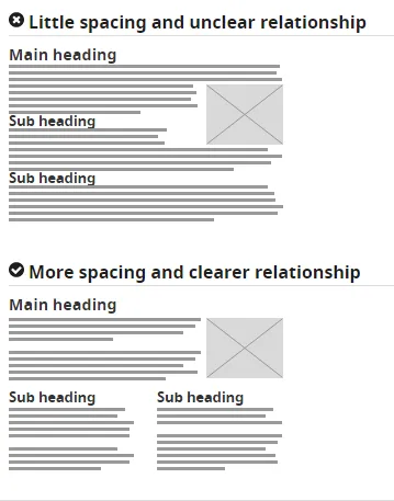
Use header tags appropriately
Header tags make it easy for users to skim through web content and they give screen readers signals about the importance, relationship, and hierarchy of different pieces of information.
Start with the <h1> and use the tags consistently and in the correct order.
How to use header tags correctly from W3C.
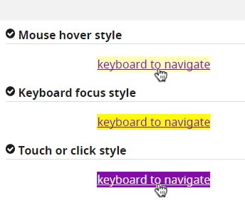
Design clear focus states
Focus states make it easy for people navigating your website using the tab key to know where they are when using your site. They are used by screen readers, people with limited mobility, and power users.
Ensure that your menu items, forms, links, and buttons have clear, high contrast focus indicators that help them stand out.
An example of clear focus states from W3C
Design helpful error states
Provide helpful and contextual information to users when they make errors. Also, explain to them how they can fix the errors and give them a chance to reverse their submissions.
Present instructions clearly and instances where user action is required should be displayed prominently.
An example of easily identifiable error states from W3C
Label all form fields
Make sure that you have descriptive labels next to every form field. Additionally, avoid using placeholder text as the form label because it is often low contrast making it hard to read. Placeholder text also creates confusion because users can’t tell what to do after the text disappears.
Form labels are also useful for people using screen readers to understand your form, screen readers only read the information that is tagged as <label> and skip over placeholder text.
A form with clear labels from W3C
Don’t use flashing UI animations
UI animations that flash more than 3 times per second can trigger seizures or physical reactions for some people. So it’s best to avoid them.
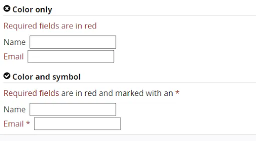
Avoid using only color to pass a message
Color is a good way to pass on a message but it should not be the only way as some people are color blind. Instead, use color plus other elements such as asterisks. For graphs and other charts, use labels plus color.
Using color plus other elements to pass on a message from W3C
Use easy to read fonts
Use a font size and style that is easy to read. The readability of a font is often determined by its style rather than its type. As a rule, cursive or decorative fonts are hard to read. Use large text, with short line lengths, tall line heights, and more space between letters for improved readability.
New Accessibility Considerations for 2020 and Beyond
WCAG 2.2 to Be Released in 2020
The World Wide Web Consortium (W3C) released the first draft of WCAG 2.2 on the 27th of February 2020. This update aims to further improve web accessibility for disabled persons, especially on mobile devices.
Here’s what you need to know about WCAG 2.2:
- It is backward compliant with WCAG 2.0 and 2.1 meaning that if your website meets the criteria of 2.2 it also meets the criteria of the previous versions.
- It includes new criteria for focus visible states such as the size of focus area and color contrast.
Growing Importance of VUI and Voice Interface Design
With more people using voice-controlled devices like Alexa, Siri, and Amazon Echo for their search needs, there is a growing need for voice interface design.
Here’s how designers can make their voice interface designs more accessible:
- Tell users what they can do.
- Let users know the functionality that they are using.
- Don’t give too many options.
- Give visual feedback whenever possible
Don’t Over-Promise on “Full” or “100%” ADA Compliance
The Americans with Disability Act (1990) was signed into law to prevent discrimination against people with disabilities. However, this law does not explicitly mention web accessibility and is therefore open to different interpretations. This means that as a designer you should not over-promise on full ADA compliance because it is not clear how ADA applies to web accessibility.
Prototyping, Designing and Developing With Accessibility in Mind
To fully comply with accessibility web design, you need the best tools to help you with prototyping, design, and development. UXPin offers an all in one platform where you can check your designs for WCAG compliance and handoff your designs smoothly. Try UXPin for free.

