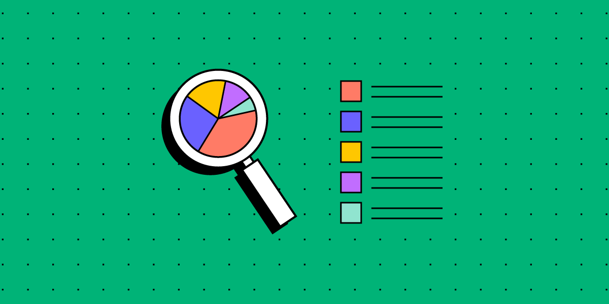
Which UX Metrics Should You Be Tracking?
User experience is often ambiguous, making it challenging to identify the right UX metrics and KPIs. Design and product teams want to know whether their solutions work while stakeholders are interested in various projects’ ROI.
Choosing the right user experience metrics and KPIs is crucial for organizations to evaluate UX successes and measure themselves against the competition. This article looks at these indicators and which ones to use for measuring various facets of the customer experience.
Increase UX value and deliver better quality digital products with the world’s most advanced user experience design tool. Discover how UXPin’s code-based design tool can enhance your product design workflows and deliver better product experiences for your customers. Sign up for a free trial.

Why Track UX Metrics and KPIs?
Tracking UX metrics tell design teams and stakeholders whether the org’s UX strategy is working and the success of each design project.
User experience and usability are vital for a successful product because these metrics tell companies how satisfied people are using their products and whether design solutions fulfill their needs correctly.
Customer satisfaction is important for retention, conversions, and other marketing and sales metrics that ultimately impact the organization’s bottom line.
UX KPIs benchmark performance and track progress over time to ensure companies meet various UX goals and objectives.
Types of UX Metrics
Like any measurement framework, there are two types of UX metrics:
- Qualitative data: Sentiment, loyalty, usability, user satisfaction, and other subjective data
- Quantitative data: Numbers, ratios, and other measurable data
The challenge with measuring user experience is that many metrics are qualitative. Quantitative is relatively simple to analyze; numbers either go up or down. Analysts and stakeholders must treat qualitative data with greater scrutiny, as it’s easier to misinterpret or bias data (purposely or incorrectly).
Net Promoter Score (NPS)
The Net Promoter Score (NPS) is a crucial UX metric because it measures how likely customers are to recommend your product. A high NPS indicates that your product solves users’ problems and that they’re inclined to share that experience with others.

NPS is determined by asking whether customers are satisfied with a product or feature on a scale of one to ten (one lowest, ten highest). Companies categorize the results into three groups:
- Promoters (scores of 9 or 10): Your most loyal customers
- Passives (scores of 7 or 8): Satisfied customers unlikely to recommend your product
- Detractors (scores of 0 to 6): Unhappy customers who may stop using your product and possibly discourage others
System Usability Scale (SUS)
The system usability scale (SUS) is a 10-question questionnaire that provides UX designers with a digital product’s overall usability score. SUS dates back to the 80s and is still considered a good UX metric for measuring usability.
We recommend reading this HubSpot article for a deeper understanding of SUS and how to use this important UX metric.
Customer Satisfaction Score (CSAT)
A customer satisfaction score (CSAT) measures how happy or satisfied customers are with a product or feature. You measure CSAT in a couple of ways:
- Yes/No questions: “Did this product help you complete task X?” Produces a percentage score.
- Scale (i.e., 1-10): “How satisfied are you with your experience today?” (including a scale from 1-10 with unsatisfied on one end and satisfied on the other). Produces an aggregate score based on the scale.
Time-on-Task
Time-on-task determines the average time it takes users to complete a specific task. It’s a fantastic indicator of a product’s efficiency, especially for enterprise products designed to increase productivity and performance.
Unlike CSAT, time-on-task requires no input from users. Instead, designers use analytics tools that measure and aggregate results.
Customer Effort Score (CES)
Organizations use a customer effort score (CES) to measure how easy it is for a customer to complete a task. You measure CES by asking users about their experience with a scale for their answer.
For example:
- Question: “How easy was it to use feature X?”
- Scale 1-10: 1 = Very difficult, 10 = Very easy
Error Rate
Error rates indicate how often a product or feature prevents someone from completing a task. System error rates are critical UX metrics because they can deter customers from using or recommending a product.
We represent error rates as a percentage with the goal of keeping them as low as possible. A high error rate indicates a significant usability issue designers must investigate and fix immediately.
Completion Rate
A completion rate (or task success rate) tells you how many times people complete a task. Completion rates are excellent indicators of a broader problem, like bugs or usability issues. If the completion rate suddenly drops, there may be a system error or usability issue resulting from a new release.
Many factors impact completion rates, so product teams can monitor this metric as an indicator that something has gone wrong.
Engagement
Engagement is another indicator of customer satisfaction and enjoyment. It tells organizations how often customers use and interact with a product. UX designers must combine several metrics to determine user engagement. For example (these will differ depending on the product):
- How long do users use the product?
- The number of pageviews.
- How much scrolling do they do?
- Do they engage with content and other users?
- The number of tasks they complete while using the product.
Each product and organization will have different methodologies and metrics for measuring engagement.
Conversion Rates
Conversion rates are crucial as they determine the percentage of conversions for completing forms, sales, signups, transactions, and other business metrics.
Designers must pay careful attention to this business metric because design decisions can have positive and negative outcomes for conversions.
How to Track UX Metrics and KPIs
There are several tools and techniques for tracking UX metrics and KPIs. This step-by-step process provides a brief outline of how to track and measure performance.
Step One – Defining Benchmarks
Benchmarks are a point of reference, usually a starting point for organizations to measure performance for both qualitative and quantitative metrics. Defining benchmarks is crucial for measuring UX metrics because they determine whether something has improved or deteriorated.
For example, time-on-task is a common quantitative UX metric used to determine how long it takes users to complete a specific goal, like purchasing a product. UX designers would have to benchmark how long it takes to buy a product at the start of a project to determine whether they’ve improved on that metric or not after release.
Step Two – Set Goals and Key Performance Indicators
- Goals: What the organization what’s to achieve
- KPIs (Key Performance Indicators): The milestones organizations use to track performance toward goals
Setting goals gives design teams a target for improvement. Organizations typically set a big long-term goal with multiple KPIs to measure performance.

For example, the Net Promoter Score (NPS) measures how likely customers are to recommend your product, usually measured from 0-10, with ten being the most likely. The product’s current NPS is six, and stakeholders want a 50% increase to nine or higher in 12 months with a 12.5% increase every quarter.
- Benchmark: 6
- Goal: 9
- Four Quarterly KPIs: 0.75-point increase each quarter
Step Three – Measuring Performance
With goals and KPIs in place, teams must use various analytical software and techniques to measure performance. Some examples of this software include:
- Hotjar: Hotjar is a fantastic qualitative measurement tool with screen recorders and heatmaps to monitor user behavior. Hotjar also includes a quick survey tool for websites and mobile apps to measure various UX metrics.
- Baremetrics: Baremetrics measures more quantitative data like churn rates, conversions, revenue, and other numerical data.
- Google Analytics: Google’s free analytics tool for tracking users, including flows, time-on-task, conversions, etc.
- Optimizely: An A/B testing tool to compare performance between two designs.
Step Four – Reporting UX Metrics
Reporting UX metrics allows design teams and stakeholders to track performance toward long-term goals and measure the success of each design project.
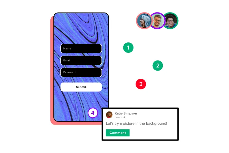
A UX metric report generally displays four key data points (usually on a graph or graphic):
- Benchmark or starting reference
- Target KPI
- Performance against KPI
- Desired goal
UX reporting must be succinct and transparent. UX designers must include references for gathering and analyzing the data so that team members and stakeholders can check their findings.
Step Five – Acting on UX Metrics
Design teams must have actionable plans to respond to KPIs. For example, what happens if performance deteriorates or you don’t meet a specific KPI?
UX metrics aren’t a framework for collecting data; they’re supposed to provide UX designers with indicators to iterate and improve–for users and the organization.
Improving Product Performance With UXPin
Creating a helpful, enjoyable, and engaging user experience that fulfills customers’ needs is a goal every UX designer strives to achieve. Designing a great user experience starts with using the right tools.
UXPin’s code-based design tool empowers UX teams to build accurate prototypes to test and identify usability and accessibility issues. Solving these issues before release is crucial for meeting an organization’s UX strategy and goals.
Unlike image-based prototypes that render vector graphics, UXPin generates HTML, CSS, and Javascript, enabling designers to replicate a coded product’s functionality and fidelity accurately.
UXPin also empowers UX designers to address usability and accessibility issues with fast prototyping to find a solution. Whether you use your own design system or a built-in design library, UX designers simply drag and drop components to build quick prototypes for usability testing.
Not only is it faster to prototype using UXPin, but UX designers also enjoy higher fidelity and functionality, providing meaningful, actionable results from usability participants and stakeholders.
Improve your product’s user experience and streamline UX workflows with the world’s most advanced design, prototyping, and testing tool. Sign up for a free trial to experience UXPin’s code-based design features.


