Full-width above the scroll images are one of the most popular trends in website design. Whether the image is still or a motion-based video, use of a hero header is definitely a popular option.
And that makes perfect sense. This format works great with plenty of different image types, fits into responsive design frameworks and appeals to users because of its highly-visual nature. In this post, we’ll show you how to use hero headers or a letterbox style to dazzle your users and catch their attention. But first, let’s examine the differences between the two.
Hero Header
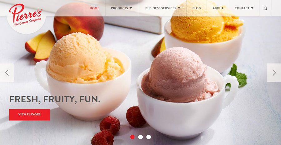
Photo credit: Pierre’s Ice Cream Company
A hero header is an oversized display with a visual, text and navigation elements above the scroll in your design framework. The stacking and layering of the elements is completely up to the designer, but one of the most common uses is a photo with text and element overlays, such as Pierre’s Ice Cream Company above.
Hero headers can be built using existing images from your collection. Or you can create new imagery that boldly stands out. Or you could use a kit to mix-and-match pieces for a semi-custom look.
One thing that you’ll want to keep in mind is your use of images. You want something that’s distinct and stands out. Think about Apple — who are the masters of the hero header. In the example below, you’re immediately drawn into the copy by the cascading iPhones.
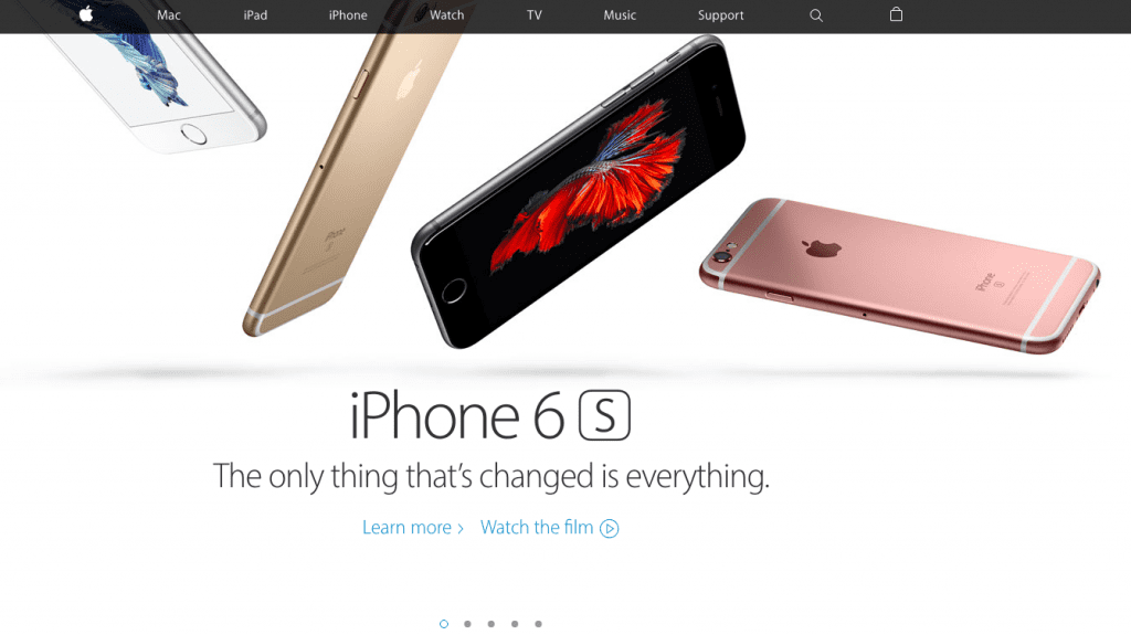
Photo Credit: Apple
Images can make or break a hero header. Choose the wrong image and visitors to your site will bounce out faster than a speeding bullet. Pick the right one and they’ll be drawn into your site, sticking around to see more of what you have to offer.
Letterboxing
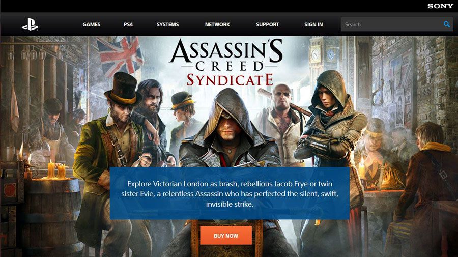
Photo credit: Playstation
The letterbox style adds some additional styling and color to hero headers. When you visit a site that uses letterboxing, you’ll notice that a border frames the main image — like when you watch a movie on your TV. Below the image you’ll notice design elements such as navigation, search or branding.
Letterboxing allows the image to have more room and makes the page less cluttered. The image still remains the dominant on the screen. This style is easy to implement because the aspect ratios are very similar to the ones you’d use for the common social media cover photos. This is a definite bonus for brands looking to maintain a consistent visual across different channels.
Once again, be choosy when it comes to photo selection. You’ll want to be just as bold as with the typical hero header.
Now that we understand the slight difference between letterboxing and hero headers, let’s dive into how you can use them in your work.
Universal Appeal
The reason hero headers and letterbox style designs have become so popular is because they have an almost universal appeal. They work for a variety of content types and play particularly well with photos, video and animation.
All you really need to make the most of this trend is one great visual — are you sensing a theme yet?
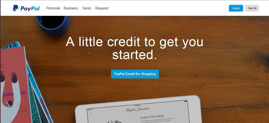
Photo credit: PayPal
Hero headers are the perfect container for one bit of information. PayPal does this exceptionally well. Throughout the site, you’ll find a collection of hero images and messages that make the user stop and examine the site each time they visit.Text and button elements work seamlessly with each image so the user is drawn in to see if the content pertains to them.
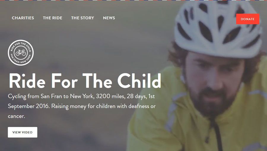
Photo credit: Ride for the Child
Video works in much the same way as images when it comes to the hero-style design. It takes a strong video clip and well-written copy to draw users in. Ride for the Child accomplishes this with a fast-speed set of video clips to hold interest along with bold, oversized typography to really get users to click around.
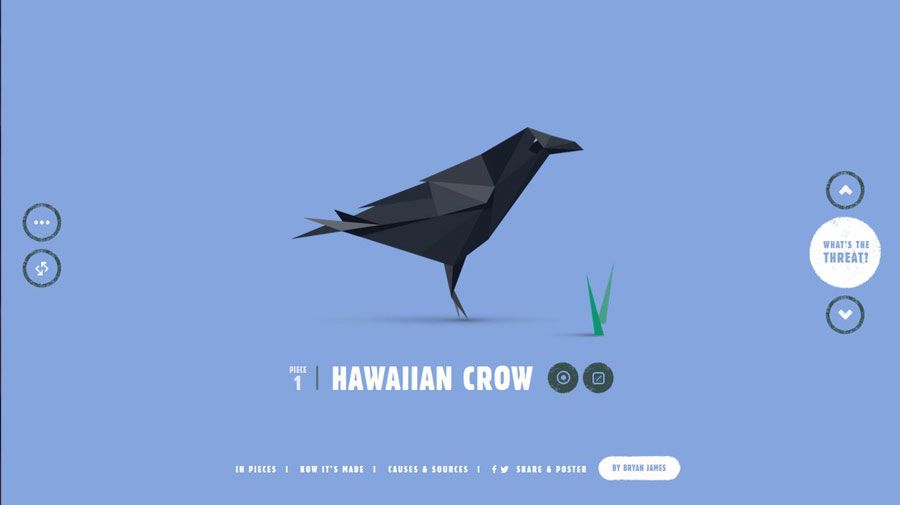
Photo credit: Species in Pieces
Make the most of your illustrations or cool animations with a dominant design element. You can actually design an entire site around some of these cool elements, such as Species in Pieces. The interactive nature of the design combined with the hero-style image for a trendy look, but really keeps users with cool HTML interactions.
10 Design Tips For Better Hero Headers and Letterboxing
While the image will steal the show in this type of design, you still need to include essential elements, such as branding and a calls to action. It’s important to match these elements to the image; you might have to go a little bolder than you expect so that the visual weight of text and other elements works well with oversized visuals.
Here are 10 ways to do just that:
- Consider dropping color for branding elements. Use a white or black logo so it does not compete with a colorful image.
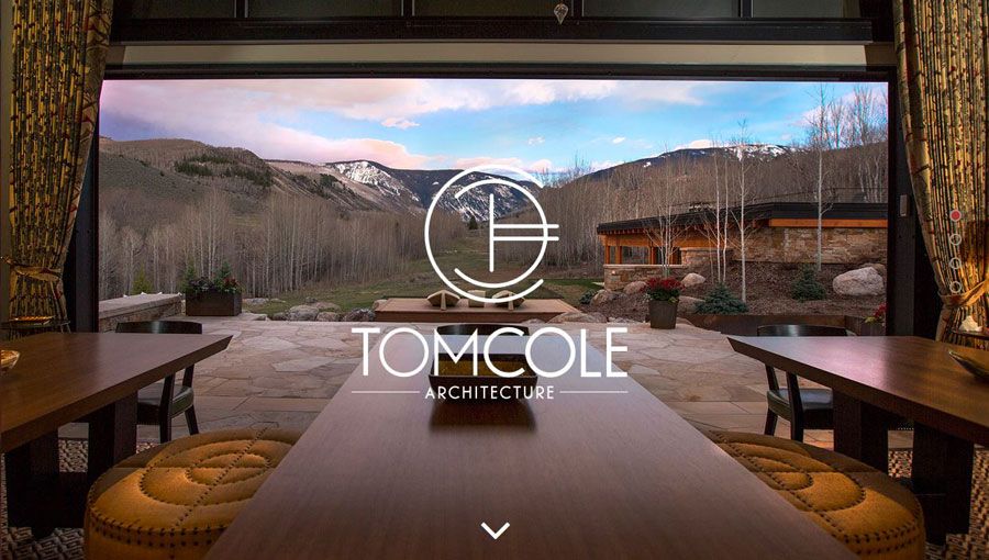
Photo credit: Tom Cole Architecture
- Design for contrast. Choose bold, easy to read typefaces that mesh with the visuals but stand apart from them. Don’t force the type onto the image. Sometimes it works best to place it just above or below the visual.
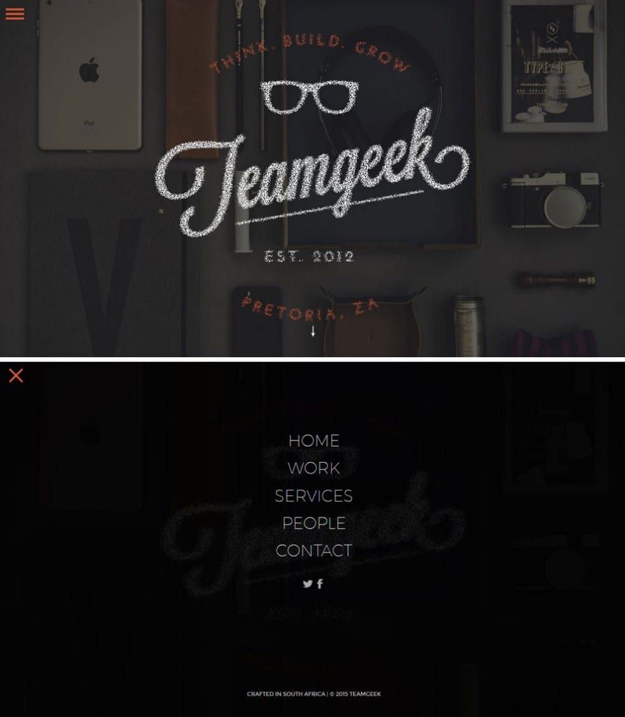
Photo credit: Teamgeek
- Letterbox navigation is a real bonus. It gives you a simple container for necessary elements in a design package that’s easy for users to understand. (Bonus: Make the navigation sticky so users don’t get lost as they scroll.) If you aren’t feeling the letterbox style, try popout navigation, such as the hamburger style used by Teamgeek.
- Consider the depth of the image. Design it so that users know what they are supposed to do. (A hero header is more than just a pretty picture.)
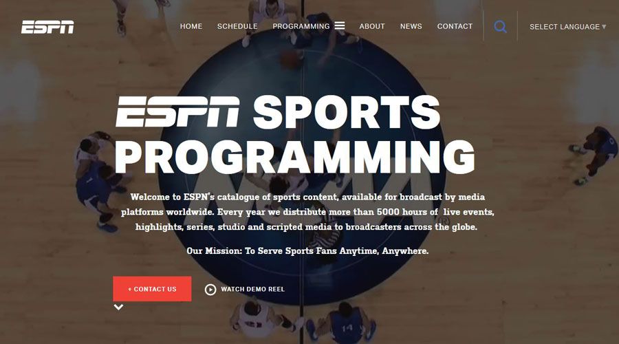
Photo credit: ESPN Media
- Use a tint or fade. This helps to provide more contrast for text, buttons or other elements.
- Consider mobile devices. Make sure your image works on all devices, even if this includes resizing or swapping out a larger image for a smaller one on a smaller device.
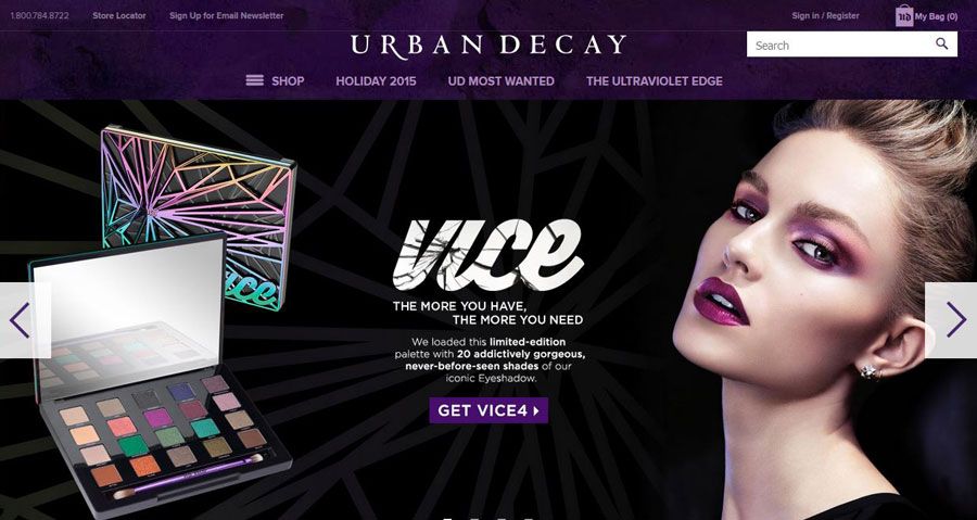
Photo credit: Urban Decay
- Think about text in relationship to the image. If you are planning to use a text-on-image design, ensure that the main part of the image is visible and understandable when text is placed.
- Make the image your centerpiece. Think of this oversized image as your “design trick” and create a simple framework for the rest of the design.
- Stay away from too much action or movement. Go with an image, video or illustrated animation. Don’t try to do all three. If you want to use a slider, keep the movement slow and intentional, especially if you want users to read something on the screen.
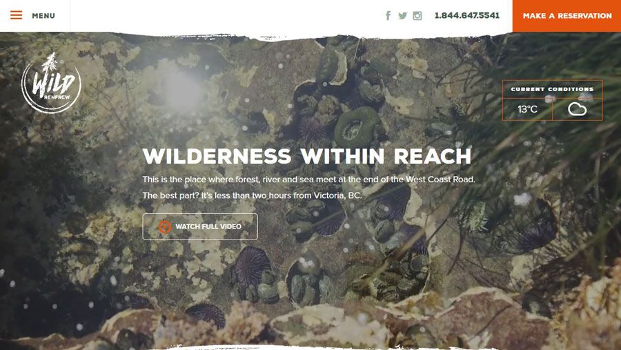
Photo credit: Wild Renfrew
- Go high res. Nothing is worse than a large, low quality image. Once again, the image is everything if you’re going to use this trend.
Takeaway
Designing with oversized visuals is one of those trends that never really goes out of fashion.
As long as your images are high quality, interesting to look at and works well with your content, a hero-style homepage design is a great option. Design with contrast and clear call-to-action goals in mind to help make the most of this bigger than life technique.
For more tips on how to use the year’s best web design trends, check out the free ebook Web Design Trends 2015-2016. You’ll find 166 hand-picked examples from companies like Adidas, Intercom, Apple, Google, Versace, and others. To help speed up the design process, there’s also a curated list of 100 free resources.