
Thinking about user experience from the perspective of large enterprises broadens the discussion. These organizations not only have more stakeholders than startups and smaller organizations, but also more internal capabilities.
Baked into workflow is the UX team, development team, product managers, project managers, a design system, design process, development processes and so on. Large organizations that want to remain competitive into the future need more than their UX designers and visual design team to adopt design thinking.
Enterprise UX design requires an organization-wide commitment to UX strategy that puts user-needs at the forefront.
Below is a breakdown of the chapters of UXPin's ebook that focuses on how enterprises should think about UX in the coming years. It covers everything from monetizing UX to determining how much to customize. It was written by Amanda Linden, Head of Design at Asana.
The Future of Enterprise UX Ebook
- Intro
- Why Enterprises Should Invest More in “Consumer-Grade” UX
- How Enterprises Can Continue Monetizing UX
- Where Enterprises Should Invest When End-Users Influence Decisions
- Determining The Appropriate Level of Customization
- The Role of User Research
- Enterprise UX Case Studies
- UXPin Enterprise Case Study
Where Enterprises Should Invest When End-Users Influence Decisions
In this section, I’ll explain the core areas of focus for designing a usable and likable enterprise product.
Brand
To make a strong connection with customers, the first thing an enterprise software company should ask is, “Do our customers feel a connection with us?”
If the answer is no, then it’s time to invest in your brand. It’s not enough for enterprise users to get usefulness out of your product. They need to feel that your company is a trusted friend.
For example, Asana spent a good number of months over the last year clearly articulating and defining our brand. With that core brand identity in place, it became much easier for teams across the company to build a unified experience and deepen our connection with users and potential users.
The First-Use Experience
Because newer business software sells itself, it’s important to invest in a great first use experience. A great first use experience gives the user immediate value for their time, but it also leverages persuasive design to sell the value of your product.
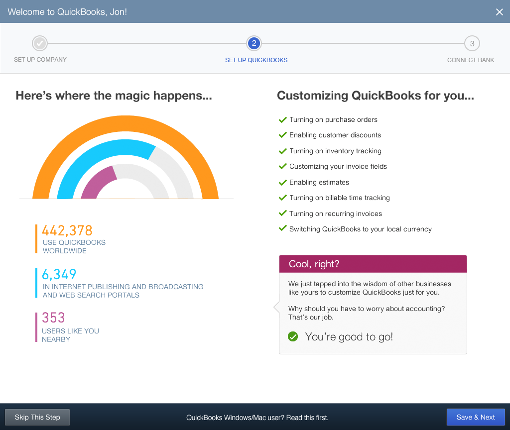
When designing the onboarding experience for Intuit’s flagship product QuickBooks, we asked for key information about the business, and then we customized the experience based on the information given, doing some of the initial setup work for the user. This helped the product feel like it was designed just for our customer and their business.
To show this value to new users, the design team created a screen with a graph showing the number of Quickbooks users in the same industry and location. Doing this wasn’t required in a traditional onboarding experience, but conversion was higher for this flow than it was for onboarding experiences with fewer steps. The screen told people, “we will save you time by setting up the product for you”, and it also reinforced that they were choosing the industry leader.
The new bar for a first use experience is not just whether it works for the person trying to use it. It has to be good enough for them to feel comfortable advocating for the product with the rest of their team and their company.
Tips for creating a great first use experience:
- Don’t make the user go through time consuming tours or tips to get acquainted with the product. Just let me users try it out and provide the information they need within the context of their tasks.
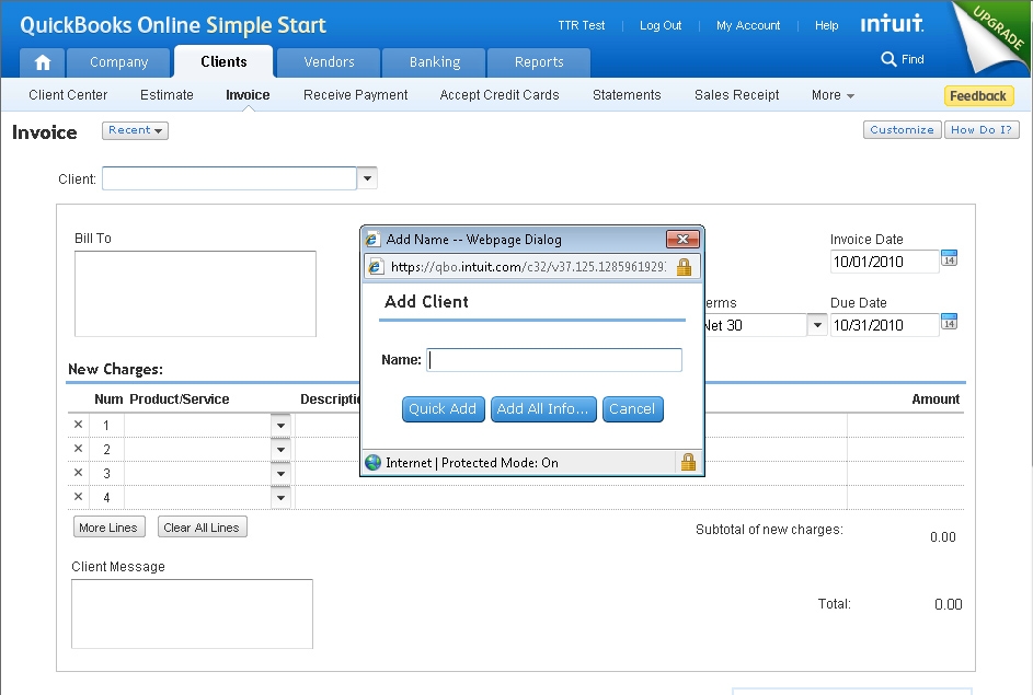
- Ensure that your user can complete a core task in their first visit. Example: creating an invoice in QuickBooks, or setting up a project in Asana. Give people an immediate feeling of success with your tool.
- Give your users an “aha” moment, that communicates the core value of your product. Make sure your users see how your product makes their lives easier.
- Ensure that your first use experience supports your brand. Make a real emotional connection with your users by using language & illustrations that convey your company’s unique personality. Be more than useful. Be likeable.
- Don’t ask for information you don’t need. Filling out forms is work for the user. If you must ask the user for information, show them exactly why you need it and how it benefits them.
- Follow up the first-use experience with an email that gives users a clear sense of what to do next, information they should keep handy, and clear access to support materials and staff.
Simplified Navigation & Interface Overhead
Traditional enterprise tools show they are powerful by making hundreds of actions available in every view.
The mindset was, “anything you want should be one click away”. Today’s users expect a user interface that makes the important things obvious and the complex power features possible. They expect product designers to know which actions are needed in each context and to make the functions appear at just the right time.
For the QuickBooks, we took a complex navigation system from over 50 tab items to less than 10 without losing any functionality. By simplifying the navigation, we immediately made the product feel easier to use.
At Asana, the product design team’s mantra was to “maximize clarity” in the product without removing functionality. A great deal of the work involved simplifying the “application chrome”, a term coined by Jakob Nielsen that refers to the interface overhead (e.g. any UI elements that gives information about or helps users operate the actual content). In a web app context, application chrome is defined by elements like toolbars, tabs, status fields, and the search box.
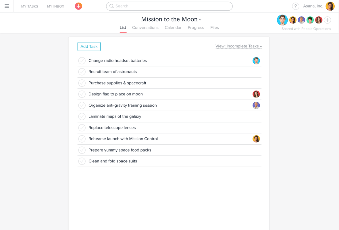
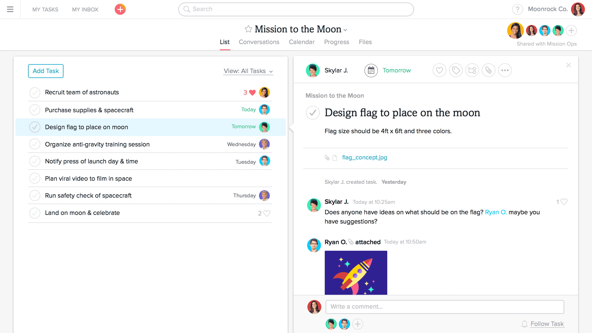
Prior to the redesign, the application chrome didn’t help people to understand how the product worked. A long and complicated left navigation pane made the product feel overwhelming. Users started on a completely empty page called “My Tasks”, making it hard to understand what to do first. The UI gave no visual cue explaining how tasks related to projects, or conversations.
The redesigned version of Asana makes the left navigation collapsable, so it’s only available when you need it. A new top bar allowed for users to create or search for anything in Asana. The “Create” button placed key actions upfront, rather than being buried inside specific containers.
Now a user starts with a screen that looks like a blank piece of paper, ready to be filled with the list of things to do for your project. The containers and visual styling make the product feel more intuitive and easy.

Though QuickBooks and Asana are very different applications, they actually use a similar top-menu and sidebar navigation model, which works well for most enterprise products.
Tips for simplifying your product’s navigation:
- Think about how best to structure the information in your application. Which functions group together, which are critical vs. optional? Which items are objects that need to be accessed from multiple locations vs. having a solid home in the navigation?
- Provide a homepage that acts as a navigation hub for your product. Users should be able to get a high level sense of what has changed in the application since they last visited, and can use that homepage or dashboard as a hub to launch tasks from, and return to when done.
- Use the top/global navigation to access key “views” of information across categories.
- Consider adding “Create New”, “Search”, “Help”, and “Settings” to the global nav, so that users have quick access in any context.
- Use the left navigation to identify groups or “folders” of information that help users organize their work. Example: in QuickBooks, your income/expenses are organized according to customers, employees, vendors, etc. In Asana, your tasks are organized by projects and teams.
Gamification & Emotional Reinforcement
Video game designers know you need to reward people for their accomplishments to keep them engaged in the game.
Why would we not employ the same habit-forming philosophy in enterprise applications to help people feel a better sense of accomplishment at work? Gamification and emotional reinforcement goes beyond a message that confirms your task is complete. Today’s enterprise applications should animate and move in a delightful and human way.
In Asana (a work tracking application), if you complete a task, you get a subtle but soothing animation that acknowledges your accomplishment. If you like, you can even turn on a hack that gives you quirky animations when your tasks are complete. You might find a narwhal or a unicorn flying across the screen when you finish a task.
It sounds ridiculous for a business application, but these animations are engagement wins, and word-of-mouth growth drivers. Enterprise companies are beginning to realize that people want to have fun with their teams.
Tips for adding gamification to your product:
- Think about the behaviors you want people to do in the product and identify subtle but satisfying responses to those behaviors. Those responses can be animations, illustrations or messages to help users confirm they completed their task. Whatever tactic you choose, make sure the feedback feels positive and visually delightful.
- Don’t be condescending or waste user’s time with excessive animations. Test out behaviors internally to ensure your interface response strikes the right chord. Always A/B test to ensure you’re making the right impact on target user behaviors.
- At the end of tasks, think about what the user must do next. Place that next task in their path to keep them moving.
- Match the impact of the reward with the difficulty of the task. A simple task gives a small reward, finishing a bigger project deserves a bigger (less frequent) payoff.
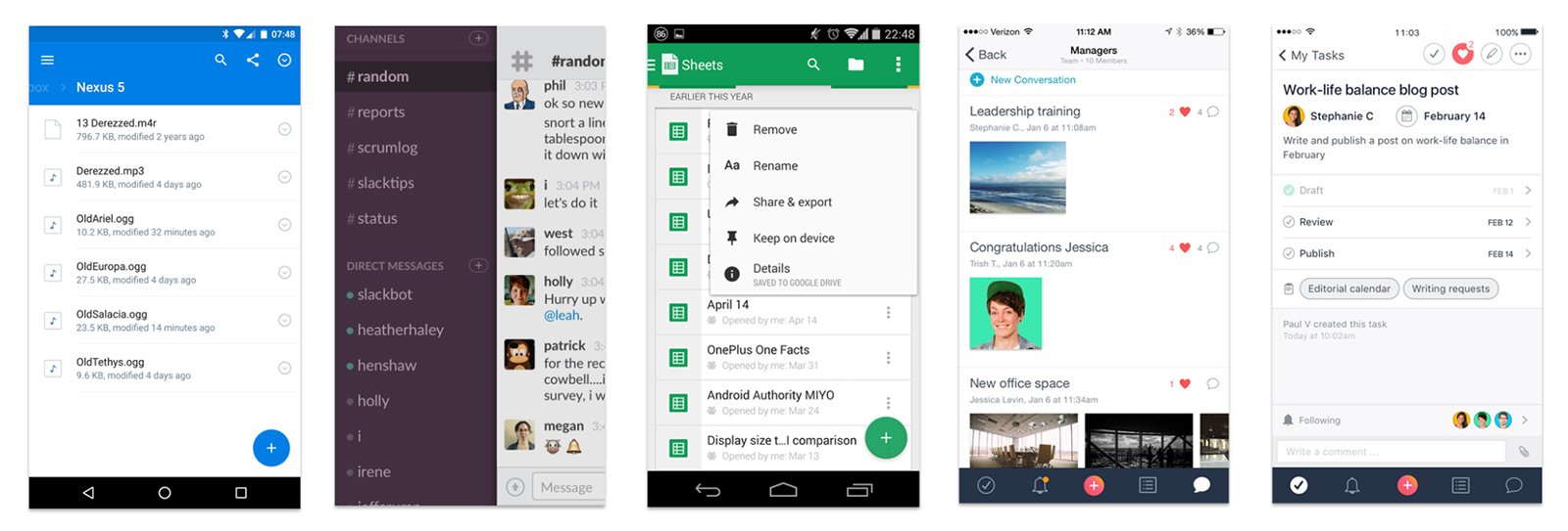
Exceptional Mobile Experiences
Having a great web app isn’t enough, even as the world transitions away from desktop solutions. Your web app must also offer a great mobile companion app and provide offline mode so that users are still productive when internet is spotty or when they’re on the go.
Enterprise software companies haven’t invested as heavily in mobile as consumer companies, but that’s just beginning to change. User behavior is changing too.
Years ago, it was hard to imagine doing work on your phone, other than email. Today’s enterprise application builders understand that mobile apps are a key to acquiring users globally where access to computers is less common. Whether it’s healthcare, construction, or CRM, mobile applications are gaining more and more traction in the enterprise space.
Of course, there’s another reason for enterprise companies to invest in mobile product design. Mobile is often the platform where product designers must innovate to simplify existing workflows. Often times, an innovation that originates on mobile ends up disrupting the workflow on the web as well.
At Intuit, our product designers were able to disrupt payroll processes by creating a mobile payroll app. Due to the constraints of the mobile platform, our design team was forced to drastically simplify the payroll workflow. Those simplifications then ended up inspiring the payroll web app team to rethink their workflows as well.
Tips for developing a great mobile app:
- Don’t feel the need to duplicate full product functionality in the mobile app. Focus only on your core tasks.
- Ensure visual patterns, iconography, animation, etc. are consistent between the mobile app and your web experience, so that users can move between the two smoothly throughout the day.
- Don’t feel the need to launch features on both mobile and web in parallel. Test a feature on one platform and then apply learnings to the other.
Offline Mode
Though many enterprise products are migrating to the cloud, internet connections aren’t always reliable. To ensure reliability, enterprise cloud services need to develop offline modes that allow users to stay productive even when the internet is down.
The first step is caching content so that users can move laterally through pages. Next, you need to set proper expectations for the experience. Indicate when users are in offline mode, then offer a reassuring message that the system will sync up when the connection is reestablished. Clearly state if any functionality isn’t available. Without these proactive measures, users may lose trust in your application, even if the sporadic Internet outage is completely unrelated.
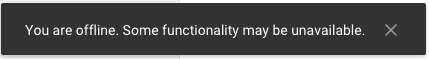
Finally, think about how to allow people to share their ideas, but be clear that the system hasn’t entered them, or that the information won’t be seen by others in the application, until you are back online.
Performance
Though many enterprise applications are moving to the web, consumer expectations around speed are no different than they are for desktop apps.
If a cloud based application takes time to load, users will leave. Gmail and other online applications have already set the standard for responsiveness and performance.
Conclusion
Simplifying navigation, investing in an easy & delightful first use experience, and creating a visual system that supports a well-defined brand are important not only for consumer experiences, but for enterprise applications as well.
That said, investing in consumer grade design is fast becoming less of a competitive advantage for enterprise companies, and more of a user expectation. In order to fully delight users, designers of enterprise applications need to not only make products that work well – they need to design products that give people a feeling of accomplishment and satisfaction while they’re working.