
Design Systems
A Design System is like a common visual language for product teams. It speeds up the design process and builds bridges between teams that bring products to life.
In UXPin, you can create your own Design System, helping your team minimize design debt while improving quality.
Design Systems let you collect design guidelines and resources at the early stages of the project. This, in turn, helps you maintain consistency and simplify the processes for your team.
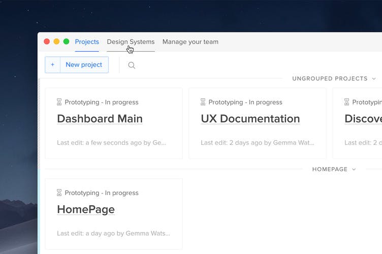
Design systems can be accessed via the top of the Dashboard — this is where you can also create a new Design System or access your existing ones.
Creating a Design System
Open Design Systems to begin building one. You will have the possibility to create a new, completely empty Design System from scratch, from an existing design system library or from a template. We will focus on the two first options in this article.
Creating a Design System from scratch
To create an empty Design System, choose Create from scratch. This will create a corresponding Design System Library with the same name as the Design System. You can always change the name in the top left corner.
Each Design System consists of four sections for the following components: Colors, Typography, Assets and Components. You can start from whichever section you want and rearrange them by dragging into desired places in the structure.
To add a color, in the Colors section type the HEX code and click Enter. You can rename each color by double-clicking its name. The custom names will be displayed on Preview in the Spec Mode.
To upload assets, go to the Assets section and click Upload images or icons in .svg format. You can rename them after they're uploaded.
When it comes to Typography, you can add text styles and formatting directly from the canvas in the Editor. Open your prototype, choose your DS library from the list at the bottom of the left-hand panel, select the text element on the canvas and add it to the Text styles section by clicking +Text style. The font along with its size and weight will upload to the library and its design system.
For Grids, just like with Typography, you can add grid styles directly within the Editor. After accessing DS library, define your desired grid style in the right panel, then simply add it to the Grids section by clicking +Add. This will upload all grid specifications to the library and integrate them into your design system.
Adding Components works the same as with text elements and grid styles, from the Editor. Open your prototype, select the elements on the canvas and add it to the Components section by clicking +Component.
Creating a Design System with a DS Library
To build a Design System from an existing Design System Library, you must first choose the library from the drop-down when creating a new Design System. All components in the library will be now included in the corresponding sections of the design system. But in order to do that, you first need to have permissions to edit that Design System Library. One Design System Library can have only one corresponding Design System.
Adding Descriptions
You can describe each section of your Design System where it says Add description here. Apart from text, these descriptions can contain detailed links, color samples, elements of the code and other information that help developers implement the design.
You can add a description for the whole section, category and in the case of Typography and Components even for a single text style or element.
The descriptions of specific Components will be displayed on Preview as a separate part of the Spec Mode along with the name of the Design System.
Setting Permissions
You can decide who can view and edit your Design System — the whole team, specific team members or only you. In the Dashboard open Design Systems and hover over More actions icon for the chosen system, select Permissions from the dropdown.
Remember that these permissions will be set to the design system libraries and the design system.
Editing a Design System
To edit or delete a Design System, you must be logged in first and have permissions to do that. Users with permissions can delete the entire Design System, edit its sections or just selected elements. The edit mode also allows you to choose between two display modes, stack or tiles.
To access a Design System while in the Editor, open the Design System Libraries section to the left. If a library has a corresponding Design System, it will have a label next to it. Click it and the matching system will open in a new tab.
There are two ways of reviewing Typography in Design Systems — Typeface and Text Styles. Typeface is generated automatically on the basis of your chosen fonts. It shows a font with all its styles and an interactive example so that you can see how your font behaves in action. Text Style shows specific texts that you’ve added from the canvas and their detailed properties.
Sharing Design Systems
You can easily share your Design Systems with the team, external collaborators, and stakeholders — even if they don’t have an active UXPin account. To do that:
Open the Design System you want to share in the Dashboard and click Settings in the bottom left corner. Copy the link in the modal and send to anyone you want to share the design system with.