Grid
Layout grids help designers to achieve a consistent, organized look in their designs and to manage the relationships and proportions between elements. In UXPin, there are three types of layout grids: column, baseline, and square. You can set them in the Properties panel by clicking the plus icon next to each grid. You can toggle all grids at once with the
Alt
"G"
shortcut. Grids have their default settings but you can update them with your own properties, and change their color in the Properties panel.
Margin - the negative space between the edge of the format and the outer edge of the content.
Gutter - the space between columns or rows.
Snapping elements to grids
When the grid is on, elements will snap to it when you move or resize them. To turn this behavior off, go to the View Settings in the bottom right corner of the editor and uncheck Snapping.
Note
Grids are only visible in the editor. They will not appear on Preview or when you view your design in the web browser.
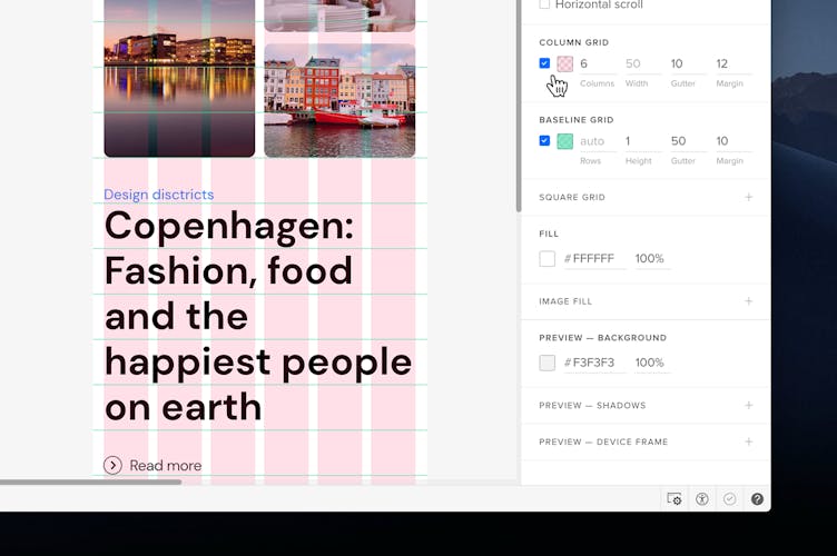
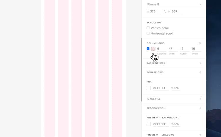
Column Grid
Column grids consist of columns and their width, the gutter, the margin or the offset. You can specify each of these values on your own in the Properties panel. When the margin is set to auto, the grid will be centered.
Tip
Changing the column grid’s width will align its offset to the left side. The offset works like an empty space that will stay before your first column from the left.
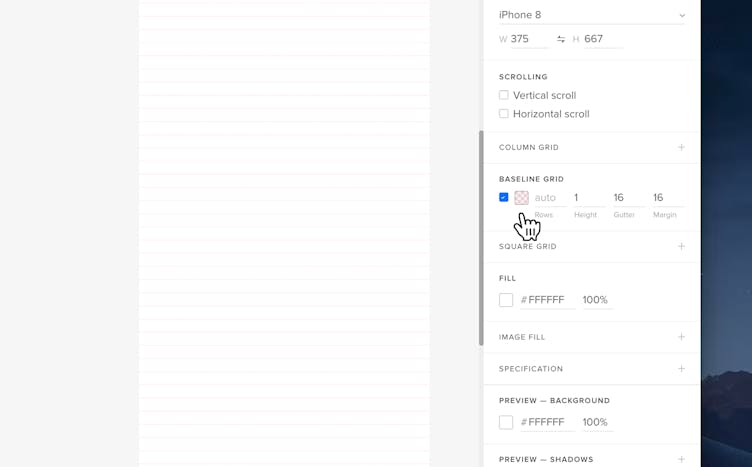
Baseline Grid
A baseline grid is an underlying structure that guides the vertical spacing in a design. The height of each line is set to 1 pixel by default and the number of rows is set to auto - which means that the number of rows will automatically adjust to the size of your canvas. You can set your own values for each field.
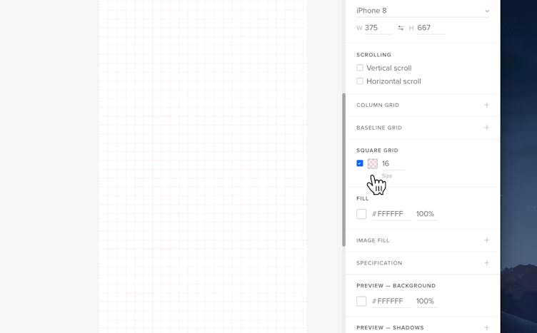
Square Grid
A square grid is formed by tiling the canvas regularly with squares. By default, the square size is set to 10.