
Adjusting Components
Portal Components
When you need to display chosen components outside the UXPin canvas – at a specific position on the screen, Portal Components will enable that.
For example, notification components (often called “toast” or “snack”) are displayed at the top or the bottom of the screen. Another common pattern in web applications is “modal” (or “dialog”) components that cover the whole screen. To display these types of components correctly, you need to render them in what is called a Portal in the React world.
Use the JSDoc comment “@uxpinuseportal” to enable this behavior in the UXPin Preview mode:
/**
 * @uxpinuseportal
 */
function Dialog(props) {
}
Portal Components can be dropped anywhere in the canvas no matter their position on the canvas in the UXPin Editor.
Mark components by comment
Component properties are serialized based on the default export of class/function. If the export of a component is not a function/class that exposes its own props but is wrapped by another function, then the serialization is not possible.
export default withAppProvider<Props>()(Button);In the Button component from the example above we cannot serialize properties (and finally can't display the Properties panel). To handle this approach, you have to add a JSDoc comment to handle this component.
A solution to the case above is to add a JSDoc comment @uxpincomponent before the class/function that declares the component.
/**
 * @uxpincomponent
 */
export class Button extends React.PureComponent {
  // ...
}
You have to add a @uxpincomponent comment before the class/function.
Namespaced Components
You may use the nested components approach in your library. It means that your component contains another component. Use them as represented below:
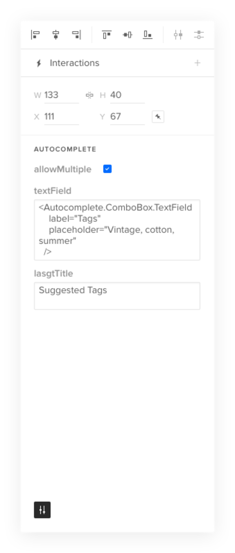
import Autocomplete from '../Autocomplete';

const textField = (
  <Autocomplete.ComboBox.TextField
    onChange={this.updateText}
    label="Tags"
    value={this.state.inputText}
    placeholder="Vintage, cotton, summer"
  />
);

export default (
  <Autocomplete
    allowMultiple
    textField={textField}
    listTitle="Suggested Tags"
  />
);
There are 3 levels of components here:
- top-level component:
Autocomplete - second-level component:
ComboBox - third-level component:
TextField
To handle this approach you have to declare the namespace in your component.
Declare namespaced components
To declare the namespace in components, use the JSDoc comment @uxpinnamespace, and declare the name of the parent component. Looking back at our example, you need to declare the namespaces in ComboBox and TextField components like below:
ComboBox.jsx
/**
 * @uxpinnamespace Autocomplete
 */
export class ComboBox extends React.PureComponent {
  // ...
}
TextField.jsx
/**
 * @uxpinnamespace Autocomplete.ComboBox
 */
export class TextField extends React.PureComponent {
  // ...
}
On our example, the namespace for the ComboBox component is Autocomplete because it's a direct child of the Autocomplete component. And the namespace for the TextField component is Autocomplete.ComboBox because it’s on the 3rd level from the top component (1st level), and its parent is the ComboBox. This is how we support multilevel nesting.
Use namespaced components in preset
After adding the @uxpinnamespace comment, you'll be able to use components in merge presets. You can do this the same way as in your application code.
When you import the Autocomplete component in preset by:
import Autocomplete from '../Autocomplete';You'll be able to use components to define preset like in your code:
import Autocomplete from '../Autocomplete';

const textField = (
  <Autocomplete.ComboBox.TextField
    onChange={this.updateText}
    label="Tags"
    value={this.state.inputText}
    placeholder="Vintage, cotton, summer"
  />
);

export default (
  <Autocomplete
    allowMultiple
    textField={textField}
    listTitle="Suggested Tags"
  />
);
You can also import the TextField component directly like below:
import TextFiled from '../components/ComboBox/components/TextField';Then you will create a preset like this:
import Autocomplete from '../Autocomplete';
import TextFiled from '../components/ComboBox/components/TextField';

const textField = (
  <TextField
    onChange={this.updateText}
    label="Tags"
    value={this.state.inputText}
    placeholder="Vintage, cotton, summer"
  />
);

export default (
  <Autocomplete
    allowMultiple
    textField={textField}
    listTitle="Suggested Tags"
  />
);
Use namespaced components in JSX property
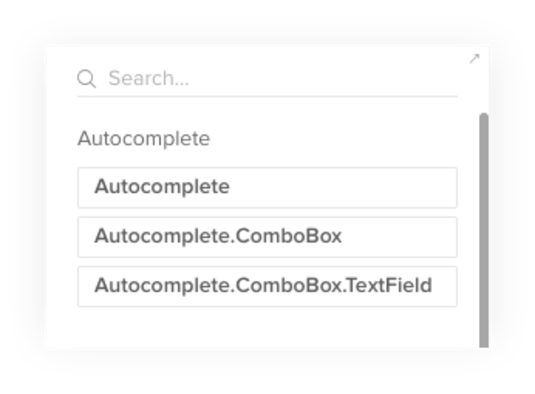
The components declared in this way can be used in the properties panel as a value in node/element properties:
Namespaced components in Library
Namespaced components in the library panel would display with a full namespace name:
Resizing Components
The presentation of code components in UXPin may require adjustments at times. That is especially important for the size of your code components.
Sometimes the bounding box of the code component may be larger than the element itself (skip container).
In other cases, you may want to block the possibility to resize the component (non-resizable). Or you may require to cover both at the same time.
Use Cases
Skip container
In some cases, the bounding box of the code component in UXPin can not match the real size of the element. To solve this problem you can point a specific HTML node (by default Merge uses root node of the component).
uxpinRefThis is a specific property that is passed to the component along with regular props. It must be set to React ref attribute, for example:
/**
 * @uxpinwrappers
 * SkipContainerWrapper
 */
const Button = ({greeting='Hello', uxpinRef}) => (
  <div>
    <button className="btn" ref={uxpinRef}>{greeting} 👋</button>
  </div>
);
Non-resizable component
Some code components aren’t resizable and you can mark this component as non-resizable to Merge. Thanks to this action we won’t see transformers to resize component in UXPin editor.
/**
 * @uxpinwrappers
 * NonResizableWrapper
 */
const Button = ({greeting='Hello}) => (
  <div>
    <button className="btn">{greeting} 👋</button>
  </div>
);
Combined cases
You can use both of the actions (and more in the future) for the same component.
/**
 * @uxpinwrappers
 * SkipContainerWrapper, NonResizableWrapper
 */
Interaction triggered on property change
In many cases, the designer wants to get value from the prototype to update the content of the prototype. It means there needs to be a way to bind, store, and use values between components and UXPin.@uxpinbind allows you to bind the interaction to a specific property of the component.
In the editor, all properties that have a defined binding are available as interaction triggers for the selected code component.
It allows the designer to:
- Trigger interactions based on the user's input
- Get the value user provided and store it as property
- Create conditional interactions
Example of bound interaction:
Checkbox.propTypes = {
  onChange: PropTypes.func,
  /**
   * @uxpinbind onChange 0.target.checked
   */
  isChecked: PropTypes.bool,
}
Example
Replace content based on the active tab using a Tabs component
In Material UI (repository available here), there is a component named Tabs. It basically allows creating navigation based on tabs. This component contains other components as children - Tab.
As a designer, we may want to create an interaction to present specific content, let's say Card based on the selected Tab. UXPin won't be able by default to get the value of the selected tab from Tabs component. To do it, we'll use @uxpinbind
The first step is to check the documentation of the component.
In this example, we'll bind two properties - onChange and value. The goal is to set an interaction in UXPin that will trigger interaction onChange once the value will be changed.
The next step is to add @uxpinbind annotation to the value that will trigger interaction. @uxpinbind requires specific information about the parameter to bind the interaction.
For Tabs we want to use a value of the property and that's why we use the second parameter of the property on Change 1
Once the @uxpinbind is defined designer can create an interaction using value as a trigger for the interaction onChange.