
npm integration
Merge npm integration allows you to add components to a library in your UXPin account with an npm package. The great thing about npm integration method is that you do all the steps in UXPin. Watch the overview walkthrough here. Scroll down for a step-by-step explanation.
STEP 1: Add a Library Using npm Integration
This can be done like adding any other library while in Editor mode or the Merge Tab in your UXPin dashboard. An example of a complete form for creating a Library using Ant Design is shown below.
Editor 'Add library' npm integration modal
Name Your Library
This is how it will be shown in the Libraries list in UXPin, not the name of the npm package you want to import.
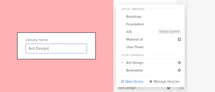
npm library name
Component Library npm Packages
Simply provide the npm package name of the component library and the Version you wish to use. For example:
- @mui/material: Version 5.1.0
- antd: Latest
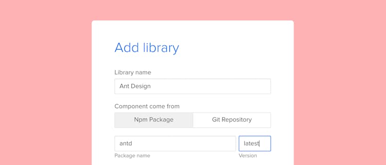
npm package name and version
Additional Support Packages or Assets
If the component library requires additional packages or assets for Fonts, Icons, etc… Then for Packages, simply click the add more dependency package and enter information exactly as shown above for the main NPM package name.
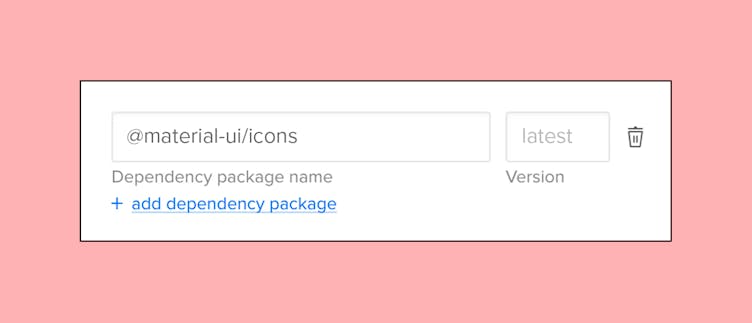
npm package dependency
For Assets, enter the URL or css file path in the existing Assets input field. We support both URL and file path for the Assets.
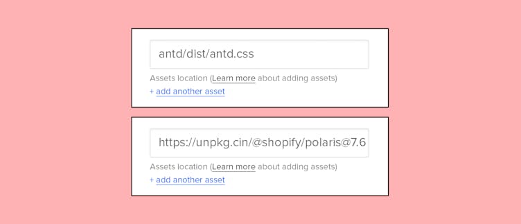
file & url path assets
STEP 2: Adding a Component and Category
This step can be done in the library you just created.
Adding new button component
Specify the component you want to add in the import statement and optionally create a category or place it into an existing one.
Example import statement: import Button from 'antd'
The import statement is usually really easy to find and probably in the documentation of your chosen library. For example, this is the documentation for MUI’s Button component, where you can view the code and see the import statement is import Button from ‘@mui/material/Button;’.
Note
Before being able to edit or add props to the component you just added, you need to publish the component first using the ‘Publish Library Changes’ button in the top right corner. This is explained in the next step.
STEP 3: Publish Newly Added Component
Now you have created your component and want to add props, before you do that you need to publish your new changes or component additions. This can be done by clicking the 'Publish Library Changes' button in the top right of page.
After clicking the publish button you’ll be shown the status of your published library. Once the status % of your library reaches 100 and shows ‘Update Success’ you will need to refresh your browser to see the changes. Now you’re ready to add props to your component.
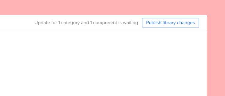
The 'Publish Library Changes' button is in the top right of page
What's Next?
Now you can start designing with a UI component you've just published. Before starting, remember to first set the properties with the help of Component Manager. Read about MCM.
Try Ant Design Library
In UXPin, you will see a built-in Ant Design library that we brought with this npm integration. Test it out and see how interactive prototyping can get. To see how we imported it, read our article.