Semantic HTML makes websites easier to use for screen reader users by providing structure and meaning to web content. Instead of relying on visual design alone, semantic elements like <nav>, <main>, and <button> communicate their purpose directly to assistive technologies. This improves navigation, accessibility, and usability for users who depend on screen readers.
Key Points:
- Semantic Elements: Tags like
<header>,<footer>,<button>, and<nav>are designed to convey meaning and functionality. - Screen Reader Benefits: Semantic HTML ensures proper roles, labels, and states are communicated, making navigation smoother.
- Landmarks and Headings: Elements like
<nav>and<main>act as landmarks, while proper heading structure aids in content scanning. - Avoid Common Mistakes: Use semantic tags instead of
<div>or<span>to maintain accessibility. Ensure logical heading order to avoid confusion.
By using semantic HTML, developers can create web experiences that are not only functional but also accessible to all users, including those relying on assistive technologies.
What is Semantic HTML and How Does it Work?
Defining Semantic HTML
Semantic HTML is all about choosing elements that match their intended meaning and purpose, rather than just focusing on how they look. As web.dev puts it:
"Writing semantic HTML means using HTML elements to structure your content based on each element’s meaning, not its appearance."
For instance, a <button> is inherently interactive – it signals to users (and assistive technologies) that it can be clicked. On the other hand, a <div> styled to resemble a button might look clickable, but it doesn’t inherently communicate its purpose or behavior. Elements like <div> and <span> are considered non-semantic because they lack built-in meaning.
By working with semantic elements, you offer non-visual affordances – clues about an element’s role and functionality that go beyond its visual design. Think of it like a doorknob: its shape suggests it’s meant to be turned. Similarly, a <nav> element tells assistive technologies that the content inside contains navigation links.
How Screen Readers Use Semantic HTML
Web browsers create two layers for interpreting content: the DOM (Document Object Model) for visuals and the AOM (Accessibility Object Model) for assistive technologies.
In the AOM, semantic elements carry key properties such as role, name, value, and state. Screen readers rely on these properties to relay not just the content but also how users can interact with it.
Certain elements, like <header>, <nav>, <main>, and <footer>, act as landmarks. These landmarks allow screen reader users to navigate quickly between main sections using keyboard shortcuts. Similarly, headings (<h1> through <h6>) provide a structured outline of the page, enabling users to jump directly to specific sections of interest.
This is why selecting the correct element is so important. A native <button> comes with built-in keyboard functionality (like responding to the Enter and Space keys), automatic role announcements, and state management. On the flip side, a <div> styled to act like a button requires extra coding to replicate these behaviors – and even small coding errors can create significant obstacles for screen reader users.
Up next, we’ll dive into some key semantic elements that make navigation even smoother for users relying on assistive technologies.
Semantic HTML Explained – Elements That Improve Accessibility & Screen Reader Support
Key Semantic HTML Elements for Screen Reader Navigation
, <aside>` automatically creates a navigable landmark without requiring extra labeling.
The <section> element, on the other hand, only becomes a navigable landmark when it’s assigned an accessible name using aria-label or aria-labelledby. Pairing it with a heading (<h1>–<h6>) further clarifies its purpose for screen readers.
By using these semantic elements, you can replace repetitive <div> blocks with a more meaningful structure. As accessibility experts Alice Boxhall, Dave Gash, and Meggin Kearney note:
"Semantic structural elements replace multiple, repetitive div blocks, and provide a clearer, more descriptive way to intuitively express page structure for both authors and readers".
sbb-itb-f6354c6
How to Implement Semantic HTML
and<form>elements function purely as containers unless they are provided with an accessible name. This can be achieved using attributes likearia-label, aria-labelledby, or title`.
Make sure to apply this approach consistently to all possible landmark elements to improve navigation and usability.
Common Mistakes and How to Avoid Them
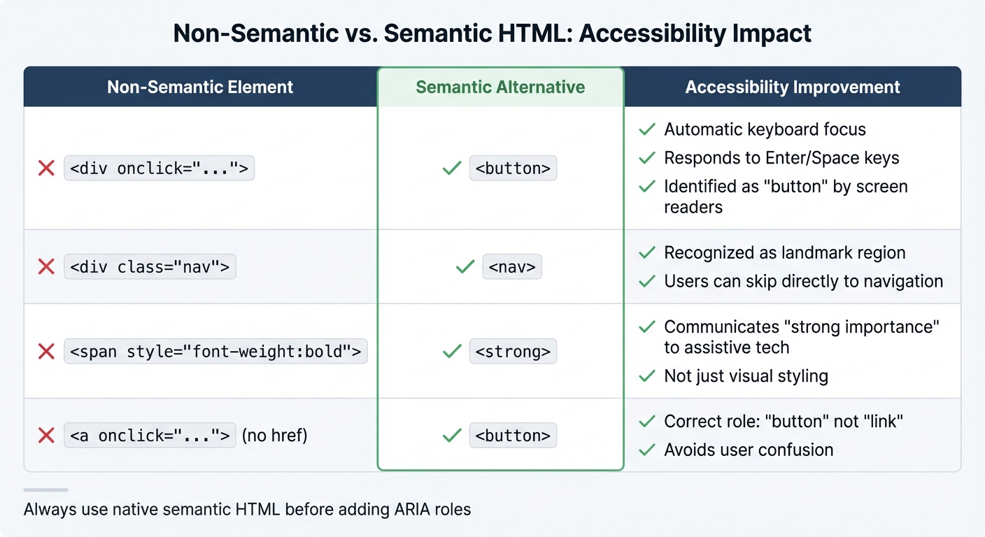
Non-Semantic vs Semantic HTML Elements Accessibility Comparison
While semantic HTML offers tremendous benefits for accessibility, even seasoned developers can fall into traps that diminish its potential. Recognizing these missteps is key to creating a better experience for screen reader users.
Non-Semantic Elements vs. Semantic Elements
One of the most common mistakes is defaulting to <div> and <span> instead of using semantic elements. For instance, developers might use <div> for buttons or navigation menus, which strips away native accessibility features. Adam Silver emphasizes this point: "The first rule of ARIA is not to use it", meaning native HTML elements should always be your first choice before resorting to ARIA roles.
Don’t pick tags based on their appearance – always use the correct semantic element for the content’s role and structure.
| Non-Semantic Element | Semantic Alternative | Accessibility Improvement |
|---|---|---|
<div onclick="..."> |
<button> |
Automatically supports keyboard focus, responds to Enter/Space keys, and is identified as a "button" |
<div class="nav"> |
<nav> |
Recognized as a landmark region, enabling users to skip directly to navigation |
<span style="font-weight:bold"> |
<strong> |
Communicates "strong importance" to assistive technologies, not just a visual change |
<a onclick="..."> (no href) |
<button> |
Corrects the role from "link" to "button", avoiding confusion for users expecting navigation |
To fix this, use the right semantic tag and rely on CSS for styling. If you must use a non-semantic element, manually manage its accessibility by adding tabindex, handling key events, and defining ARIA states.
Using the proper semantic elements ensures your HTML is both functional and accessible.
Improper Heading Hierarchy
Even when the correct elements are used, maintaining a logical heading structure is critical for accessibility. Headings act as markers that help screen reader users understand the layout of a page and navigate efficiently. Skipping levels – like jumping from <h2> to <h4> – disrupts this structure, leaving users disoriented. Screen readers announce both the heading level and its text (e.g., "Heading level 2: Keyboard Navigation"), so a broken hierarchy makes it harder to scan the page using tools like the "rotor" feature, which isolates headings.
Always prioritize semantic correctness over visual design. If you need a heading to look different, use CSS to style the appropriate level rather than picking a tag based on its appearance. For sections that require a heading for accessibility but don’t align with the visual design, use CSS to position the heading off-screen instead of skipping it entirely.
Conclusion
Semantic HTML changes the game for screen reader users by offering hidden cues that communicate structure, meaning, and functionality. By incorporating elements like <nav>, <main>, and <button>, you’re essentially creating an accessibility map for assistive technologies. This map becomes a lifeline for users who rely on audible feedback to navigate the web.
But the perks of semantic HTML don’t stop there. It helps more than just screen reader users. A well-organized heading structure can assist people with cognitive challenges by making content easier to follow. Keyboard-only users can jump around more efficiently thanks to clearly defined landmarks. Even mobile users enjoy smoother experiences, with better reader modes and quicker page scans.
"The goal isn’t ‘all or nothing’; every improvement you can make will help the cause of accessibility." – MDN
Start small. Apply the basics covered in this guide. For example, if your site has multiple navigation sections, use aria-label to clarify their purpose. Then, test your work manually with tools like NVDA, JAWS, or VoiceOver. While automated checks are helpful, they can only catch syntax issues, not the user experience.
FAQs
How does semantic HTML make websites more accessible for screen reader users?
, and properly structured heading tags (<h1>to<h6>`), developers provide browsers with the tools to build an accessibility tree. This tree helps define the purpose of each section on a page without requiring additional code, ensuring screen readers can present the content in a logical and meaningful way.
These semantic elements also serve as landmarks, making navigation much easier for users who rely on screen readers. Instead of painstakingly tabbing through every element, users can jump directly to important areas like the header, navigation menu, or main content. A well-organized heading structure further enhances this experience, allowing users to quickly grasp the layout and flow of the page.
Tools like UXPin make it possible to incorporate semantic HTML early in the design phase, ensuring prototypes meet accessibility standards from the start. By prioritizing native HTML elements before introducing ARIA roles, developers can create smoother, more intuitive experiences for screen reader users.
What are the most common mistakes to avoid with semantic HTML?
When working with semantic HTML, there are a few common missteps that can negatively impact both accessibility and usability. Let’s break them down:
First, steer clear of using generic tags like <div> or <span> when meaningful elements like <header>, <nav>, <main>, or <button> are more appropriate. These generic tags don’t carry semantic value, making it more difficult for screen readers to understand the page’s structure and purpose.
Second, maintain a proper heading hierarchy. Skipping heading levels – for instance, jumping from <h2> to <h4> – or using multiple <h1> tags on a single page can confuse assistive technologies. This makes navigation harder for users who rely on screen readers to browse content.
Third, be cautious with ARIA roles and attributes. For example, applying role="button" to an element that already has native button semantics (like a <button>) can lead to redundant or conflicting information for screen readers, which could frustrate users.
Lastly, ensure that landmark regions such as <nav>, <main>, and <footer> are properly labeled, and interactive elements are fully accessible via keyboard. Simple actions, like adding descriptive alt text for images and ensuring that buttons and links are keyboard-focusable, can make a world of difference for users relying on assistive technologies.
By addressing these issues, semantic HTML can create a more inclusive and user-friendly experience for everyone.
What are the best ways to test if semantic HTML improves screen reader navigation?
To evaluate how well your semantic HTML is working, try navigating your page with screen readers like NVDA, JAWS, or VoiceOver. Focus on how the headings are structured, how landmark regions are defined, and how content is announced. This will help you check if navigation feels logical and intuitive.
In addition to manual testing, leverage automated accessibility tools to spot potential problems and confirm compliance with accessibility standards like Section 508. Using both manual and automated methods gives you a more complete picture of your implementation’s effectiveness.

