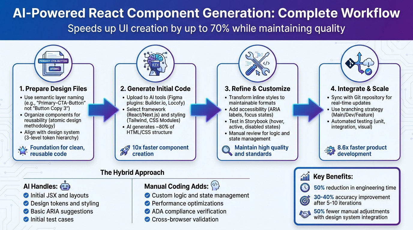
AI tools are transforming how React components are built by converting design files into functional code. This process eliminates repetitive tasks, bridges the gap between design and development, and speeds up UI creation by up to 70%. Here’s what you need to know:
- What it does: AI generates React components directly from design tools like Figma, creating JSX, CSS, and layouts.
- Who benefits: Designers can create interactive prototypes faster, developers save time on UI coding, and teams reduce errors and costs.
- How it works: By organizing design files with clear naming conventions, aligning with design systems, and refining AI-generated outputs, teams can ensure high-quality results.
- Limitations: AI handles structure and styling but requires manual input for logic, state management, and accessibility.
This hybrid approach of AI and manual refinement enables faster, more efficient workflows while maintaining quality.
AI-Powered React Component Generation Workflow: From Design to Production
Generate cool React components using AI! Trying out v0 by Vercel!
Preparing Design Files for AI Generation
The quality of AI-generated React components hinges on how well you organize your design files. AI uses the details you provide to interpret and generate code, so clear and thoughtful structuring is key to producing clean, reusable components. By focusing on precise naming and modular organization, you can significantly improve the efficiency and accuracy of AI-driven code generation.
Using Semantic Layer Naming
The names you assign to layers in your design files play a crucial role in how AI understands and generates code. Avoid generic names like “Rectangle 1” or “Frame 12.” Instead, use descriptive and functional names that clearly indicate the purpose of each element. For instance, name a button layer “Primary-CTA-Button” instead of something vague like “Button Copy 3.”
“Using semantic layer names in Figma will help the AI model to know the use for a given layer. These names will inform how the figma design gets imported… which will in turn be used to inform the generation of the component code.” – Tim Garibaldi, Writer, Builder.io
AI doesn’t have the intuition that humans rely on, so it depends on explicit cues to interpret your design intent. Functional names reduce ambiguity and guide the AI in generating accurate code. These layer names often carry over into the resulting React component code, influencing variable names, class names, and the overall component structure.
“AI doesn’t share our intuition or historical context. It is now a first-class consumer of the codebase. Unclear structure misleads the AI, causing inaccurate component generation.” – Nelson Michael, Author, LogRocket
Organizing Components for Reusability
Once you’ve established clear naming conventions, the next step is to group elements into reusable modules. This approach ensures consistency and makes it easier for AI to recognize patterns across your designs. Think of your design files as a collection of modular, reusable building blocks rather than isolated screens.
For example, you can follow the atomic design methodology by creating reusable elements like buttons, input fields, or cards. These smaller components can then be assembled into larger structures. Grouping related elements together and defining clear parent-child relationships also helps. If you’re designing a product card, for instance, group all its parts – image, title, description, and price – within a single, well-named group. This organization provides the AI with the context it needs to understand component boundaries and generate React code that reflects the intended hierarchy.
Logical grouping allows the AI to identify which elements belong together, resulting in React components that are easier to reuse and maintain.
Aligning with Your Design System
After naming and organizing your components, the final step is to align them with your design system. This ensures seamless code generation and avoids inconsistencies. Incorporating a three-level token hierarchy in your design files can optimize this process:
- Primitive tokens: Base values like color codes (
#000000). - Semantic tokens: Purpose-driven names like
--color-brand-primary. - Component-specific tokens: Tailored for individual UI elements.
Store these tokens in machine-readable formats so AI tools can apply them automatically during code generation.
If you’re using tools like UXPin, you can link directly to React libraries such as MUI, Ant Design, or Bootstrap, or even connect to your custom Git repository. This integration allows the AI to generate code based on the exact components used in production, eliminating the need to rebuild interfaces. When your design files share the same tokens and structure as your development environment, the AI produces code that’s not only consistent with your brand but also ready for production with minimal manual adjustments.
Generating Initial React Component Code
Starting with well-structured design files, you can use AI to generate initial React components efficiently. This process not only speeds up development but also helps catch early errors, giving you a solid foundation to build on.
Uploading Design Files to AI Tools
AI-powered tools, often integrated into design workflows via Figma plugins like Builder.io or Locofy, make it easy to generate code. Simply select the desired component in your design tool and click “Generate Code” in the plugin. Additional options, such as Figma’s MCP or IDE extensions like Rode for VS Code, allow you to insert code directly into your development environment.
During this step, you’ll define key parameters: the target framework (e.g., React or Next.js) and your preferred styling method (like Tailwind CSS, CSS Modules, or Styled Components). You can also choose export modes – “Precise” for pixel-perfect accuracy or “Easy” for faster results – based on your project goals. For larger pages, exporting individual sections or components is a smart way to create reusable pieces and keep the initial code manageable.
“These AI tools… aren’t meant to replace you. They are meant to take the tedious jobs, like converting a Figma mock into some reasonable HTML, and do those for you so that as a developer, you can focus on what you do best.” – Jack Herrington, Principal Full Stack Engineer
Understanding the First-Pass Output
The code generated by AI serves as a starting point, often covering around 80% of the required HTML and CSS. Tools like Locofy claim to help developers create responsive, component-based React code up to 10x faster. However, it’s important to have realistic expectations – this initial output typically focuses on the UI structure and visual styling, including layout, spacing, typography, and the basic hierarchy of components.
While the AI-generated code provides a strong visual framework, it won’t include complex logic, state management, or accessibility features. You’ll need to manually add functionality, such as event handling and data integration. The quality of the output also depends on the AI model and the fidelity of your design files. High-fidelity mockups usually result in more accurate code, whereas low-fidelity wireframes may require additional input to fill in details like colors and interactive states.
Reviewing and Debugging Generated Code
Once the code is generated, compare it to your original design to ensure accuracy. Use features like “Spec Mode” to inspect the JSX or HTML for details, including dependencies and property settings. Confirm that the generated code aligns with your chosen design system library (e.g., MUI, Ant Design, or Bootstrap) instead of defaulting to generic inline styles.
Test interactive elements to verify they behave as expected, including hover, focus, and active states. Built-in components like tabs, calendars, or sortable tables should also be reviewed. If adjustments are needed, you can refine the output using natural language prompts (e.g., “make this button primary” or “replace with Next.js Image tags”) rather than rewriting code from scratch. For more complex components, breaking them into smaller, simpler pieces can improve accuracy.
Finally, ensure the code uses semantic HTML and includes ARIA labels for accessibility. Since AI tools may not automatically handle these aspects, a manual review or targeted prompts are essential. Some tools, like Builder.io, even let you sync the generated code directly with your IDE using an npx command, streamlining the integration process. Once reviewed and debugged, you can refine and customize the components to meet your project’s design and functional needs fully.
Refining and Customizing Generated Components
Transform inline styles into more maintainable formats like Tailwind CSS, CSS Modules, or Styled Components. This approach not only improves readability but also helps reduce the overall bundle size. Break down large components into smaller, manageable sub-components that are easier to test and maintain. Since AI might overlook certain cross-browser quirks, manually verify the responsive behavior of your components to ensure consistency across different devices and browsers.
Focus on accessibility by incorporating ARIA labels, ensuring proper focus states, and using accurate input labels. Eliminate any unused CSS and consolidate repetitive styles into shared utility classes or design tokens for better organization. Keep a detailed record of your refinements, including the original AI prompt, the generated code, and any manual adjustments you made. This documentation will serve as a valuable reference for improving future prompts and achieving better initial outcomes.
Testing Components Against Design Specifications
Once your components are refined, test them rigorously to ensure they align with your design requirements. Tools like Storybook are invaluable for this process, allowing you to evaluate AI-generated components in various states – hover, active, disabled, and focused. This ensures their behavior matches the intended design across all interactive scenarios. Compare the rendered components side-by-side with your original design files to verify visual details like spacing, typography, and color accuracy.
Don’t overlook accessibility testing. Check keyboard navigation to confirm that all interactive elements can be accessed without a mouse. Use browser developer tools or specialized accessibility checkers to ensure color contrast complies with WCAG standards. To maintain consistency, develop a standardized review checklist that addresses common AI-related issues, such as missing focus states, improper color contrast, non-semantic markup, and uneven spacing. By following this systematic approach, you can ensure every component meets production standards before it’s integrated into your codebase.
sbb-itb-f6354c6
Integrating Components into Development Workflows
Once your AI-generated components are polished and tested, the next step is bringing them into your development environment. Moving these components into production requires careful integration and a solid infrastructure. Here’s how to make sure everything fits smoothly into your existing codebase.
Syncing AI-Generated Code with Your Codebase
You can connect AI-generated components directly to your Git repository. This allows real-time syncing, so any updates made by developers are instantly reflected in the design environment.
Another option is importing components through tools like npm packages or Storybook. These tools act as a single source of truth for designers and developers, ensuring everyone is on the same page. Before merging, use Spec Mode to inspect JSX/HTML and catch any issues early.
To manage updates without disrupting production, adopt a clear branching strategy:
| Branch Type | Purpose | Best Used For |
|---|---|---|
| Main/Production | Stable, production-ready code | Live projects and official releases |
| Development | Staging and active updates | Testing new features and library updates |
| Feature | Isolated changes | Modifications to individual components |
This structure ensures untested AI-generated code doesn’t accidentally make its way into production, keeping your workflow safe and efficient.
Maintaining Consistency Across Iterations
Consistency is key when integrating AI-generated components. Use rigorous versioning and automated checks to maintain alignment between design and code. Two-way synchronization ensures that any updates made in the codebase are immediately reflected in the design environment, and vice versa. Versioning allows you to track changes easily and roll back if needed.
Automated quality checks can also play a big role. AI tools can flag issues like accessibility concerns, spacing problems, or deviations from design tokens early in the process. This saves time and keeps your components in line with your design standards.
To keep everything running smoothly, establish change approval workflows. Designated stakeholders should review and sign off on updates before they’re merged into the main design system. This step ensures both technical and brand consistency across your product.
Scaling AI Generation Across Teams
When design and production code are aligned, discrepancies shrink – and scaling these practices across teams can significantly boost productivity. To make this work, standardize property controls, document approved state options, and enforce role-based access. This prevents designers from accidentally breaking functionality while customizing components.
Role-based access controls help manage who can modify core design system elements. On top of that, set up automated testing frameworks to validate components before deployment. These tests should cover:
- Unit tests for component props and state
- Integration tests for data flow
- Visual tests for layout and responsiveness
Studies suggest that integrated AI component workflows can make product development up to 8.6 times faster than traditional methods. But to achieve this, teams need the right infrastructure to support collaboration at scale.
Best Practices for AI-Generated React Components
To make the most of AI-generated React components, you need a strategy that balances speed, quality, and maintainability. The following practices can help you streamline your workflow while keeping your codebase clean and efficient.
Using Your Design System to Guide AI
Your design system acts as the blueprint for accurate AI outputs. By connecting AI tools to your production component library through Git, you can ensure that generated components align with your brand’s standards. Define clear design tokens – covering primitive, semantic, and component-specific elements – and map Figma components (like “Button/Primary”) to their corresponding React components in your codebase.
This method can cut down manual adjustments by up to 50% when working on complex user interfaces.
“We synced our Microsoft Fluent design system with UXPin’s design editor via Merge technology. It was so efficient that our 3 designers were able to support 60 internal products and over 1000 developers.” – Erica Rider, UX Architect and Design Leader
By setting up component mappings between Figma elements and your codebase, you maintain consistency between design and development. This ensures that AI-generated components fit seamlessly into your architecture, reducing friction during iterations.
Combining AI and Manual Coding
Once your design system is integrated, the key to success lies in balancing AI’s speed with the precision of manual coding.
AI excels at generating the initial structure and boilerplate code, but custom logic, performance optimizations, and complex state management still benefit from a human touch. For projects requiring specialized React expertise, partnering with a React Native development company can provide the technical depth needed to handle complex implementations and ensure production-ready code.
| Aspect | AI Role | Manual Coding Role |
|---|---|---|
| Scaffolding | Generates initial JSX and layouts | Refines structure for logic and clarity |
| Styling | Applies design tokens and utility classes | Fine-tunes for performance and readability |
| Accessibility | Suggests basic ARIA labels and contrast | Ensures ADA compliance and screen reader flow |
| Testing | Creates initial test cases | Conducts UX and cross-browser validations |
For larger updates, such as “Add props for text inputs” or “Make this form responsive”, AI prompts can save time. However, smaller changes are often faster to handle directly in your IDE. If the AI output doesn’t meet your needs, refine your prompts instead of over-editing. Incorporating design system mappings into prompts can lead to better results. This hybrid approach can reduce development time by up to 70% while maintaining high-quality output.
Iterating for Continuous Improvement
Once you’ve established an AI-manual workflow, it’s crucial to keep refining both your processes and the tools you use.
AI-generated components improve as you iterate. Regularly review outputs against your specifications and adjust prompts to address any gaps. For example, if a generated button lacks hover states, update the prompt to include them using your design system tokens. Similarly, refine component mappings to better align with common use cases. Measure key metrics like code review time, pixel-perfect accuracy, and bundle size to track progress.
Teams have reported a 30-40% improvement in accuracy after 5-10 iterations. To scale this process, centralize custom instructions within your AI tools so that designers, developers, and QA teams can work cohesively. For example, designers can prepare semantic Figma files, developers can refine codebase mappings and prompts, and QA can validate outputs. Sharing prompt libraries and regeneration cycles fosters team-wide consistency and reduces unnecessary handoffs.
“When I used UXPin Merge, our engineering time was reduced by around 50%. Imagine how much money that saves across an enterprise-level organization with dozens of designers and hundreds of engineers.” – Larry Sawyer, Lead UX Designer
Finally, validate AI-generated components using automated frameworks. Include unit tests for props and state, integration tests for data flow, and visual tests for layout responsiveness. Early testing catches issues before they escalate, building confidence in your AI-driven workflow. Over time, this iterative process strengthens the connection between design and development, enhancing both efficiency and quality.
Conclusion
AI is reshaping how React components are generated, cutting down the process from days to just a few hours. By preparing design files with meaningful, semantic naming conventions, linking AI tools to your design system, and refining outputs with natural language prompts, you can dramatically speed up development.
The real magic happens when you combine AI’s ability to generate initial structures with the precision of manual refinement. AI does a great job creating the foundation – like applying design tokens and setting up layouts – but developers step in to fine-tune logic, ensure accessibility, and optimize performance. This blend of automation and human expertise slashes engineering time while maintaining quality.
Integration is where the biggest time savings occur. Syncing AI-generated components directly with your codebase through tools like Git removes the need for manual handoffs, ensuring your design and development teams stay aligned and consistent.
As you iterate on prompts, update component mappings, and validate outputs with automated testing, the AI-generated components become more precise and better aligned with your design specifications. Over time, this process creates a seamless pipeline from design to production.
This unified workflow allows designers and developers to collaborate more effectively by working from a single source of truth – code-backed components that reflect the final product. It’s a time-saver and a collaboration booster, especially when using tools like UXPin Merge to bridge the gap between design and development. Together, these strategies can revolutionize and accelerate your entire product development process.
FAQs
How does AI make generating React components faster and easier?
AI makes creating React components faster and easier by converting design inputs – like wireframes, images, or design systems – into fully coded, ready-to-use components. This eliminates much of the manual coding effort and helps close the gap between design and development.
By taking over repetitive tasks and fitting smoothly into existing workflows, AI allows teams to spend more time improving user experiences and delivering finished products more quickly. It’s a game-changer for simplifying the design-to-code process while ensuring top-notch results.
What challenges come with using AI to create React components?
AI can certainly help speed up the process of creating React components, but it’s not without its hurdles. One major concern is that code generated by AI might include hidden bugs or even security issues. This means developers still need to carefully review and, in many cases, manually fix the code. Another potential downside is that the generated code might be inefficient or overly complicated, which could lead to larger bundle sizes – something that can seriously affect performance in bigger applications.
Another challenge is that AI often struggles with tasks requiring a deeper grasp of design intent or more intricate integrations. For example, managing state or following specific project standards can trip up AI, resulting in inconsistent or less-than-ideal code. These shortcomings often require developers to step in and make adjustments to ensure the final output is both high-quality and maintainable. While AI is a powerful tool, it’s clear that human oversight remains essential to meet the unique needs of each project.
How do I make sure AI-generated React components match my design system?
To make sure AI-generated React components fit seamlessly into your design system, rely on tools that stick to your design rules – things like color palettes, typography, and component layouts. Platforms like UXPin offer AI features that can create components based on your predefined design tokens, cutting down on the need for tedious manual tweaks.
Another option is syncing components directly from your existing codebase. This approach ensures your components remain visually and functionally consistent. By using shared libraries or frameworks such as MUI or Bootstrap within UXPin, AI-generated components can align with your design standards. This not only keeps your brand identity intact but also simplifies your workflow.

