Prototyping digital products no longer has to be a struggle between speed and precision. By combining GPT-5.1, shadcn/ui, and UXPin Merge, you can create interactive prototypes directly with production-ready React components – saving time and aligning design with development from the start. Here’s how it works:
- GPT-5.1: Generates layouts with advanced AI coding capabilities.
- shadcn/ui: Provides pre-built, accessible, and responsive React components.
- UXPin Merge: Bridges design and development by rendering live, editable code in your design canvas.
This workflow eliminates the traditional design-to-development handoff, reduces engineering time by up to 50%, and accelerates product development up to 10× faster. Teams can create prototypes that look and behave like the final product, ensuring consistency and functionality.
Setup Essentials:
- Use React.js, Tailwind CSS, and Node.js in your environment.
- Connect your OpenAI API key to access AI-powered tools.
- Sync your shadcn/ui library with UXPin Merge for seamless integration.
Key Steps:
- Generate layouts with GPT-5.1 using precise prompts.
- Customize components with UXPin Merge, adjusting styles and layouts.
- Add interactions and logic using pre-coded shadcn/ui features.
- Preview, share, and iterate based on feedback.
This method not only improves collaboration between designers and developers but also ensures prototypes are functional, responsive, and accessible from the start. For large teams, maintaining a shared component library and leveraging AI for bulk updates ensures consistency and efficiency across projects.
UXPin Merge AI: Smarter UI Generation That Follows Your Design System
What You Need Before You Start
Before diving into GPT-5.1, shadcn/ui, and UXPin Merge, there are a few things you’ll need to have in place. Thankfully, most setup steps are straightforward and don’t require additional integrations. As of January 2026, all UXPin plans come with Merge+AI technology, so the core infrastructure is already included.
Your development environment should support React.js (^16.0.0+), Webpack (^4.6.0+), and Tailwind CSS. For the smoothest experience, use the Chrome browser. You’ll also need the latest LTS version of Node.js and a package manager like NPM, Yarn, pnpm, or bun.
If you want to unlock AI-powered features like the AI Component Creator, you’ll need an OpenAI API key. You can get this key from the OpenAI website and add it to the Settings tab of the AI Component Creator in the UXPin Editor. This allows you to use GPT models such as GPT-5-mini (optimized for speed) or GPT-4.1 (focused on detailed outputs) in your workflow. If you’re working with a custom shadcn/ui repository instead of the built-in library, you can connect it via Git to ensure your design system remains the single source of truth.
For a manual setup, install the UXPin Merge CLI as a project dependency by running npm install @uxpin/merge-cli --save-dev. You’ll also need to create a uxpin.config.js file in your root directory to define component categories and paths. If you’re managing CSS-in-JS or SVG assets, you’ll need a dedicated webpack.config.js for Merge. Additionally, shadcn/ui requires specific packages such as class-variance-authority, clsx, tailwind-merge, lucide-react, and tw-animate-css to function properly.
Setting Up UXPin Merge
To get started, create a new library in the UXPin Editor. Choose "Import react.js components" and copy the authentication token into your CI environment variable (UXPIN_AUTH_TOKEN). This syncs your local environment with UXPin, enabling you to push components directly to the design canvas.
Make sure your project includes a components.json file in the root directory and that path aliases (e.g., @/*) are configured in your tsconfig.json or jsconfig.json. Your globals.css file should also include @import "tailwindcss" along with the necessary CSS variables for theming. These configurations ensure that shadcn/ui components render correctly in UXPin.
When naming components, keep the parent directory name and the exported component name the same. This consistency ensures the names appear correctly in the UXPin Editor and spec mode, avoiding confusion. If you’re working with complex themes or providers (common with shadcn/ui), create a Higher Order Component (HOC) Wrapper to wrap components in the required ThemeProviders so they render properly in UXPin.
Once your environment is synced and your components are configured, you’ll have seamless access to the shadcn/ui library.
Using the shadcn/ui Library
The shadcn/ui library is a built-in open-source React library in UXPin Merge. This means you can start using it immediately without extra setup. It’s the quickest way to prototype with production-ready components. The library includes a comprehensive set of accessible, responsive components built with semantic HTML and ARIA roles.
Configuring GPT-5.1 for Prototyping
To enable GPT-5.1 in UXPin, open the Quick Tools panel in the UXPin Editor and access the AI Component Creator. Head to the Settings tab and paste your OpenAI API key. This unlocks AI-powered features, allowing you to choose between models like GPT-5-mini for speed, GPT-4.1 for detailed layouts, or Claude Sonnet 4.5 for consistent designs.
For optimal results, use precise prompts that specify design details such as hex codes (e.g., #0000FF), font sizes (e.g., 16px), border styles (e.g., 2px solid), and focus states. The more detailed your instructions, the better the AI-generated components will match your needs. You can also use the "Modify with AI" purple icon in the component info section to make quick visual or layout updates to shadcn/ui components without manually tweaking properties.
With these steps completed, you’re ready to move on to building interactive prototypes.
How to Build Prototypes with GPT-5.1 and shadcn/ui
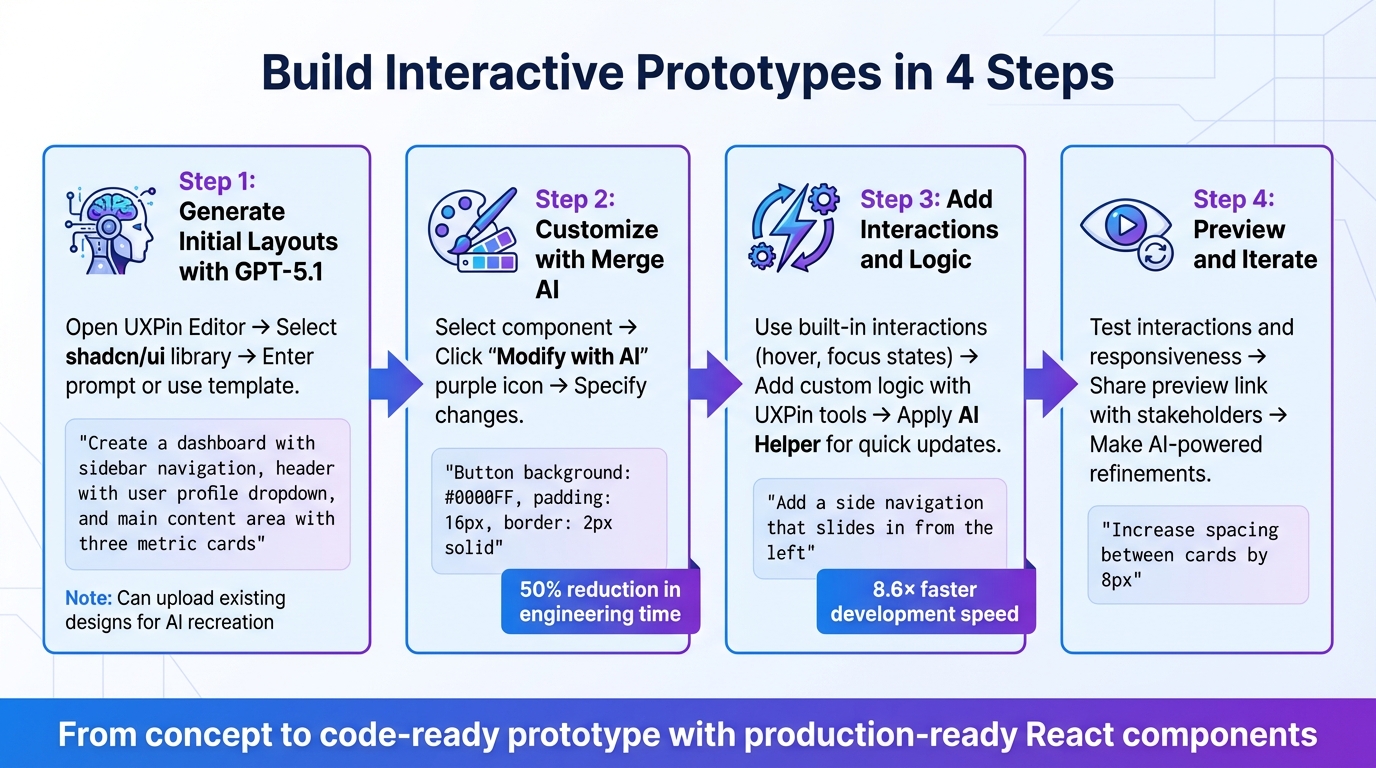
4-Step Workflow for Prototyping with GPT-5.1, shadcn/ui, and UXPin Merge
Once your environment is set up, you can create interactive prototypes using real React components in just four steps.
Step 1: Generate Initial Layouts with GPT-5.1
Start by opening the UXPin Editor and clicking the AI button. Select shadcn/ui as your component library, then type your prompt or choose a pre-made template. These templates can range from individual components to complete layouts.
For example, if you’re building a dashboard, you might use a prompt like:
"Create a dashboard with a sidebar navigation, header with user profile dropdown, and a main content area with three metric cards showing revenue, users, and conversion rate."
The AI will generate this layout using real shadcn/ui components – not static images or vectors.
If you already have a design or sketch, you can upload it directly into the AI Component Creator. The system will analyze your screenshot and recreate the structure using components from the shadcn/ui library. This is particularly handy when transitioning older designs into a modern design system.
"AI should create interfaces you can actually ship – not just pretty pictures." – UXPin
You can refine the layout right away by giving additional instructions like "make this denser" or "swap primary to tertiary buttons." The AI will adjust the layout while preserving the integrity of the components.
Once your layout is ready, you can move on to customizing it with Merge AI.
Step 2: Customize shadcn/ui Components with Merge AI
With your layout in place, you can tweak colors, spacing, and typography to match your brand. Select any component, click the "Modify with AI" purple icon in the component info section, and specify your changes. For example:
"Button background: #0000FF, padding: 16px, border: 2px solid."
Detailed instructions yield better results. For complex components, break them into smaller parts and provide separate instructions for each.
Larry Sawyer, Lead UX Designer, shared his experience with this approach:
"When I used UXPin Merge, our engineering time was reduced by around 50%. Imagine how much money that saves across an enterprise-level organization with dozens of designers and hundreds of engineers." – Larry Sawyer
The AI Helper can handle updates to visual styles, layout adjustments (like alignment, padding, and margins), and even text changes. If you’re working with high-fidelity mockups, uploading them can help the AI identify specific design elements like fonts and color schemes. Make sure to keep the component selected while the AI processes the changes.
Once your design matches your vision, it’s time to add functionality.
Step 3: Add Interactions and Logic
shadcn/ui components in UXPin Merge come with built-in interactions, such as hover and focus states, as well as responsiveness. These are already coded into the library, so you don’t need to start from scratch.
For custom logic, use UXPin’s interaction tools. You can add variables, conditional logic, and advanced interactions to simulate real functionality. For example, you might create a variable to track whether a modal is open and then connect a button’s onClick event to toggle that variable.
The AI Helper can also make quick interaction updates. Just describe what you need, like:
"Change this button to a loading state" or "Add a side navigation that slides in from the left."
The AI ensures that the code structure remains intact while applying these updates.
UXPin Merge claims to speed up product development by up to 8.6 times, allowing teams to go from design to code-ready prototypes faster. The December 2025 release of Merge AI 2.0 was specifically designed to keep AI aligned with your team’s component library throughout the process.
Now, it’s time to test and refine your prototype.
Step 4: Preview and Iterate
Preview your prototype in UXPin Merge to test interactions, states, and responsiveness. All behaviors will function as they would in a live application. Share the preview link with stakeholders for feedback, and you can even password-protect it for added security.
Make changes based on feedback without starting over. Use the AI Helper for targeted tweaks, like:
"Increase the spacing between cards by 8px" or "Change the primary CTA to a ghost button variant."
As you refine the prototype, check the component properties in the info section. Many shadcn/ui components include interactive props (like isOpen for dialogs) that you can toggle without needing to add extra logic. This keeps iterations fast and ensures the prototype stays aligned with how developers will build the final product.
sbb-itb-f6354c6
Tips for Large-Scale Prototyping
Maintaining Design Consistency Across Teams
When teams are spread across different time zones, keeping design consistent becomes a major challenge. A unified component library can solve this. Tools like UXPin Merge allow designers to work directly with coded React components pulled straight from Git repositories. This ensures that everyone uses the exact same shadcn/ui components that developers will implement in production.
For example, at Microsoft, UX Architect Erica Rider used UXPin Merge to integrate the Fluent design system. This setup enabled just three designers to support 60 internal products and over 1,000 developers. Such efficiency is only possible when your design tools and codebase are perfectly synced.
To manage this effectively, establish a governance committee with senior designers, developers, and product managers. Their role is to review and approve new components before adding them to the shared library. Create a clear submission process that evaluates each component for brand alignment, reusability, accessibility, and performance. For AI-generated components, consider fast-tracking variations of existing components but require full reviews for entirely new ones.
Structure your custom shadcn/ui libraries in a hierarchical manner. Place base components under /components/ui/base and brand-specific variations in /components/ui/custom. Keep everything documented in a components.json file. This file should include details on all available components, their variants, usage guidelines, Tailwind CSS settings, and your icon library.
Using AI to Speed Up Prototyping
AI can do more than just maintain design consistency – it can also save time during prototyping. To get the best results, be as specific as possible with your prompts. For instance, instead of saying, "Make this button bigger", try something like, "Button padding: 16px vertical, 24px horizontal, font size: 16px, weight: 600."
AI tools can also handle bulk updates across multiple components. If you need to change the primary color on 20 different screens, describe the change once, and let the AI apply it across the board. This speeds up your workflow while ensuring the design system stays intact.
For more complex enterprise-level interfaces, break them into smaller components and generate each piece individually. This approach helps AI produce better results and makes it easier to review and approve each part before assembling them into a full layout.
Scaling with shadcn/ui and Custom Libraries
Once you’ve established consistent design practices and incorporated AI for faster iterations, scaling your component library becomes much easier. Start by initializing shadcn/ui with npx shadcn@latest init. Add specific components using npx shadcn@latest add button card, and use the -p ./custom/libs flag to keep proprietary components separate from the base library.
Many large companies rely on shadcn/ui for scalable deployments because its composable design and consistent API make it easy to use across big teams. The shared patterns in these components also help new designers get up to speed quickly.
To manage updates, implement semantic versioning (e.g., 1.0.0, 2.0.0). This helps teams track changes, stay informed about updates, and refer to a changelog that explains what was updated and why. Use a staging environment to test new versions before rolling them out to all projects. This way, teams can avoid working with outdated components while still allowing flexibility for projects that need to stick with older versions temporarily.
Leverage UXPin Merge’s "Patterns" feature to save frequently-used component combinations. If a specific variant hasn’t been added to your core library yet, saving it as a Pattern makes it instantly accessible to your team without waiting for a development cycle.
Conclusion
The combination of GPT-5.1, shadcn/ui, and UXPin Merge is transforming enterprise prototyping. By replacing static mockups with production-ready React components, this approach bridges the gap between design and code, ensuring prototypes align perfectly with the final product.
Enterprise teams have reported notable efficiency improvements with this workflow. These gains highlight how AI simplifies and enhances the design process. GPT-5.1 takes over repetitive layout tasks, while shadcn/ui’s straightforward API and open-code structure enable smooth integration. This setup allows designers to concentrate on strategic decisions and fine-tuning. The result? A workflow that eliminates handoffs and guarantees consistency from concept to deployment.
What truly sets this approach apart is its scalability without compromising uniformity. When teams operate from a shared component library synced through Git, everyone works with the same production-ready elements. Changes are automatically updated, governance stays intact, and prototypes maintain the functional accuracy needed for effective user testing. For enterprise teams juggling multiple products across distributed groups, this method isn’t just faster – it lays the groundwork for consistent, high-quality design across projects.
FAQs
How does GPT-5.1 enhance prototyping with UXPin Merge?
GPT-5.1 takes prototyping in UXPin Merge to the next level by using AI to transform natural language prompts or sketches into production-ready UI components. This drastically cuts down on manual work, streamlines workflows, and ensures that every component aligns with established design systems. The result? Greater consistency and fewer errors.
With its advanced ability to understand natural language, GPT-5.1 enables teams to make quick adjustments and iterate on prototypes without needing extensive coding skills. This means you can create interactive, high-fidelity prototypes that mirror the final product more accurately. The process saves time and fosters smoother collaboration between design and development teams.
What are the benefits of using shadcn/ui for prototyping with UXPin Merge?
Using shadcn/ui with UXPin Merge simplifies and accelerates the design and development process. These production-ready React components allow designers to create prototypes that closely mirror the final product in both appearance and behavior. This means accurate styling, interactions, and functionality are built right into the prototypes, cutting down on errors and eliminating the need for extra manual tweaks.
UXPin Merge makes it easy to customize shadcn/ui components within a single environment. Teams can adjust props, styles, and behaviors without hassle, fostering better collaboration between designers and developers. This streamlined process not only saves time but also ensures prototypes align closely with the end product, leading to smoother handoffs and a more efficient development cycle.
How does AI help ensure design consistency for large teams?
AI has become a key player in ensuring design consistency for large teams, simplifying workflows by automating repetitive tasks and upholding design standards. For example, tools like UXPin Merge use AI to create layouts and components that seamlessly align with existing design systems, cutting down on potential inconsistencies.
In addition, AI helps bridge the gap between design and development by ensuring that code-backed components faithfully represent the final product. By standardizing outputs with predefined rules and metadata, teams can work together more smoothly, reduce mistakes, and deliver a unified user experience. This approach helps organizations scale their design systems efficiently without compromising on quality.

