UXPin and Storybook Integration is Here!
There are many ways for product teams to achieve greater efficiency and consistency in the design handoff.
At UXPin, we believe that smooth communication between designers and developers is one of the most important factors in setting up an efficient and scalable DesignOps process for your business. In the ideal world, both designers and devs should speak a common language when building digital products together.
With our new release of Storybook integration rooted in Merge technology, we believe we are getting one step closer to reaching this goal.
The challenge behind design consistency
Designing products with vector or pixel-based tools leads to endless inconsistencies during the design implementation. If you’ve heard it somewhere it’s because many design thought leaders like Nathan Gitter, or UXPin’s own founder, Marcin Treder have been echoing this statement for years.
The drift between design and the end product often boils down to one problem. The technology behind design tools to display the UI elements and what devs use to build the product for end-users is just completely different tech. What most designers do, is merely paint a picture with a visual representation of a digital product.
Think what would happen if instead of drawing text input with a rectangle and adding some text to it on a separate layer, designers could use a native input component where they could type something in. Or how about using an interactive component of a radio button that changes states, instead of drawing circles that mimic those buttons?
Some design tools (like UXPin) give you the code-based components as your building blocks. They look and behave the same way both in the design editor and as an end-product. It doesn’t require you to know how to code – it just gives you some common vocabulary to work better with devs. Great, but why stop there?
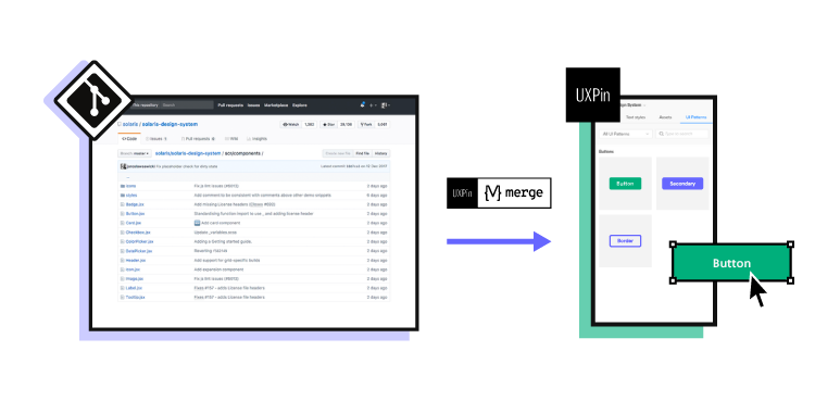
As your company and product grow, you end up with different UI patterns, elements, and typography that are standardized by Design System and organized in your devs’ Git Repo – the ultimate source of all the shiny, finalized components that went through tons of revisions. All full of interactions and states.
Now imagine taking those code components from your devs repo and using them to build new parts of your product. Wouldn’t that just make sense?
The code components as a common language
Some time ago UXPin came up with a revolutionary technology called Merge. It does exactly what we’ve just described: it allows you to plug into any Git repo with UI components and bring them to the UXPin design editor. The outcome of this integration has blown us away. Some of the biggest tech giants, like PayPal, adapted Merge technology and built the whole design process with its help.
PayPal measured that Merge sped up their design process over 6 times, and allowed them to remove product drift during the handoff to the absolute minimum. It really helped designers and devs speak one language. Whatever designer used in their prototype to build UI – the dev already had it in their repo as the same component.
As we kept talking with other companies, we realized how many of them face the same problems. That’s why we’ve decided to expand the Merge technology in two ways and bring more comprehensive design innovations to the market.
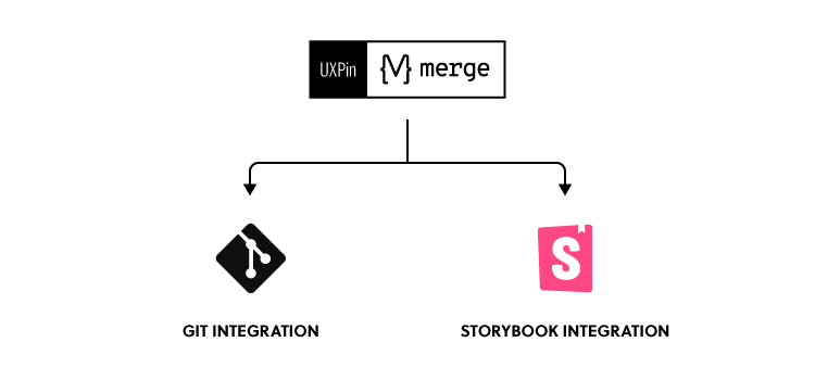
The first thing we have been working on is adding more frameworks to the existing Git integration. The second one was finding an alternative source of components developed by UI engineers. Something that would allow for a faster setup and supported a wider range of frameworks. The integration with Storybook seemed like a natural choice here.
What is Storybook
If you haven’t heard of Storybook, it’s about time. This great tool helps developers build UI components and pages in isolation. It simplifies testing and preparing on-point documentation. If devs or UI engineers want to turn a design Style Guide or a Design System into organized coded components, Storybook is a perfect place for that.
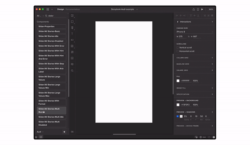
Storybook shared a list of really great examples of design systems and component libraries that are open to the public. All were built in Storybook, some of them by companies like: Audi, Shopify (Polaris), IBM (Carbon), or Airbnb (with date components). And yes, you can bring any of those libraries to UXPin and use those components in your prototypes.
How the integration works
Firstly, you need access to Merge technology in your UXPin account. If you haven’t requested it yet, you can do it here.
Then, just copy the link of the Storybook that you want to use (e.g. Audi’s), go to the UXPin editor and add the new library by pasting the link in the “Import Storybook components” box.
Yes, it’s that simple! Now you can design with the exact same components right away and play with all interactions on Preview.
If you want to get to know more about the integration, see our Docs.
Benefits of the integration
Build advanced UI fast
With Storybook integration, you can build high-fidelity prototypes fast just by dragging and dropping code components on the canvas. They are fully interactive and behave just like an end product. On top of that, you can still add UXPin’s interactions to glue different UI patterns together into a truly immersive experience for user testing and show your team how the product should look. The whole process is extremely fast.
Besides speed, you also improve the design consistency. The Storybook components are in line with your production standards, so you don’t have to spend time matching the right colors, fonts, or rebuilding parts of the UI.
Manage only one library
There’s no need to take care of the UXPin and Storybook libraries separately. The components are in sync all the time, so whenever your Story (Storybook component) is changed, your designs and library in UXPin get automatically updated. These are the same code-powered components as in the Storybook library, so whatever works there, will work in UXPin.
Handoff revolution
All those back and forths between designers and developers cost time and money. By using a single source of truth, you can remove the silos and speed up your product development process. There’s no place for handoff drift with design or interaction inconsistencies. When the prototype is finished, the developer just needs to find the components that designers used, in their Storybook. That’s it! Developing a product where you already have the code for design is much faster and clearer.
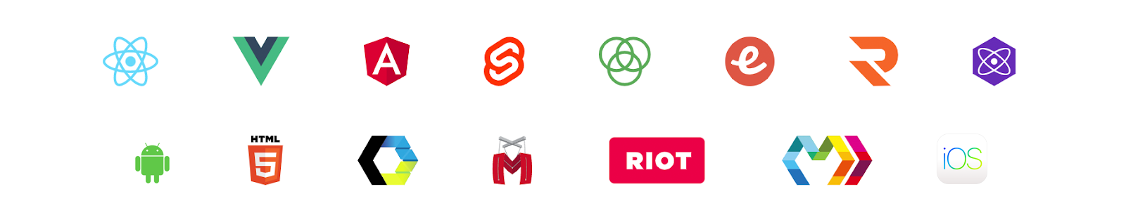
15 Frameworks
UXPin’s integration supports all 15 frameworks that Storybook does, so it doesn’t matter whether you work with React, Vue, or Angular – the library imported to UXPin will work just fine.
Try UXPin + Storybook integration with your team
Build prototypes that behave like real products and cut down your product development process. Request access for our Storybook integration, integrate with your library in under 1 minute, and get ready to design with code!

