Top Tips To Design UX Text for Mobile Apps
When you are designing your app, you want to make sure not to gloss over your UX text design. Text copy is a key component of how users will utilize your app, and poor UX text can frustrate them and turn them away. Below are 9 fundamental tips on UX design that will enhance your product and, most importantly, your user’s experience.
1. Be Concise
No one wants to read a block of text, especially when using an app. “One of the simplest tips for designing UX text is to keep it short and sweet”, said Lucas Bailey, UX/UI designer at Essaytigers. Of course, you have to make sure you get the point across, but it is important to do it in as few words as possible, unlike this:

Notice that the sign itself is quite intimidating with lots of small text all in one ugly block. Now imagine you open an app and see a warning like this, many users would just skip it instead of getting the necessary information. The flip side of this is being as concise as possible:

When you see this, you know exactly what it means. There are no arrows pointing to the house, talking about the type of house, price, etc. It is giving customers (users) the crucial information of the house being for sale (and if they want more information it can be available elsewhere).
2. Use Numbers/Numerals
If you want the user to pay attention to something, you need to somehow draw their eyes to the relevant text. The easiest way to do this is the use of numbers or numerals. Numbers often pop out to the average reader, and tend to be associated with something important:

You will notice in this UI that the numbers are bigger than the text and really grabs your attention. You should also refrain from spelling out numbers (even 0-10!), as it takes up more space and blends in with other text. Even something as simple as changing “Pick Two Options” to “Pick 2 Options” will make a difference in grabbing the user’s attention.
3. Mix Up Your Fonts/Colors
Similar to using number/numerals, you want to use different fonts, text sizes, and colors to grab the user’s attention. Even if your text is interesting if all of the app’s text is in the same font/same color the user will likely get bored and frustrated that they can’t find the information they want. You need to be careful, however, because overdoing colors/font sizes (or just using the wrong ones) can make your app look ugly and hurt the user’s eyes.
Below is an example of good use of colors and fonts:
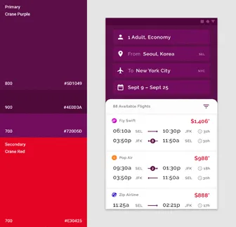
While this is what designers came up with to showcase a not so great use of fonts and colors:
