
Positions and Dimensions
At the top of the Properties panel, there are the alignment and distribution buttons. Below them, there are features to directly manipulate the location and dimensions of elements on your design — you can change the width, height, rotation, and modify their position on the x and y axes.

Use the align and distribute feature at the top of the Properties panel.
Fixed Position
Fixed position for elements allows you to set your layers to a defined position. This makes headers, footers, menus, etc. stay in their defined position as you scroll the page on Preview when the zoom in UXPin is set to 100%. To set an element to a fixed position, select it and click the pin icon in the Properties panel.
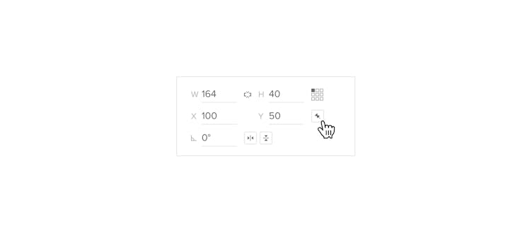
Anchor Points
Element actions, such as resizing or moving, are performed in relation to a point called the anchor point.
By default, this point is at the top left corner of the element, but you can move it to a different location using the anchor point locator next to the size values in the Properties Panel. Each square represents a point on the bounding box. Click on a square to change it. For example, to move it to the bottom-left corner of the bounding box, click the bottom-left square on the anchor point locator.
Note
Resizing elements in relation to the anchor point works when you change the size manually in the inputs, when you drag the inputs or when you use the Size interaction to resize an element.
Align and Distribute
Alignment is the arrangement of elements along a common vertical or horizontal axis. The align and distribute feature is at the top of the Properties panel. When a single layer is selected, it will be aligned to the canvas. In the case of multiple layers, they will be aligned among themselves. For example, when aligning elements to the left, everything will move to match the left-most element.
- Align right – click Align right or use the shortcut
Alt
"D"
- Align left – click Align left or use
Alt
"A"
- Align top – click Align top or use
Alt
"W"
- Align bottom – click Align bottom or use
Alt
"S"
- Align center – click Align center or use
Alt
"X"
- Align middle – click Align middle or use
Alt
"Y"
The distribute feature makes the distance between elements the same size. To distribute your elements, select them and choose one of the Distribute options at the top of the Properties Panel:
- horizontally – the selected elements are spaced evenly in relation to the X axis
Ctrl
Alt
"X"
. - vertically – the selected elements are spaced evenly in relation to the Y axis
Ctrl
Alt
"Y"
.
Distribute horizontally
If you want to create a horizontal row of elements which are placed vertically one above other, you first need to choose the Align top option. This way you will determine where the row should be placed. Now, click Distribute horizontally and your elements will be positioned in a nice and ordered horizontal row.
Distribute vertically
Distributing elements vertically works the same way. They will change their position and will be arranged in a clear vertical manner.
Nudge
Nudges are the amounts for moving and sizing elements using arrow keys (Small Nudge), or arrow keys and
"Shift"
(Big Nudge). The default for the Big Nudge is 10px and 1px for the Small Nudge, but you can change the size of both nudges in the View Settings.
Here are a few other places inside UXPin that take the nudge values:
- The offset when duplicating elements using
Ctrl
"C"
andCtrl
"V"
,Ctrl
"D"
. - The size of your Square Grid – if not changed yet, it will be determined by the Big Nudge.
- Points in SVG elements can be nudged by the Big Nudge value with
"Shift"
down and the Small Nudge value.
Power Duplicate
UXPin offers a quick way to create designs, such as search results or any other lists that contain multiple elements with data like avatars or names.
The fastest way to do it is to select an element or a group of elements already filled with data, hold
Alt
and drag the bottom right handle. That way, you can create as many elements as you want – all with refreshed content.
Smart Grid
Smart Grid speeds up your work by letting you quickly rearrange and adjust the spacing between elements in grid layouts and designs with repetitive objects.
Smart Grid works automatically when you select two or more elements with equal spacing.
- Select the elements that you want to adjust in the Smart Grid.
- When you hover over the Smart Grid, you will see handles in the center of each element; these are pink squares. Drag them to rearrange elements in the selection – it will not change their position in the Layers panel.
- You will also see pink lines between elements which you can drag to adjust the spacing between them.
To be included in the Smart Grid, elements also have to align on at least one axis, horizontal or vertical, or be in a grid. They don’t have to be the same size or shape.
If they’re not spaced equally apart, you can use the Distribute on grid option. Also adjusting the spacing between Components is only possible when editing the Master Component and not the Instances.
The Smart Grid does not work for elements inside Component Instances. That's because you can’t change the element’s position when editing Components on the canvas.
Distribute on Grid
Distribute on grid redistributes selected elements so that they are spaced evenly apart and qualify for the Smart Grid. You can do it in the following ways:
- Use the Distribute on grid option in the Properties panel (on the very right of the alignment section).
- Open the Context menu > Arrange > Grid.
- Use the shortcut
Ctrl
Alt
"G"
.
You can adjust the vertical or horizontal spacing between elements in two ways. Either drag the pink lines between elements or change it directly in the space field in the Properties panel.
Constraints
Constraints are available for elements placed inside Groups or Components that determine specific resizing rules. UXPin automatically sets the constraints based on the position and size of the elements, but you can change the settings in the Resizing section.
There are four types of constraints:
- Stretch (no constraints selected) — stretches the element proportionally.
- Left/Right/Top/Bottom — pins the element to the specified side of the parent and preserves its size.
- Center — keeps the element in place in relation to the center of the parent element and preserves its size.
- Left & Right or Top & Bottom — stretches the element horizontally or vertically so that both sides remain pinned to the parent and the distance from the borders is preserved.
Example when no constraints are applied — the element stretches along with the parent.