
Accordion Menu
In this tutorial, you will learn how to create an accordion menu in UXPin using States.
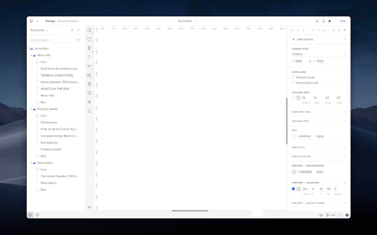
→ Download a ready .uxp file for this tutorial.
Creating Menu Sections
- Create a menu section using the Box tool from the Quick Tools menu. Then, use Text to add a header, text, and icon.
- Select the box and other elements and group them with the
Ctrl
"G"
shortcut or from the Top bar. - Duplicate this section twice and adjust the design and content for each section.
Creating Menu States
- Select all three groups and group them.
- Select the second section and check Crop selected content in the Properties panel. Crop this section so that it only shows the header. Repeat this for other sections but don't crop the first one – leave it as expanded.
Tip
Hiding content by cropping allows you to give the section a collapsed form. This is only possible in the base state.
3. Click Add State in the Top bar and create State 2 and State 3 – each state is another view of the menu.
4. Each state should have only one section expanded; the second in State 2 and the third in State 3. After you expand each section, make sure to position all sections evenly in a column.
Toggling Section's Visibility on Click
- In State 1, select the first section of the accordion and click + in the Properties panel to add an on-click interaction that will expand the section.
- In the Action section select Set state.
- Under Element, select the Group.
- In Set state, select State 1 – Base. Click Add.
Tip
Adding interactions to your base state propagates them to other states.
5. Repeat these steps for the second and third section, choosing respectively State 2 and State 3 in the Set state dropdown.
6. Preview your design.