
Multilevel Dropdown
This tutorial shows you how to build a multilevel navigation through the stages of building a simple button navigation and dropdown navigation. You can either follow the entire tutorial or finish at whichever stage you want.
→ Download a ready .uxp file for this tutorial.
Setting up the Design
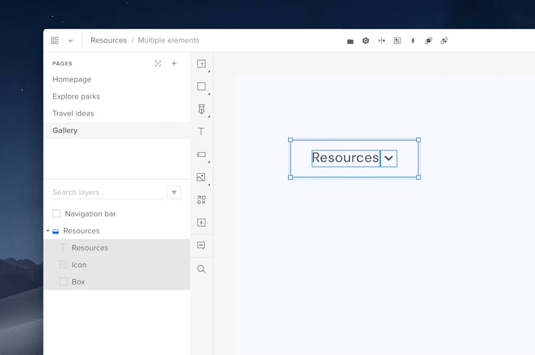
- Start by creating a navigation bar using the Box element from the Quick tools menu.
- Place a Box element on the navigation bar and add a text element on the box. Type in the category name.
- Group the box and the text element.
Simple Button Navigation
- With the selected group, click Add State in the Top bar. You’ll have State 1 (the Base) already created. Create the second state and name it Hover. Click Enter.
- In the Hover state, change the content’s design (color fill or opacity) to create a hover effect.
Adding Interactions
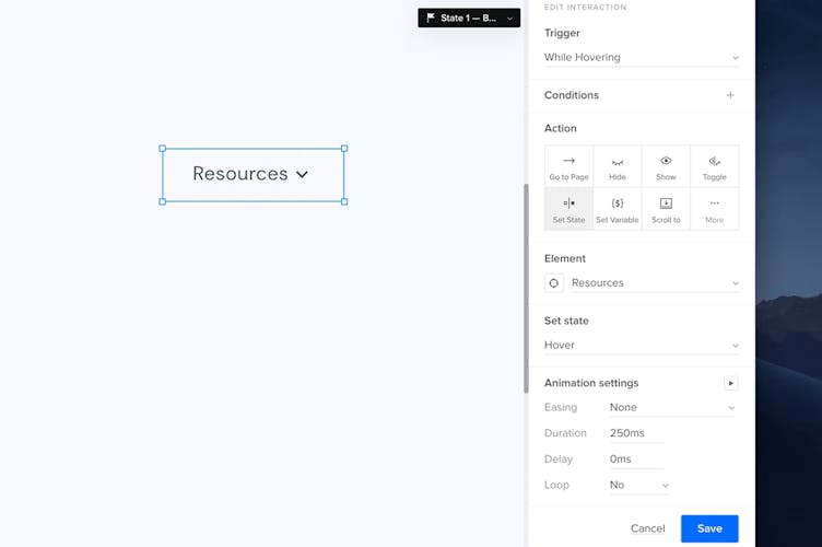
- Select your menu category group and click + at the top of the Properties panel to add a new interaction.
- Select While Hovering under Trigger.
- In the Action section, choose Set state.
- Under Element, select your category group.
- In Set state, choose Hover.
- Click Add.
Tip
Adding interactions to the Base - State 1 propagates them to other states.
You can now create as many categories as you want by duplicating the category group with added states and the interaction. Then, preview your prototype.
Dropdown Navigation
- Choose Box from the Quick tools menu and place the box right below a category box to create a dropdown.
- Place another box on top of the dropdown background and add content, such as text and an icon.
- Group the box with its content.
4. Click Add State in the Top bar. Create two states and name the second one Hover. Click Enter.
5. In the Hover state, you can differentiate the text by changing its opacity, color or adding an underline.
Adding Interactions
- Click the + icon on top of the Properties panel.
- Select While Hovering under Trigger.
- In the Action section, choose Set state.
- Under Element, select your category.
- In Set state, choose Hover.
- Click Add.
- Create more sections by duplicating that section to fill up the dropdown.
Configuring States
- In the Layers panel, set the navigation bar category group to its Hover state.
- Then, select the dropdown group and drag and drop it into the Hover state of the navigation bar category group.
3. Make sure that the dropdown is hidden in the Base - State 1.
4. Preview your prototype.
Multilevel Dropdown Navigation
- Create a multilevel dropdown background by adding another box next to your first dropdown.
- Place another box on the dropdown background and add content, such as text.
- Select the box and the content and turn all elements into a group.
- Click Add State in the Top bar and create two states; Base - State 1 and Hover.
- In the Hover state, change the color fill of the text.
Adding Interactions
- Click the + icon on top of the Properties panel.
- Select While Hovering under Trigger.
- In the Action section, choose Set state.
- Under Element, select the subcategory that will expand.
- In Set state, choose your section group.
- Click Add.
Configuring States
- Create more sections by duplicating the first one and fill up the rest of the second dropdown.
- Group them all together with the dropdown background.
- In the Layers panel, make sure that the section group from the first dropdown is on its Hover state.
- Then, drag and drop the group from the multilevel dropdown into that group.
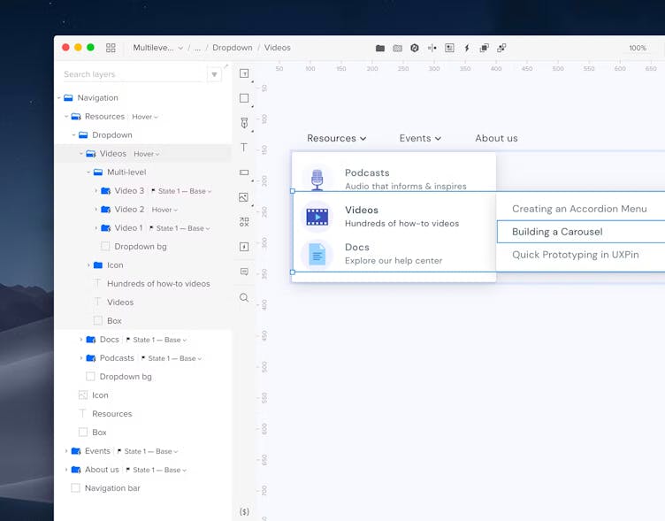
- Also, make sure that the multilevel dropdown is hidden in the Base - State 1.
- Preview your design.