
Configuring the Properties Panel
When a React component is integrated with UXPin using Merge, all its properties are serialized with their names from the code. And because of this, the component's properties panel can often be illegible and display too many properties that are redundant for the designer.
Excluding Properties
A specific property can be excluded from the properties panel and, therefore, will not be visible in the controls mode. You can use the @uxpinignoreprop comment before the property you would like to exclude.
BarChart.propTypes = {
  width: PropTypes.number,
  height: PropTypes.number,
  /** @uxpinignoreprop */
  onSeriesMouseOver: PropTypes.func,
}
Thanks to this comment property, onSeriesMouseOver will not be displayed in the properties panel in both modes – controls and code.
Alternative Names
Sometimes a property has a very technical name You can set an alternative name that will display in the properties panel's controls mode. To set it, use the @uxpinpropname comment before the property you would like to change.
Button.propTypes = {
  /**
   * Icon that goes after the children
   * @uxpinpropname  right icon
   * */
  iconEnd: PropTypes.element,
  /**
   * Icon that goes before the children
   * @uxpinpropname left icon
   * */
  iconStart?: PropTypes.element,
}
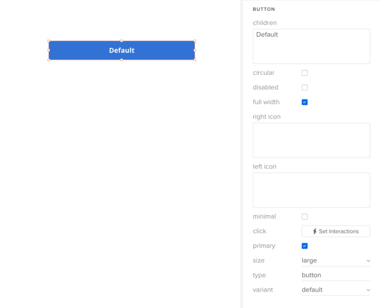
The original name is still visible in the properties panel's code mode.
Alternative Descriptions
You can also overwrite the component description to make it more user friendly. To change this, you can set an alternative description for the property in the properties panel's controls mode by inserting a comment @uxpindescription before declaring the property type.
BarChart.propTypes = {
  /**
   * Width of the Chart in px. Accepts only numbers.
   * @uxpindescription width of the chart
   * */
  width: PropTypes.number,
  /**
   * Height of the Chart in px. Accepts only numbers.
   * @uxpindescription height of the chart
   * */
  height: PropTypes.number,
}
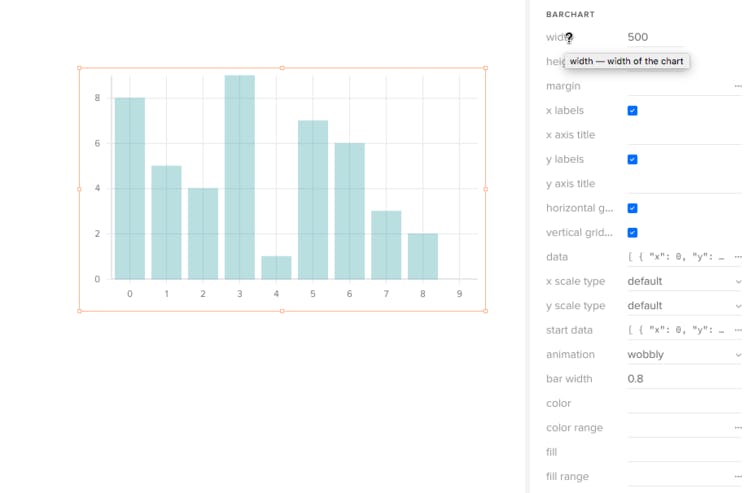
The original description is still visible in the properties panel's code mode.
Control Types
UXPin offers controls to handle the component’s properties. These controls are displayed in the properties panel.
codeeditor- displays the code editorinput- displays a single line inputinteractions- displays a button to add a new interaction or a list of interactionsnumber- displays a short input that accepts only numbersselect- displays a select list with optionsswitcher- displays a checkboxtextfield(x)- displays a textarea with multiple lines, wherexis the line counter. Passing thexparameter is not necessary because the control has 3 rows count by defaultcolor- displays a color pickerimage- displays an upload button for selecting an image from the local device and an input field for adding an image URLcss- displays controls for adjusting a component's visual styling through CSS properties
Each property type has a specific default control:
- Boolean -
switcher - Children -
textfield(4) - Node/element -
textfield(3) - Text -
input - Number -
number - oneOf -
select - Array, Shape -
codeeditor - Functions -
interactions
Sometimes the default property does not fit the property or, as in this specific case, the usability is poor, so by using the comment @uxpincontroltype in a place where you declare properties you can change control type for this property. If the control type matches the property type, the new control will be displayed in the properties panel.
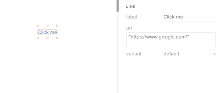
Link.propTypes = {
  /**
   * Content of the Link
   * @uxpinpropname label
   * @uxpincontroltype input
   * */
  children: PropTypes.Node,
  /**
   * A URL or URL fragment to which the Link points
   * @uxpinpropname url
   * @uxpincontroltype textfield(2)
   * */
  href:  PropTypes.string,
  /** Available variants */
  variant: PropTypes.oneOf(['danger', 'success', 'warning']);
};
Example
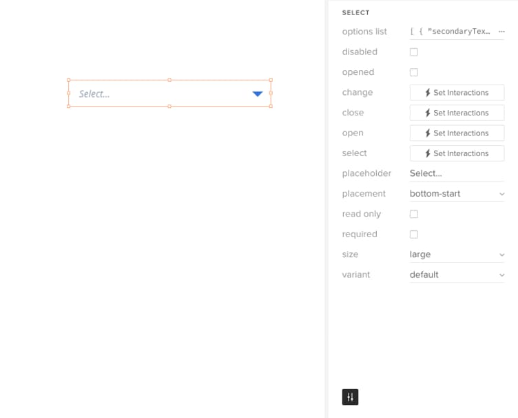
By means of JSDoc annotations you can modify the properties panel to make it cleaner and more designer-friendly, such as hide unnecessary properties (needed only for developers), rename other properties, and make controls more usable. Let’s take a look at the example below:
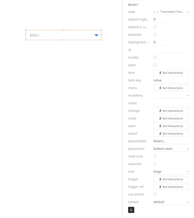
The selected component shows a long list of properties most of which are not necessary. Using JSDoc annotations, you define which properties you want to be displayed.
Below are the details of the component properties declaration:
/**
  * Open the Select upon initialization. Primarily for use with uncontrolled
  * components.
  * @uxpinignoreprop
  */
 defaultIsOpen?: boolean,
 /**
  * Item selected
  * upon initialization. Primarily for use with uncontrolled
  * components.
  * @uxpinignoreprop
  */
 defaultSelectedItem?: Item,
 /** Disables the control */
 disabled?: boolean,
 /** Index of the highlighted item. For use with controlled components.
  * @uxpinignoreprop
  * */
 highlightedIndex?: number,
 /** Id of the Select
  * @uxpinignoreprop
  * */
 id?: string,
 /** Indicates that the value of the element is invalid
  * @uxpinignoreprop
  * */
 invalid?: boolean,
 /** Determines whether the Select is open. For use with controlled components.
  * @uxpinpropname opened
  * @uxpindescription Open options list
  * */
 isOpen?: boolean,
 /**
  * Provides custom rendering control for the items. See the
  * [custom item example](/components/select#custom-item) and
  * our [render props guide](/render-props).
  * @uxpinignoreprop
  */
 item?: RenderFn,
 /**
  * Specifies a key in the item data that gives an item its unique identity. See
  * the [React docs](https://reactjs.org/docs/lists-and-keys.html#keys).
  * @uxpinignoreprop
  */
 itemKey?: string,
 /**
  * Provides custom rendering control for the menu. See the
  * [custom menu example](/components/select#custom-menu) and
  * our [render props guide](/render-props).
  * @uxpinignoreprop
  */
 menu?: RenderFn,
 /**
  * Plugins that are used to alter behavior. See
  * [PopperJS docs](https://popper.js.org/popper-documentation.html#modifiers)
  * for options.
  * @uxpinignoreprop
  */
 modifiers?: Object,
 /** Name of the field when submitted in a form
  * @uxpinignoreprop
  * */
 name?: string,
 /**
  * Called when an item is selected and it is different than the previously
  * selected item.
  */
 onChange?: (item: Item, event: SyntheticEvent<>) => void,
 /** Called when Select is closed */
 onClose?: (event: SyntheticEvent<>) => void,
 /** Called when Select is opened */
 onOpen?: (event: SyntheticEvent<>) => void,
 /** Called when an item is selected */
 onSelect?: (item: Item, event: SyntheticEvent<>) => void,
 /** Text displayed when there is no item selected */
 placeholder?: string,
 /** Placement of the Select menu */
 placement?: 'bottom-end' | 'bottom-start' | 'top-end' | 'top-start',
 /** Indicates that the user cannot modify the value of the control */
 readOnly?: boolean,
 /** Indicates that the user must select a value before submitting a form */
 required?: boolean,
 /** The selected item. For use with controlled components.
  * @uxpinignoreprop
  * */
 selectedItem?: Item,
 /** Available sizes */
 size?: 'small' | 'medium' | 'large' | 'jumbo',
 /**
  * Provides custom rendering control for the trigger. See the
  * [custom trigger example](/components/select#custom-trigger) and
  * our [render props guide](/render-props).
  * @uxpinignoreprop
  */
 trigger?: RenderFn,
 /** Ref for the trigger
  * @uxpinignoreprop
  * */
 triggerRef?: (node: ?React$Component<*, *>) => void,
 /**
  * Use a Portal to render the Select menu to the body rather than as a sibling
  * to the trigger
  * @uxpinignoreprop
  */
 usePortal?: boolean,
 /** Available variants */
 variant?: 'danger' | 'success' | 'warning'
};