Dashboards vs. Data Reports – Which is Better For Your User?
Many designers ask when trying to come up with the best way of presenting data: Are we designing a dashboard or report user interface? As with everything in product development and UX design, it depends on the user’s needs!
Understanding the difference between dashboards vs reports is crucial for presenting the right data visualization to the right people to make data-driven decisions. Some people value granularity, while others want a snapshot of key performance indicators (KPIs).
This article defines dashboards and reports and why UI designers would prioritize one over the other. We also share some examples to demonstrate how these UIs visualize data differently.
Design fully functioning, immersive dashboard and report user interfaces with live data using UXPin Merge. Sync ready-made data visualization components to test interfaces with stakeholders and end users. Visit our Merge page to find out more and how to request access.

What are Dashboards?
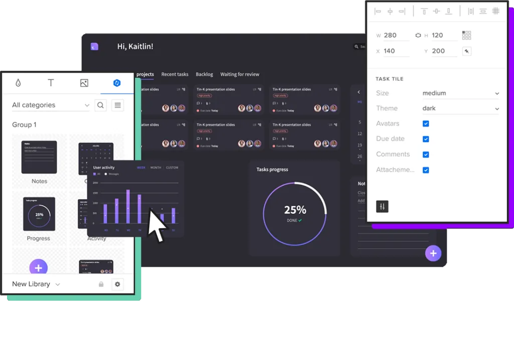
Dashboards are user interfaces that visualize multiple data sources (or reports) through numbers, graphs, and charts–typically on one screen, but some are scrollable. A dashboard can visualize one data set theme, like users, or summarize multiple data points for a high-level business performance snapshot.
What are the Benefits of Dashboards?
The most significant benefit is that dashboards can visualize large amounts of data on a single screen. Users can instantly identify issues or successes to investigate further.
For example, a sales executive notices a 20% revenue increase from the previous month. They can then investigate to uncover the cause of the significant bump in sales:
- Which products performed best?
- Was there a particular promotion responsible?
- Which sales team generated the most revenue?
Real-time dashboards are also crucial for many industries, like manufacturing, last-mile logistics, fulfillment, and live sports analysis, to name a few. Users can monitor these real-time dashboards to respond to issues or predict outcomes.
Dashboard Examples
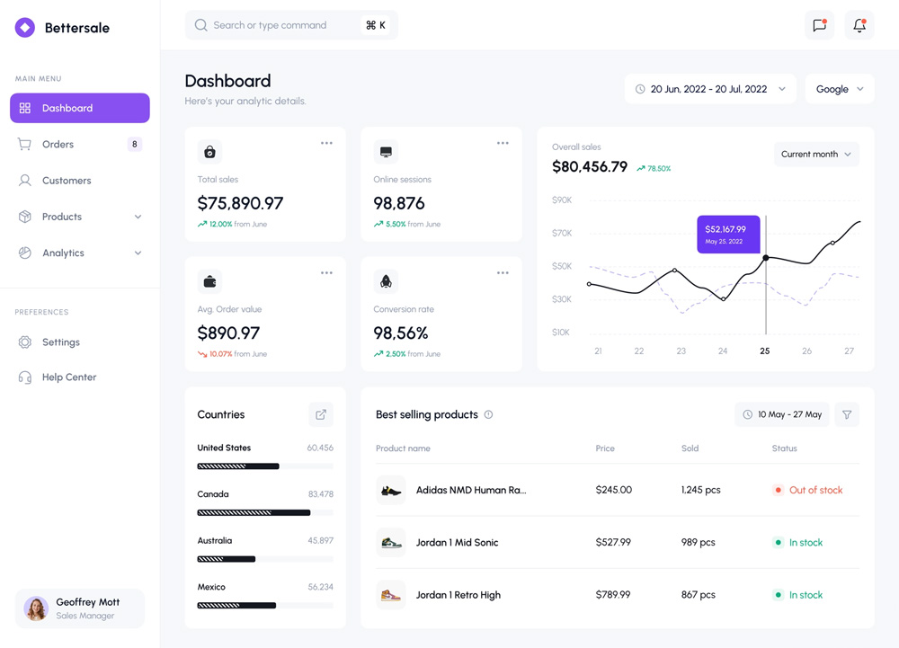
This sales dashboard from Barly Vallendito via Dribbble is an excellent example of a specific dataset theme (sales). The dashboard displays multiple data sets for the month, including:
- Total sales
- Average order value
- Conversion rate
- Best performing countries
- Top selling products
- Line graph plotting daily sales
Datapine’s manufacturing dashboard example displays production stats for an electronics company, aggregating data from many sources. These production dashboards typically feed real-time data so companies can react to issues immediately. The “Quick Stats” section is particularly important because it tells managers about operating capacity vs. order volume.
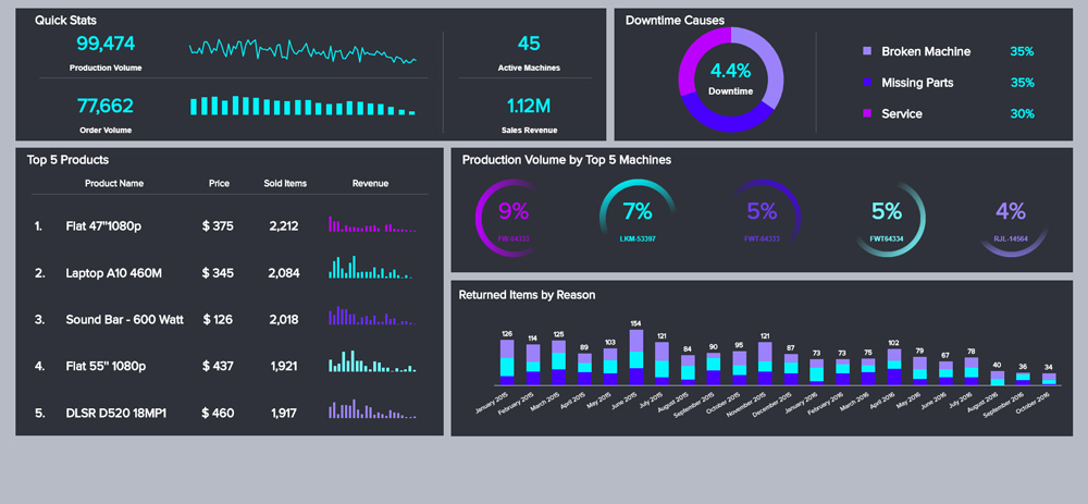
The manufacturing dashboard also feeds production managers sales and return data, so they can react to what’s happening in other parts of the business. For example, if they suddenly see a spike in Laptop A10 460M sales, they can order additional parts and take precautionary measures to ensure the relevant machines run optimally.
Dashboards also appear in B2C products like this activity tracker example from Outcrowd. The dashboard displays the user’s step count, average heart rate, step comparison chart, calories, and sleep. A second dashboard allows users to see their current progress vs. their daily goals.
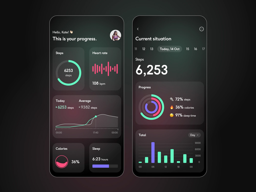
These comparison dashboards are common for many digital products, consumer and enterprise, because they allow users to track performance and make adjustments to meet goals and targets.
What are Reports?
Reports are comprehensive datasets from a specific time period. They are more granular than dashboards, allowing users to dive deep into the data to pinpoint trends and events.
A report can be a single page or hundreds of pages long, including data tables, graphs, charts, and other visualizations. For example, a sales report might include a chart plotting daily sales for a week with a table displaying every transaction below it. Analysts can use the chart to identify anomalies and the table to drill down into the data for an in-depth analysis.
What are the Benefits of Reports?
Reports allow users to get a deeper understanding of data and identify causes. Analysts can run reports on different data points within a set to uncover trends, issues, and opportunities. Baremetrics, for instance, helps SaaS companies run detailed reports on subscription metrics, churn analysis, and revenue forecasting to uncover revenue recovery opportunities.
For example, a sales report might include data about the transaction (products, prices, total cost, TAX, shipping, etc.) and customers (names, addresses, sales history, etc.). Analysts can filter and sort this sales report to understand:
- Sales by product/category/user group
- Best-selling products/categories
- Average order value
- Best-performing customer locations (city, state, country)
- Number of returning customers
- Popular payment methods
UX teams can use this data to understand customers better, update UX artifacts (user personas, user journey maps, etc.), and ultimately create a better user experience that aligns with the company’s business goals.
Report Examples
This report UI from Sharon Kalarikkal on Behance is a fantastic example of marketing efforts relating to revenue. Users can add or remove metrics at the top to generate custom reports.
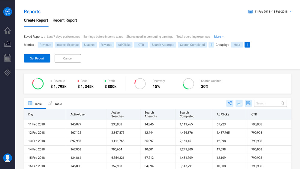
A small visualization summarizes the data table below. The user can change the date range, filter, and sort the table for data analysis. There are also options to share, save, and export the report.
This report UI from Inflectra displays a software development project’s functional and system requirements. The report shows high-level business intelligence and allows users to drill into individual tasks via a dropdown. They can also filter, sort, and manipulate data using multiple tools.
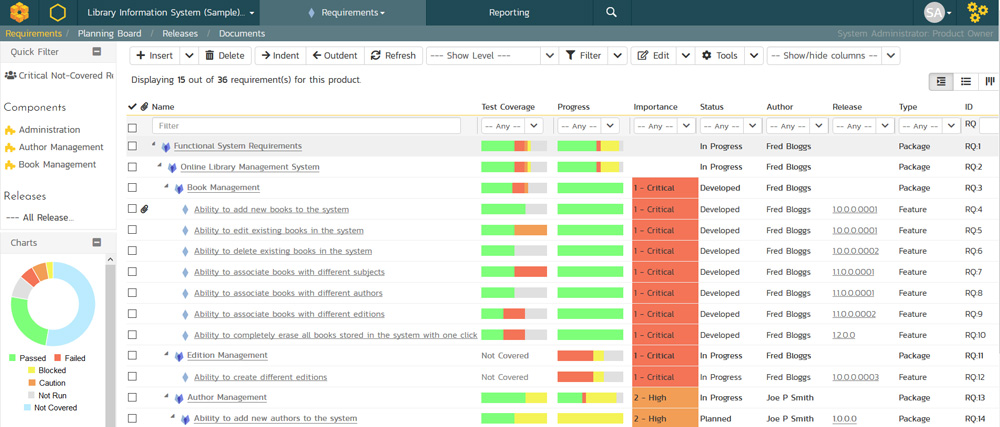
These reports are common in project management software, allowing users to monitor projects and product roadmaps.
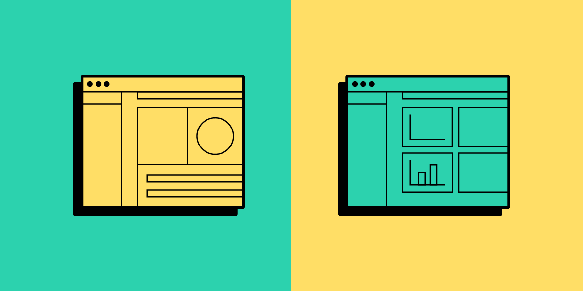
Ismail Hossain’s dairy inventory report is an excellent example of a report that, at first glance, looks like a dashboard. This type of report confuses many people, leading to the use of dashboard and report interchangeably.
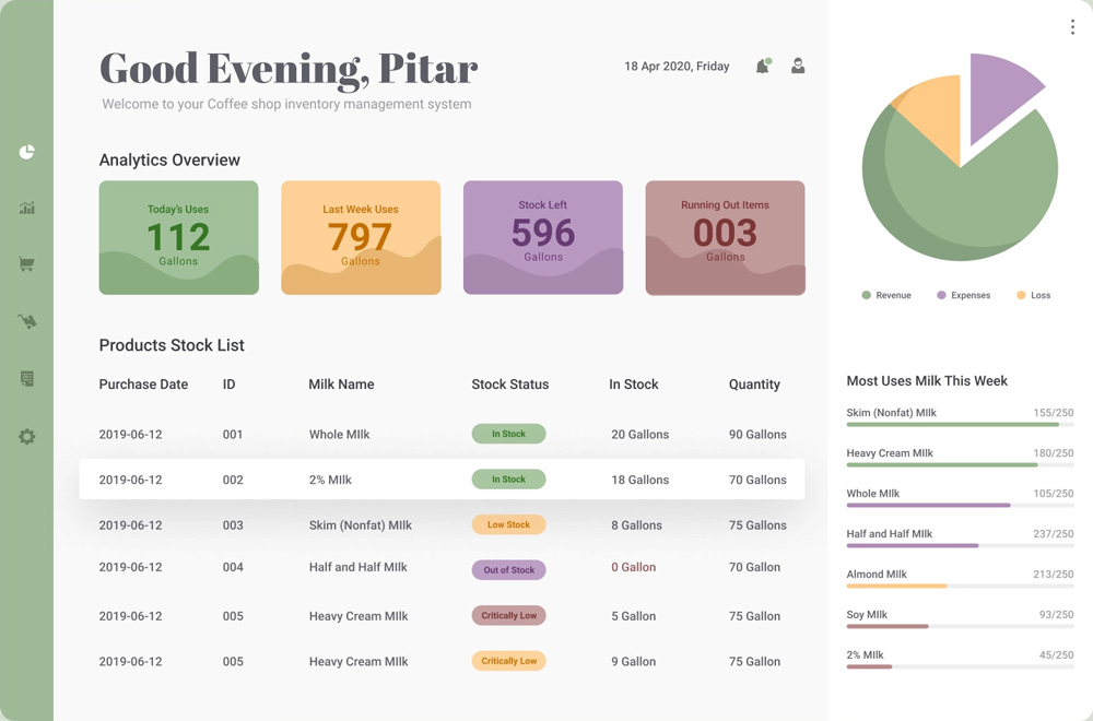
Ismail’s UI design is classified as a report because it answers how and why–users have access to the supporting inventory data. If it were a dashboard, you wouldn’t have all the supporting data behind each metric.
Ismail’s mockup is a concept, so not all the data matches up, but it gives you a good idea of how people confuse dashboards and reports. If there were more products, the inventory would be scrollable so users could visualize all the data.
Dashboard vs. Report
Designers must understand users’ data needs to determine whether the dataset requires a dashboard or report. In most cases, users will probably need both, but understanding their needs will help prioritize the UI and menu options accordingly.
A simple way to start is to think of the key differences between dashboards vs reports is:
- Dashboards answer what–what is this month’s sales and revenue?
- Reports answer how and why–how did we achieve those figures, and why didn’t we meet our target?
Dashboards are easy to digest, while reports are more granular, requiring users to spend more time analyzing the data. There is no “better option.” Choosing a dashboard vs. a report boils down to your users and how they want to visualize data.
When to use a Dashboard?
Dashboard designs are best for summarizing data, preferably within a single desktop view. C-suite and executive stakeholders prefer dashboards because it gives them a quick snapshot of what’s happening and whether the organization is on track to meet its goals.
Dashboard UIs are also preferable for B2C products, like automotive UIs, activity trackers, banking apps, social media apps, etc. These dashboards provide users with snapshots of their activities which they can analyze further using reports, statements, transactions, and other data lists.
When to use a Report?
Reports are best for users who want to research and analyze data. Business analysts, data scientists, marketers, finance teams, and team leaders are all business users who value granularity.
They want to know precisely what’s going on and why so they can present findings to stakeholders, measure performance, recommend strategies, and guide decision-making.
Live Data Visualizations Using UXPin Merge
Prototyping dashboards and reports in image-based design tools are restrictive, and designers battle to get meaningful, accurate results.
Without functioning graphs, charts, data tables, and other visualizations, usability participants and stakeholders can’t interact with the prototypes as they would in the final product. Designers must rely on UX engineers or front-end devs to build code prototypes–a time-consuming and resource-hungry process!
With UXPin Merge, designers can import fully functioning data components and templates to create prototypes that look and feel like the final product. Design teams can add real data to these data components or use an API via IFTTT for live-data prototyping.
Prototyping dashboards and reports are one thing. Collaboration between designers and engineers with complex data components is another challenge altogether!
UXPin Merge facilitates smooth collaboration between designers and engineers because they work with the same component library hosted in a repository–a single source of truth bridging the gap between design and development.
Merge streamlines the design handoff process because engineers already have the components. It’s as simple as using the component library to copy the design team’s prototypes. Less friction. Faster time-to-market.
PayPal uses Merge to design, prototype, and test its internal products, which primarily feature dashboards and reports. Product teams can build a one-page UI in under ten minutes–8X faster than experienced designers could previously using popular image-based design tools.
If Merge can achieve these results for a multinational giant like PayPal, imagine what it could do to scale your design operations and processes!
Visit our Merge page for more details and how to request access to this revolutionary UX design technology.