Real-time prototype-to-code with React bridges the gap between design and development by using production-ready React components directly in the design process. This approach ensures that prototypes generate actual HTML, CSS, and JavaScript, matching the behavior of the final product. Here’s why it matters and how it works:
- Why React? React’s component-based structure allows designers and developers to work with the same components, reducing engineering time by up to 50%. Props and states ensure prototypes behave like the final product, improving accuracy during user testing.
- Tools like UXPin: UXPin’s Merge technology connects React component libraries directly to the design tool. This setup eliminates manual handoffs, ensures consistency, and reduces feedback loops from days to hours.
- Setup and Integration: You can sync components via npm, Git, or Storybook. Tools like Node.js, Webpack, and UXPin Merge CLI are essential to streamline the workflow.
- Exporting Code: Designers can export production-ready JSX directly from prototypes, ensuring alignment with the development team’s codebase.
This workflow saves time, improves collaboration, and delivers prototypes that are ready for production with minimal adjustments.
Setting Up UXPin and React Integration

UXPin Tools and Frameworks Requirements for React Integration
Creating Your UXPin Account
To get started, head over to UXPin, sign up, and choose a plan that fits your needs. Here are your options:
- Free tier: Allows up to two prototypes.
- Merge AI plan: Costs $39 per editor per month and includes AI-powered prototyping along with built-in React libraries.
- Company plan: Priced at $119 per editor per month, this plan adds Storybook and npm integration, plus a 30-day version history.
Once you’ve selected your plan, you can jump right into the UXPin design editor. From there, you can explore the built-in React libraries or start setting up a custom component library tailored to your needs.
The next step involves configuring your React component library using UXPin’s Merge technology.
Setting Up a React Component Library
UXPin’s Merge technology gives you three options for syncing React components:
- npm integration: This is the quickest way to get started, especially if you’re working with open-source libraries like MUI, Ant Design, or Tailwind UI. UXPin even provides pre-configured versions of these libraries, so you can dive into prototyping without waiting for developer assistance.
- Git repository connection: Perfect for custom design systems, this option offers full version control and is exclusively for React.
- Storybook integration: If your team already uses Storybook for documenting components, this path supports not just React but also Vue, Angular, and other frameworks.
Choose the method that aligns with your workflow and design system setup.
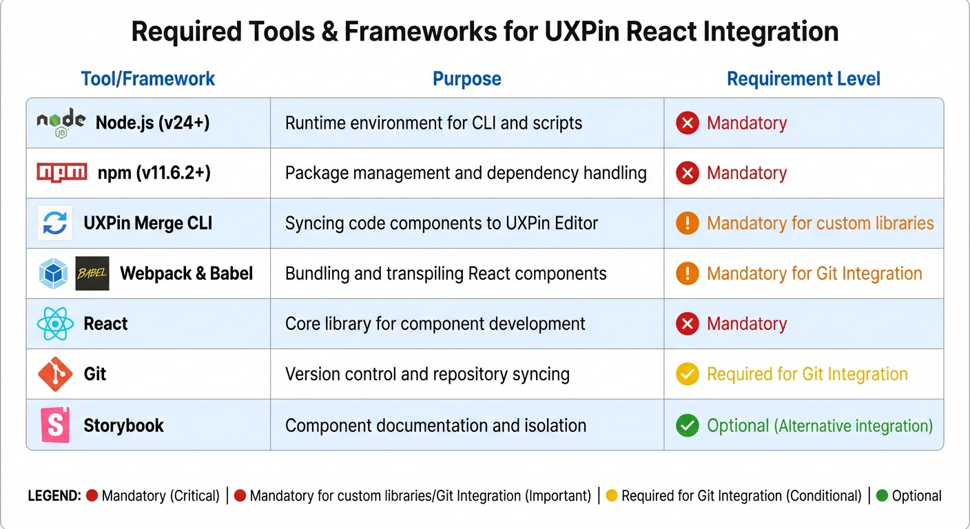
Required Tools and Frameworks
After setting up your component library, make sure your development environment meets these key requirements:
- Node.js (v24 or later) and npm (v11.6.2 or later): These are essential for managing packages and running the Merge CLI.
- UXPin Merge CLI: The latest version (3.5.0) connects your local component libraries to the UXPin editor.
- uxpin.config.js: This configuration file manages library settings. To let designers tweak padding, margins, and colors without coding, include
settings: { useUXPinProps: true }in the file. Note: You’ll need CLI version 3.4.3 or newer for this feature. - For Git integration, tools like Webpack and Babel are necessary for bundling and transpiling React components.
Here’s a quick breakdown of the tools and their purposes:
| Tool/Framework | Purpose | Requirement Level |
|---|---|---|
| Node.js (v24+) | Runtime environment for CLI and scripts | Mandatory |
| npm (v11.6.2+) | Package management and dependency handling | Mandatory |
| UXPin Merge CLI | Syncing code components to UXPin Editor | Mandatory for custom libraries |
| Webpack & Babel | Bundling and transpiling React components | Mandatory for Git Integration |
| React | Core library for component development | Mandatory |
| Git | Version control and repository syncing | Required for Git Integration |
| Storybook | Component documentation and isolation | Optional (Alternative integration) |
With these tools in place, you’ll be ready to seamlessly integrate your React components into UXPin and start designing with precision.
Building Interactive Prototypes with UXPin
Adding and Customizing React Components
Once your React component library is synced, you can start building prototypes by dragging components directly onto the canvas. UXPin supports popular built-in libraries like MUI (offering over 90 interactive components), Tailwind UI, Ant Design, and Bootstrap. If you’re working with a custom design system, your proprietary components will show up in the library panel after syncing through Git, Storybook, or npm.
What sets UXPin apart is that these prototypes aren’t just static designs. Since UXPin renders actual HTML, CSS, and JavaScript, your components come with their built-in interactivity – like ripple effects on buttons, sortable tables, and functional calendar pickers – right out of the box. You can tweak any component through the properties panel, adjusting React props such as text, colors, or data objects, all without writing a single line of code.
For large teams, this approach simplifies workflows. If a component you need isn’t in your library yet, the AI Component Creator can generate layouts with working code from natural language prompts using OpenAI or Claude models. Additionally, Tailwind CSS can be applied directly for quick layout adjustments.
Once your components are customized, the next step is defining their interactive behavior.
Creating Dynamic Interactions and Logic
The beauty of UXPin is that your components already behave like they would in the final product. For instance, when you drop a button or form field onto the canvas, it works as expected – no extra configuration needed. To build more advanced interactions, you can modify React props via the properties panel. A simple change to a prop can alter behaviors or styles programmed into the component’s code.
For nested components, the Layers Panel helps you manage hierarchy and rearrange child elements. Components adapt automatically to their CSS layout rules, like Flexbox. To gain even more control, enable settings: { useUXPinProps: true } in uxpin.config.js for additional CSS and attribute options.
UXPin also supports variables, conditional logic, and states, enabling you to simulate complex user flows. For example, data-driven components like sortable tables will re-render automatically when their data changes, giving stakeholders a realistic preview of how the interface will behave. This level of interactivity speeds up feedback loops and ensures designs are as close to the final product as possible.
After defining interactions, it’s time to validate your prototype’s functionality.
Testing and Validating Prototypes
Testing in UXPin starts with the Preview mode, where you can interact with your prototype just like a user would. You can click through flows, test form submissions, and confirm that conditional logic works as intended. Because UXPin uses the same code-backed components from your codebase, what you see in the prototype is exactly what developers will build.
For more detailed validation, you can export your prototype as HTML and host it on platforms like Netlify. This lets you use tools like FullStory to record user sessions, capturing "DVR-like" replays of interactions. Instead of relying solely on interview feedback, you can observe real user behavior – where they hesitate, what they click, and where they encounter issues.
Different testing scenarios call for different methods. Functional testing ensures interactive elements and states work correctly using UXPin’s Preview mode. Usability testing combines session recordings and user interviews to evaluate how users navigate and interact with the design. Compatibility testing checks performance across browsers and devices using tools like UXPin Mirror, while accessibility testing involves manual reviews to confirm keyboard navigation, screen reader support, and ARIA attributes.
"UXPin prototypes gave our developers enough confidence to build our designs straight in code. If we had to code every prototype and they didn’t test well, I can only imagine the waste of time and money."
- Edward Nguyen, UX Architect.
Exporting React Code from Prototypes
How UXPin Generates React Code
UXPin takes a unique approach by working directly with actual React components rather than converting static visuals into code. It integrates seamlessly with components from your Git repository, Storybook, or npm package. When you tweak a component in UXPin – like adjusting a button’s color or toggling its state – you’re interacting with the component’s real propTypes. These changes instantly generate production-ready JSX.
What makes this process stand out is the single source of truth it provides. Since UXPin uses the same components as your development environment, the exported code matches your library exactly. There’s no need for translation or cleanup, reducing the risk of inconsistencies. In Spec Mode, developers can directly copy JSX along with its properties, dependencies, and interactions.
The platform also features AI Component Creator, which generates clean, production-ready code. Using models like OpenAI or Claude, it can transform text prompts into code-backed components. These components can then be exported just like manually designed prototypes, ensuring that design changes are tightly linked to real code updates.
Export Options and File Formats
UXPin supports multiple export options to fit different workflows. In Spec Mode, developers can copy JSX and CSS directly from the browser. For quick testing and debugging, exported code can be opened in StackBlitz, an online IDE that allows live previews and edits.
| Export Method | Best For | Key Feature |
|---|---|---|
| Spec Mode | Quick Handoff | Copy/paste JSX and CSS directly from the browser |
| StackBlitz | Rapid Prototyping | Edit and preview code in a live online IDE |
| Git Integration | Enterprise Systems | Two-way sync with your production repository |
| npm Integration | Third-party Libraries | Import components from public or private packages |
For teams using UXPin Merge, Git integration ensures the exported code remains fully synchronized with your version-controlled design system. The Direct Code Export option is also available, including all necessary dependencies and props, making it ideal for full project integration. These export methods work seamlessly within the broader UXPin ecosystem, ensuring your workflow stays efficient and consistent.
Once you’ve selected an export method, it’s important to confirm the code’s readiness for integration.
Reviewing and Improving Exported Code
Before integrating the exported code, it’s essential to review it for semantic accuracy, WCAG accessibility compliance, and performance. A good starting point is to test the workflow with a smaller pilot project, such as a single web page or app screen with a few subcomponents, before applying it on a larger scale.
Early collaboration with developers is key to aligning the exported code with your team’s codebase. This approach helps ensure a smooth transition from design to code. For teams managing extensive design systems, the efficiency gains can be significant. Erica Rider, UX Architect and Design Leader, shared:
"We synced our Microsoft Fluent design system with UXPin’s design editor via Merge technology. It was so efficient that our 3 designers were able to support 60 internal products and over 1,000 developers".
For additional validation, UXPin offers an Experimental Mode through its CLI. This feature allows developers to bundle components locally and preview how they’ll render in UXPin before sharing them with the design team. This extra step helps catch potential issues early, ensuring smoother integration into production workflows.
sbb-itb-f6354c6
Integrating Exported React Code into Your Project
Setting Up Your Development Environment
Before diving into the integration of UXPin code, it’s essential to prepare your development environment. Start by ensuring that Node.js, npm, and your preferred React framework – whether it’s Create React App, Next.js, or Vite – are properly installed. If you’re working on a Windows system, consider installing the Windows Subsystem for Linux (WSL) to use Linux-based command-line tools seamlessly. Additionally, double-check your Git integration settings to ensure smooth collaboration and version control.
Don’t forget to verify that your package.json file includes all the necessary dependencies that align with the components you’re planning to import. Once everything is in place, you’re ready to bring in and validate your UXPin components.
Importing and Testing the Components
With your exported code reviewed, the next step is to import the components into your project and test them right away. If you’re using Git integration, the components will sync directly with your repository, creating a single, reliable source of truth for both design and development teams.
UXPin components leverage React props to manage their behavior and styling, ensuring that your design system remains intact. If you encounter a component that requires additional props, you can enable the useUXPinProps: true setting in your uxpin.config.js file. This feature allows designers to apply custom CSS and attributes directly to the root element without changing the original source code.
Once everything is set up, run your development server to confirm that the components render as expected and function properly within your environment.
Keeping Components Up to Date
After verifying that everything works smoothly, focus on maintaining consistency over time. By automating updates through Git integration, any changes made to your component library will automatically reflect in UXPin. This approach ensures that designers always have access to the latest versions of components, eliminating the need for manual updates and reducing the risk of discrepancies between design and development.
Customizing and Optimizing Generated React Components
Refining Component Design and Behavior
To tailor React components for your project, make adjustments that align with your specific design needs. Use the useUXPinProps: true setting to tweak CSS attributes – like padding, margins, and borders – without touching the original source code. This makes customization faster and keeps your codebase clean.
For layout control, wrap your components in UXPin’s Flexbox Component. This allows you to easily manage alignment and responsiveness. Need more complex layouts? You can nest components, such as adding a CardFooter to a Card, to create designs that adhere to your guidelines while maintaining flexibility.
Improving Code Performance
Once your components look the way you want, shift your focus to performance. Start by using React.memo to memoize components and cut down on unnecessary re-renders. For example, memoizing a list component can reduce render times by 30-40%. Pair this with useCallback and useMemo hooks to handle computationally heavy tasks more efficiently.
For even better performance, consider code-splitting with React.lazy and Suspense to enable lazy loading. This approach ensures that only the code needed at a given moment gets loaded, improving load times. Also, enable React.StrictMode to catch potential issues early in the development process.
"When I used UXPin Merge, our engineering time was reduced by around 50%. Imagine how much money that saves across an enterprise-level organization with dozens of designers and hundreds of engineers."
- Lead UX Designer Larry Sawyer.
Implementing Accessibility Best Practices
With performance in check, don’t overlook accessibility. Use Custom Props to add attributes like id or ARIA labels directly to your components. Wrapping your app in StrictMode can help you identify and fix accessibility issues early on. Additionally, validate component semantics to ensure they meet accessibility standards.
By focusing on accessibility from the start, you can ensure your components comply with WCAG guidelines before they go into production. Combining UXPin’s design-time tools with React’s runtime validation creates a strong foundation for accessibility that scales across your entire project.
These steps ensure your React components are not only optimized for performance but also ready for seamless integration into production workflows.
Conclusion
Integrating real-time prototype-to-code workflows with React and UXPin is transforming how digital products are developed. By leveraging code-backed components instead of static visuals, teams can establish a single source of truth, bridging the gap between design and development. This method speeds up the process, enabling teams to deliver functional prototypes in hours rather than days, significantly shortening the feedback loop .
The move from manual handoffs to automated code generation allows developers to pull production-ready JSX directly from prototypes. When UXPin syncs with design systems, teams can scale effortlessly – supporting numerous products and large development teams with fewer design resources. This is made possible by designers and developers working with the same React components, ensuring perfect alignment from prototype to production.
With the steps outlined earlier, the transition from design to production becomes straightforward. Start by setting up your React component library in UXPin, create interactive prototypes, and export production-ready code for development. Every component is optimized for performance and accessibility, ready to go from the start.
Adopt these practices today to streamline your workflow and take your prototypes seamlessly into production.
FAQs
How does UXPin Merge work with React components?
UXPin Merge brings React components from your code repository – whether it’s Git, Storybook, or an npm package – straight into the UXPin editor. This means your design system always stays aligned with the production code.
Here’s how it works: when a component is added via Merge, its JSX, props (or TypeScript interfaces), and CSS are imported. Designers can then drag these components onto the canvas, tweak their props through an easy-to-use interface, and see real interactions in action – all without touching a single line of code. What’s even better? Any changes made to the source code are automatically updated in the design, eliminating the risk of mismatches between design and development.
Merge also supports npm integration, making it simple for teams to upload React component libraries and use them instantly in UXPin. Whether your team uses plain CSS, Sass, or Styled Components, Merge adapts to your development workflow. By turning React components into the single source of truth, Merge ensures smooth, real-time collaboration between designers and developers.
What are the benefits of using real-time prototype-to-code workflows with React?
Real-time prototype-to-code workflows make it easier for designers and developers to work together by using the same React components for both prototyping and production. This approach bridges the typical design-to-code gap, ensuring that any updates made to the prototype are immediately reflected in the underlying code. The result? Fewer inconsistencies and smoother transitions between design and development.
These workflows also speed up the iteration process, allowing teams to prototype, test, and tweak user interfaces in minutes rather than days. Thanks to React’s component-based structure, designs stay aligned with the final codebase, which not only boosts consistency but also reduces the chances of errors. This means teams can roll out production-ready prototypes faster, with improved precision, leading to shorter timelines and streamlined processes.
How can I make my UXPin prototypes accessible and high-performing?
To make sure your UXPin prototypes are accessible, start by using real React components through UXPin Merge. These components come with built-in accessibility features like ARIA attributes, keyboard navigation, and semantic markup. This means your prototypes automatically inherit these features. To fine-tune accessibility, run an audit using tools like axe or Lighthouse on your UXPin preview link. Fix any issues by adjusting props in the Merge library or updating the source components. Any changes you make will instantly update across your prototype, keeping everything consistent.
For performance, UXPin Merge relies on production-ready components, which eliminates the need for rework and ensures your prototypes are optimized for the browser. To keep things running smoothly, streamline your component library by removing unnecessary imports, using functional components, and enabling lazy loading when needed. UXPin’s preview server takes care of bundling, reducing load times and providing a seamless experience, even on less powerful hardware. By following these steps, your prototypes will not only be accessible but also perform efficiently, offering a realistic preview of the final product.

