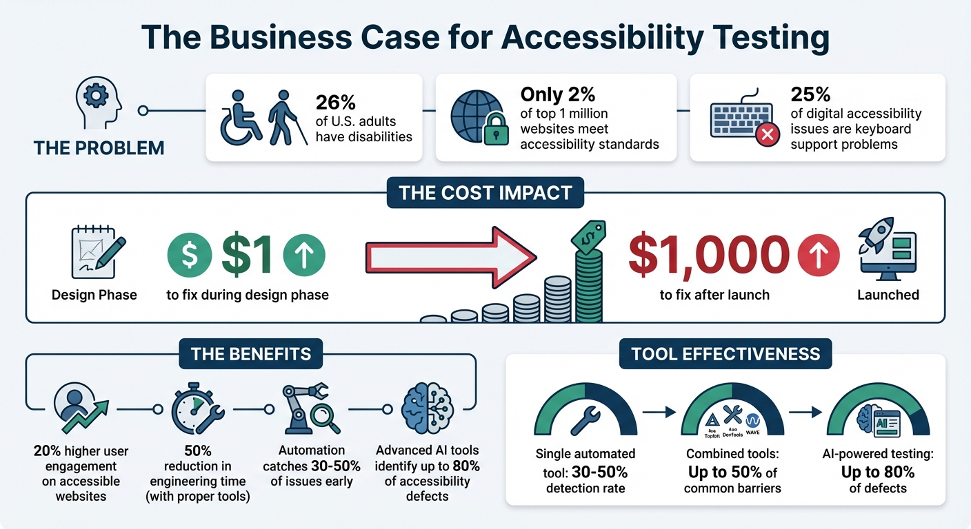
Accessibility testing ensures that digital products are usable for everyone, including the 26% of U.S. adults with disabilities. Yet, only 2% of the top 1 million websites meet accessibility standards, creating a gap that businesses can address. Fixing issues early saves money: $1 during design versus $1,000 after launch. Accessible websites also see 20% higher user engagement.
To make accessibility a priority in design-to-code workflows:
- Automate Testing: Tools like Axe DevTools, Pa11y CI, and eslint-plugin-jsx-a11y catch 30–50% of issues early, saving time.
- Manual Testing: Use screen readers (VoiceOver, NVDA) and keyboard navigation to ensure usability.
- Checklists: Align WCAG 2.1 standards with team roles for structured reviews.
- Collaborate: Use tools like UXPin Merge for code-backed prototypes, ensuring accessibility from design through development.
Combining automation, manual testing, and collaboration prevents costly fixes and improves usability for all users.
Accessibility Testing Statistics and Impact in Design-to-Code Processes
How Do You Make Accessibility Testing as Efficient as Possible | Axe-con 2024
Automating Accessibility Testing in the Workflow
Automated accessibility testing is a game-changer for identifying issues that manual reviews might overlook. By embedding these tools into your development workflow – from the initial coding phase to final deployment – you can streamline the process and catch problems earlier. While automation can’t identify every issue (it typically addresses 30–50% of accessibility concerns), it efficiently handles repetitive technical checks, saving your team valuable time and effort. This approach builds a bridge between technical evaluations and the broader design goals.
Overview of Automated Accessibility Testing Tools
Linters like eslint-plugin-jsx-a11y work directly in your code editor, flagging accessibility issues as you write. This ensures potential problems are addressed before they’re committed. Browser extensions such as Axe DevTools, WAVE, and Accessibility Insights analyze rendered pages, catching issues like missing alt attributes or poor color contrast. For CI/CD pipelines, tools like Pa11y CI and axe-core automatically test multiple pages, even blocking pull requests if they detect new accessibility regressions.
Using multiple tools together can improve detection rates. For example, combining Arc Toolkit, Axe DevTools, and WAVE can help identify up to 50% of common accessibility barriers. Additionally, component-driven testing tools like Storybook with the a11y addon allow developers to validate individual UI components before integrating them into larger applications.
By leveraging these tools, automation becomes a powerful ally in improving accessibility throughout the design-to-code journey.
Benefits of Integrating Automation into Design-to-Code Processes
Automation offers three standout benefits: speed, consistency, and early issue detection. Linters provide immediate feedback during the coding phase, while CI/CD tools act as a safety net, ensuring accessibility issues are caught before deployment.
"Automated accessibility testing is a fast and repeatable way to spot some accessibility issues. These tools can be integrated into development and deployment workflows."
– Intelligence Community Design System
Instead of manually reviewing every page for basic issues like color contrast or missing form labels, automation handles these checks in seconds. This frees up your team to focus on more nuanced tasks that require human insight – like evaluating the quality of alt text or ensuring logical keyboard navigation. Advanced tools powered by AI and Intelligent Guided Testing can identify up to 80% of accessibility defects, drastically reducing the need for manual testing.
Conducting Manual Accessibility Testing
Automated tools are great for handling technical checks, but they can’t replace the human touch when it comes to ensuring real-world usability. For instance, while these tools can confirm the presence of alt text, they can’t judge whether it’s accurate or helpful. This is where manual testing steps in, especially since around 25% of all digital accessibility issues are related to keyboard support problems. Screen readers might announce page elements, but only a human tester can verify that the reading order is logical or that the content adds meaningful value. Unlike automated checks, manual testing ensures that user interactions feel intuitive and natural.
"Screen reader users are one of the primary beneficiaries of your accessibility efforts, so it makes sense to understand their needs."
– WebAIM
Using Screen Readers for Accessibility Validation
Get familiar with popular screen readers like VoiceOver, NVDA, and JAWS. These tools transform a visual interface into a linear, text-based experience, helping you interact with content as a blind user would – relying solely on the source code order rather than the visual layout. This process can reveal problems like mispronounced words, confusing reading orders, or unclear alt text.
VoiceOver comes built into macOS and iOS, NVDA is a free option for Windows, and JAWS – though widely used – costs over $1,000. Windows users also have access to Narrator at no extra cost. When testing, focus on how users navigate between headings, landmarks, and link lists. Check that form labels provide clear context, even when hidden using attributes like aria-label. Also, confirm that focus returns to a logical element after closing modals or menus. If you’re testing on Safari, don’t forget to enable the "Press Tab to highlight each item on a webpage" option in its Advanced Settings.
"Listening to your web content rather than looking at it can be an ‘eye-opening’ experience… that takes sighted users out of their normal comfort zone."
– WebAIM
Keyboard Navigation Testing
Building on screen reader testing, keyboard navigation is another critical area to examine. Try using your interface with only a keyboard – this approach quickly highlights any reliance on hover states or click events that could exclude users who depend on keyboards, screen readers, or voice recognition software.
As you test, ensure the focus indicator is always visible. Avoid using CSS rules like outline: none unless you provide an alternative that maintains visibility. Check that the tab order follows a logical sequence and remove any negative tabindex values from elements that should be accessible. Look out for focus traps by verifying users can navigate into and out of menus or modals without getting stuck. When a dialog box closes, make sure the focus returns to the element that triggered it, rather than jumping to the top of the page. Lastly, test "skip navigation" links to confirm they move focus directly to the main content area.
| Key | Action |
|---|---|
| Tab | Moves focus forward to the next interactive element |
| Shift + Tab | Moves focus backward to the previous element |
| Arrow Keys | Cycles through related controls (radio buttons, sliders, menus) |
| Enter | Activates links and buttons |
| Spacebar | Toggles checkboxes, activates buttons, or scrolls down |
| Escape | Dismisses dialogs, menus, or dynamic content |
sbb-itb-f6354c6
Setting Up Accessibility Checklists and Review Processes
Manual testing is great for catching details that automated tools might miss. But without a structured checklist, even critical issues can slip through the cracks. A well-thought-out checklist keeps your team on the same page and ensures every step of the design-to-code process is covered. Since WCAG 2.1 includes 78 criteria, your checklist should stay flexible and evolve alongside your workflow.
Creating an Accessibility Checklist
Start by aligning WCAG success criteria with specific team roles. For instance, assign designers to handle color contrast checks, developers to validate semantic HTML, and content creators to review alt text. This role-based approach not only clarifies responsibilities but also avoids redundant work.
Your checklist should cover key accessibility elements, such as:
- Keyboard navigation
- Text scaling up to 200%
- Form labels
- Logical heading structure
- Contrast ratios meeting Level AA standards (4.5:1 for regular text)
Here’s a quick breakdown of WCAG levels and their corresponding requirements:
| WCAG Level | Conformance Level | Key Requirements |
|---|---|---|
| Level A | Basic | Keyboard navigation, non-text alternatives, video captions, descriptive link labels. |
| Level AA | Acceptable | 4.5:1 contrast ratio, form labels, logical heading structure, 200% text resizing. |
| Level AAA | Optimal | 7:1 contrast ratio, 8th-grade reading level, sign language for media, no justified text. |
Think of your checklist as a "living document." Regular updates are crucial, especially when team roles shift or recurring issues emerge. If accessibility problems continue to appear in production, it’s a sign your criteria need adjusting.
These checklists lay the groundwork for more thorough team reviews in the next phase.
Implementing Peer Reviews for Accessibility
Checklists are a great start, but peer reviews add another layer of quality control. Use commenting tools to flag accessibility concerns directly on designs or prototypes. Assign each comment to a team member and track its progress – whether it’s resolved or still pending.
For example, in 2022, T. Rowe Price streamlined their feedback process using UXPin’s collaborative tools. According to Sr. UX Team Lead Mark Figueiredo, feedback cycles that once took days were reduced to hours. This shift eliminated the need for manual redlining and endless email chains, potentially saving months on project timelines. Color-coded comments (e.g., green for resolved, purple for internal, and red for stakeholder feedback) helped keep reviews organized and efficient.
Cross-functional walkthroughs during the design-to-code handoff are also essential. Designers and developers should review final prototypes together, discussing project goals, interactions, and potential failure states to identify technical challenges early. Developers should then audit the implementation against the prototypes, ensuring proper use of ARIA attributes and semantic HTML.
For instance, AAA Digital & Creative Services enhanced their workflow in 2022 by integrating a custom-built React Design System with UXPin Merge. Sr. UX Designer Brian Demchak’s team used code-backed prototypes to simplify testing and handoffs, boosting productivity, quality, and consistency across projects.
Using UXPin for Accessibility in Prototyping
Code-backed prototypes are a game-changer when it comes to bridging the gap between design and development. They behave like real products, making it possible to test accessibility features before any production coding begins.
Using Code-Backed Prototypes to Test Accessibility
With UXPin Merge, you can design using production-ready React components from libraries like MUI, Ant Design, and Tailwind UI. These components come with built-in accessibility features like ARIA roles, keyboard navigation, and screen reader support. This means that when you’re prototyping, you’re testing the exact features that will eventually ship with your product.
UXPin prototypes enable real-time testing for screen reader users, allowing them to verify ARIA labels, roles, and live regions. The platform also includes tools like a real-time contrast checker and a color blindness simulator, ensuring your designs meet WCAG standards and remain visually clear.
The AI Component Creator simplifies the process by generating React components with semantic HTML and suggesting ARIA attributes. You can even test complex scenarios, such as managing focus in modals or navigating dropdowns with a keyboard, by using conditional logic and interaction settings.
Thanks to UXPin’s integration with tools like Storybook and npm, any accessibility updates made in your codebase automatically sync with your design tool. This integration creates a single source of truth, eliminating the risk of design-development misalignment and potential accessibility issues.
This streamlined approach not only improves testing but also lays the foundation for better collaboration across teams.
Improving Collaboration Between Designers and Developers
Strong prototype testing is just one part of the equation. Effective collaboration between designers and developers ensures accessibility remains a priority throughout the entire process.
UXPin’s automated handoff feature generates CSS, dimensions, and specifications, removing the need for time-consuming manual redlining. This minimizes miscommunication around accessibility details, such as focus states or contrast ratios. Designers can also leave contextual notes directly on the prototype, providing specific guidance on accessibility elements like ARIA labels, focus order, or keyboard shortcuts.
Developers and stakeholders can review and provide feedback on the prototype, making it easier to catch and address accessibility issues before development begins. When designers and developers work with the same components used in production, there’s less room for misunderstandings that could compromise accessibility compliance.
| Feature | Benefit for Designers | Benefit for Developers |
|---|---|---|
| UXPin Merge | Design with interactive, accessible components | Receive designs aligned with production code constraints |
| Contrast Checker | Instantly verify WCAG compliance | Avoid rework caused by non-compliant color choices |
| Contextual Notes | Specify ARIA labels and focus order | Get clear instructions for implementing accessibility |
| Auto-Spec Generation | Eliminate manual redlining | Access auto-generated CSS and JSX props |
Conclusion
Accessibility testing shouldn’t be treated as an afterthought or tacked on at the end of development. Instead, it must be integrated into every step of the process – from early prototyping all the way to final implementation. By addressing accessibility from the start, teams can identify and resolve issues before they become costly while ensuring a product that works for everyone.
The key to success lies in combining automated and manual testing methods. Automated tools are invaluable for quickly handling tasks like checking color contrast, spotting missing alt text, and flagging code-level issues at scale. On the other hand, manual testing steps in to evaluate the user experience – things like keyboard navigation and screen reader compatibility. Together, these methods create a comprehensive safety net that catches both technical errors and usability challenges, ultimately saving time and money.
To maintain consistency, shared processes and clear documentation are essential. When teams use standardized component libraries and tools like UXPin, they can test accessibility features – such as ARIA attributes and keyboard interactions – directly in code-backed prototypes. This proactive approach ensures accessibility is built into the design from the ground up, even before production code is written.
"When I used UXPin Merge, our engineering time was reduced by around 50%. Imagine how much money that saves across an enterprise-level organization with dozens of designers and hundreds of engineers." – Larry Sawyer, Lead UX Designer
FAQs
How do automated and manual accessibility testing work together?
Automated accessibility tools are excellent for spotting common issues like missing alt text, low color contrast, or ARIA misuse. They offer quick, repeatable scans that help catch these problems early, ensuring a baseline level of compliance. But here’s the catch: these tools can only identify around 30% of accessibility issues. They fall short when it comes to subjective elements, like judging whether an alt text description is meaningful or not.
This is where manual testing steps in. Human judgment is key to uncovering more complex issues – things like confusing focus order, misleading alt text, or poor logical flow. Manual testing involves real-world scenarios, keyboard navigation, and screen readers to tackle the nuanced challenges automated tools simply can’t address. With this hands-on approach, you can cover up to 95% of accessibility concerns.
By combining the strengths of both automated and manual testing, you get the best of both worlds: the speed and consistency of automated checks paired with the depth and context that only human evaluation can provide. Together, they ensure a thorough review process, helping teams design inclusive, user-friendly experiences while meeting both legal requirements and ethical responsibilities.
What are the benefits of using code-backed prototypes for accessibility testing?
Code-backed prototypes offer a practical, working version of the UI, making it possible to test accessibility during the early stages of development. Teams can use automated tools like Lighthouse, axe, or WAVE alongside manual checks – such as testing keyboard navigation, verifying screen reader compatibility, and analyzing color contrast – directly on the prototype. This proactive approach helps uncover and address accessibility issues before the final code is ready.
These prototypes also promote better collaboration between designers and developers. By working in a shared environment where design choices are directly reflected in functional code, developers can ensure accessibility tweaks integrate smoothly without disrupting implementation. This reduces errors and allows for quicker iterations.
Addressing accessibility barriers early in the process can save both time and money. Early testing minimizes the need for costly fixes after release and ensures adherence to standards like WCAG and ADA, leading to a product that is more inclusive and easier for everyone to use.
Why should accessibility testing be part of the design-to-code process from the start?
Starting accessibility testing early in the design and development process allows teams to catch and resolve potential issues before they become harder – and more expensive – to fix. This approach not only ensures compliance with standards like WCAG and Section 508 but also improves usability for everyone.
Building accessibility into the process from the start helps teams create more inclusive products, simplify workflows, and avoid the need for significant rework down the line. It also reflects a dedication to providing user-friendly, high-quality experiences for all.

