When using ShadCN components in UXPin Merge, you design directly with production-ready React code, eliminating the need for static mockups. This approach ensures your prototypes match the final product in both functionality and appearance. By integrating ShadCN components, you can:
- Use the same components developers implement in production, preserving styling, props, and interactions.
- Avoid manual handoffs by providing developers with production-ready JSX and auto-generated specs.
- Create interactive prototypes that behave like actual applications, complete with built-in functionality.
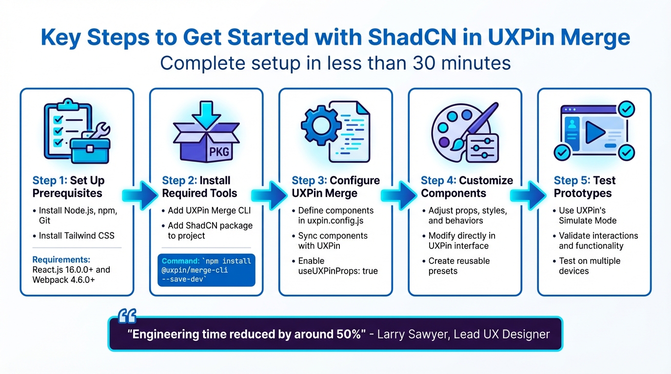
Key Steps to Get Started:
- Set Up Prerequisites: Install Node.js, npm, Git, and Tailwind CSS. Ensure your project uses React.js (16.0.0+) and Webpack (4.6.0+).
- Install Required Tools: Add the UXPin Merge CLI and ShadCN package to your project.
- Configure UXPin Merge: Define your components in the
uxpin.config.jsfile and sync them with UXPin. - Customize Components: Adjust props, styles, and behaviors directly in UXPin to meet design needs.
- Test Prototypes: Use UXPin’s Simulate Mode to validate interactions and functionality.
This workflow saves time, reduces errors, and improves collaboration between design and development teams. By designing with actual code, you ensure alignment from prototype to production.
5-Step Setup Process for ShadCN Components in UXPin Merge
UXPin Merge Tutorial: User Interface (2/5)
Setting Up ShadCN Components in UXPin Merge
You can have your environment ready in less than 30 minutes. The setup involves installing a few tools, configuring your project files, and linking your repository to UXPin‘s design editor. But first, let’s go over the essentials you’ll need before starting the integration.
Prerequisites for Integration
Before diving in, make sure your system meets these requirements:
- Node.js and npm (or alternatives like yarn, pnpm, or bun) installed.
- Git for repository management.
- Google Chrome for testing.
Your project should use React.js version 16.0.0 or higher and Webpack version 4.6.0 or higher. Since ShadCN components rely on Tailwind CSS for styling, you’ll also need to have Tailwind installed and configured properly.
Additionally, this setup requires an active UXPin Merge subscription, as the feature isn’t included in free or basic plans. If you’re planning to enable automated syncing, you’ll need an authentication token from the UXPin Design Editor to link your repository to your UXPin library.
Finally, install the following dependencies to ensure everything runs smoothly: class-variance-authority, clsx, tailwind-merge, lucide-react, and tw-animate-css.
Installing the @uxpin/shadcn Package
Once you’ve covered the prerequisites, you can begin installing the necessary packages. Start by adding the UXPin Merge CLI tool as a development dependency. Run this command in your project directory:
npm install @uxpin/merge-cli --save-dev Then, initialize ShadCN in your project with:
npx shadcn@latest init This command generates a components.json file in the root of your project. This file defines your style preferences, Tailwind configuration path, and component aliases. To ensure smooth imports for ShadCN components, include path aliases like "@/*": ["./*"] in your tsconfig.json or jsconfig.json.
Before pushing anything to production, test your setup locally using:
uxpin-merge --disable-tunneling This step helps confirm that everything is working as expected.
Configuring uxpin.config.js for ShadCN
The next step is to configure the connection between your design components and production code. Create a uxpin.config.js file in your project’s root directory. This file acts as the bridge, telling UXPin Merge where to locate your components and how to bundle them.
Here’s an example of a basic configuration:
module.exports = { name: "ShadCN Design System", components: { categories: [ { name: "Buttons", include: ["src/components/ui/button/button.jsx"] } ], wrapper: "src/Wrapper/UXPinWrapper.js", webpackConfig: "webpack.config.js" }, settings: { useUXPinProps: true } }; Start with just one component in the include list to make debugging easier. The useUXPinProps: true option allows designers to tweak properties like padding, margins, and colors directly in UXPin without needing to modify the code. Be sure you’re using @uxpin/merge-cli version 3.4.3 or later to enable this feature.
Since ShadCN relies on Tailwind CSS, your webpackConfig must support PostCSS and Tailwind processing to ensure that styles render correctly in the UXPin canvas.
Importing and Customizing ShadCN Components
Once your configuration is set up, it’s time to bring your ShadCN components into UXPin and tailor them for interactive and precise design needs.
Importing ShadCN Components into UXPin
After configuring your project, you can sync ShadCN components with UXPin using Git or npm.
For Git integration, push your components by running the following command with your authentication token:
./node_modules/.bin/uxpin-merge push If you’re using npm, add a new library in the UXPin Editor or Dashboard by specifying your package name and version. Then, include the necessary import statements in your code, like this:
import { Button } from '@/components/ui/button' Once you’ve published the library changes, your components will sync into UXPin. This ensures your components render in UXPin exactly as they would in production.
Merge automatically detects properties defined through PropTypes, Flow, or TypeScript, making editing straightforward. Additionally, class-variance-authority handles variant options, such as "default", "outline", or "destructive", which appear as dropdowns for easy selection.
Creating Presets for Reusable Components
To simplify your workflow, you can save specific component configurations – like a "Primary Loading Button" – as reusable JSX presets using the Merge Component Manager. This approach significantly reduces repetitive setup.
For more intricate components, such as Cards, you can use the Layers Panel to nest sub-components. Flexbox rules can then be applied for precise layout adjustments, giving you full control over the design.
Customizing Props for Tailored Designs
To enable CSS-level adjustments directly in UXPin, activate the useUXPinProps feature in your uxpin.config.js file. This unlocks a control interface for modifying styles like padding, margins, and borders without diving into the code. Note that this feature requires Merge CLI version 3.4.3 or later.
ShadCN components use CSS variables for theming, such as --primary or --background. You can update these variables in your globals.css file and use the cn() utility to combine Tailwind classes. This method avoids hardcoding colors, keeping your design flexible.
For more advanced needs, consider creating higher-order components (HOCs) or wrappers. These can add functionality like loading states or controlled inputs, giving you extra customization options. However, keep in mind that these additions may require additional maintenance over time.
sbb-itb-f6354c6
Designing Interactive Prototypes with ShadCN Components
With your imported and customized ShadCN components, you can build prototypes that feel just like real applications. Since Merge uses actual production code, these components come with their built-in behaviors intact – think clickable stars, ripple-effect buttons, or dropdowns that open naturally.
Adding Interactions to ShadCN Components
ShadCN components keep their native functionality, making it easy to layer on interactions and create smooth user flows. To add custom behaviors, you can use the Properties panel or the Interactions icon in the Topbar.
Interactions are built using Triggers (user actions like Click, Hover, Focus, or Value Change) and Actions (results such as Go to Page, Set State, or API Request). For example, you can configure a ShadCN Button to shift from a "default" to a "loading" state when clicked, and then navigate to a new page after a short delay. To quickly select nested components in complex layouts – like Cards or Dialogs – use Command (MacOS) or Ctrl (Windows) + Click.
Conditional Interactions take things further by adding if-else logic to your flows. This lets you validate form inputs, display error messages, or show different content based on user choices – all without writing a single line of code. With Variables and Expressions, you can store user data across pages, enabling your prototype to remember selections and respond dynamically.
"Conditional interactions allow creating the flows of interactions to resemble the real applications closely. They are the system of rules to determine whether a given interaction should be performed or not." – UXPin Editor Documentation
Interactive elements are marked with a Thunderbolt icon on the canvas, which you can toggle on or off in the View Settings. Once your interactions are set up, you’re ready to test everything in Simulate Mode.
Previewing and Testing Prototypes
Simulate Mode is where you can test your interactions in action. This mode lets you interact with the React code behind your components – click a ShadCN dropdown to see it expand, fill out forms to trigger validation, or navigate between pages to ensure your flows work as intended.
"Imported components are 100% identical to the components used by developers during the development process. It means that components are going to look, feel and function (interactions, data) just like the real product experienced by the end-users." – UXPin Merge Tools
For mobile and tablet testing, use the UXPin Mirror app to scan the Preview QR code and confirm interaction behaviors on different devices. Alternatively, Spec Mode offers a detailed view for developers, showing the exact props and values applied to your prototype. This ensures everything matches the production environment, simplifying the handoff process.
The Layers Panel is useful for checking that nested components are structured correctly and that layouts perform as expected. If you’re working with a private Storybook integration, make sure testers are logged into an authorized UXPin account to access the components.
Testing and Troubleshooting ShadCN Components in UXPin Merge
Keeping design and production in sync is a must, which makes thorough testing and troubleshooting of ShadCN components in UXPin Merge a priority. Since Merge operates with actual React code, it allows you to confirm that components behave exactly as they would in a live environment.
Running Tests for ShadCN Components
Begin by adding your components incrementally to the uxpin.config.js file. This step-by-step approach helps pinpoint any specific component causing build errors or rendering problems. After including a component, run the Merge CLI with the --disable-tunneling flag to avoid constant page reloading during local testing.
"Merge requires a unified naming of the parent directory and the exported component. Since this name shows up in the UXPin Editor and the UXPin spec mode, make sure that the name of the exported component matches the name of the original component." – UXPin Documentation
Testing is optimized for Google Chrome. For interactive elements, like checkboxes or text inputs, use the @uxpinbind annotation. Without it, these controlled components won’t update properly in the preview.
Troubleshooting Common Issues
Some common problems include CSS conflicts. If your ShadCN styles appear broken or inconsistent, they might be clashing with UXPin’s editor CSS. The fix? Scope your component styles locally.
In September 2024, a developer encountered an issue where the ShadCN Switch component rendered incorrectly in both "On" and "Off" states. The problem was traced to a global padding style applied to all button elements in the index.css file. Once the global padding was removed, the issue was resolved.
If experimental mode doesn’t load, delete the .uxpin-merge file from your design system repository. For "Module not found" errors, ensure the path aliases in your components.json match those in your jsconfig.json or tsconfig.json. In July 2023, users resolved similar errors by manually updating their jsconfig.json with the correct compiler options for paths.
| Issue Type | Common Symptom | Recommended Solution |
|---|---|---|
| Installation | "Missing license key" or "Invalid registry" | Verify .env variables and components.json header configuration |
| Rendering | Broken or inconsistent styles | Scope CSS locally to avoid interference with UXPin’s editor styles |
| Interactions | Checkbox/Input not updating in preview | Apply @uxpinbind annotation to handle controlled React state |
| CLI/Environment | Experimental mode won’t load | Delete the .uxpin-merge file in the root directory |
These steps will help you identify and resolve issues, ensuring your components perform as expected.
Best Practices for a Smooth Workflow
To streamline your design-to-development process, consider using Wrapped Integration with Higher-Order Component (HOC) wrappers for ShadCN components. This allows you to adapt components to meet design requirements – like creating controlled checkboxes – without altering production code.
For added flexibility, enable custom props by setting settings: { useUXPinProps: true } in your uxpin.config.js. This lets designers modify root element styles and attributes directly within the UXPin properties panel.
If your team uses Continuous Integration tools like CircleCI or Travis, you can push components to UXPin with the uxpin-merge push command and an authentication token, eliminating the need for manual uploads.
"Some styles appear broken – your styles may interfere with UXPin CSS, or UXPin can interfere with your styles, so your styles need to be locally scoped to avoid conflicting with UXPin CSS." – UXPin Documentation
When working with npm integration, always click "Publish Library Changes" and refresh your browser to see updates or new props in the UXPin Editor. Keeping your Merge CLI updated to the latest version ensures smooth operation.
Conclusion
Using ShadCN components in UXPin Merge reshapes how teams tackle the design-to-development process. By designing with the exact React code developers rely on in production, you bridge the gap between design and implementation. This approach ensures a single source of truth, where your prototypes perfectly align with the final product. The result? Tangible time savings and a more seamless collaboration between teams.
The benefits are hard to ignore.
Larry Sawyer, Lead UX Designer, shared: "When I used UXPin Merge, our engineering time was reduced by around 50%. Imagine how much money that saves across an enterprise-level organization with dozens of designers and hundreds of engineers".
But it’s not just about saving time. You also gain functional fidelity. ShadCN components bring built-in interactivity, accessibility features powered by Radix UI primitives, and responsive behaviors directly into your prototypes. This means your prototypes don’t just look like the final product – they function like it. You can test real user experiences before a single line of production code is written.
This approach also transforms the handoff process. Instead of static mockups that developers need to interpret and rebuild, they receive production-ready JSX and detailed specifications tied to real components. Prop-based customization and integration through Git or npm keep your design system intact while enabling faster iteration cycles.
Whether you’re working solo or as part of a large team, leveraging ShadCN components with UXPin Merge allows you to develop products faster, reduce errors, and foster stronger collaboration between design and engineering.
FAQs
What are the benefits of designing with ShadCN components in UXPin Merge?
Designing with ShadCN components in UXPin Merge ensures your prototypes align perfectly with production-ready code. This approach eliminates inconsistencies and significantly cuts down hand-off time, allowing designers and developers to collaborate effortlessly using the same component library. No more miscommunication or translation gaps – just smooth teamwork.
Because these components are fully coded, your prototypes come to life with real interactions, states, and responsive behavior. This means you can test user flows with incredible accuracy, spotting potential issues early and refining designs faster – all without writing extra code.
On top of that, ShadCN components integrate seamlessly with UXPin’s npm integration, giving teams centralized control over versions, properties, and documentation. Designers can even tweak component properties and descriptions, ensuring consistency across the board while speeding up product releases.
How can I resolve issues when integrating ShadCN components into UXPin Merge?
If you’re having trouble integrating ShadCN components into UXPin Merge, here are some steps that can help you troubleshoot and get things back on track:
- Ensure compatibility: Make sure the components are built using React 16.0.0 or newer. They should also use PropTypes, Flow, or TypeScript for defining props and stick to the single-component-per-directory structure.
- Double-check npm details: Confirm that the package name (e.g.,
@shadcn/ui) and version number are correct when setting up the npm integration. Even small errors here can stop components from rendering properly. - Clear outdated configurations: If the editor freezes or behaves unexpectedly, try deleting the
.uxpin-mergefile located in your design system’s root directory, then restart the integration process. - Address loading errors: Update your Merge package to the latest version (such as 3.0.0) and ensure your
masterbranch is properly synced. This can prevent issues like repeated page reloads. - Check for missing dependencies: Use Chrome DevTools to pinpoint any missing modules or assets. Add these through the npm integration settings to ensure everything loads correctly.
Once you’ve made these changes, re-run your CI pipeline or push the updated code to your repository. This should refresh the components in UXPin and allow you to work smoothly with ShadCN components.
What do I need to set up ShadCN components in UXPin Merge?
To integrate ShadCN components into UXPin Merge, you’ll need to make sure your setup meets a few technical requirements:
- React Version: Ensure you’re using React 16.0.0 or later.
- Browser: Google Chrome is recommended for the smoothest experience.
- Bundler: Use Webpack 4.6.0 or higher to bundle your component code and styles.
- File Structure: Organize each component in its own folder, naming the folder after the component. The component file inside must export a default React component.
- JavaScript Support: Props can be defined using PropTypes, Flow, or TypeScript.
- Team Preparation: Your team should be familiar with JavaScript development tools and have access to the UXPin Merge workspace.
- Library Installation: Add the ShadCN UI package (
@shadcn/ui) through Merge’s npm integration by specifying the package name and version.
Once everything is in place, you’ll be able to import ShadCN components into Merge and use them as if they were part of your production codebase.

