The three “lite” style guides that we talk about here aren’t perfect replacements for a full, front-end style guide. They can be used as either time-savers, or better yet complements to a more complete style guide that comes later.

Photo Credit: “Discussing the mood boards.” foam.
Creative Commons.
For example, front-end guides can’t match the creative and atmospheric benefits of mood boards, which are much more useful in the earlier stages of the design process. In the later stages, though, developers won’t be able to copy-and-paste code from a mood board.
If you have the time, start with these three, then expand them into complete style guides.
1. Mood Boards
Mood boards are the most artistic, but most abstract, of all style guides. They specialize in setting an project’s atmosphere and artistic style but little else aside from that. What they lack in technical details, they make up for in concept exploration.
Popularized by industries such as fashion and interior design, these stylistic collages have been proven effective across many visual industries, including web UI design.
Mood boards work best at the beginning of the design process: they aid in the inspiration and exploration of ideas, at a time when ideas are most needed. An eye-pleasing mood board will keep the entire team moving in the same direction before more substantial style decisions come into fruition. However, as more consistent frameworks develop throughout the design process, the mood board loses effectiveness.
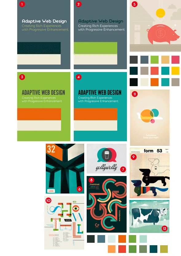
Photo credit: Duoh
In addition to helping you think about consistency early in design, mood boards are also great for design collaboration. Since clients and stakeholders may have difficulty articulating the details of their ideas, mood boards provide a clear visual direction for productive feedback.
To learn more about mood boards, check out this list of 24 pro tips. When you’re ready to start, here’s a list of helpful tools.
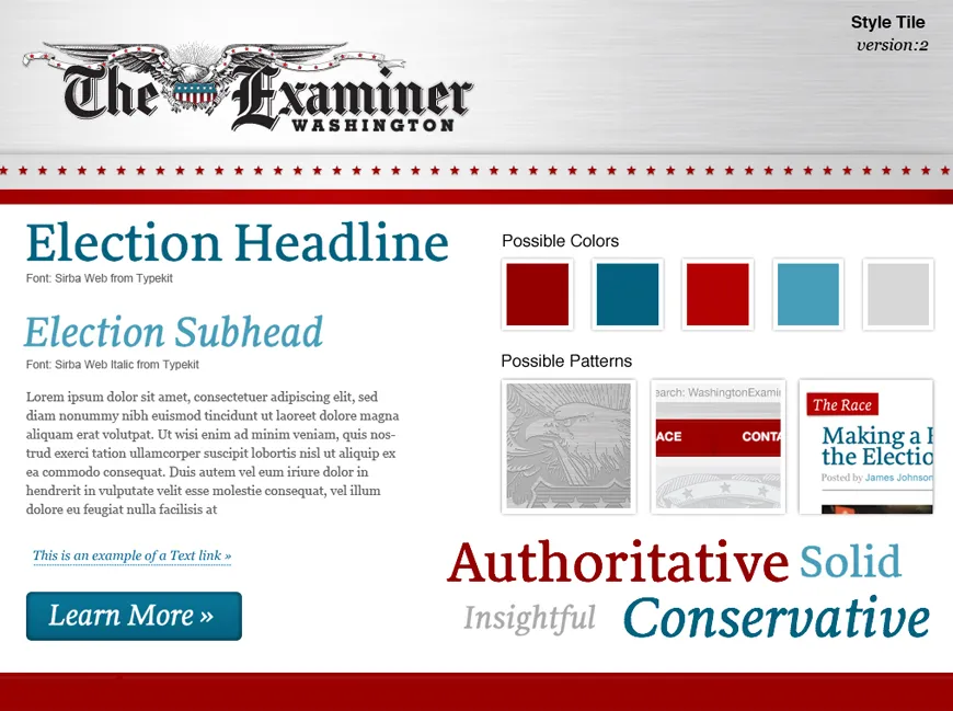
2. Style Tiles
Style tiles are a transitional style guide more specific than mood boards, but lacking the intricacy of brand or front-end guides.
The inventor of style tiles, designer Samantha Warren, describes them as a way to “establish a direct connection with actual interface elements without defining layout,” and that they, “work well for clients who have established brands and need them to translate smoothly to the web.”
Source: Samantha Warren, StyleTil.es.
Creative Commons Attribution-NonCommercial 3.0 Unported License.
As you can see in Warren’s example, style tiles maintain the same collage look and feel of a mood board, but with more concrete information. Notice how the style tile provides details like typeface, font treatment, and recommended patterns.
Because they’re quick to make, style tiles work when first determining a site or app’s visual style, or when considering a redesign. If done well, style tiles can even replace mockups as a visual representation of the site or app’s theme.
Even if you need something meatier, this Compass extension can help you turn style tiles into a more complete style guide. Installation instructions are on the site.
3. Brand Style (Identity) Guides
Deviating from posters to manuals, the brand style or identity guide lists out all the rules and standards for a company’s brand. Extending far beyond simply the logo, it will affect the entire brand identity on websites/apps, advertising, business cards, public forums – anywhere, really.
Brand style guides will include design details such as fonts, colors, sizes, iconography, and logo placement. Aside from consistency, their overarching purpose is defining the personality of the brand – whether the tone is smart or sassy, or whether the first impression should be rugged or refined.
The brand style guide is like a Magna Carta that protects your identity, preventing less familiar employees from diluting your impact through poorly executed visuals. They cover any usage specifications concerning the brand, including:
- Logo Usage – There are a lot of rules for logos: they may lose their effects at certain sizes, require a certain amount of space around them for more impact, change colors depending on the background, or have different variations depending on context (i.e., website vs. app).
- Color – Companies are strongly identified by their colors – can you imagine a blue Coke can? Not only should you outline the brand’s preferred color scheme, but also the values of the specific hues. Include both HEX codes for web use, and CMYK (or Pantone) for print.
- Typography – Aside from typeface, you’ll also want to specify weights and treatments, and any specific styles should be avoided. Brands may sometimes create highly customized typefaces ( ever notice that the Ls in Kellogg’s are different sizes?).
- Iconography/Imagery – If the brand has its own specialized set of icons or images, include them (or a link) here. Chances are they’ll have multiple variations, each with their own individual rules for usage.
These are the essential fields that almost all brand guides cover. To go the extra mile, though, you can also include sections on:
- Copywriting – The tone and language style for writing associated with the brand. This can include specific phrases to include, appropriate slang, or any words that are off-limits.
- Medium-specific Instructions – Which rules apply only to web, mobile devices, various types of ads, brochures, etc
- Brand Background – To paint a fuller picture of the brand, include its history, mission statement/vision, and personality.
Here’s an example:
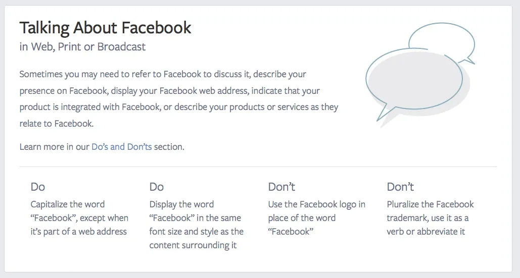
Photo Credit: Facebook
Facebook takes a more lenient approach, with a boiled-down version of their brand guidelines on a public webpage, and the option to download a more comprehensive manual. This webpage is designed for quick reference, featuring digestible sections for downloading and using their different icons and screenshots, the general do s and don’t s, and download links to PDFs on using their brand in various scenarios.
Depending on how strong your brand identity is, you may or may not need a separate branding style guide – sometimes an individual section in the front-end style guide covers everything.
Takeaway: Style Guide Seeds
We always recommend a full front-end style guide. The above style guides can do in a pinch, but really they work better as iterative documents leading up to — not replacements of — full front-end guides.
The truth is that, in their simplicity and freedom, mood boards and style boards provide advantages a 100-page style guide doesn’t. In fact, the simpler version can even be the first step in creating a style guide, the acorn that spawns the oak.
Ideally, we recommend the best of both: create the smaller style guides above, and use them as the basis for the front-end style guide to come.
If you enjoyed this article, check out our free e-book Style Guides f0r Web UI with dozens of examples analyzed from Adobe, Facebook, Yelp and more.