Affordances in UX Design: 6 Types, Real-World Examples & Best Practices (2026)
Every time a user lands on a new screen, they need to instantly understand what they can do and how to do it. The visual cues that make this possible are called affordances — and they are the backbone of intuitive interface design. A well-designed affordance makes an action obvious without requiring labels, tutorials, onboarding tours, or guesswork.
This guide explains what affordances are, where the concept comes from, breaks down the six types of affordances with real-world UI examples, and provides practical design principles for creating interfaces where the right action is always the obvious one.
Want to prototype and test affordances with realistic interactions — not flat mockups? Try UXPin free — build high-fidelity prototypes with States, Variables, and Conditional Interactions that behave like the real product.

What Is an Affordance in UX Design?
An affordance is a property of an object — physical or digital — that suggests how it can be used. The concept was introduced by psychologist James J. Gibson in 1977 and later adapted for design by Don Norman in his landmark book The Design of Everyday Things.
In everyday life, a door handle’s shape tells you whether to push or pull. A coin slot tells you to insert a flat, round object. These are physical affordances — the object’s form communicates its function.
In UI and UX design, affordances work the same way. A button with depth and shadow affords clicking. A text field with a blinking cursor and placeholder text affords typing. A slider track with a draggable thumb affords adjustment. When designed well, affordances reduce cognitive load, minimise errors, and make interfaces feel intuitive on first contact.
Affordance vs. Signifier: Understanding the Difference
Don Norman later refined the concept by distinguishing between affordances and signifiers — a distinction that’s critical for UI designers:
- Affordance: The actual possibility of an action. A button can be clicked — that’s the affordance. It exists regardless of whether the user knows about it.
- Signifier: A cue that communicates the affordance to the user. The button’s label, colour, shadow, hover effect, or cursor change tells the user it can be clicked — that’s the signifier.
An affordance can exist without a good signifier (a clickable area with no visual indicator), and a signifier can exist without a real affordance (styled text that looks like a link but isn’t clickable). Good design pairs a real affordance with a clear signifier. Microcopy like “Click to create an account” is an example of a signifier reinforcing the affordance of a clickable button.
The Six Types of Affordances in UX Design
1. Explicit Affordances
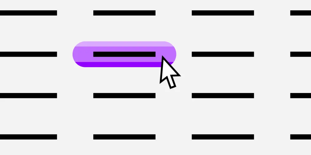
Explicit affordances use visual appearance or direct language to make actions unmistakably obvious. A high-contrast button that looks raised and clickable affords clicking. An input field labelled “Enter your email address” with a visible border and placeholder text affords text entry.
Best for: Onboarding flows, first-time user experiences, primary calls-to-action, and any action where clarity is critical to conversion or task completion.
Design tip: Explicit affordances should be the default for primary actions. Use strong visual contrast, familiar shapes (pill buttons, bordered input fields), and descriptive labels.
2. Hidden Affordances
Hidden affordances reveal themselves only after a specific trigger action — hovering, clicking, long-pressing, swiping, or right-clicking. Dropdown menus, context menus, swipe-to-delete gestures, and tooltip reveals are all hidden affordances.
Design consideration: Hidden affordances reduce visual clutter and establish information hierarchy, but they carry a discoverability risk. Users may never find them unless another signifier hints at their existence.
Rule of thumb: Reserve hidden affordances for secondary or power-user actions — never for critical tasks or primary navigation paths.
3. Pattern Affordances
Pattern affordances leverage conventions that users already recognise from years of web and app usage. A website logo in the top-left corner affords navigation home. Underlined or differently-coloured text affords a hyperlink. A hamburger icon (☰) affords opening a navigation menu. A heart icon affords “favouriting” or “liking.”
Key principle: Pattern affordances provide mental shortcuts — they reduce learning time to near zero. Breaking established patterns forces users to relearn basic interactions, which should only be done with strong justification and user testing to validate the alternative.
4. Metaphorical Affordances
Metaphorical affordances use real-world objects as visual metaphors for digital actions. A magnifying glass icon affords search. An envelope icon affords messaging or email. A trash-can icon affords deletion. A floppy disk icon (still!) affords saving.
Context matters enormously. A magnifying glass next to a search input means “search,” but inside a PDF viewer or map application, it means “zoom.” The surrounding UI context determines which real-world metaphor the user maps to the icon.
Design tip: Test metaphorical affordances with your actual users, especially across cultures. Some metaphors are culturally specific or generationally dependent (the floppy disk is increasingly unrecognisable to younger users).
5. Negative Affordances
Negative affordances signal that an action is not available — either temporarily or permanently. Greyed-out buttons, disabled form fields, reduced-opacity elements, and “not-allowed” cursor changes all communicate inactivity.
Common use cases:
- A “Submit” button remains greyed out until all required fields are completed, guiding users through the correct sequence
- A premium feature is visible but dimmed, with a lock icon and “Upgrade to access” tooltip
- Unavailable menu options are shown in lighter text to maintain spatial consistency while communicating constraint
Design tip: Always pair a negative affordance with a reason. A greyed-out button with no explanation frustrates users. Add a tooltip or inline message explaining why the action is unavailable and what the user needs to do to enable it.
6. False Affordances
False affordances appear to suggest one action but deliver another — or no action at all. Coloured, underlined text that isn’t actually a link is a false affordance. An image that looks like a button but doesn’t respond to clicks is a false affordance. A decorative element styled like a form field that doesn’t accept input is a false affordance.
False affordances are always a design failure. They cause user errors, erode trust, increase frustration, and directly damage conversion rates. Every element in your UI should either genuinely afford an action or clearly not look like it does.
How to Design Effective Affordances: 8 Practical Principles
- Research your users. Understand their digital literacy, device context, and expectations. A power user and a first-time visitor need different affordance strategies.
- Make primary affordances explicit. The most important action on any screen should have the most visually obvious affordance — strong contrast, familiar shape, descriptive label.
- Use signifiers generously. Text labels, shadows, colour contrast, hover effects, cursor changes, and microanimations all reinforce that an affordance exists.
- Follow established conventions. Pattern affordances work because users already know them. Don’t reinvent the hamburger menu or move the close button to the bottom of a modal.
- Use size and visual weight to signal priority. Primary actions get the largest, highest-contrast affordance. Secondary actions get smaller, lower-contrast treatment.
- Explain negative affordances. When an action is disabled, always communicate why and how to enable it.
- Eliminate false affordances ruthlessly. Audit your UI for elements that look interactive but aren’t. Every false affordance is a trust erosion.
- Test with interactive prototypes. Static mockups cannot reveal affordance problems — you need hover states, disabled states, transitions, and conditional logic to evaluate whether users discover and correctly interpret your affordances.
Affordances in AI-Generated Interfaces
As AI-generated UI becomes more common in 2026, affordance design takes on new importance. AI tools that generate interfaces from text prompts or images must produce elements with correct affordances — buttons that look like buttons, links that look like links, disabled states that communicate constraint.
This is where the quality of the underlying component library matters enormously. AI tools that generate from generic pixels often produce elements with weak or inconsistent affordances. Tools like Forge generate from real, production-tested components that already encode correct affordance patterns — hover states, focus rings, disabled variants, and responsive behaviours are all built into the components themselves. The affordances are correct by construction, not by luck.
Prototyping and Testing Affordances With UXPin
Affordances are inherently interactive — you simply cannot evaluate them in static mockups. Does the hover state clearly communicate clickability? Does the disabled button explain why it’s inactive? Does the dropdown reveal feel discoverable or hidden?
UXPin lets you build high-fidelity prototypes where hover states, disabled states, dropdown reveals, conditional interactions, and microanimations all behave like the final product. With UXPin Merge, you can prototype using your actual production components — so the affordances you test in design are identical to what users experience in the shipped product. There’s no gap between prototype behaviour and production behaviour.
Forge, UXPin’s AI assistant, can generate interactive UI layouts from a text prompt — using real components from your design system. Because those components already have correct affordance patterns built in (hover states, focus management, disabled variants), the generated layouts have strong affordances from the first iteration.
Sign up for a free trial of UXPin and start testing affordances with interactive, code-backed prototypes.
Frequently Asked Questions
What is an affordance in UX design?
An affordance is a property of an interface element that suggests how it can be used. For example, a raised button with a shadow affords clicking, a text field with a blinking cursor affords typing, and a slider track with a draggable thumb affords adjustment. The concept was popularised by Don Norman and originates from psychologist James J. Gibson’s work on perception.
What is the difference between an affordance and a signifier?
An affordance is the actual possibility of an action — a button can be clicked. A signifier is the visual cue that communicates that possibility to the user — the button’s label, colour, shadow, or hover effect tells you it can be clicked. Good design pairs real affordances with clear signifiers so users understand available actions instantly.
What are the six types of affordances?
The six types are: explicit (obvious visual cues like buttons), hidden (revealed by interaction, like dropdown menus), pattern (based on conventions, like underlined links), metaphorical (real-world object metaphors, like a trash-can icon for delete), negative (signals that an action is unavailable, like greyed-out buttons), and false (misleading cues that cause user errors).
Why are false affordances bad for UX?
False affordances mislead users into expecting an action that doesn’t happen — like clicking coloured text that isn’t actually a link. They cause user errors, erode trust, increase frustration, and directly reduce conversion rates. Every false affordance in your UI is a point where users lose confidence in the interface.
How can I test affordances in my design?
Use interactive prototyping tools like UXPin to build prototypes with realistic hover states, disabled states, dropdown reveals, and conditional interactions. Then conduct usability testing to observe whether users discover and correctly interpret your affordances. Static mockups cannot reliably reveal affordance problems.
What is a negative affordance? Give an example.
A negative affordance communicates that an action is currently unavailable. The most common example is a greyed-out “Submit” button that only becomes active (full colour, clickable) after all required form fields are completed. Well-designed negative affordances also explain why the action is unavailable, using tooltips or inline helper text.


