Button Design – Get Site Visitors to Actually Click Your Buttons
Buttons are essential components in any digital product. While there are many ways to design a button, designers must follow principles and best practices to create familiar and intuitive user experiences.
Button design is more than choosing a shape and color. Designers must consider a button’s states, placement, size, responsiveness, consistency, icon usage, suitable text/labels, and more.
Design beautiful UI elements that look and function like code components using UXPin. Sign up for a free trial to explore the world’s most advanced design, prototyping, and testing tool.

What is a Button?
A button in UI and UX design is a graphical element typically appearing as a clickable area on a digital interface. Its primary purpose is to convey a specific call to action (CTA), thereby directing user interaction within the system.
Buttons serve as interactive cues informing users that an action will occur upon activation. Through various visual cues such as color, text, and states, including disabled states when applicable, buttons effectively communicate with users, guiding them through the interface and facilitating desired interactions.
Despite its seemingly straightforward nature, the strategic implementation of buttons is crucial for ensuring intuitive and efficient user experiences across digital platforms.
Buttons vs links
Many digital products and websites use buttons and links incorrectly. There is a simple rule to follow when deciding between a button or link: Links are for navigation, and buttons are for performing actions.
Types of button UI
There are four types of buttons, and each button conveys a different message to users:
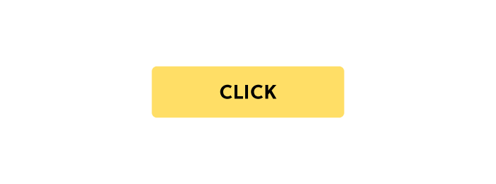
- Contained Button: Often used as the primary button for CTAs and important actions. Contained buttons use a background color with contrasting text.
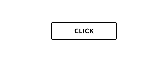
- Outlined Button: Also referred to as a secondary or ghost button, and often placed next to a primary button as an alternative action, like “Cancel” instead of “Submit.” Outlined buttons use a transparent background with a contrasting border and text.
- Text Button: Also called a flat button and often used for low important actions, like date pickers. Text buttons have no background or border, with only the label colored and visible.
- Toggle Button: Designers use toggle buttons for two or more related actions–like switching dark/light mode on an app or bold, italic, and underline in word processors. Designers use states to indicate which option is active.


Modern mobile apps also use a floating action button (FAB) for important actions. Designers often place FABs at the bottom of the screen so that it’s a thumb’s reach from the user.
The basics of button UI design
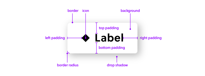
Designers and engineers can modify several button properties:
- Background – The background of a button refers to the color or image that fills the area behind the button’s content. It’s essential for providing visual contrast and emphasis, helping the button stand out against the surrounding interface elements.
- Label – The label of a button is the text or symbol displayed on its surface, conveying the action or function associated with the button. A clear and concise label ensures users understand the purpose of the button and encourages interaction.
- Icon – An icon is a graphical symbol or representation often used alongside or instead of text in a button. Icons can enhance visual communication, particularly for actions with universally recognized symbols, and contribute to a clean and minimalist design.
- Padding – Padding refers to the space between the content of a button (such as text or icon) and its edges. Adequate padding ensures that the button’s content is visually separated from its border, improving readability and touchability on both desktop and mobile devices.
- Margin – Margin is the space around the outside of a button, separating it from neighboring elements. Proper margin helps maintain visual balance and prevents overcrowding, allowing users to interact with buttons without accidental touches or clicks.
- Border – The border of a button is the visible line or stroke that outlines its shape. Borders can be solid or dashed, and they contribute to the button’s visual appearance and hierarchy within the interface.
- Border radius – Border radius refers to the curvature of the button’s corners. Applying a border radius creates rounded corners, softening the button’s appearance and adding a touch of visual elegance to the design.
- Drop shadow – A drop shadow is a visual effect that creates the illusion of depth by adding a shadow beneath the button. This effect helps lift the button from the background, making it appear more prominent and tactile. Drop shadows can enhance the overall aesthetics and usability of a button in UI design.
What are typical button UI states?
Designers use states to provide context and communicate with users. There are six types of button states. We explain them briefly here, but if you want to read about them at length, we have a dedicated article about button states.
- Default: How a button looks without any state. A default button could be contained, outlined, or flat, depending on your UI design and design system
- Active: Tells the user they have pressed the button
- Hover: Activated when a mouse cursor hovers over a button. Hover tells the user this is a clickable element
- Focus: Used to indicate selection when using the keyboard or assistive technologies
- Disabled: Indicates the user can’t click the button until completing another task
- Loading: Communicates the system is processing the user’s action
What are the best practices for designing button UI?
Designers must follow certain principles for designing buttons and user interfaces. Use these button design best practices to guide your next project.
Button Hierarchy and Placement
Designers must consider button hierarchy and placement to provide users with clarity and highlight the most important action. Google’s Material Design recommends designers must create emphasis through color:
- High emphasis (Primary): Use a bright color, preferably a contained button, to show this button is most important. Avoid using more than one high-emphasis button on a single screen.
- Medium emphasis (Secondary): Use a lighter shade of your high-emphasis color to signify this button is less important.
- Low emphasis (Tertiary): Use a text button or outlined button with a transparent background to show users its low importance.
By applying button hierarchy principles, users can complete important actions without much thought. If you use a single button for every action, users will have to examine each to determine which one they must press.
Correct button placement is also essential to guide users through a digital product. If you place two buttons side-by-side, always use a contained button as the primary action and outlined or text button for the secondary action.
For example, if you have “Save” and “Cancel” at the bottom of a form, “Save” would be the primary action with the higher emphasis.
Button Consistency
Designers must use buttons consistently throughout a digital product. If you use a contained button for a primary action on one screen, repeat this choice throughout.
Designers must also be consistent with button sizes, fonts, icons, colors, border radius, whitespace, and other properties to create a familiar user experience that’s easy to navigate.
Button Sizing & Spacing
Size matters when it comes to buttons, especially on mobile applications where users use their fingers. Designers must use appropriate button size and spacing to ensure users don’t accidentally hit another element.
Designer Taras Bakusevych recommends making UI elements a minimum of 48×48 pixels to avoid touch target errors.
Button Labels
Labels should be as short and meaningful as possible. Designers must also keep labels on a single line for legibility.
Button text language is also critical for conveying the correct message and action to users. For example, if you’re removing a song from a playlist, the correct phrasing would be “Remove” instead of “Delete.” Delete might confuse the user into thinking they’re deleting the song from their device or application.
Capitalization is also a critical factor designers must consider. Google Material Design recommends using uppercase for languages that allow it, while UX Movement says to use sentence-style capitalization.
The argument for sentence-style capitalization is better for users with reading disabilities like dyslexia. Google reasons that uppercase “is to distinguish the text label from surrounding text.”
The best option is to test your product with users. Color, contrast, size, UI layout, and many factors impact legibility, so there is no one-size-fits-all for capitalization.
Button Accessibility
Accessibility is a critical factor in modern UX design and product development. Designers must test UIs using tools and diverse usability participants to ensure buttons and other UI elements meet accessibility standards.
The color contrast between the label and background is one of the biggest considerations for button accessibility. With UXPin’s built-in accessibility features, designers can test color blindness and contrast on the fly–keeping them focused in UXPin rather than turning to external tools.
Label size, spacing, and padding can also impact accessibility. These properties are harder to test using tools, so designers must use usability testing to get meaningful results.
Devices & Screen Sizes
Recognizing how buttons look across different devices and screen sizes is crucial for designers. For example, dialog boxes look completely different on Apple devices compared to Android. The floating action button also looks different on iOS vs. Android.
Designers also need to consider how buttons will appear across multiple screen widths. For example, a button with a long label might not look the same on mobile vs. desktop.
Designing Buttons in UXPin
Designing buttons using an image-based design tool can be challenging. The static nature of image-based tools means buttons lack interactivity, functionality, and fidelity.
With UXPin’s code-based design tool, designers can create authentic user experiences with components that look and function like code. Here are some of UXPin’s advanced features to enhance your button design.
Components
Designers can build buttons from scratch and save them as Components to reuse throughout the design. Designers can also share these components through a shared design system to maintain consistency throughout the team.
States
UXPin States allow designers to create multiple states for a single UI component, like a button. For example, you can design the six-button states mentioned above, each with different properties that change according to user and system actions.
Designers can also use UXPin’s States for other components like carousels, dropdown navigation, accordions, and more.
Interactions
Create code-like interactivity using UXPin’s Interactions. Designers can choose from an extensive list of triggers and actions for desktop and mobile interactions.
UXPin takes interactivity one step further with Conditional Interactions, allowing you to create dynamic, unique experiences based on user and system actions.
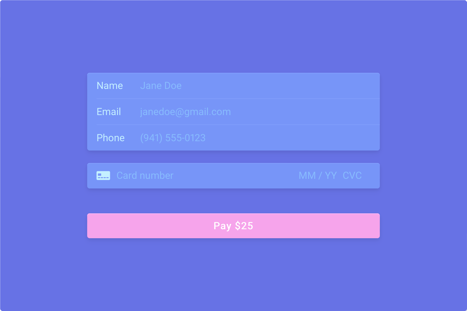
Variables & Expressions
With Variables and Expressions, designers can build high-fidelity prototypes with interactivity mirroring code.
For example, using UXPin Variables, designers can create a dynamic pay button that displays a variable total from a shopping cart, “Pay $25.” With dynamic content generation, you can even personalize buttons and calls-to-action in ways that engage users at scale.
You can also use Variables to create a personalized user experience during testing, like a welcome message with the name from user input or populating a profile page.
With Expressions, designers can validate form fields, like emails and passwords, and even disable a button until the user completes a form’s required fields.
With UXPin’s advanced prototyping features, the possibilities are endless. Designers can design prototypes that look and function like code, saving countless hours developing an identical prototype simply for testing purposes.
Sign up for a free trial and start building your first UXPin prototype immediately. Install one of UXPin’s free example apps to see how to create working buttons and other UI components.


