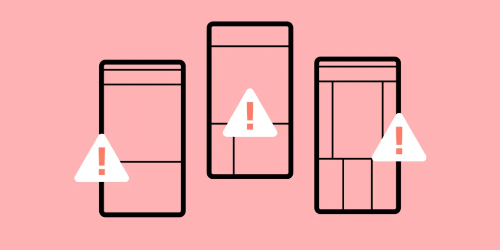
Bad App Design – What Mistakes Should You Avoid in a New App Design?
Irrespective whether you’re creating android or iOS app design there are a number of mistakes which you should avoid at all costs if you don’t want to design a bad UI. Among others, these are:
- Including too many features which clutter the design
- Ignoring updates
- Skipping MVPs
- Having a poor Information Architecture.
Table of contents
- 9 new app design mistakes worth avoiding
- #1 Overdoing it with features
- #2 Poor Information Architecture (IA)
- #3 Not paying attention to updates
- #4 Not displaying key information in a quick and prominent manner
- #5 User testing with a low range of personas
- #6 Not launching an MVP version of your mobile app
- #7 Ignoring preferences of current users
- #8 Not including CTAs that would encourage users to share data
- #9 Using hamburger menus
- Use UXPin for Good App Design
Did you know that there are about 2.8 million apps on the Google Play store and another 1.96 million on Apple App Store? This means that we don’t have to grind our teeth and tolerate bad app design. For anything we need, we can simply turn to one of the tens, if not hundreds of competing mobile apps.
So, the million-dollar question is – how to avoid user dropout in your app product design? Among others, it’s essential to spot and avoid the most common mistakes in iOS and Android app designs.
Most product design teams build a prototype to test their app design idea and avoid mistakes. If you want to design a prototype, try UXPin, it’s a design tool that allows you to build highly interactive prototypes that are ready for tests. Try UXPin for free.
9 new app design mistakes worth avoiding
Here are a few mistakes that you should avoid while creating android app designs and iOS app designs.
#1 Overdoing it with features
Josh Wright Title, CEO of CellPhoneDeal Website
A big mistake that a lot of people make when designing a mobile app is incorporating too many features into the app straight off the bat. While you may want your app to cover a wide range of tasks, including too many features might end up taking away from the app’s core purpose.
In the first place, cover the core purpose, and only when the app becomes more popular and people become used to using it should you start to integrate new features slowly. This will avoid confusion, and it will allow your users to adjust to your user interface as the app evolves.
With that being said, you still need to know when to stop. If you bring in too many features, your app might end up with an information overload, that is your app becoming too cluttered and confusing, despite bringing in the features gradually.
#2 Poor Information Architecture (IA)
DaBina Donley, Digital Marketing Lead at Techna Digital

Poor information architecture results in bad app design as the layout and structure of your app’s information aren’t easy to understand or use. As a result, users will be confused about navigating your app and will likely end up abandoning it.
Common problems with poor IA in mobile apps include:
- Having too many screens or pages, which can be overwhelming for users and make it challenging to find the information they need
- Not using clear and concise labels for buttons and other interface elements.
- Having navigation that is not intuitive or easy to use
- Using complex or unfamiliar terms instead of plain language
- Placing important information in unexpected or hard-to-reach places
It is essential to consider your users’ needs and ensure that your app’s ease of use. By following some basic principles of good UX, you can help make your app more successful among your target audience.
#3 Not paying attention to updates
Laura Jimenez, Owner at Ishine365

The mobile app development process does not end with its launch. It begins there. So, regular app updates are critical for attracting new users and retaining the existing ones. Although it’s not related to your design process, be sure to gather user feedback once you release the app and try to implement new functionalities.
You can do this by keeping a check on reviews. It will help you get a clear view of the shortcomings and make app improvements as and when needed.
#4 Not displaying key information in a quick and prominent manner
Sally Stevens, Marketing Manager & Co-Founder of FastPeopleSearch.io

An app’s first appearance and appeal are crucial in enticing a target audience. The first time they use the app, a user forms an opinion about its user interface and functionality. A user may not give an app a second chance if it appears to be complicated or boring, i.e., offers bad UX design and poor user interface design.
The importance of displaying useful information on the initial screen cannot be overstated. All relevant icons, such as login, logout, home page, search bar, contact information, and any other key features, should be on the initial screen.
On top of the above, the loading speed of the app should also be taken into account as a key aspect. Hence, the need for designing light-weight experiences – otherwise, users become bored and lose interest if it takes too long to start the app or load any critical feature. Finally, an app’s color palette should correspond to its function.
An app for professional usage, for example, should not have a quirky colour scheme, while leisure applications should not be dreary or monotonous. Users may become bored and have a bad first experience if the colors aren’t vibrant and solid.
#5 User testing with a low range of personas
David Stellini, Co-Founder at All Front

User testing allows you to gather insights about usability, functionality, speed performance, and user experience by letting real people test out your mobile app.
It’s important to test across different types of users – from different gender, ages, and background as they might have different reasons for using your product displaying different behavior patterns.
This way, you can get an idea of the diversity in your users and identify unique behavior or what can be generalized to improve your design. So the takeaway here is to do user research prior to UX design! That’s not all, though.
Test your design with every user set. Show them different design examples, do other types of user testing, and check if you really have the right answer to a problem AKA good design.
If you test with just one user type, you risk being misled by actions that might be accidental or in a spur of the moment. This can lead to bad app design, and – as a result – low conversion rates and usability issues further down the line. It can be significantly more expensive to fix these once your mobile app has launched rather than performing user testing on multiple personas beforehand.
#6 Not launching an MVP version of your mobile app
Daving Stellini of All Front brings up another common mistake among app creators – launching a full-blown app based on assumptions, instead of going with a minimum viable product. With a no-code platform like Adalo, you can quickly build and test your MVP without requiring extensive development resources.
The idea behind an MVP is to identify one critical problem your users have and how you are going to solve it. This way you can focus on your main value proposition and prioritize core features that your users need the most. Instead, businesses add too many non-critical functionalities to impress stakeholders.
The result is a clustered design that can overwhelm visitors and lead to poor user experience. You also create more work for your developers which can result in slow development and delayed launch. All of this can have a negative impact on your business including discouraging people from using your mobile app, low perceived value and low-profit margins.
#7 Ignoring preferences of current users
Pavel Tahil, Senior UX Designer at EPAM Systems

I had a chance to work on iOS and android app designs for one of the popular airlines. Our company had an extensive website with more than 3000 pages and an old iOS app.
Our job was to build new iOS and android apps that would keep the website functionality, including booking, offers, travel documents, and many other pages. My team and I designed apps from scratch. All the decisions were based on our deep research, interviews with users, and business. We knew all the customers’ problems, and new apps worked perfectly for new users.
When we analyzed the stats, we found out that new users had a better conversion rate than users who already had an account. So all user testing and interviews were based on the behaviors of new users. And we didn’t focus on the current web audience.
The problem was that existing users already had preferences and behaviors that didn’t match the new app structure. That’s why we had many drop-offs and found later users closed an app to continue the flow on the web.
The problem was solved by educational screens and tips for existing users. Also, the structure and IA of the web were updated later based on the mobile experience.
#8 Not including CTAs that would encourage users to share data
Ashley Regan-Scherf, Content Marketing Executive at RGC Advertising

Two of the most important key performance indicators (KPIs) for mobile apps are user downloads and logins. One of the most common mistakes web designers experience is not including enticing enough calls to actions or content to ensure their users hand over personal details, create logins, and interact further with the app.
However, it’s one thing to encourage app users to register, but it’s quite another to make them do so without annoying them enough that they delete the app. For example, some people are cautious of apps that collect too much data, so it’s a good idea to make it optional for users to sign up or register to use your app.
To avoid this common mobile app design mistake, UX design team should offer a good user experience to entice customers to sign up for the app without expecting anything in return. This could mean exploring products before urging them to subscribe, for example, if you’re developing a mobile application.
#9 Using hamburger menus
Ryan Vice, Co-founder and CEO of Vice Software

In iOS and android app designs, avoid hamburger menus unless you have a really compelling reason to use them. All too often, we see these menus being used when in all honesty, they shouldn’t be. Hamburger menus are the very design elements that hide features, reducing their value, and they are hard to reach with one hand when located in the top left corner.
There are many alternatives you can use instead, but we favor having core features visible to users as much as possible to improve user engagement and only reverting to a hamburger for secondary features if the app is complex.
Use UXPin for Good App Design
Want to avoid costly design mistakes? UXPin lets you design prototypes that behave like the final product. This way, you can test the real user experience and observe how your users interact with an app, not what they think they would click on, choose or go to. Start UXPin free trial.

