Creating user interfaces can be a hassle when designers and developers aren’t aligned, causing delays, inconsistencies, and endless revisions. But combining GPT-5 Mini, Bootstrap, and UXPin Merge offers a streamlined solution. Here’s how it works:
- GPT-5 Mini generates Bootstrap-compatible code instantly from your design ideas, cutting down early-stage development time.
- Bootstrap provides a responsive, mobile-first framework with pre-built components for consistent design.
- UXPin Merge connects design and code by letting teams prototype with real, production-ready components, eliminating mismatches.
Key Benefits:
- Faster iterations: AI-generated layouts and direct prototyping save time.
- Consistency: Designers and developers work with the same components.
- Simplified handoffs: Prototypes align perfectly with the final product.
This workflow is ideal for teams building responsive, enterprise-grade web products. By integrating these tools, you can create, test, and deploy UIs more efficiently while avoiding common design-development bottlenecks.
Want to try it? Start by setting up Bootstrap, leveraging GPT-5 Mini for layout ideas, and connecting everything in UXPin Merge. This guide walks you through every step.
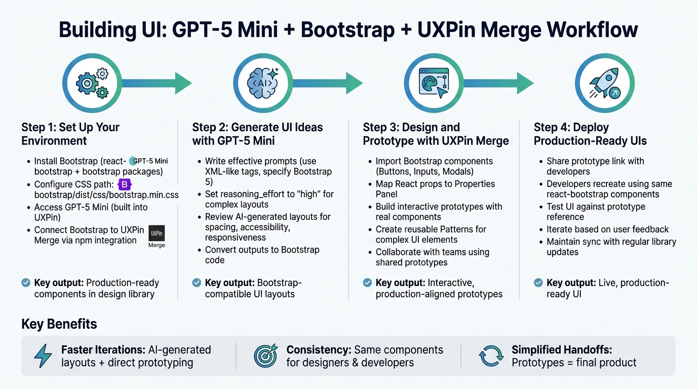
4-Step Workflow for Building UI with GPT-5 Mini, Bootstrap, and UXPin Merge
UXPin Merge AI: Smarter UI Generation That Follows Your Design System
sbb-itb-f6354c6
Step 1: Set Up Your Environment
To kick things off, you’ll need to integrate three essential tools: Bootstrap for your UI framework, GPT-5 Mini for AI-assisted code generation, and UXPin Merge to seamlessly connect design and code.
Install Bootstrap and Configure Your Project
For a smooth Bootstrap integration, you’ll need to install two npm packages: react-bootstrap and bootstrap. These packages ensure your components are interactive and styled correctly. The key step here is linking to Bootstrap’s CSS file: bootstrap/dist/css/bootstrap.min.css. This ensures consistent rendering of styles across your project.
If npm is your tool of choice, install the packages directly in your project directory. Alternatively, for quick prototyping, you can use Bootstrap’s CDN by adding its CSS and JavaScript links to your HTML file. However, the npm approach offers better version control and works seamlessly with UXPin Merge.
With Bootstrap installed and configured, you’re ready to leverage GPT-5 Mini for fast and efficient UI design.
Get Started with GPT-5 Mini
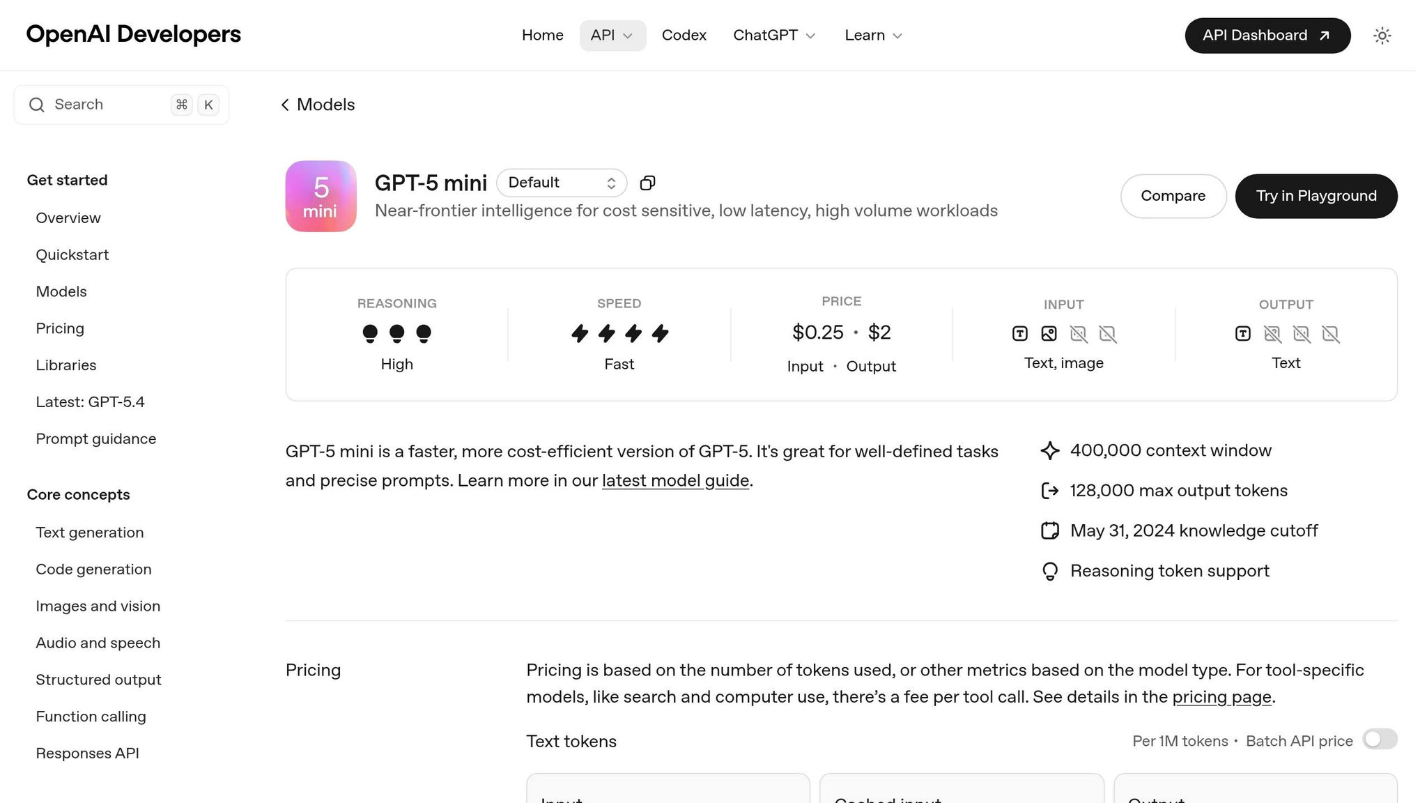
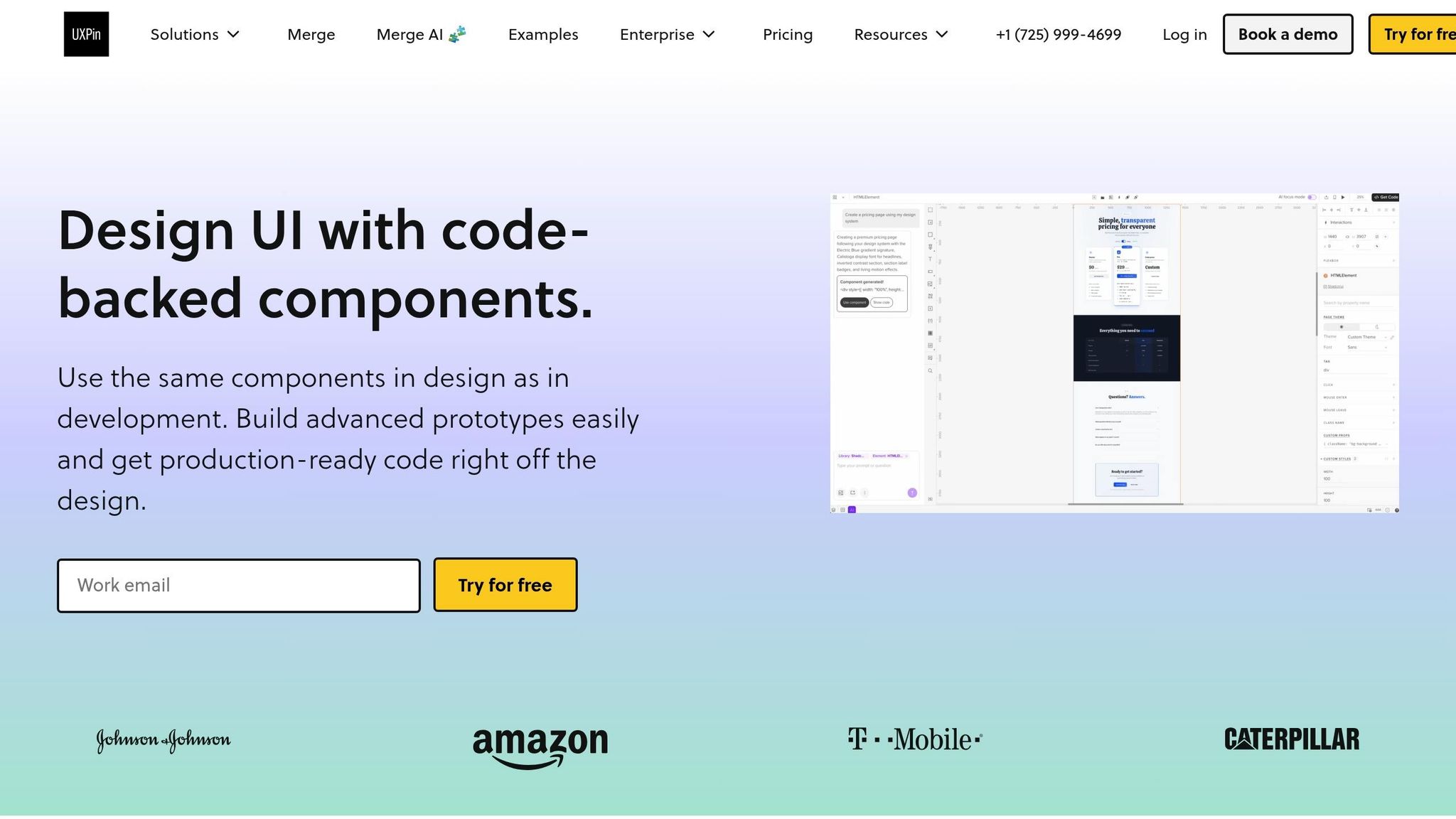
GPT-5 Mini speeds up UI creation by turning your design requirements into structured Bootstrap code. It’s accessible directly within the UXPin canvas, generating ready-to-use code for common UI elements like navigation bars, forms, and card grids.
If you’re already using UXPin, GPT-5 Mini is built right into the platform. There’s no need for a separate ChatGPT subscription or API setup. The AI operates within your design system’s constraints, ensuring that all suggestions are aligned with your pre-approved components and ready for development.
Once you’ve explored GPT-5 Mini, the next step is to connect Bootstrap to UXPin Merge for a unified design and development workflow.
Connect Bootstrap to UXPin Merge
To align your design components with production code, you’ll need to import Bootstrap components into UXPin Merge. This is done using npm integration, which allows you to pull components directly into your design library.
Start by creating a new project in the UXPin dashboard. Select "Design with Merge components", and then choose "Import React Components with npm integration." During setup, configure the following:
- Primary Package:
react-bootstrap - Dependency Package:
bootstrap - CSS Path:
bootstrap/dist/css/bootstrap.min.css - Integration Method: npm integration
Use the Merge Component Manager to import individual components, ensuring you follow the naming conventions from the React Bootstrap documentation. Map properties like button labels to the appropriate control types. Once you’ve configured everything, click "Publish Changes" in the Component Manager. Then, refresh your library in the UXPin editor to see your imported components ready for use.
| Configuration Item | Value |
|---|---|
| Primary Package | react-bootstrap |
| Dependency Package | bootstrap |
| CSS Path | bootstrap/dist/css/bootstrap.min.css |
| Integration Method | npm integration |
With this setup, your design team can work directly with production-ready components that match your codebase, eliminating the need for extra imports or manual adjustments.
Step 2: Generate UI Ideas with GPT-5 Mini
Now that your environment is set up, you can leverage GPT-5 Mini to create Bootstrap-compatible UI layouts. This tool works directly on your design canvas, turning your requirements into structured code that fits seamlessly with your design system. Once you’ve fine-tuned your prompts and reviewed the outputs, you can move on to prototyping with real components in UXPin Merge.
Writing Effective Prompts for GPT-5 Mini
GPT-5 Mini combines aesthetic awareness with strong implementation capabilities. To get the best results, you’ll need to craft prompts carefully. Use XML-like tags to define your engineering principles and UI standards. For instance, you can include a <ui_ux_best_practices> section in your prompt to outline rules like:
- Using multiples of 4 for spacing (margins and padding).
- Limiting typography to 4–5 font sizes.
- Explicitly specifying "Bootstrap 5" to ensure the latest utility classes and components are used.
For more intricate layouts, such as dashboards or interactive forms, set reasoning_effort to "high" and include a <self_reflection> instruction like:
"First, develop a rubric for a top-tier Bootstrap layout. Use it to assess and refine your output. If it doesn’t meet the criteria, try again."
The key is clarity. GPT-5 Mini adheres closely to your instructions, so vague or conflicting prompts can lead to less effective results.
Once your prompts are well-defined, you can move on to reviewing the AI-generated layouts.
Reviewing and Refining AI-Generated Layouts
After GPT-5 Mini generates a layout, it’s important to evaluate it against your design system’s guidelines and usability standards. While the model typically aligns with pre-approved Bootstrap components, you’ll want to double-check for:
- Spacing consistency: Ensure margins and padding adhere to the multiples of 4 rule.
- Accessibility features: Confirm proper ARIA attributes and color contrast.
- Responsive behavior: Test layouts across various screen sizes using mobile-first responsive design principles.
Use the Canvas preview to test and refine the generated Bootstrap code in real-time. Adjust the verbosity parameter as needed – higher verbosity produces detailed, well-commented HTML with all necessary Bootstrap classes.
Once refined, these layouts are ready to be imported into UXPin Merge for further prototyping.
Converting AI Outputs to Bootstrap Code
If you have design screenshots or sketches, you can prompt GPT-5 Mini to translate them into Bootstrap-ready HTML and CSS. To ensure accuracy, pair a visual reference with a clear text prompt, such as:
"Convert this dashboard design into a responsive Bootstrap 5 layout."
To streamline the process, use helper functions with regular expressions to extract code blocks from the response. A typical pattern might look like this:
```html (.*?) ``` This approach simplifies the transition from AI-generated concepts to live prototypes in UXPin Merge.
| Prompt Element | Purpose for Bootstrap UI | Recommended Practice |
|---|---|---|
<guiding_principles> |
Ensures modularity | Instruct the model to create reusable components for repeated UI patterns. |
<ui_ux_best_practices> |
Maintains visual consistency | Specify multiples of 4 for spacing and a neutral base color with two accent colors. |
reasoning_effort |
Controls depth of logic | Set to "high" for complex layouts or interactive components. |
verbosity |
Manages output detail | Use "high" for complete Bootstrap class implementation and well-commented code. |
Step 3: Design and Prototype with UXPin Merge
After setting up your environment and generating AI-driven layouts, it’s time to integrate them into UXPin Merge. This step ensures your designs align perfectly with development, creating a seamless transition from concept to final product.
Import Bootstrap Components into UXPin Merge
UXPin Merge simplifies the process by directly connecting to Bootstrap components. Through the Merge Component Manager, you can import essential UI elements like Buttons, Inputs, and Modals into your design canvas. While importing, map their React props to the UXPin Properties Panel. For instance, assign "children" for labels, "variant" for styling, and "size" for dimensions. Keep property names consistent with React conventions, and focus only on the properties and variants relevant to your project. This keeps the Properties Panel clean and easy to navigate.
One of the standout features is the instant access to Bootstrap’s built-in interactivity, such as hover states and responsive behavior. This setup ensures your design and development teams work from a shared foundation.
Build Prototypes with Real Components
Once your components are imported, creating interactive prototypes becomes straightforward. Replace placeholders with the actual Merge components and use the Properties Panel to tweak variants, sizes, and states – all without writing a single line of code.
For more complex UI elements, like navigation bars or sign-up forms, UXPin Patterns allow you to combine multiple Merge components into reusable structures. Save specific states, such as "Error", "Success", or "Disabled", to speed up iterations and maintain consistency across all screens.
Collaborate with Teams Using Merge Prototypes
With UXPin Merge, your prototypes are built using the same production-ready components developers will use, minimizing rework. This alignment ensures stakeholders can confidently review designs, knowing the final product will look and function as intended.
User Management settings let you control roles and permissions, making it easy to manage access for reviewers and stakeholders. Additionally, Team Libraries allow you to share components, colors, and text styles across projects, ensuring a unified design language.
For remote teams, collaboration is seamless thanks to cloud-based tools. Plus, built-in accessibility simulators help ensure compliance with WCAG standards, promoting inclusivity in your designs.
Step 4: Deploy Production-Ready UIs
This step is where your UXPin Merge prototypes evolve into live UIs using production-ready Bootstrap components. It’s all about ensuring a smooth transition from design to deployment, streamlining the process for both designers and developers.
Export Code from UXPin Merge
With UXPin Merge, there’s no need for a traditional export step. The platform integrates production-ready components directly into your codebase. Essentially, your prototype acts as a visual specification for developers, ensuring the components, properties, and states align perfectly with the React Bootstrap library.
When developers examine your Merge prototype, they can view the React props you configured in the Properties Panel. This transparency eliminates the guesswork and reduces miscommunication between design and engineering teams.
Integrate Prototypes into Your Development Workflow
Once the code is integrated, the next focus is incorporating these prototypes into your development process.
Share the UXPin Merge prototype link with your developers. Since the prototype relies on components from the react-bootstrap package, developers can recreate the design using the same Properties Panel configurations. They’ll have access to matching component names, prop values, and CSS paths (e.g., bootstrap/dist/css/bootstrap.min.css).
To ensure everything stays in sync, establish a refresh schedule where the team regularly updates the component library in UXPin. Using the "Refresh Library" and "Publish Changes" features helps designers work with up-to-date Bootstrap components, avoiding potential mismatches between design and production.
Test and Iterate on Your Final UI
Once integrated, the focus shifts to testing and refining your UI.
Use your prototype as a reference during quality assurance to confirm component variants, spacing, and interactive states. Since both the prototype and production environments rely on the same Bootstrap components, it’s easier to identify and resolve any inconsistencies.
Gather feedback from real users and make adjustments in UXPin Merge by tweaking component properties or building new Patterns. These updates flow directly back to your developers, ensuring design and development stay aligned throughout the product’s lifecycle.
Conclusion
Bringing together GPT-5 Mini, Bootstrap, and UXPin Merge creates a game-changing approach to UI development for product teams. This workflow combines the strengths of each tool, offering a smoother, more efficient way to design and build user interfaces. GPT-5 Mini kickstarts your process by generating UI concepts and Bootstrap code using natural language prompts. Bootstrap acts as the backbone, providing a standardized, mobile-first framework that bridges AI-generated ideas with production-ready code. Finally, UXPin Merge lets you design directly with production-ready Bootstrap components, eliminating the usual disconnect between design and development.
This approach tackles common pain points – like miscommunication, inconsistent UI execution, and slow handoffs – by ensuring that both designers and developers work from the same set of tools and standards. Using identical Bootstrap components in both prototypes and final products removes unnecessary steps, saving time and reducing errors.
Key Benefits of This Workflow
This workflow offers speed and precision. By starting with AI-generated concepts and moving seamlessly to interactive prototypes and production-ready UIs, teams can cut down on development time while maintaining high standards. UXPin Merge ensures that designers and developers share the same Bootstrap components, creating a unified source of truth.
Consistency gets a major boost thanks to Bootstrap’s established design patterns and your team’s custom configurations. This alignment minimizes misinterpretations and simplifies the transition from design to development.
Collaboration becomes easier when everyone works with real, interactive components rather than static designs. Designers can iterate quickly, knowing their work is grounded in pre-tested elements, while developers can inspect prototypes to confirm exact configurations. This shared workflow reduces friction and sets the stage for smoother digital product development.
Next Steps for Your Team
To get started, try using GPT-5 Mini to generate Bootstrap layouts for a small project or feature. Experiment with the prompts and techniques outlined in this guide to refine the AI-generated outputs. Once you have a solid concept, bring it into UXPin Merge, where you can immediately prototype using native Bootstrap components – no extra setup required.
For teams looking to scale this process across multiple projects, consider UXPin’s Growth or Enterprise plans. These plans include detailed resources for connecting Bootstrap components, configuring Merge, and optimizing your workflow. Begin with a small project, measure your time savings, and expand as your team gains confidence with these tools. This step-by-step adoption ensures a smoother transition and maximizes the benefits of this integrated workflow.
FAQs
Do I need coding skills to use GPT-5 Mini in UXPin?
No, you don’t need any coding skills to work with GPT-5 Mini in UXPin. With just simple text prompts or images, you can create UI components and layouts effortlessly. Once generated, these elements can be seamlessly integrated into your prototypes – no manual coding required. This setup streamlines the design-to-development workflow, making it easy for anyone to use, regardless of technical background.
How do I keep my React Bootstrap components in sync with UXPin Merge?
To align your React Bootstrap components with UXPin Merge, start by enabling the Bootstrap library in the Design Systems panel. This step ensures your prototypes stay consistent with the production code. You can customize components using predefined properties such as variant, size, and disabled, or apply your own styles for a tailored look. Keep your component library updated and use the same Bootstrap components for both prototyping and development to maintain harmony across your workflow.
What should I check before shipping an AI-generated Bootstrap UI?
Before finalizing an AI-generated Bootstrap UI for release, take these essential steps to ensure it’s ready:
- Check design consistency: Make sure the components match your design system or align with your brand guidelines.
- Test responsiveness: Use Bootstrap’s grid system to confirm the UI adapts well across various devices and screen sizes.
- Review code quality: Inspect the exported code to ensure it’s clean, efficient, and integrates seamlessly into your project.
These checks are crucial for delivering a functional and professional-looking UI.

