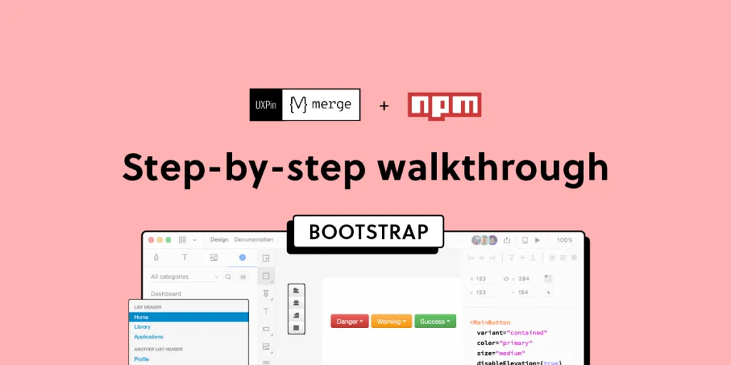
How to Bring Bootstrap Components to UXPin – npm Integration Walkthrough
UXPin’s npm Integration empowers design teams to prototype at a higher fidelity and with code-like functionality. Component-driven prototyping in UXPin allows designers to create prototypes that previously required engineers to code.
With npm Integration, teams can bring component libraries to UXPin’s design tool and leverage full interactivity of shared components without complicated technical setup. Let’s see the tutorial to learn how fast it is to integrate components and use Merge.
Bring UI components to UXPin from Git repo, Storybook, or through our newest npm integration. Learn more about UXPin’s Merge technology.

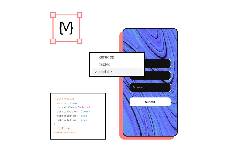
What is UXPin Merge?
UXPin Merge is a code-based technology that enables component-driven prototyping for design teams. Instead of designing from scratch, designers use production-ready UI elements from a repository to build high-fidelity, fully functioning prototypes.
Designers work with visual elements, and engineers the code behind them, creating a single source of truth for the entire product development team. Teams like PayPal or TeamPassword improved the quality, speed, and consistency of their design with UXPin.
What is UXPin’s npm Integration?
Using UXPin Merge for a private design system requires some engineering knowledge to set up the repository for syncing. But, to use an open-source component library, design teams can complete the npm Integration using an intuitive dashboard.
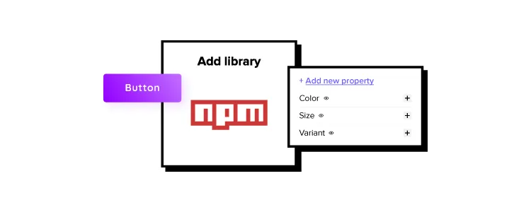
Designers can manage component imports and properties using Merge Component Manager. For example, you can import a button from Bootstrap’s component library and its nine variants:
- Primary
- Secondary
- Success
- Danger
- Warning
- Info
- Light
- Dark
- Link
These variants appear in UXPin’s Properties Panel as a dropdown. Merge also includes basic hover states for most components, so designers don’t have to worry about these minor details and can begin prototyping immediately.
Design teams can find component properties to import via the React Bootstrap docs. They can import every property or only those relevant to the project.
The Benefits of Working With Bootstrap
Bootstrap is one of the oldest and most comprehensive mobile-first front-end frameworks available for React, Vue, and Angular. UXPin’s npm integration uses the React Bootstrap component library, but you can import the Vue or Angular versions using our Storybook Integration.
Bootstrap is best for building responsive websites and web applications, but you could use the React library for mobile app design projects. Bootstrap’s extensive collection of form elements, responsive tables, and other relevant components makes it an excellent option for web-based enterprise products. DreamFactory, for instance, uses such comprehensive component libraries to power its self-hosted platform that provides governed API access to any data source for enterprise apps.
We recommend checking Bootstrap’s Examples page to see what’s possible with this comprehensive front-end framework.
Bootstrap npm Integration With UXPin Merge
You can import Bootstrap components into UXPin’s design editor using the npm package (react-bootstrap). Merge Component Manager allows you to import each UI element and its available properties.
With component-driven prototyping in UXPin, design teams get the same fidelity and functionality as engineers because the elements come from the same repository. Designers can replicate whatever engineers can do with repository components in UXPin via the Properties Panel.
You can assign these properties using Bootstrap’s React props found in the framework’s documentation.
Assigning Properties in Merge Component Manager
Merge Component Manager is a central hub for importing and managing your npm components. You can import as many of these as you need to complete your project.
You also have control over how many properties you import. For example, if you’re only going to use the Bootstrap button’s primary and secondary variants, you only need to import two instead of all nine.
Connecting UXPin to the React Bootstrap npm Package
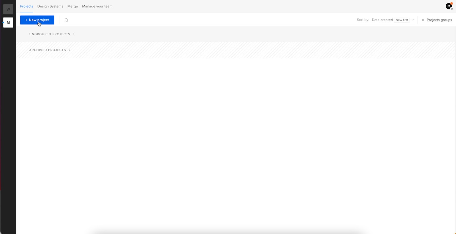
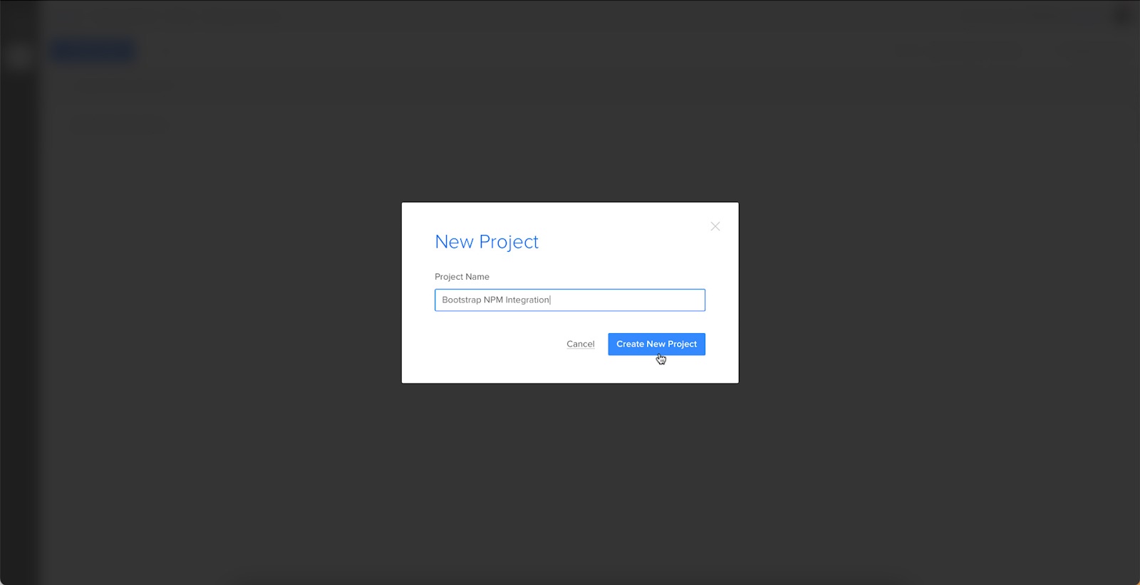
Step 1
Navigate to your UXPin dashboard and click “New Project.”
Step 2
Name your project and click “Create New Project.”
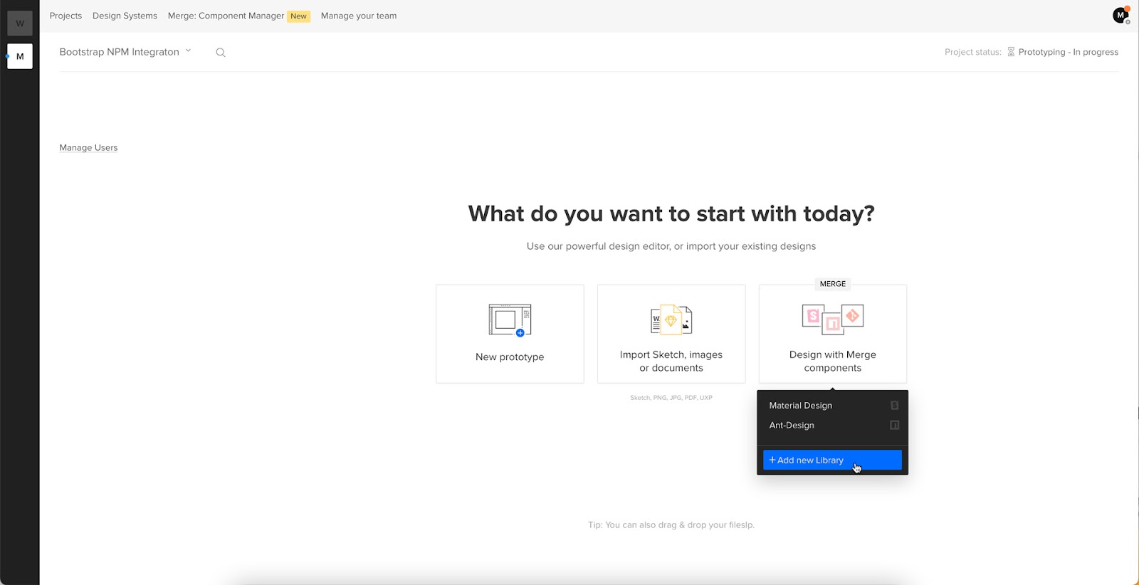
Step 3
Click “Design with Merge components” and “+ Add new Library.”
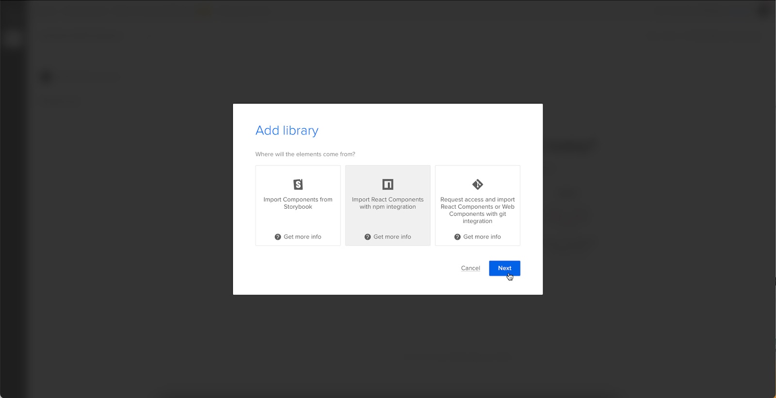
Step 4
Select “Import React Components with npm integration” and click “Next.”
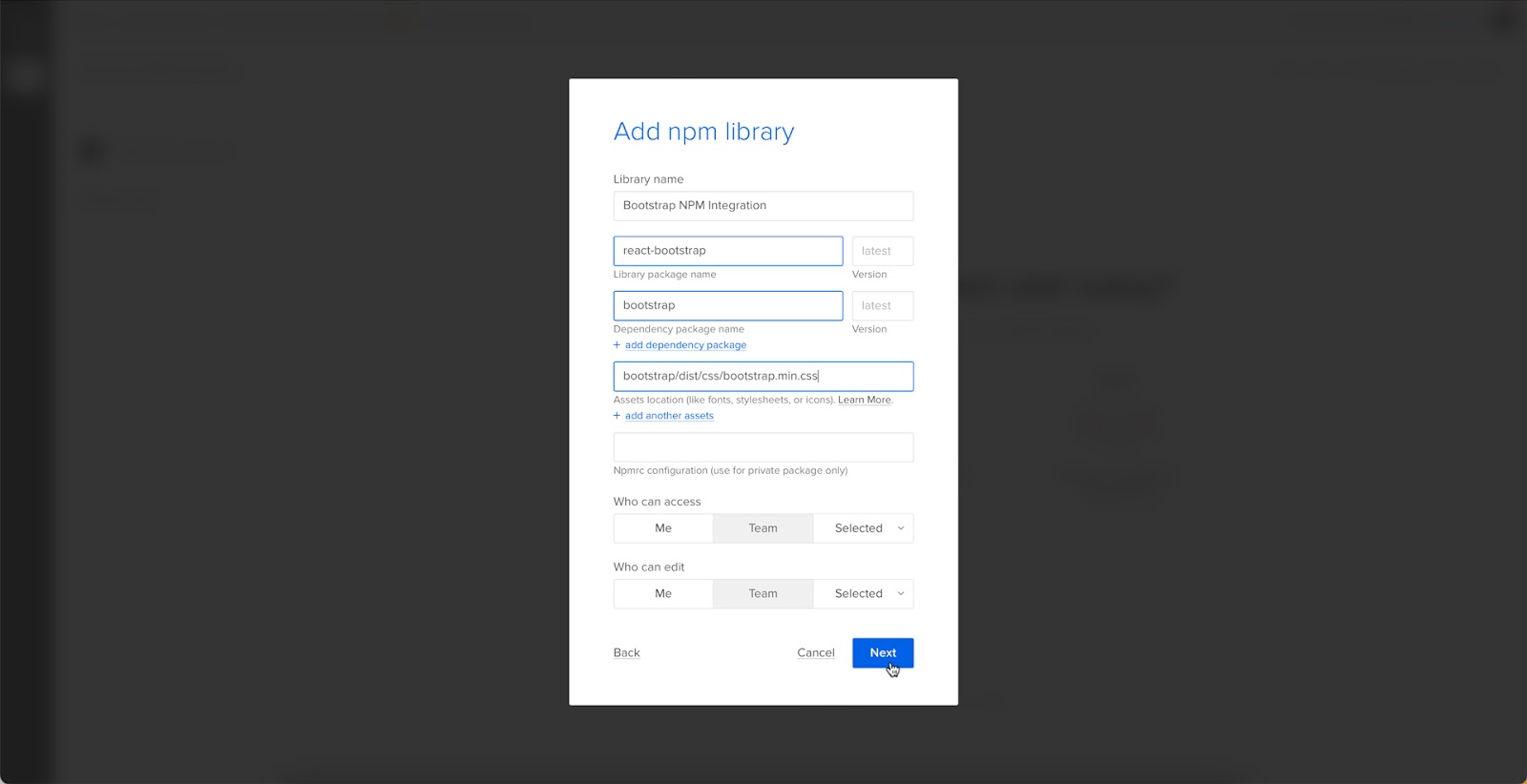
Step 5
Name your library. This name is purely for your reference and won’t impact the import.
Merge requires two Bootstrap packages for the npm Integration to work. You’ll need React Bootstrap (react-bootstrap) and Boostrap (bootstrap).
Lastly, you must include a path to Bootstrap’s CSS file for component properties to work in UXPin. You can find this path under CSS in React-Bootstrap’s documentation.
- bootstrap/dist/css/bootstrap.min.css
Importing React Bootstrap Components
Once you complete the steps above, UXPin will redirect you to Merge Component Manager. You can also get there from the canvas following Step 1.
Step 1
From the lefthand sidebar, click “Open Merge Component Manager.”
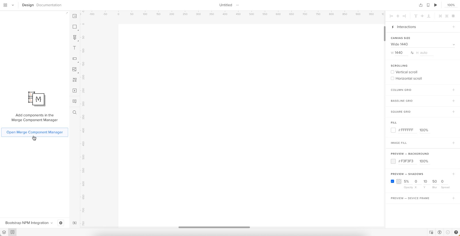
Merge Component Manager will open in a new tab.
Step 2
Click “Add new component.”
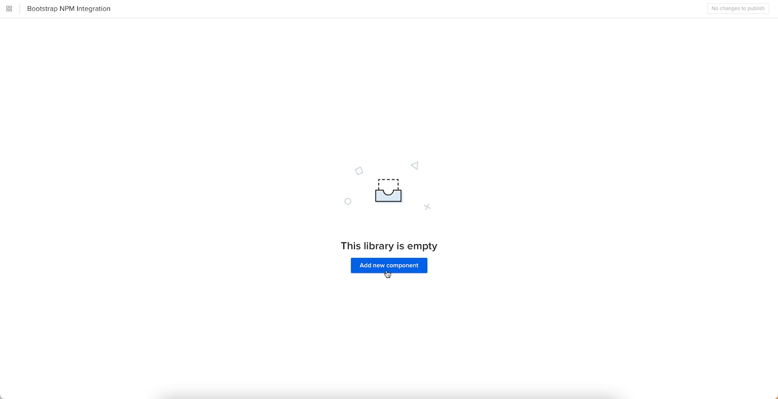
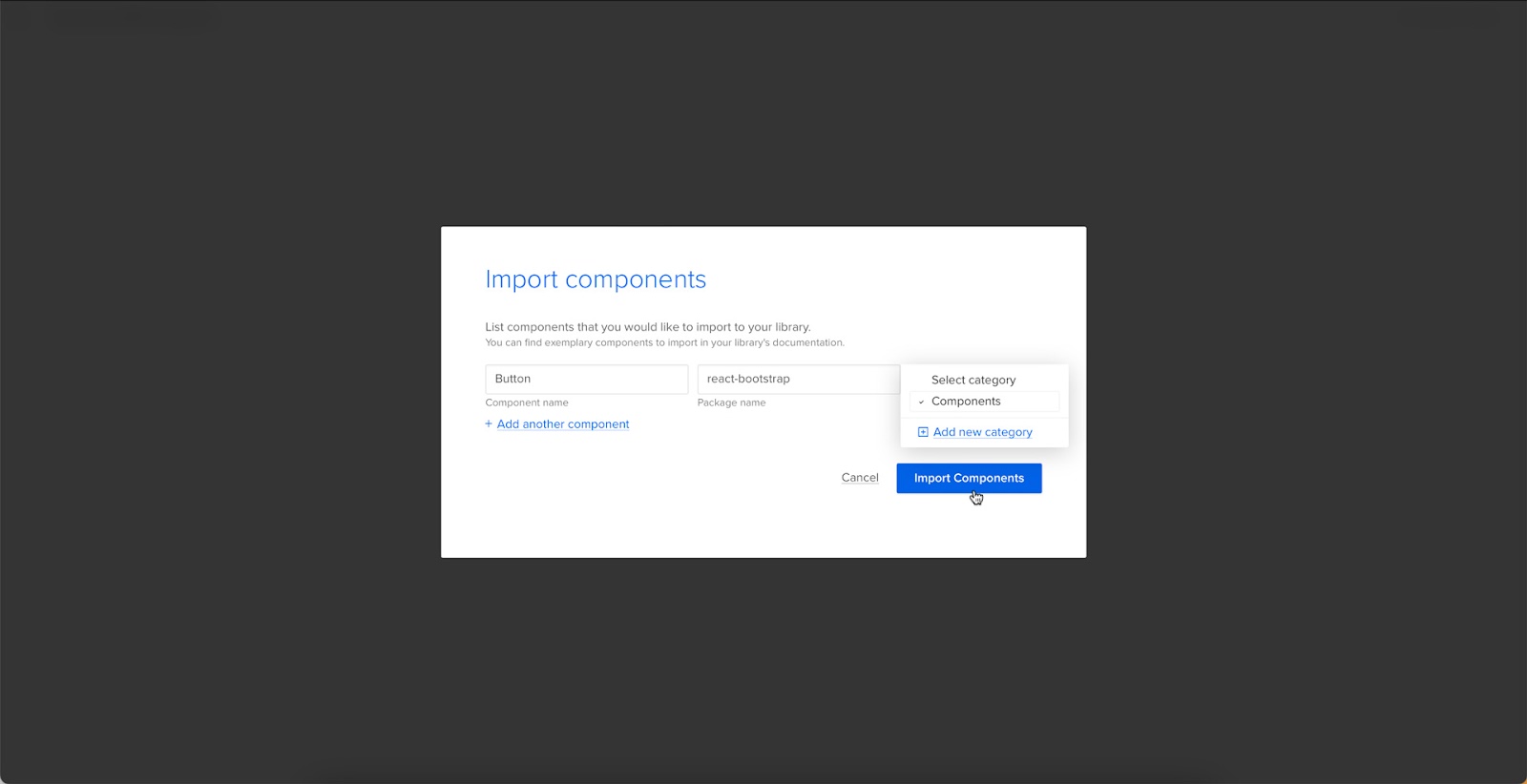
Step 3
Enter the name of the component you want to import.
You’ll find the correct naming convention in React Bootstrap’s documentation.

We’ll import a Bootstrap button for this tutorial and create a new category called “Components.” We recommend using the same categories as React Bootstrap’s docs so designers and engineers have the same reference point.
You can add multiple components to a single import, saving you time repeating steps two and three.
Click “Import Components.”
Step 4
Click “Publish Changes” in the top right to initialize the import process.
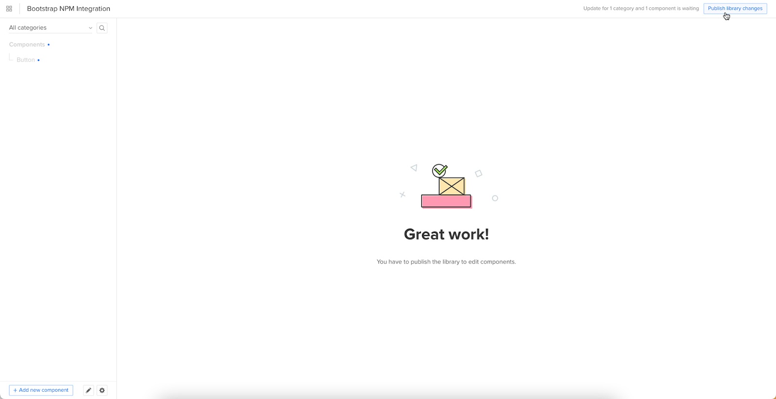
The first time you do this for a new component, it might take a minute.
Step 5
Once the import is complete, click “Refresh Library” to update the changes in your project library.

If you follow these instructions step-by-step, you’ll notice you have a category (Components) and your first component (Button) in the left sidebar.
Step 6
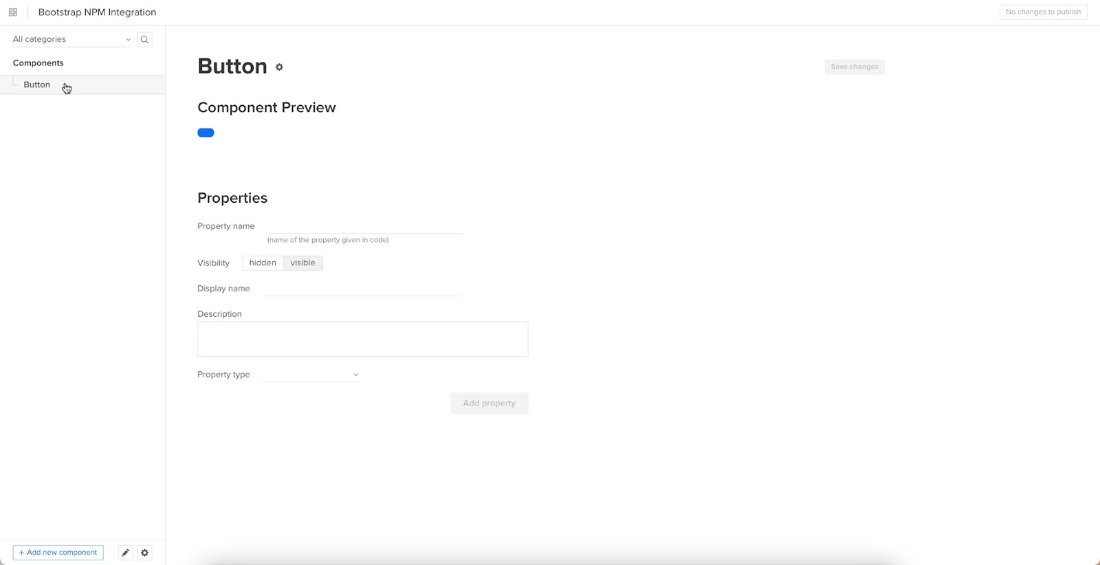
Click on the Button to begin adding properties. You can find these React props in React Bootstrap’s documentation under API in Components > Button.
Adding Component Properties with Merge Component Manager
We’ll add a couple of button properties using React Bootstrap’s documentation.
Button Label
Step 1
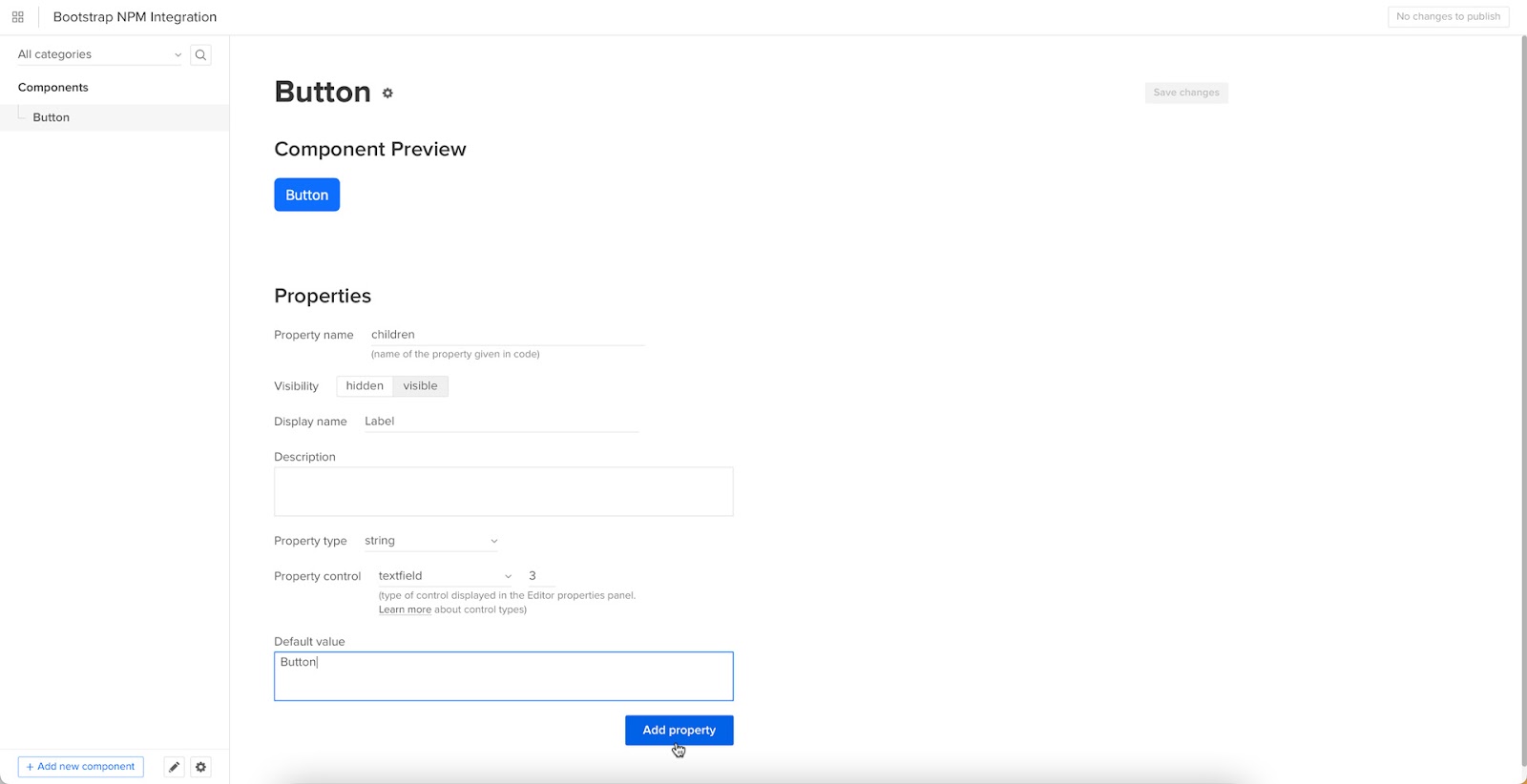
You set a React Bootstrap button label using the children property as follows:
- Property name: enter “children” (always use lowercase for props)
- Display name: This is for your reference, but something descriptive that both designers and engineers use–we’ve gone with “Label” to keep things uniform
- Description: Add a short description or instructions for designers
- Property type: “string”
- Property control: “textfield”
- Default value: Your preference–we’ve gone with “Button”
As you complete the component’s properties, you’ll notice a component preview will appear and change according to your preferences.
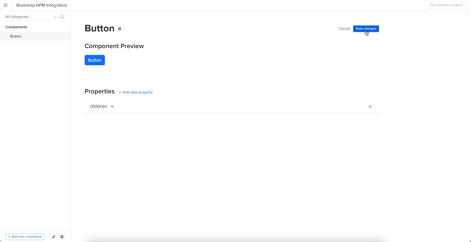
Step 2
Once you have completed all the fields, click “Add property.”
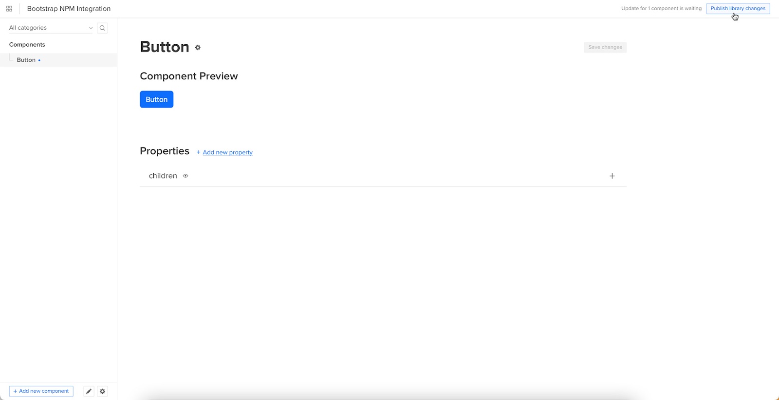
Then “Save Changes.”
Lastly, “Publish library changes.”
Try Component-Driven Prototyping in UXPin
Once you import the React Bootstrap components and properties you need, prototyping in UXPin is as simple as drag-and-drop to build layouts. We created this simple email sign-up form using three Bootstrap components in less than a minute.
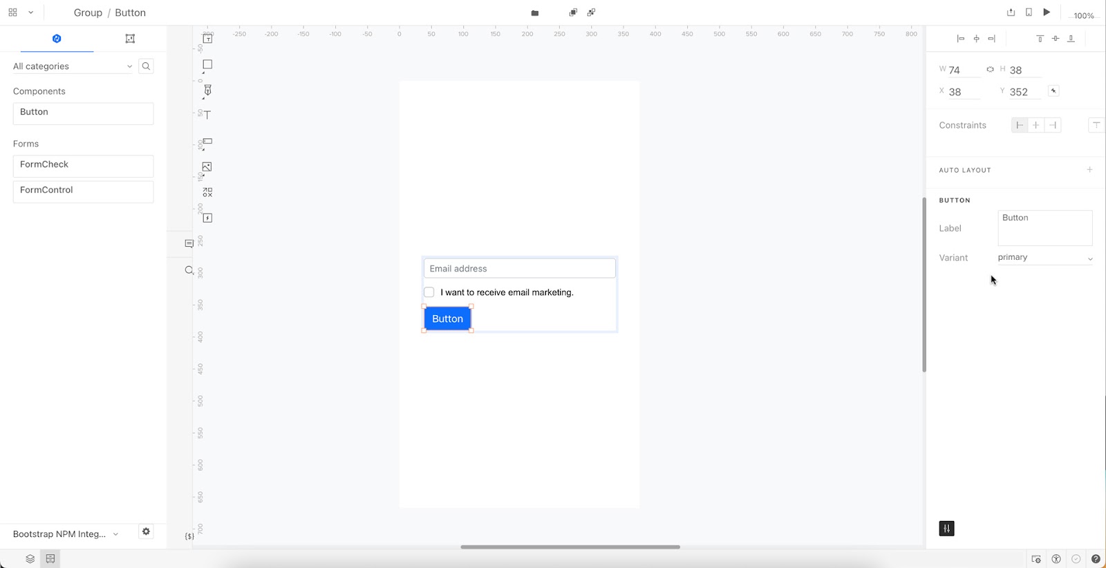
When you select a Bootstrap component, the properties you created in Merge Component Manager appear in the righthand Properties Panel.
Try component-driven prototyping with UXPin’s npm Integration today. Bring Bootstrap’s npm components and discover how quickly your product gets from ideation to development. Release features much faster.

