Common Mistakes In UI Design And How Graphic Designers Can Avoid Them
User interface design has a lot to do with the ‘outside’ of design, the visual aspects that the audience see. Whether it be an app or a website, the placement of elements and features of each design can make or break it.
It is important to ensure that the meaning of the design is fully conveyed. Like with any design that we see daily, such as street signs or even those in the supermarkets, if the design doesn’t provide complete clarity, then the audience can quickly become confused. Within this blog, we will be looking at what the user interface is, but also the most common mistakes in UI design and how you too can avoid making these mistakes.
What Is User Interface Design?
User interface (UI) design is the process of using graphic workstations to create layers of interfaces in software or applications, with the designer focussing fully on looks and style. In order for a user interface designer to be successful, they must always create with three key criteria in mind. These guidelines ensure that the designs are engaging, attractive and create an emotional response from the user, helping to minimise the amount of common mistakes in UI design made by the designer.
Being able to uphold these audience desires can be rather difficult for a UI designer. With users being extremely judgemental and somewhat impatient with the interfaces they are using. To put it into perspective, it has been researched and concluded that:
- 94% of device users will shut down and stop using a website if their web design is not up to scratch
- 38% of users will avoid a website if their content or layout is unattractive
- 47% of users will expect a web page to load in less than 2 seconds, and will not use the site if it fails to do so
With very high expectations, the job of a graphic designer is not for the faint hearted and requires being taken seriously at all times. In order to succeed, every design must be different, innovative and always to a high quality to avoid those clear and ruthless website killers. Otherwise, your work will quickly become unused, and building a brand name will become impossible.
Because of this, below are some of the top common mistakes in UI design that an user interface designers will make throughout their careers, and how they can best be avoided.
Unresponsive Designs
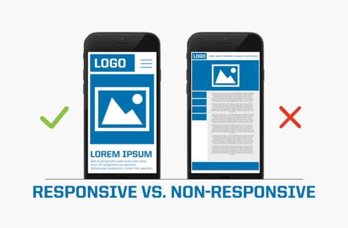
https://poweredbyawesome.com/2017/05/24/non-responsive-website-killing-business/
Having a responsive design is the ability to be able to access and view a website across a range of different devices. From the large computer screens to the tiny mobile phones, a responsive website will be actionable, attractive and easy to use for all. But this is a very difficult task to succeed in.
An unresponsive design prevents the creators from providing users with the best possible interface. It adds an extreme amount of effort on top of the design process, and in unfortunate circumstances, forces the customers to use a different web page for a better experience.
Inconsistency In Elements

https://inspiretothrive.com/your-facebook-feed/
Another common mistake in UI designer and that is many designers may often become slightly too adventurous within their processes, and begin to branch out using new and innovative tools and layouts. However, this inconsistency doesn’t show creativity as many would assume. In fact, it will only send mixed signals to the users of the interface.
The key is to keep up with repeating patterns and elements at any chance given.
In doing this, there is a sense of trust built up from the customers or users, when the designer is creating inviting and enjoyable user experiences. Including this, it allows any user to get to know the interface they are using, which will allow functions such as purchases to be dealt with a lot faster.
Too Much Text

https://visme.co/blog/graphic-design-rules/
When users google sites online, they usually do not take the time to read through everything produced on that page. Instead, they focus on skimming through the text, trying to reach the few points they need most, skipping out on anything extra and useless to their needs.
Having too much text on a page doesn’t actually serve any purpose. It will only send users away, or (as said before) will give them a reason to skip through everything seen. For a designer, the temptation to brag about services, products or prices will be hard to fight, but the key to learn, is that less is far more.
Having emotion in what is written is key to know that what has been said, no matter how short, will help to create an impact, drawing them in further, converting them and preventing them from exiting to go on to use another site.
Confusing Forms

https://yourstory.com/mystory/46e3dafe96-content-or-design-whi
A form is one of the most important parts of the user journey. Surprisingly named, a form is a pop-up feature given to log in, check out, sign out, or proceed further into the site. These aspects are essentially the most important. Especially for those that have sites where users will be purchasing products.
Providing clear guidance through these parts of the user processes will avoid any issues being made, or customers getting annoyed and deciding not to use the site.
To do this, avoid using colour to show that the user has selected something in error. Instead, use commentary feedback such as ‘Password Incorrect’, in order to show a mistake has been made. This way, every user processes should function swiftly, with few errors occuring, helping to create a positive user experience.
Distinction Between Buttons
When designing apps and software, there are likely going to be functions that the user has to complete in order to progress further into either the site or complete their transaction. For example, with the app ‘Instagram’, the user can follow, like and comment on anything they wish, with each task having a different button to click to perform each task.
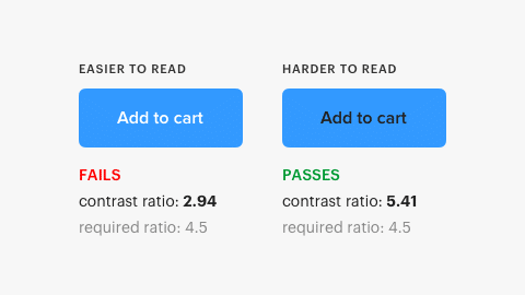
https://uxmovement.com/buttons/the-myths-of-color-contrast-accessibility/
The problem most designers will have is unintuitive buttons. This is either the buttons being too small, too large or each being too similar in size that an action chosen cannot be performed – this will, of course, ruin the user experience.
This is also valid when it comes to differentiating between primary and secondary actions. For example, a ‘login’ button should be in a contrasting colour or size to the ‘sign up’ button. This way, there is a distinctive difference, and the users will never get confused, or click for the site to perform something they do not wish. In turn, leading to a negative experience.
Summary
User Interface design does not come without its challenges. The creator, without a doubt, has a sure set amount of obstacles that have to be overcome before being able to make immersive, entertaining and attractive applications, software or websites.
The designer must ensure that the user experience is kept always in mind. Just because the page looks pretty, it doesn’t mean it performs well. Similarly with building the interface, if it is too difficult or jam-packed with high-end features, a user may find it difficult and challenging to use, and therefore find somewhere else to aid their needs.
The users are always going to be the most judgemental and hard to please group, and as a designer, be aware that the audience is continually changing and requires a well designed and functioning website to cater to their every need.
By following our common mistakes in UI design and using them as a checklist to avoid, you too can make sure that you have created a well designed, attractive and functioning website with the perfect user interface that users will enjoy navigating their way around.

