Designing with code-backed components in UXPin Merge simplifies the workflow for product teams, ensuring designs match the final product. Instead of static mockups, you work directly with React components, MUI, Ant Design, or custom libraries used in production. This eliminates the need for developers to translate designs into code, saving time and reducing inconsistencies.
Key takeaways:
- Custom Components: Use production-ready React components with real behavior and functionality.
- Streamlined Workflow: Align design and development by tweaking props directly in UXPin’s interface.
- Advanced Prototyping: Test interactions like sortable tables or form validations with real-world logic.
- Team Collaboration: Share component libraries, manage versions, and maintain consistency across projects.
- Code Handoff: Export production-ready JSX code, ensuring a smooth transition from design to development.
This process has helped companies like PayPal and others reduce engineering time by up to 50%, proving its efficiency for enterprise teams. Read on to learn how to set up your library, customize components, and optimize collaboration.
What Are Custom Design Components in UXPin Merge?

Custom Components Defined
Custom design components in UXPin Merge are React.js UI elements directly imported from your production repository – whether that’s Git, Storybook, or npm. These components aren’t just placeholders; they’re the exact elements your developers use to build the product. That means they match the final product in appearance, behavior, and functionality.
You can tweak these components using props – the same parameters developers rely on. UXPin conveniently displays these props in the Properties Panel, allowing you to adjust text, switch variants, or apply colors aligned with your design system.
Let’s dive into how these features can enhance your design-to-development workflow.
Why Use Custom Components
Custom components bridge the gap between design and development. Designers don’t have to recreate elements that already exist in code, and developers get access to JSX specs that perfectly align with the production environment. Built-in constraints ensure that only predefined props can be modified, reducing the risk of applying unsupported styles or creating designs that can’t be implemented.
These components also enable advanced prototyping with real-world interactions and data. For example, you can test sortable tables, video players, or complex form validations using the same logic as your production code. This approach minimizes unexpected issues when it’s time to launch.
Custom Components vs Pre-Built Libraries
In UXPin Merge, you can work with both custom components and pre-built libraries like MUI, Ant Design, Bootstrap, and ShadCN – right on the canvas. Custom components from your proprietary library are a perfect match for your production environment. They reflect your brand identity, integrate your specific business logic, and include any unique functionality you’ve developed. This makes them particularly valuable for enterprise teams with well-established design systems and proprietary products.
On the other hand, pre-built libraries are ideal for quick prototyping, MVPs, or teams just starting to develop a design system. With seamless npm integration, you can start designing immediately using reliable components from popular frameworks – no developer assistance required. Many teams begin with pre-built libraries to save time and later replace them with custom components as their design system evolves.
Now that you understand custom components, it’s time to prepare your custom component library.
Design To React Code Components
Preparing Your Custom Component Library
UXPin Merge Custom Component Integration Workflow
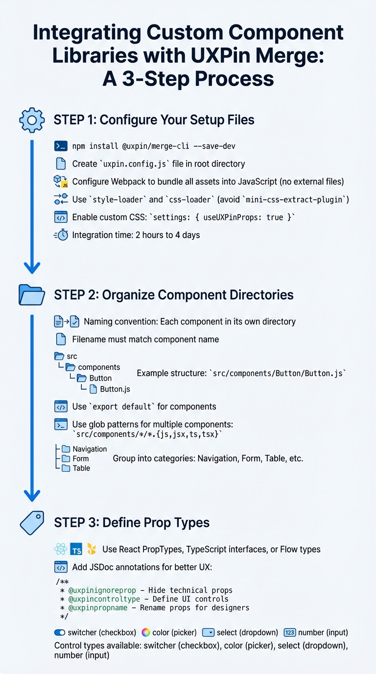
Setting up a well-structured component library is key to ensuring smooth integration with UXPin Merge and enabling effective prototyping. By aligning your library with UXPin Merge, your React components will operate seamlessly with the same props developers use. According to UXPin’s documentation, integrating a complete design system typically takes between 2 hours and 4 days, making the initial setup a worthwhile investment.
Configure Your Setup Files
Begin by adding the UXPin Merge CLI as a development dependency using the following command:
npm install @uxpin/merge-cli --save-dev.
This tool is essential for connecting your component library to UXPin Merge.
Then, create a uxpin.config.js file in your project’s root directory. This file is required to define your library’s name, component categories, and Webpack configuration paths. To simplify the initial setup and debugging process, include just one component at first.
Your Webpack configuration must ensure that all assets – like CSS, fonts, and images – are bundled into JavaScript. Merge requires that no external files are exported. For example, avoid using mini-css-extract-plugin; instead, rely on style-loader and css-loader to load CSS directly into the JavaScript bundle. As UXPin notes:
"Your Webpack config has to be built in a way that does not export any external files.".
If your production Webpack setup is complex, consider creating a separate configuration file, such as uxpin.webpack.config.js, specifically for Merge.
To let designers apply custom CSS directly in the editor, include the following setting in your uxpin.config.js file:
settings: { useUXPinProps: true }.
Organize Component Directories
Merge enforces a specific naming convention: each component must reside in its own directory, and the filename must match the component name. For instance, a Button component should follow this structure:
src/components/Button/Button.js, and the component must use export default.
To streamline managing multiple components, use glob patterns in your configuration file. For example:
src/components/*/*.{js,jsx,ts,tsx}. This approach makes scaling your library easier over time.
The IBM Carbon integration offers a great example of how to structure your uxpin.config.js file. They grouped components into functional categories such as "Navigation" (e.g., src/Breadcrumb/Breadcrumb.js), "Form" (e.g., src/TextInput/TextInput.js), and "Table" (e.g., src/Table/Table.js). This logical organization helps designers quickly locate components in the UXPin Editor.
If your production code doesn’t fully meet Merge’s requirements, you can create a "Wrapped Integration." Store these wrappers in a subdirectory, such as ./src/components/Button/Merge/Button/Button.js, to keep them isolated from your production logic.
With these file structures and naming conventions in place, you can move on to defining clear component behaviors through Prop Types.
Define Prop Types
Well-defined props are essential for providing designers with in-editor documentation. UXPin automatically generates a Properties Panel from your React PropTypes, TypeScript interfaces, or Flow types. When prop types are properly defined, designers can see descriptions directly in the editor, reducing the need to refer to external documentation.
You can enhance the Properties Panel with JSDoc annotations. For example:
- Use
@uxpinignorepropto hide technical props. - Use
@uxpincontroltypeto define specific UI controls. - Use
@uxpinpropnameto rename technical prop names to more user-friendly ones. For instance, changingiconEndto "Right Icon" makes the interface easier for non-developers to understand.
| Control Type | Description |
|---|---|
switcher |
Displays a checkbox |
color |
Displays a color picker |
select |
Displays a dropdown list |
number |
Input that accepts numbers |
As one UXPin Merge user explains:
"These props are what changes the look and feel of this particular card component… UXPin Merge, when you hover over the prop, it will actually give you the short description".
These small but impactful details significantly improve the designer experience, cutting down on unnecessary back-and-forth communication.
Adding Custom Components to the UXPin Merge Canvas
Once you’ve configured your library, the next steps are to register your components, test them, and ensure they render properly on the UXPin canvas.
Register Components in UXPin Merge
The uxpin.config.js file is the bridge between your component library and UXPin Merge. It specifies where your components are located and organizes them within the editor. This file must export a JavaScript object containing a components object with a categories array.
Here’s an example of how it might look:
module.exports = { components: { categories: [{ name: 'General', include: ['src/Button/Merge/Button/Button.js'], wrapper: 'src/Wrapper/UXPinWrapper.js' }] } }; The wrapper property is optional but can be incredibly helpful. It lets you load global styles or context before rendering components. For instance, your UXPinWrapper.js file might include:
import React from "react"; import '../index.css'; export default function UXPinWrapper({ children }) { return children; } To test your components locally, use the command uxpin-merge --disable-tunneling. This launches an experimental mode where you can confirm that components render as expected and respond correctly to prop changes.
Place Components on the Canvas
Once registered, your components will show up in the UXPin library panel. Designers can drag and drop components directly onto the canvas, where they will function with production-level behavior.
For components that support children, nesting is straightforward. Designers can drag child components into parent containers on the canvas or use the Layers Panel to adjust the hierarchy. If your parent container uses Flexbox, child components will automatically follow the Flexbox rules on the canvas.
To give designers even more control, you can enhance your configuration file by adding the following:
settings: { useUXPinProps: true } This enables custom CSS controls, allowing designers to adjust properties like colors and margins directly in the editor – no need to dive into the source code.
Fix Common Integration Problems
Sometimes, integration issues can crop up. Common problems include styling conflicts, rendering failures, and cluttered Properties Panels.
- Style conflicts: These occur when your component’s CSS interferes with UXPin’s interface. To avoid this, ensure your styles are scoped locally. If resizing issues arise, check whether width or height values are hardcoded in the CSS – use React props for dimensions instead.
- Rendering failures: These are often linked to webpack configuration issues. If your production webpack setup is complex, consider creating a simpler, dedicated configuration specifically for Merge.
- Overloaded Properties Panels: If the Properties Panel displays too many technical details, you can clean it up using JSDoc annotations. Use
@uxpinignorepropto hide developer-only props or@uxpinpropnameto rename props for better clarity. For npm integration, ensure the status reaches 100% and displays "Update Success" before refreshing your browser to see changes.
Start small – add one component to your uxpin.config.js file and test it thoroughly before moving on to others. This step-by-step approach makes debugging easier and lets you address issues before they spread across your library. It also lays the groundwork for more advanced customizations later on.
sbb-itb-f6354c6
Customizing Components While Designing
Once you’ve successfully integrated components, the next step is tailoring them to fit your design needs. With your custom components on the canvas, designers can make adjustments through the Properties Panel, which showcases all the props from your React code. This is where UXPin Merge stands out – designers interact with the same properties developers use, ensuring a seamless handoff from design to development.
Change Variants and States
Component variants like size, color, or type are mapped to dropdown menus in the Properties Panel when developers define them using oneOf prop types. For instance, a Button component offering size options (small, medium, large) will display these choices in a select list. Designers can simply pick the desired variant from the dropdown.
Designers also have the flexibility to use either visual controls or edit JSX directly. To make the process even more designer-friendly, developers can leverage JSDoc annotations such as @uxpinpropname to rename technical props into clearer, more intuitive labels. For components without predefined styling props, the CSS control offers an easy-to-use interface for adjusting colors, padding, margins, and borders visually.
Bind Data and Variables
Props are the gateway for data to flow into components, and UXPin Merge recognizes these props through PropTypes, TypeScript, or Flow. For simple text or numeric inputs, designers can directly enter values into input fields. When dealing with more complex data types like arrays or objects – think tables, charts, or lists – the @uxpincontroltype codeeditor annotation opens up a JSON editor. This allows designers to paste real data into components without causing any disruptions.
This approach ensures functional fidelity, meaning components behave as they would with real-world data. For example, designers can test scenarios like sortable tables that dynamically re-render when the data changes. As UX Architect and Design Leader Erica Rider explained:
"We synced our Microsoft Fluent design system with UXPin’s design editor via Merge technology. It was so efficient that our 3 designers were able to support 60 internal products and over 1,000 developers."
Apply Themes and Styles
Themes can be switched effortlessly using wrapper components. By including a theme provider in UXPinWrapper.js, you can load global styles or context. For more granular, component-level styling, the Custom CSS control – enabled via the useUXPinProps setting – gives designers a visual interface to tweak properties like colors, spacing, and borders without needing to write code.
To maintain a clean and focused Properties Panel, developers can use @uxpinignoreprop to hide technical properties that designers don’t need to see. These techniques ensure designs remain polished and ready for collaboration as the project progresses.
| Control Type | Best For | Enables |
|---|---|---|
| Select | Variants (size, color) | Dropdown menus for predefined options |
| Code Editor | Complex data (arrays) | JSON input for tables, charts, and lists |
| CSS Control | Visual styling | Adjustments for colors, spacing, and borders |
| Custom Props | Root element attributes | IDs, slots, and additional custom attributes |
Sharing Custom Component Libraries with Your Team
Once you’ve tested your custom components, the next step is sharing them with your team. This ensures everyone stays on the same page, speeds up collaboration, and keeps your design and production code aligned.
Set Up a Shared Merge Library
In the UXPin Editor or Dashboard, you can create a new library by choosing either "Import react.js components" or "npm integration," depending on your setup. Make sure to define permissions in the UXPin Editor to control who has access. For security, use an authentication token stored safely in your CI/CD pipeline to handle code updates – never include this token in public Git repositories.
For production environments, automate updates with Continuous Integration tools like CircleCI or Travis. Use the uxpin-merge push command to streamline this process and keep everything up to date.
Manage Component Versions
Once your shared library is in place, managing versions is critical. Version control helps avoid disruptions in ongoing projects while allowing teams to experiment with new features. UXPin Merge makes this easy with Tags and Branches. Tags lock a prototype to a specific version, ensuring stability, while Branches allow automatic syncing for prototypes that are still in development.
To switch versions for a prototype, click the gear icon in the Merge library panel, select "Manage Version in project," and pick the version you need. You can also set a default version in "Library settings" so that all new projects start with the same components. For stable releases, use the CLI command npx uxpin-merge push --tag VERSION. For ongoing development versions, use npx uxpin-merge push --branch branch.
With version control in place, your team will have a seamless experience accessing the right components for their projects.
Enable Team Access
Once the library is shared, team members can access components directly from the Library panel. Metadata for each component will appear in the Properties Panel, giving them all the details they need. To maintain security, store the authentication token as an environment variable (UXPIN_AUTH_TOKEN) in your CI system.
If your team is juggling multiple projects, you can assign different component versions to separate prototypes. This flexibility allows ongoing work to remain stable while testing new features in parallel. As Erica Rider, UX Architect and Design Leader, explained:
"It used to take us two to three months just to do the design. Now, with UXPin Merge, teams can design, test, and deliver products in the same timeframe. Faster time to market is one of the most significant changes we’ve experienced using Merge."
Handing Off Code to Development
Traditional handoffs often lead to discrepancies between design and the final code. UXPin Merge bridges this gap by allowing designers to work with the same React components used in production. This approach eliminates misunderstandings and reduces redundant tasks.
Let’s break down how each step of this process improves your development workflow.
Preview Prototypes with Real Component Behavior
With UXPin Merge, when you preview a prototype, stakeholders don’t just see static images or approximations. Instead, they interact with fully compiled JavaScript and CSS. For example, if your prototype includes a sortable table or a functional video player, those components behave exactly as they would in the final product. Since Merge uses real code, you can validate interactions, states (like hover, active, or disabled), and logic before writing any production code.
Next, let’s see how Spec Mode turns prototypes into actionable, production-ready code.
View and Export JSX Code in Spec Mode
In Spec Mode – also called Get Code Mode – developers can directly view and copy production-ready JSX code. This includes all the necessary CSS, spacing, color codes, and configurations, making the code ready for immediate use and edits. You can even open projects in StackBlitz for instant code editing, streamlining the transition from design to development.
Align Design and Development
By combining real-code previews with editable JSX, UXPin Merge ensures that your design is the single source of truth. Traditional handoff methods often result in "design drift", where designers and developers work with separate versions of components. Merge eliminates this issue by syncing directly with your Git repository, ensuring the same code powers both design and production. Any updates in the repository are automatically reflected in the UXPin Editor, keeping teams aligned.
Additionally, prop-based customization ensures that designers work within the same constraints as developers. This means designers can’t create elements that are impossible to build because they’re working with the actual production code. This seamless process reduces back-and-forth revisions and accelerates deployment. In fact, using code-backed components can make product development up to 8.6x faster compared to traditional image-based design tools.
Conclusion
UXPin Merge transforms the way teams approach product development by enabling designers to work directly with production-ready React components. This seamless integration bridges the traditional gap between design and development, leading to noticeable improvements in workflow efficiency.
Real-world case studies highlight impressive outcomes, such as cutting engineering time by 50% and empowering thousands of developers with the support of a small design team. By using code-backed components, teams establish a single source of truth, maintain design consistency, and accelerate deployment – all while reducing costs.
With UXPin Merge, your design system can scale effortlessly, generating production-ready JSX code that developers can use right away. This process ensures that what you design is exactly what gets built, streamlining collaboration and eliminating unnecessary revisions.
Want to prevent design drift and speed up your product development process? Check out UXPin’s pricing plans or reach out to sales@uxpin.com for enterprise solutions tailored to your needs.
FAQs
How does UXPin Merge help designers and developers work better together?
UXPin Merge creates a seamless connection between designers and developers by enabling both teams to work with the exact same code-backed components. With Merge, designers can incorporate live React components directly into their prototypes, ensuring designs are not only visually accurate but also functional and aligned with the end product.
By providing a single source of truth for components, this approach eliminates the usual handoff headaches. Developers supply components that designers can instantly integrate, leading to better communication, a quicker design process, and a smoother transition from prototype to production. Merge streamlines collaboration, helping teams deliver products faster and with precision.
What are the advantages of using custom components in UXPin Merge instead of pre-built libraries?
Using custom components in UXPin Merge offers several advantages compared to relying on pre-built libraries. These components are crafted specifically to match your team’s unique needs, ensuring they align seamlessly with your product’s design and functional goals. This tailored approach helps maintain consistency throughout your designs and removes the restrictions that come with generic, one-size-fits-all elements.
Custom components also provide greater flexibility and scalability. They can be centrally updated, versioned, and managed, which simplifies maintaining a cohesive design system and minimizes discrepancies between design and development. By streamlining workflows and encouraging smoother collaboration across teams, custom components not only speed up deployment but also enhance the entire design process.
How do I set up my component library to work with UXPin Merge?
To prepare your component library for UXPin Merge, start by ensuring your React.js components are compatible with the required framework version (16.0.0 or higher). Organize your files properly, making sure each component includes an export default statement and uses supported JavaScript dialects like PropTypes, Flow, or TypeScript.
Next, host your components in a repository that UXPin Merge can access. Follow the naming conventions and directory structures specified in the documentation, and bundle your components correctly using tools like webpack. Once everything is set up, your library will be ready to integrate seamlessly, allowing for consistent, code-based designs throughout your workflows.
A well-prepared setup ensures your components work efficiently within Merge, streamlining collaboration between design and development, maintaining uniformity, and accelerating deployment.

