Design faster and collaborate better by using real Material UI (MUI) components in UXPin Merge. Instead of static mockups, this approach lets you create prototypes with production-ready React components, cutting down on design-to-development handoffs and miscommunication.
Here’s what you need to know:
- What it is: UXPin Merge allows designers to work with actual Material UI components pulled directly from a Git repository.
- Why it matters: Developers get JSX code ready for implementation, eliminating the need to rebuild designs from scratch.
- Key benefits:
- Save time: Prototypes behave like the final product, reducing testing and delivery timelines.
- Improve accuracy: Designs and code stay synced, ensuring consistency across teams.
- Simplify handoffs: Share interactive prototypes with built-in specs for easy developer implementation.
- How it works: Link your Git repository to UXPin, import Material UI components, and start designing with functional elements like buttons, forms, and grids.
UXPin Merge Tutorial: Prototyping an App with MUI – (4/5)
What Are UXPin Merge and Material UI?
UXPin Merge is a tool that bridges the gap between design and development by importing React components directly from your Git repository into the UXPin design editor. This means designers work with the same production-ready components that developers use, creating a seamless connection between the two processes.
Material UI (MUI), on the other hand, is a React component library based on Google’s Material Design principles. It offers over 90 interactive and accessible components. When paired with UXPin Merge, MUI components allow designers to create with functional code that behaves exactly as it will in the final product.
This pairing changes the game for design handoffs. According to UXPin’s documentation, "Merge is a revolutionary technology that lets users import and keep in sync coded React.js components from GIT repositories to the UXPin Editor. Imported components are 100% identical to the components used by developers during the development process". With this setup, developers receive JSX code that’s ready to implement, cutting out the usual back-and-forth of translating static designs into working code. This integration highlights how Merge connects design and production in a way that streamlines the entire workflow.
How UXPin Merge Works
UXPin Merge links your design environment to your codebase through a simple but effective process. It analyzes your component repository, compiles components using webpack, and makes them available in the design library. This synchronization happens automatically, ensuring that your design components always reflect the latest code updates.
The system supports various CSS methodologies, including pure CSS, Sass, Styled Components, and Emotion. This flexibility allows you to integrate Merge without overhauling your existing component architecture. As developers update the repository, those changes are instantly reflected in the design environment. With tools like CircleCI handling continuous integration, these updates happen in real time.
Now that the technical groundwork is clear, let’s dive into the advantages of using Material UI components in this setup.
Benefits of Material UI Components
Material UI components offer several practical perks that enhance the design process. For starters, they are interactive by default – buttons function, forms validate, and data grids sort and filter just as they would in the final product. This lets you test complex scenarios and get more meaningful feedback during usability testing.
Additionally, MUI components come with built-in accessibility features and are already responsive and production-ready. This means your prototypes inherit these qualities automatically, helping your team reach broader audiences without extra effort. There’s no need for a translation layer where critical details can get lost or misinterpreted.
The efficiency gains are impressive. With UXPin Merge, teams can develop products up to 10 times faster. Traditional handoffs, often bogged down by miscommunication, are replaced by an agile process where developers receive auto-generated specifications tied to real JSX code. This approach also promotes consistency across design systems by providing shared documentation for both designers and developers, creating a unified workflow that minimizes errors and speeds up delivery.
How to Set Up UXPin Merge for Material UI
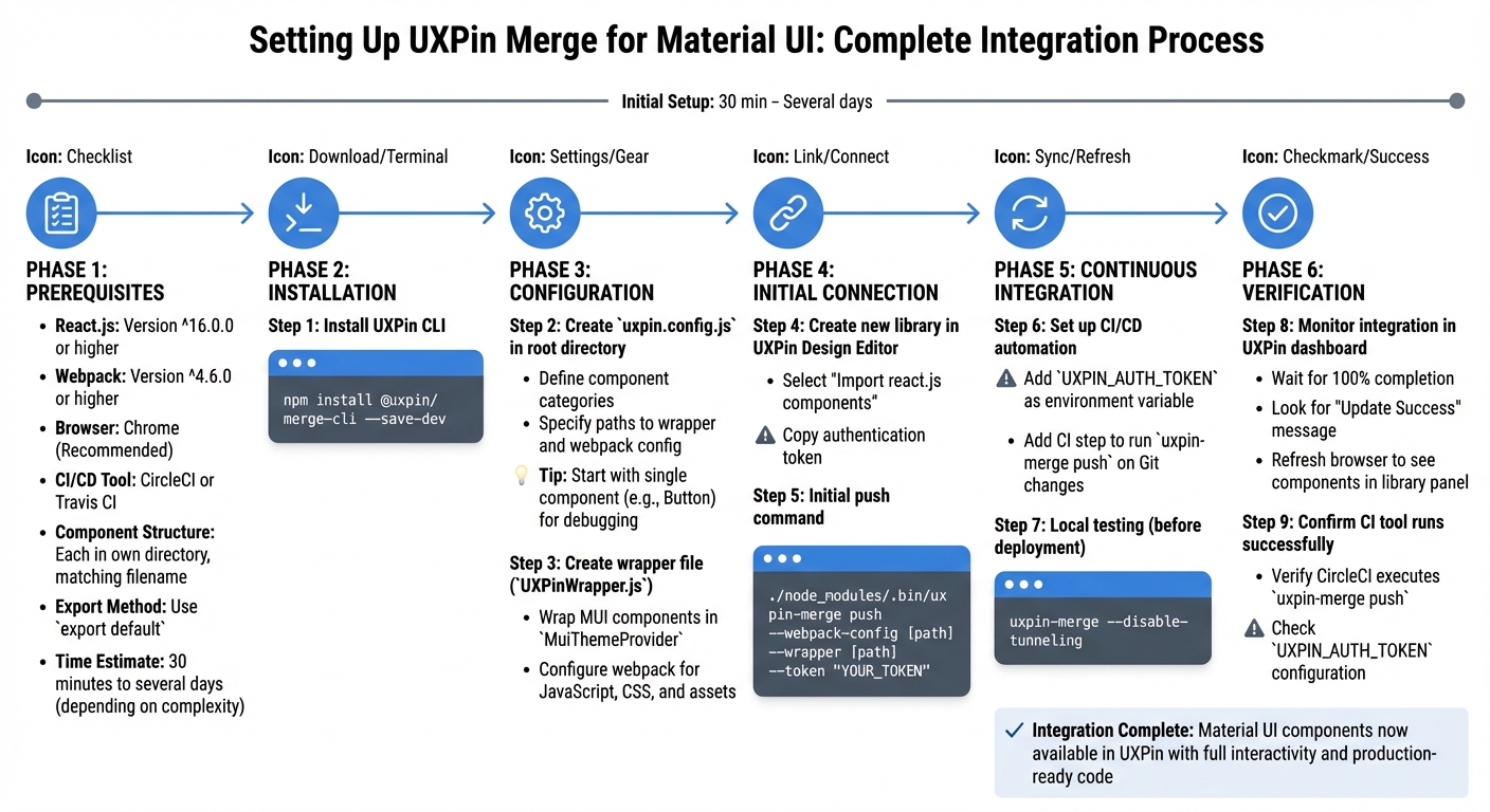
How to Set Up UXPin Merge with Material UI Components – Step-by-Step Guide
You can integrate Material UI components into UXPin Merge by using the ready-made MUI 5 library for quick prototyping or setting up Git integration for custom libraries.
What You Need Before Starting
Before diving in, ensure your setup meets these requirements:
- React.js: Version ^16.0.0 or higher.
- Webpack: Version ^4.6.0 or higher.
- Browser: Chrome is recommended for the best experience.
Your components should follow specific coding standards. Each component must reside in its own directory, with the filename matching the component name. Components must be exported using export default to work with Merge. To ensure proper rendering, wrap your Material UI components in a Higher-Order Component (HOC) that provides the MuiThemeProvider and your custom themes.
You’ll also need a CI/CD tool, such as CircleCI or Travis CI, to automate updates. Additionally, obtain a unique UXPIN_AUTH_TOKEN to link your Git repository with your UXPin account. While the initial setup takes about 30 minutes, full integration can take anywhere from two hours to several days, depending on the complexity of your component library.
| Requirement Category | Specification |
|---|---|
| React Version | ^16.0.0 |
| Webpack Version | ^4.6.0 |
| Browser | Chrome (Recommended) |
| JS Dialects | JavaScript (PropTypes), Flow, TypeScript |
| Auth Method | UXPIN_AUTH_TOKEN |
| CI/CD Tools | CircleCI, Travis CI, etc. |
How to Connect Your Git Repository to UXPin
Start by installing the UXPin CLI tool in your project:
npm install @uxpin/merge-cli --save-dev Next, create a uxpin.config.js file in your project’s root directory. This file defines component categories and specifies paths to your wrapper and webpack configuration. To simplify debugging, begin by adding a single component – like a Button – before importing your entire library.
Create a wrapper file (commonly named UXPinWrapper.js) to wrap your Material UI components in the MuiThemeProvider. Then, configure your webpack setup to handle JavaScript, CSS, and assets. Once ready, go to the UXPin Design Editor, create a new library, and select "Import react.js components." Copy the authentication token provided.
For an initial push, run the following command:
./node_modules/.bin/uxpin-merge push --webpack-config [path] --wrapper [path] --token "YOUR_TOKEN" To enable continuous syncing, set the UXPIN_AUTH_TOKEN as an environment variable in your CI tool (e.g., CircleCI or Travis CI). Add a CI step to run uxpin-merge push whenever you push changes to Git. Before deploying, test locally by running:
uxpin-merge --disable-tunneling This command lets you preview how components will appear in UXPin before they go live. After completing these steps, you can verify the integration.
How to Verify the Integration
Once you click "Publish Library Changes" in UXPin, monitor the progress indicator in your dashboard. The integration is complete when the status reaches 100% and displays an "Update Success" message. At this point, refresh your browser to access the interactive Material UI components in the library panel.
UXPin Documentation: "Once the status % of your library reaches 100 and shows ‘Update Success’ you will need to refresh your browser to see the changes."
If you’ve set up Git integration, confirm that your CI tool (e.g., CircleCI) successfully runs the uxpin-merge push command and that your UXPIN_AUTH_TOKEN is correctly configured. For an extra layer of verification, run:
uxpin-merge --disable-tunneling This local preview ensures your components are ready before they go live. Once everything checks out, your Material UI components are fully integrated and ready for use in UXPin.
sbb-itb-f6354c6
How to Design Interactive Prototypes with Material UI Components
Once you’ve successfully integrated Material UI, you can follow these steps to create fully interactive, production-ready prototypes. Unlike static design tools, UXPin uses real HTML, CSS, and JavaScript to render Material UI components, ensuring your prototypes mirror the final production environment.
How to Add and Customize Components
Start by opening the UXPin editor and locating the Material UI library in the left panel. From there, drag components like Button, TextField, or Card onto your canvas. These components are fully interactive, not just static images.
You can edit component properties directly in the Properties Panel, which reflects the actual React props defined in Material UI’s documentation. For example, you can:
- Switch between button variants like contained, outlined, or text.
- Adjust colors using predefined palette options like primary, secondary, or error.
- Modify sizes, add icons, and tweak typography settings.
When you make changes in the editor, they instantly update the production-ready components. To edit button labels or text content, map the children prop in the Merge Component Manager to a text field control. This lets you update text directly in the editor without writing any code. For more advanced customizations, configure the MuiThemeProvider wrapper to set global theme settings – like brand colors or typography – before importing the components.
How to Add Interactions and States
Material UI components come with built-in interactive states that work immediately after import. For example, hover over a button, click a checkbox, or type into a text field, and you’ll see states like hover, toggle, or validation in action.
To go further, use UXPin’s interaction tools to add custom behaviors. For instance, you can:
- Create a button that opens a modal when clicked.
- Build a multi-step form that progresses through screens.
- Programmatically control states in the Properties Panel, such as setting a button to "disabled", showing loading spinners, or displaying error messages on form fields.
Advanced components like date pickers, data grids, and autocomplete fields remain fully functional, allowing users to interact with them just as they would in a live environment. This level of interactivity makes user testing far more effective than relying on static mockups.
Finally, take advantage of MUI’s responsive grid system to ensure your prototype looks great on any device.
How to Build Responsive Designs
Material UI components are designed to adapt to different screen sizes using their built-in grid system. When you place components on the canvas, they automatically adjust without requiring manual breakpoint settings.
Use the Grid component to create layouts that reflow seamlessly across mobile, tablet, and desktop screens. Components will adjust their spacing, typography, and layout proportions based on the screen width, ensuring everything – from tappable elements to readable text – remains user-friendly.
UXPin’s Material UI library includes over 90 interactive components, all of which are code-ready and responsive by default. This means you won’t need to create separate versions for different devices – a single prototype will adapt effortlessly across all screen sizes.
How to Improve Design-to-Development Workflows
Using real Material UI components in UXPin Merge transforms how designers and developers collaborate. Instead of relying on static mockups that developers need to rebuild from scratch, designers work directly with the same components that will appear in production. This approach eliminates the usual translation step, speeding up product development and reducing inconsistencies. By integrating real components, both teams can streamline the design-to-development handoff, saving time and effort.
The impact on project timelines is substantial. Since both teams share a unified component library, changes made by designers – like tweaking a button’s color or variant – are the same adjustments a developer would make in code. This shared workflow cuts down on redundancies and ensures consistency.
How to Simplify Design Handoff
Traditional design handoffs often involve handing over static mockups to developers, who then have to interpret spacing, colors, and interactions to recreate the design in code. With Material UI components in UXPin Merge, this process becomes far simpler. Designers can share a single link containing an interactive prototype, complete with technical specs and production-ready code – all in one place.
Developers can inspect components directly to view their exact React props, removing any guesswork about implementation. Since these components are built with Material UI, there’s no need to translate visual designs into code – the design itself is the code. This eliminates version mismatches that often occur when teams use different component libraries.
To make the handoff even easier, the Merge Component Manager lets you rename properties in designer-friendly terms and add descriptions to clarify how specific Material UI props function.
How to Keep Design and Code Aligned
One of the biggest challenges in product development is keeping design and code synchronized as projects evolve. With UXPin Merge and Material UI, both teams work with identical component versions pulled directly from the same Git repository. If developers update a component – whether by changing default padding or adding a new variant – those updates automatically appear in the design environment.
Version control plays a key role here. By linking your Material UI component library to UXPin via GitHub, any updates pushed by developers can be seamlessly pulled into the design tool. The Merge CLI’s experimental mode even allows teams to preview how updates render before rolling them out to everyone.
With 69% of companies actively using or building design systems to maintain consistency, keeping design and code aligned is crucial as teams grow. The functional fidelity of real React components – where buttons are clickable, forms validate, and states update – ensures that what designers test matches what users experience in production. This alignment fosters smoother collaboration and reduces errors.
How to Collaborate Across Teams
When designers and developers rely on the same Material UI component library, they create a shared language and reference point. Both teams can turn to Material UI’s documentation to better understand component behaviors, available props, and effective design patterns. This shared understanding minimizes miscommunication and speeds up decision-making.
For larger organizations, this approach scales impressively. Erica Rider’s team demonstrated this efficiency when syncing their design system with UXPin:
"We synced our Microsoft Fluent design system with UXPin’s design editor via Merge technology. It was so efficient that our 3 designers were able to support 60 internal products and over 1,000 developers."
This level of productivity is possible because designers create prototypes that developers can implement directly, without additional rework. High-fidelity prototypes also allow product managers, stakeholders, and QA teams to interact with functional designs, enabling feedback on actual functionality rather than static visuals. By working from a unified foundation, teams can avoid delays and keep projects moving forward efficiently.
Conclusion
Using real Material UI components in UXPin Merge revolutionizes how teams approach product development. By working with production-ready components, the gap between design and code is effectively bridged, ensuring designers and developers operate on the same foundation and communicate seamlessly.
The impact is clear. Teams leveraging UXPin Merge have significantly shortened their design, testing, and delivery timelines. In fact, engineering efforts have been reduced by about 50%, leading to notable cost savings across organizations.
This integrated workflow allows designers to create interactive prototypes while developers receive code that’s ready to implement. With continuous syncing, both teams remain on the same page as projects evolve, eliminating the guesswork during implementation.
This streamlined approach not only simplifies processes but also scales effortlessly. Whether tackling a small project or managing dozens of products within large organizations, the combination of Material UI’s powerful component library and UXPin Merge’s code-based prototyping ensures reduced redundancies, faster delivery, and a consistent user experience from design to production.
Want to transform your team’s workflow? Start by connecting your Material UI library to UXPin Merge and discover how real components can redefine the way you build products.
FAQs
How does UXPin Merge help maintain consistency between design and code?
UXPin Merge bridges the gap between design and development by using live React components as the foundation for both. By importing a component library from platforms like npm, Git, or Storybook, Merge automatically syncs any updates directly to the UXPin editor. This means that whenever there’s a change to a component – whether it’s in styling, properties, or interactions – it’s instantly mirrored in the design, cutting out the need for tedious manual updates.
Since components are rendered straight from their source code, both designers and developers work with the exact same elements. Designers can tweak properties effortlessly through an intuitive interface, while developers interact with the actual component code, including JSX, TypeScript, and prop definitions. This tight integration keeps designs aligned with development, reducing mistakes and speeding up the overall workflow.
What are the benefits of designing with Material UI components in UXPin Merge?
Designing with Material UI (MUI) components in UXPin Merge means your prototypes are built with the exact same components your development team uses. This approach creates a single source of truth, ensuring your designs stay consistent and perfectly aligned with the final product. Plus, any updates made to the MUI library automatically sync with UXPin, removing the need for manual updates and minimizing potential errors.
Because MUI components are fully interactive React elements, your prototypes function just like the real product. They include built-in states, variables, and responsive layouts, enabling designers to test realistic interactions and gather more accurate usability feedback. Best of all, you can deliver developer-ready specifications without needing to write a single line of code.
Using MUI in UXPin Merge helps teams streamline prototyping, maintain both visual and functional consistency, and speed up the design-to-development process – saving time while ensuring features are shipped faster and with greater reliability.
How do I connect my Git repository to UXPin Merge?
To link your Git repository with UXPin Merge, start by logging into the Merge portal using your UXPin credentials. If Merge isn’t activated for your organization, you might need to request access via the Git integration settings.
Once you have access, head over to the Git Integration section in the Merge dashboard. Choose your Git provider, such as GitHub, GitLab, or Bitbucket, and authorize UXPin Merge to access your repository. Next, select the repository and branch you want to sync, like main or develop.
After that, set your sync preferences – either automatic or manual – and confirm the connection. UXPin Merge will then pull your code and make the components available for your design projects. Any changes made to the linked branch will automatically update in Merge, keeping your design and development perfectly aligned.

