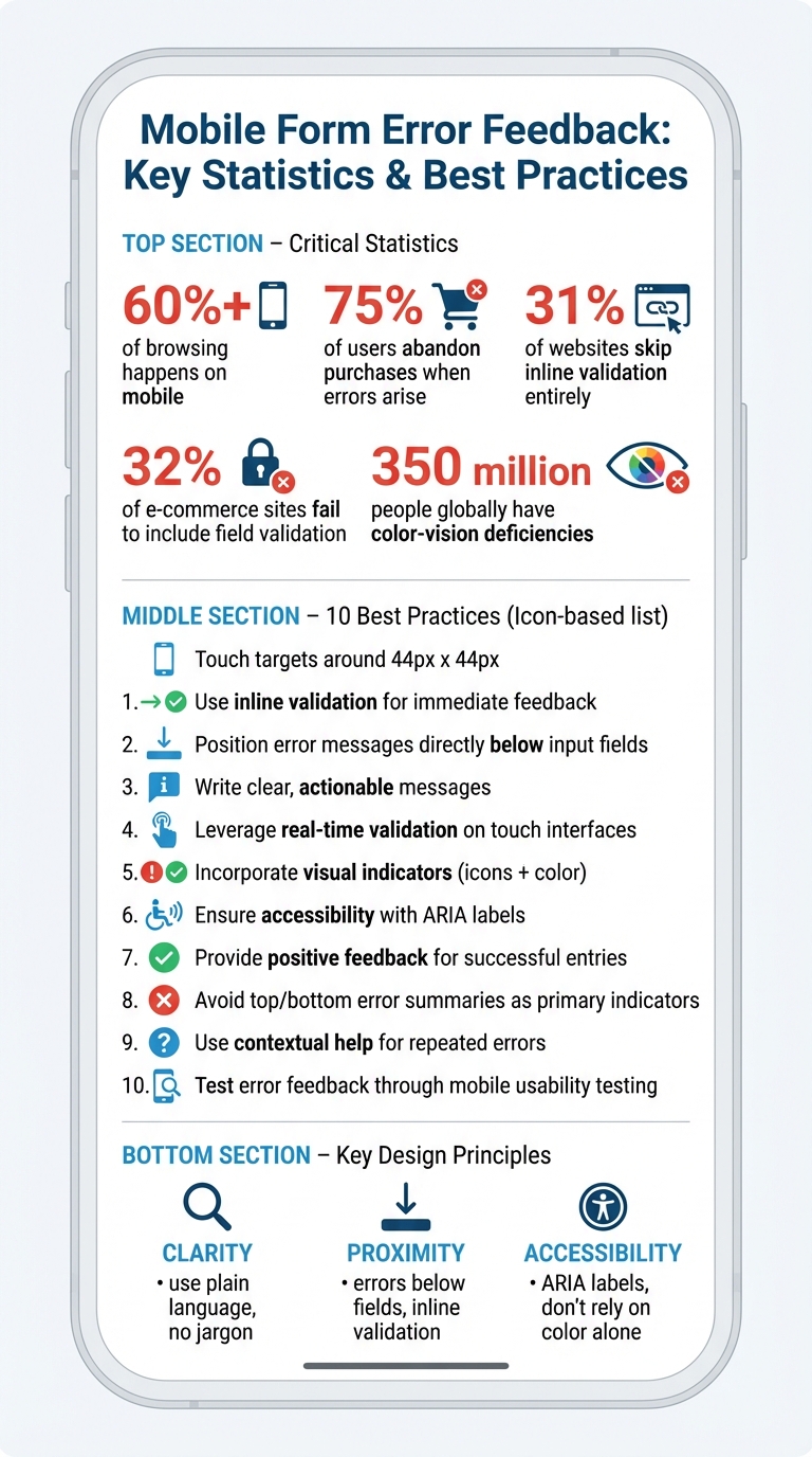
Poor error feedback is one of the top reasons users abandon mobile forms. With over 60% of browsing happening on mobile and 75% of users leaving purchases when errors arise, designing effective error messages is critical. Here’s how to fix that:
- Provide immediate, inline feedback: Validate fields as users move through them.
- Place error messages directly below fields: This aligns with vertical reading flows and avoids confusion.
- Write clear, actionable messages: Instead of vague phrases like "Invalid input", explain the issue and how to fix it.
- Use visual indicators: Combine color, icons, and borders to highlight errors – but don’t rely on color alone for accessibility.
- Ensure accessibility: Use ARIA labels and screen reader support to guide all users.
- Test on real devices: Observe how users interact with error feedback to identify and fix usability issues.
Mobile Form Error Statistics and Best Practices Overview
Top 5 UX Mistakes in Form Design (and How to Fix Them!) 🚀
1. Use Inline Validation for Immediate Feedback
Inline validation is a powerful way to confirm user input as they go, offering feedback right after they finish typing or move to the next field. Surprisingly, 31% of websites skip inline validation entirely, and 32% of e-commerce sites fail to include any field validation at all. This oversight creates unnecessary hurdles, especially for mobile users.
The key is to trigger validation when users leave a field (on "blur"), not while they’re actively typing. Rachel Krause from Nielsen Norman Group highlights the importance of this approach:
"Ideally, all validation should be inline; that is, as soon as the user has finished filling in a field, an indicator should appear nearby if the field contains an error. This approach reduces interaction cost for the user by allowing them to fix errors immediately, without searching or returning to a field they thought was completed correctly".
This strategy helps users address mistakes right away, cutting down on frustration and reducing the chances they’ll abandon the form altogether.
Immediate feedback also prevents those frustrating "full stops" – moments when users think they’ve completed a form, only to be interrupted by unexpected errors. These disruptions are particularly annoying on mobile devices, where ease of use is crucial.
For a smoother experience, consider implementing keystroke-level rechecking. This ensures that error messages disappear as soon as the input becomes valid, giving users instant confirmation that their corrections worked. For more complex fields, like passwords, real-time feedback (such as a password strength meter that updates with each character) can guide users to meet requirements more efficiently.
Inline validation keeps everything fresh in the user’s mind. They don’t have to revisit a field and relearn its requirements. Adding positive indicators, like green checkmarks for correctly completed fields, can also provide a sense of progress and reassurance, making the entire process feel more seamless.
2. Position Error Messages Directly Below Input Fields
On mobile screens, where horizontal space is limited, placing error messages directly below input fields is a smart choice. When error messages are positioned above the fields, they can blend with labels, causing confusion. By keeping errors below the field, users can instantly identify and address issues – especially when paired with inline validation.
This approach aligns with the natural vertical reading flow of mobile users. As Anthony Tseng from UX Movement puts it:
"Error messages below the field feel less awkward than above the field because it follows their vertical reading progression".
This design choice supports the mobile-first mindset that’s crucial for touch-based interfaces.
Keeping error messages close to the problematic fields reduces cognitive effort and helps users fix mistakes faster. Research shows that inline validation – where error messages are placed directly below the input – leads to fewer errors and quicker form completion compared to placing validation summaries at the top or bottom of the form.
To enhance clarity, make sure there’s enough white space around the error messages and use auto-scrolling to ensure the messages stay visible, even when the keyboard is active. This keeps the process smooth and frustration-free for users.
3. Write Clear, Actionable, and User-Friendly Messages
Error messages should do more than just point out a problem – they should guide users toward a solution. For instance, instead of a vague "Invalid input", a better approach is to say, "Please enter a valid email address (e.g., name@example.com)."
Stick to plain, straightforward language. Avoid technical jargon or cryptic terms like "Error 4002." Instead, use clear explanations such as "Email cannot contain special characters" or "We’re having trouble saving your information. Please try again shortly." Jakob Nielsen emphasizes this in his 10 Usability Heuristics:
"Error messages should be expressed in plain language, communicate the problem and a solution, and make use of visual styling that will help users notice them".
It’s also important not to place blame on users. Swap accusatory phrases like "You entered an invalid date" with something more neutral and helpful, such as "Please enter the date in MM/DD/YYYY format." This small change can make a big difference in reducing frustration.
Here’s how unhelpful error messages can be transformed into clear, actionable ones:
| Unhelpful Error Message | Clear, Actionable Message |
|---|---|
| "Invalid input" | "Please enter a valid email address (e.g., name@example.com)." |
| "Error 4002" | "Email cannot contain special characters." |
| "Invalid ZIP code" | "We couldn’t find that ZIP code. Please enter a 5-digit ZIP." |
| "Required field missing" | "Please enter your phone number to continue." |
Be specific about requirements. For example, instead of leaving users guessing, say, "Enter a password with at least 8 characters, including one number." Providing this level of clarity not only improves the user experience but also supports effective real-time validation, especially on touch devices.
4. Leverage Real-Time Validation on Touch Interfaces
When designing for mobile devices, real-time validation requires careful timing to avoid disrupting touch interactions. For instance, if a user corrects an existing error, validation should occur immediately to clear the feedback as soon as the input becomes valid. However, for less critical changes, it’s better to delay validation until the user moves to the next field. In cases of serious errors – like typing letters into a digits-only field – validation should trigger right away, as continuing to type won’t resolve the issue.
Complex fields, such as passwords, are an exception. Here, real-time validation can guide users by providing helpful feedback, like password strength meters, as they type. This approach builds on the fundamentals of inline validation, but mobile interfaces require especially precise timing to keep the experience smooth and uninterrupted.
Given the limited screen space on mobile, error messages can sometimes be hidden by virtual keyboards. To address this, subtle animations lasting 200–300 milliseconds can ensure error feedback stays visible without being intrusive. It’s also important to preserve any user input when displaying errors, so users don’t lose their progress.
Another key consideration is font size. Use a minimum font size of 16px for form inputs to prevent iOS from automatically zooming in when a field is focused. This prevents users from feeling disoriented or losing sight of validation feedback. For accessibility, include the attribute aria-invalid="true" on fields that fail validation, so screen readers can notify users relying on assistive technologies.
5. Incorporate Visual Indicators Like Icons and Color Changes
Icons, color changes, and borders are key tools for signaling errors on mobile screens. Colors play a significant role in this process: red typically represents errors, yellow or orange signals warnings, and green or blue conveys success. This intuitive use of color helps users quickly understand validation feedback.
"Color is one of the best tools to use when designing validation. Because it works on an instinctual level, adding red to error messages and yellow to warning messages is incredibly powerful." – Nick Babich, Software Developer
Icons are another effective way to grab attention, especially for fields that need correction. For example, pairing an exclamation mark or caution symbol with error messages not only improves visibility but also enhances accessibility for users with colorblindness. It’s essential to combine icons with text rather than relying solely on color.
To ensure errors are noticeable on small screens, use a combination of elements like a red border, red error text, and an alert icon. This reduces cognitive load and makes issues more apparent. For longer, scrollable pages, adding a red background to error fields can further highlight the problem areas.
Save bold red text and warning symbols for critical errors that disrupt the workflow. For less urgent notifications or routine messages, opt for softer tones like gray or blue to avoid overwhelming users or making them feel reprimanded.
Subtle animations, such as a pulsing error icon, can be used sparingly when multiple errors appear. This layered approach to visual feedback creates an accessible and user-friendly error design for mobile interfaces.
sbb-itb-f6354c6
6. Ensure Accessibility with ARIA Labels and Screen Reader Support
Accessible error messages play a crucial role in guiding screen reader users by clearly identifying issues and offering solutions. By using ARIA (Accessible Rich Internet Applications) attributes, you can link error messages directly to their corresponding fields. This connection allows assistive technologies to announce problems in a way that’s easy for users to understand. Incorporating these attributes complements the concept of real-time validation, ensuring that all users – regardless of ability – receive immediate and clear feedback. For instance, using live regions with attributes like aria-live="assertive" or the role="alert" ensures that new errors are announced as soon as they appear.
For native mobile apps, platform-specific tools enhance accessibility. On iOS, developers can use UIAccessibilityPostNotification to trigger VoiceOver announcements whenever an error occurs. Similarly, Android provides the TextInputLayout class with the setError method, which delivers inline error messages that TalkBack can read aloud automatically.
To make error feedback universally accessible, avoid relying solely on color to indicate issues. Instead, pair visual indicators with descriptive text or icons. This approach benefits users with color vision deficiencies and those dealing with high-glare conditions. Like inline validation, accessible error feedback simplifies the correction process, making it smoother for everyone. Adding HTML autocomplete attributes can further improve form completion accuracy, while ensuring that all interactive elements meet minimum touch target sizes helps prevent accidental inputs.
Lastly, when a form submission fails, automatically shift the keyboard focus to the first invalid field. This eliminates the need for users to search for errors, which is especially helpful on smaller mobile screens.
7. Provide Positive Feedback for Successful Entries
In addition to clear error messages, offering positive feedback when users input correct data can significantly improve their experience. This approach is particularly helpful for complex fields, where users may need reassurance that they’ve met the system’s requirements. As Rachel Krause from Nielsen Norman Group points out:
"Inline validation can also be used to indicate successful completion of fields. For example, when the user creates a username, a green checkmark and a message that the username is available provide clear feedback".
By integrating real-time feedback, success indicators help users feel more confident, especially when completing tricky fields like password creation or username selection. However, it’s important to use these indicators selectively. For straightforward fields that only require basic text input, such as a name or email address, adding success indicators can clutter the interface unnecessarily. Krause emphasizes this balance:
"Success indicators shouldn’t distract users from filling out forms and should only be used when the additional context helps complete the form faster or more accurately".
To visually signal success, use a combination of green or blue colors along with checkmark icons. This approach is inclusive, as it works for users with color-vision deficiencies who might struggle to differentiate colors alone. For example, a password strength meter that transitions from red to green as users type provides immediate feedback, letting them know they’re meeting the requirements.
Positive feedback also reduces mental effort by removing uncertainty. Seeing a green checkmark next to a newly created password, for instance, reassures users that they won’t need to revisit that field later. This clarity not only speeds up the process but also minimizes the frustration often associated with filling out forms. When paired with timely error messages, these confirmations create a smoother and more efficient experience, especially on mobile devices.
Finally, maintain a friendly and supportive tone in success messages. Avoid language that feels judgmental or shifts blame to the user. As Nielsen Norman Group advises, success messages should come across as helpful acknowledgments rather than tests the user has passed.
8. Avoid Top or Bottom Error Summaries as Primary Indicators
When designing forms, especially for mobile devices, relying on error summaries at the top or bottom of the page as the main way to communicate mistakes isn’t the best approach. These summaries require users to remember the errors instead of simply recognizing them, which can be frustrating and inefficient – especially on smaller screens. Inline error messages, which appear right next to the problem, are much more effective for mobile users.
Rachel Krause from Nielsen Norman Group explains it well:
"A validation summary can give the user a global understanding of all the errors in a form but shouldn’t be used as the only form of error indication, as it forces the user to search for the field in error".
For mobile users, error summaries become even less practical. Small screens often hide these summaries when users scroll, leading to a constant back-and-forth between the summary and the fields. Studies show that this design choice increases the time it takes to fix errors and reduces the likelihood of successfully resolving them.
That said, error summaries can still play a supportive role in specific cases, like long or complex forms. In these situations, a summary at the top can provide an overview of all the errors, especially for issues located further down the page. However, this should always be paired with inline error messages. While the summary alerts users to the presence of errors, inline messages guide them directly to the problem and offer clear instructions on how to fix it. This combination reduces mental effort and keeps users focused, even on mobile devices.
9. Use Contextual Help for Repeated Errors
When users repeatedly stumble over the same field in a form, it’s a clear sign that something isn’t clicking. This could mean the instructions aren’t clear enough, or the requirements aren’t intuitive. These repeated errors present a chance to step in with smarter, more tailored assistance.
To make things smoother, error feedback should go beyond just pointing out what’s wrong. Contextual help in mobile forms needs to be clear, direct, and helpful. If a user struggles multiple times, offer more detailed guidance. For example, you could link them to a help page, provide a pop-up with step-by-step instructions, or even suggest corrective actions, like auto-filling a city name based on the ZIP code they entered. In cases where errors persist, you might even direct them to customer support or specialized tools for resolving the issue.
Another way to cut down on repeated mistakes is by being proactive. Display formatting rules and input requirements right from the start. Small touches, like icons or tooltips, can also go a long way in guiding users (see [5, 13]).
Lastly, don’t overlook the value of analyzing your form data. Regularly review where users are getting stuck and tweak those fields accordingly. If a particular field consistently causes confusion, it might be time to rethink its design entirely instead of just patching up the error messages.
10. Test Error Feedback Through Mobile Usability Testing
Testing error feedback with real users is key to uncovering issues that might not be obvious during the design phase. Watching how people interact with validation messages on actual mobile devices can reveal whether your design communicates effectively – or leaves users confused.
Pay close attention to how users respond to error messages. Do they notice them immediately? On mobile screens, where space is tight, color indicators and icons should grab attention quickly. Beyond visibility, examine whether users understand why the error occurred and how to resolve it. Another critical factor: does the virtual keyboard block the error message or make users scroll excessively to locate the problematic field? These details can make or break the usability of your design.
One useful guideline is the "Rule of Three." If a user encounters the same error three or more times while filling out a single form, it’s likely a design issue, not a user mistake. Rachel Krause from Nielsen Norman Group explains:
"When users encounter the same error repeatedly (3 or more times in a single form-filling attempt), it indicates a deeper issue in the user interface – unclear error messages, a mismatch between the design and users’ needs, or overly complex requirements."
Measure how long it takes users to recover from errors – the time between when an error appears and when it’s corrected. Also, consider the interaction cost: how much effort does it take for users to identify and fix the issue? If they have to dismiss the keyboard, scroll up to see the error message, and scroll back down to correct the field, the process is too cumbersome. Error messages should stay visible during corrections to reduce cognitive load.
Analytics can provide additional insights. Look for patterns, such as where users abandon the form after encountering specific error messages. Ensure your design includes touch targets that are at least 44px by 44px for easy interaction on mobile devices. And don’t forget accessibility: since about 350 million people globally have color-vision deficiencies, always pair color indicators with icons and text to convey errors.
Finally, take advantage of interactive prototyping tools like UXPin (https://uxpin.com) to simulate real-world interactions with your error feedback. This lets you catch usability problems early and refine your mobile form design before launch.
Conclusion
Creating effective error feedback for mobile forms hinges on three key principles: clarity, proximity, and accessibility. Use inline validation to catch errors as users move out of a field, place error messages directly beneath the problematic fields for easy correction, and combine color cues with icons to ensure all users, including those with visual impairments, can understand the feedback.
The tone and content of error messages are just as important as their placement. Focus on crafting messages that are clear, user-centric, and solution-oriented. As Kate Kaplan from Nielsen Norman Group emphasizes:
"Let’s assist users, not admonish them".
Timing also matters. Avoid triggering error messages while users are still typing – wait until they finish and move to the next field. Additionally, ensure accessibility by incorporating ARIA attributes like aria-invalid="true" so screen readers can effectively communicate errors.
Testing is crucial. Use real mobile devices to observe how users interact with your error messages. Are the errors noticeable? Do users understand how to fix them? Rachel Krause from Nielsen Norman Group wisely notes:
"Errors highlight flaws in your design".
After testing, analyze user behavior to uncover problem areas. Patterns like frequent abandonment or repeated mistakes can reveal opportunities to refine your design. Tools like UXPin (https://uxpin.com) are helpful for prototyping and testing error feedback early in the design process.
FAQs
Why is inline validation essential for mobile forms?
Inline validation plays a key role in mobile forms by offering instant, field-specific feedback. This means users can spot and correct errors right away, which not only reduces frustration but also cuts down on mistakes. On mobile devices – where screens are small and distractions are everywhere – this feature helps users complete forms more quickly and smoothly.
By tackling issues as they come up, inline validation eases mental effort and makes the process feel more seamless. It ensures forms are easier to navigate and far more user-friendly.
What are the best ways to make error messages in mobile forms more accessible?
To make error messages in mobile forms accessible, they need to be clear, actionable, and inclusive for everyone, including users relying on assistive technologies. Don’t depend solely on color to indicate errors – combine it with elements like icons, bold text, or high-contrast backgrounds. Additionally, use ARIA attributes such as aria-invalid and aria-describedby to help screen readers identify and announce the issue effectively. Always position error messages inline, next to the field they relate to, and use live regions (e.g., aria-live="assertive" or "polite") to alert users of changes without interrupting their navigation.
Keep the language straightforward and specific. For example, say, "Enter a valid 10-digit phone number", instead of something vague like "Invalid input." Make sure the error message is programmatically linked to the input field so users can easily locate and address the problem. For mobile forms, implement real-time validation for critical fields, such as email addresses, while delaying less important checks until the field is exited or the form is submitted. This prevents users from feeling overwhelmed by constant feedback.
Finally, test your design with real users and accessibility tools to confirm that error messages are effective, easy to understand, and don’t disrupt the user experience.
What are the best ways to visually highlight errors on mobile forms?
To make it easier for users to spot and fix errors on mobile forms, rely on clear visual indicators that work well on smaller screens. A common approach is to highlight the problematic field with a red outline or background and include a small error icon, like an exclamation mark, either next to or inside the field. Pair these visuals with short, inline error messages positioned directly below the field. These messages should explain the issue in straightforward, actionable language.
When errors are resolved, provide positive feedback, such as a green checkmark or a “Correct” message, to reassure users. Ensure all visual indicators are large enough for touch interaction and comply with WCAG accessibility standards, including a minimum 3:1 contrast ratio for error states. Using familiar symbols, like a red ❗ for errors and a green ✅ for success, helps reduce confusion and makes the experience more user-friendly.
By combining strong colors, recognizable icons, and clear inline messaging, you create a smooth error-recovery process that keeps users moving forward without unnecessary frustration.

