
You’ve probably heard this before: “Good artists copy, great artists steal”.
The quote is usually attributed to Picasso, but there’s no proof that Picasso ever said that, apart from Steve Jobs quoting him in one of the interviews. No matter who authored these words, they still describe an important cultural concept of remixing as part of the creative process.
Remixing is constantly pushing art towards the future, without breaking the connection with the past.
The functional nature of product design and the nuances of the Internet put a unique spin on the whole idea. You see, the Internet is a densely inhabited world in which user experience is a huge differentiator for businesses. Straight out copying others is not only embarrassing, but might negatively affect the user experience. You can’t just copy without context.
Blindly copying work of others will not make you a great designer. Working with users will.
So how do we remix what exists to build great user experiences? To start with, we have to understand the key differences between the two kinds of copying in design.
The Two Kinds of Copying in Design
In product design, copying others typically takes two forms:
- Mindless copying. Mindless copying (e.g. plagiarism) happens when a designer heavily borrows from a work of another designer without thinking about adaptation for users. Mindless copying is usually skin deep, lifting just the visual aspects of the design.
- Thoughtful reuse. Thoughtful reuse requires analyzing patterns used by other designers to adapt them or new user contexts. Thoughtful reuse doesn’t focus on copying, but rather of remixing patterns and adding them to the planned user experience.
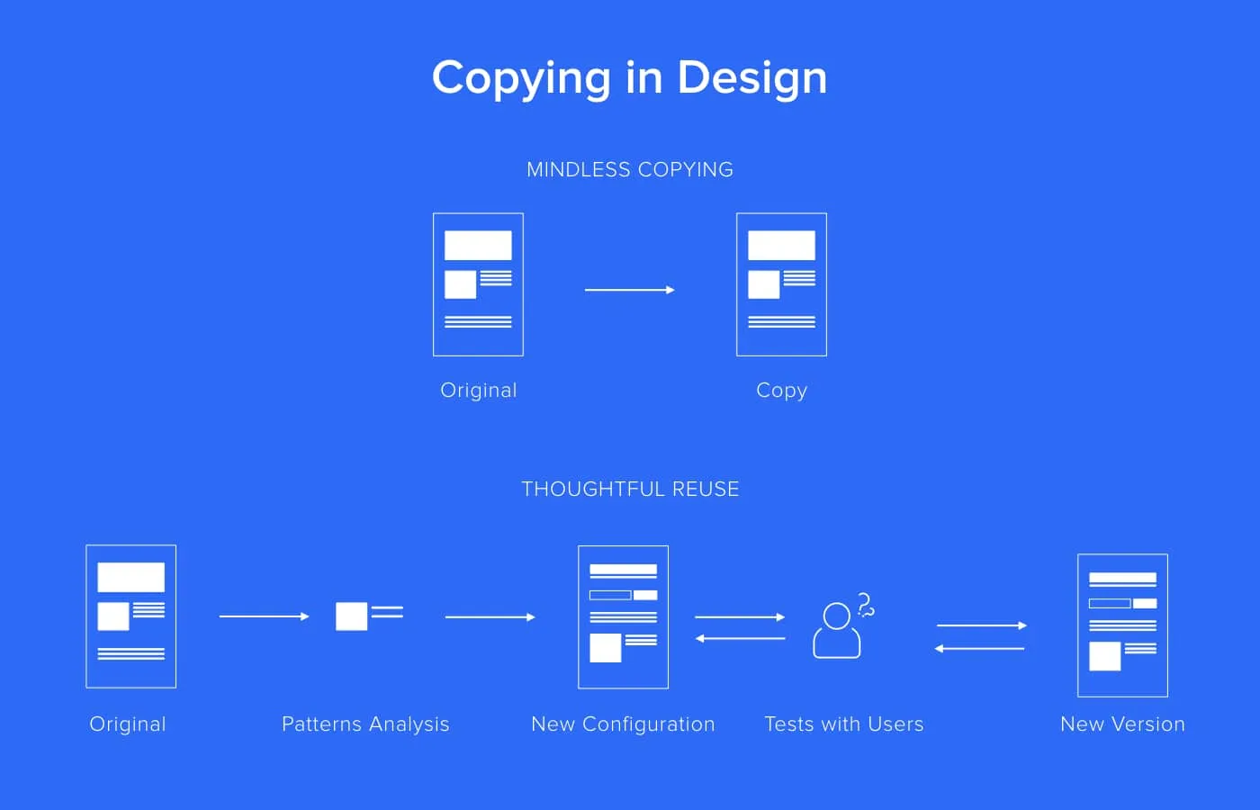
Thoughtful reuse is like standing on the shoulders of giants. Our new creations take what’s best in the past and take it to the next level. That leads to fast progress.
Some could argue that basing our design on what exists only kills innovation. But hardly anything in our collective culture comes to life from thin air. Analyzing and improving what exists lies at the heart of creative nature. It roots innovation in reality.
Reusability in product design is not like running in circles. It’s more like running a spiral in which every lap elevates you to the next level.
On the other hand, mindless copying is like building on a shallow foundation – the whole experience will eventually collapse.
So thoughtful reuse and remixing is the way to go. But here’s the surprising truth: reaching higher efficiency and improving your craft should not start with reusing the work of others. It should start with reusing your own work.
The first person you should copy is…you. By reusing your own work you can reach new highs of efficiency and UX quality.
Copy Yourself and Share It With Others
Designers are creators. We love to come up with new ideas and bring them to life. Yet, constantly coming up with new ideas isn’t a feasible business strategy.
Whenever we try to create something completely new, when an already tested solution exists, we incur a triple cost:
- Production Cost – We ask our engineers to craft a completely new code.
- Maintenance Cost – By building a completely new solution we double the maintenance cost. Now both old and new needs to be supported. Customer service teams need new training. Bugs will come up and require resolving.
- Experience Cost – If you’ve ever redesigned a big digital product, you know that users hate changes. The reason is very simple: by changing what they know and feel comfortable with, you’re attacking their feeling of security. Building multiple distinctive solutions (or visual representations of the solution) for the same problem will just confuse users and make them uncomfortable.
Sometimes we have to accept this triple cost. Sometimes drastic changes are needed. Sometimes coherence needs to be compromised.
Sometimes… but not usually.
Usually, a smart designer starts by analyzing what she already created (or what other designers on the team has already created) to jumpstart the creative process, avoid an unnecessary cost, and create coherent experience for users.
Rule of thumb: analyze existing patterns before jumping into a new solution.
Enter the Design System
Whenever consistency and efficiency are discussed, one solution immediately comes to mind – the design system. If you’re lucky, you’re already working with one. If that’s not the case, you’re probably going to work with one soon. Our survey done with over 3,100 enterprise designers, showed that nearly 70% of companies either has some form of a design system or is currently working on one.
Design systems are a process of building and maintaining single source of truth for all things interface. It’s a living language of creation for digital products.
But what if you don’t have a design system, or don’t need one yet? Well you can still standardize the your existing styles and patterns.
In design, habits trump rules. It’s never too early to reuse assets in your design workflow.
Standardize Building Blocks
The first step that can immediately improve your design process is saving and sharing the most fundamental design building blocks – colors, text styles, icons, image assets.
Saving color palettes and text styles is typically the last thing we’re thinking about when designing, but just think about all this time wasted on the constant search for the color or style of the text used in some old project. Or worse, think about all these times when you eyeballed things and got ‘almost’ the right color, or font size and you added to the overall lack of coherency of user experience.
And yes, in the past saving and sharing colors and text styles was difficult, so nobody really wanted to do it. These days though it became so easy, that you can easily apply it to your usual design workflow.
This is how saving colors and text styles looks like in UXPin:
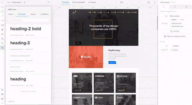
Everything saved in the library is immediately available to your team. Instead of checking styles in the old projects or guessing you can simply apply all the shared styles while working on your projects.
Whenever I have a unique style and color that I think we’ll use in more than one place, I save it in the library.
Saving your standard building blocks takes a second, but ends up saving hours.
But that’s not all.
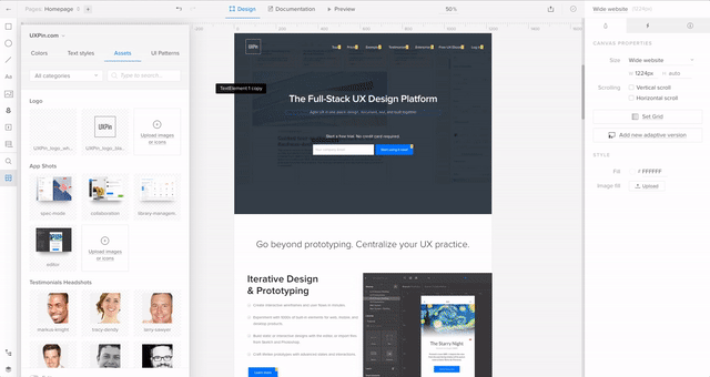
Another major waste of time is sharing all the graphic assets – logos, brand images, approved product shots, headshots, icons. Back in the days, my teams used to maintain FTP servers with shared assets. Then we switched to Dropbox, only to start using Google Drive. Every single time though the problem was that these assets were not easily accessible from within our design tools.
Now, at UXPin, we just store all the assets in a shared library. All the logos, screenshots, icons and other images are immediately available to the entire team. Huge time saver.
Standardize Patterns
Standardizing, sharing, and reusing build blocks is a great start to copying design in a way that increases efficiency and quality. But to really master reusability, you have to move to adapting and reusing entire interface patterns. Only then will you design even faster and more consistently.
The golden rule of design efficiency is:
When you use it more than once, turn it into a symbol.
Back in the day, design tools offered only masters limited in functionality that were lacking ability to override particular properties of elements, save states of elements and, often, save interactions and animations. It was very difficult, if at all possible, to create masters that were flexible enough to serve the entire team. These days are officially gone.
Forget about your old design tools with masters limited in functionality and painful to use. Those days are gone.
When we started to work on shared symbols, we had to make significant changes to what was a standard in competitive tools in the past. To fit the needs of our customers and, frankly, our needs, we had to change the status quo.
Here are our the internal requirements our product team described for UXPin symbols:
- Text and states of elements have to be overridable (you can change these properties in an instance of the symbol without affecting the master)
- Designer needs control what gets synced back to the master version of a symbol
- Symbols should be nestable
- Symbols must be shareable with the entire team and easily searchable
These might sound complex, so let me show couple of examples.
Navigation Created with UXPin Symbols
You should reuse navigation on every single page of a website. Recreating it every single time is a huge waste of time.
But simple copy/paste won’t work. What if you’d decide to change font size? Now you have to go through 20 pages and correct it. It’s going to take hours!
Simple masters won’t help either, because navigation tends to have different states depending of every page. Let’s say that you want to show the user the current location. You can’t just have one master, because then changing a state of one element will affect all of the instances. What you need is a symbol that can have overridable states.
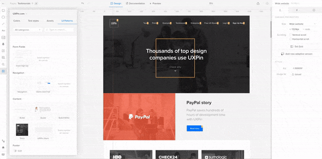
Here’s how it works in UXPin:
The navigation pattern is saved in a shared library for easy access. Our navigation has three states (there’s a change in the structure of links depending on the sub-page) and every link has three states (default, active and hover).
As you can see, I’m simply dragging and dropping the navigation pattern and adjusting the state for a particular state (state is going to override the default saved in the library, so I don’t need to worry about the effect on other pages!). Magic!
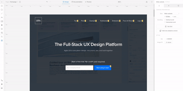
Now I need to show the active state of one of the links. I can simply override the default state in a nested symbol.
Footer with Nested Symbols
UI Patterns can get really complex.
When your whole team is using them (as they should!), you want to make sure that styling is easily controllable for every single element in the pattern. This is where nested symbols come in play.
Take the example of a footer. A typical footer has multiple links in it. You want to override the links (so you can link to individual pages) but control styling of whole groups of elements (like headers). To do that, you need to nest symbols within symbol so that every repeatable element within a repeatable element can have have a life on its own.
This is how it works in UXPin:
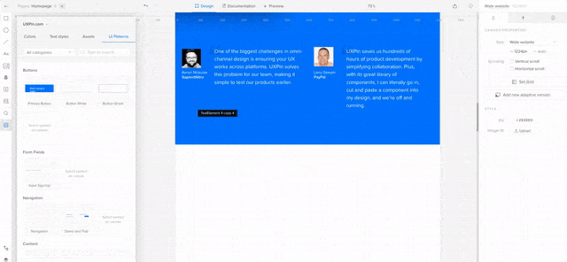
Nothing really complicated, but it’s been quite the wait in our industry.
Putting it All Together
Great designers steal? Yes! We shouldn’t be ashamed to admit that we steal from ourselves and colleagues. The only kind of stealing that works in design is smart reuse that leads to new experiences consistent with the overall system.
Not only is there no shame in smart reuse, we all should do it to save time on the tedious work. That’s why our product team spent the last few weeks working on Symbols in UXPin.

