Does the Hamburger Menu Make Mincemeat of UX Design?
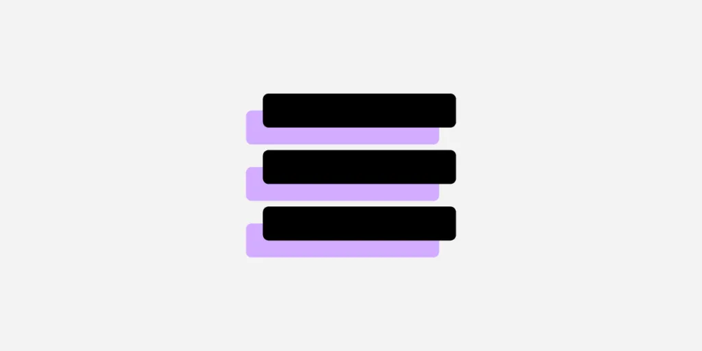
The hamburger menu looks as tasty as it sounds. It’s a design-cum-navigation element, now on almost all apps, that comprises three horizontal lines. It looks like a hamburger. Picture something like this:

Bun, patty, bun.
If you squint, it kind of looks like the Spotify logo:
The UX designer’s hamburger menu saves time and space by storing relevant information in a universally recognized format. All that information is there in one place, and everyone knows where it is. Like how a diner learns what food a restaurant serves by reading the menu, a website visitor accesses different linked sections through one navigational element.
Well, that’s the theory, anyway.
This icon became pervasive in the mid-2010s, and similar to the classic hamburger itself, every UX designer has an opinion about it. For every designer who thinks it frees up screen real estate, another believes it’s a blot on the informational architectural landscape. You might fall somewhere in the middle, but you will change your mind after reading this.
Design apps and websites with a hamburger menu in UXPin. Build prototypes that are responsive and have functional navigation. Test your prototypes with users, hand them over to developers and build your design system without using additional design tools. Try UXPin for free.

What Is a Hamburger Menu?
A hamburger menu is a UI element consisting of three horizontal lines, resembling a hamburger, typically located in the top corner of a website or app. When clicked or tapped, it reveals a hidden navigation menu or additional options.
The hamburger menu is commonly used in mobile interfaces to save space and keep the layout clean by tucking away less frequently used navigation items. While it’s efficient for mobile screens, some argue it hides important features, leading to lower discoverability.
Those three lines at the top of almost every app or mobile-optimized website? They make up the hamburger menu. Designer Norm Cox cooked up the idea in the early 80s because he thought it was easier to communicate information to people in a list format.
There’s evidence that backs up this theory:
- Humans remember facts better when presented with a list.
- Fifty-five percent of website users look at lists (seventy percent look at lists with bullet points).
- Lists improve the selection-making process for users.
Even that short list above improves readability and breaks down content into digestible “chunks.”
But other research tells a different story.
It all has to do with discoverability. Some website visitors can’t find the links when they’re hidden in a hamburger menu, which affects click rates. And click rates are even lower when designers place the hamburger menu on the top-left of the screen because of how most people scan their devices (center first, then right).
“The implied message is that things at the top of the screen are to be glanced at, not clicked on,” says UX Planet.
Perhaps the most shocking statistic is this one: Forty-eight percent of internet users over 45 don’t know what the icon even means.
So, unless your creative brief is “create a design for only millennials because nobody else must visit our website,” maybe choose something different the next time you consider a hamburger.
It’s Just a Hamburger Menu. What’s the Problem?
The hamburger menu certainly saves space; some would argue it’s easier on the eye. Instead of links stacked up against each other in the sidebar — or, God forbid, sprawled across the top of the home page like trash bags on a downtown sidewalk — the menu keeps everything hidden from sight, facilitating crisp and creative design. It’s like neatly placing everything in a drawer.
But it’s that drawer comparison that irks some designers.
Despite what IKEA tells you, humans put stuff in drawers for one reason:
There’s nowhere else to put it.
That’s why, for some designers, hamburgers are off the menu.
Think about the things you keep in drawers. Now think about the things you keep on shelves. Would you keep a framed photo of Mom in your drawer? Or your Master’s in User Experience Design? Probably not, because you want everyone to see it.
The hamburger menu suggests one thing: The items contained within are of little importance — concealed from public view and brushed under the carpet like a 20-year-old dirty secret that nobody wants to talk about.
Anti-hamburger designers think the menu is little more than an afterthought: There’s nowhere to put it, so let’s put it here. It’s lazy, if not necessarily bad, design.
So what are the alternatives?
A Burger-Free Menu
The most popular alternative to the hamburger menu is probably tabs, especially for app navigation on smaller smartphone screens. Sure, you’re limited to four or five menu items, but the ones featured hold greater importance because you haven’t hidden them away.
“Tabs offer a more modern and useful method to navigate around an app, and the core sections of your application are immediately visible to the user,” says UX designer and software engineer Michael J. Fordham. “If you’re concerned about space, you can implement hide gestures that make the tabs disappear when you scroll down but reappear when you scroll up.”
What else is on the menu?
Floating Hamburger
Again, best served on apps, this alternative provides users with context when they click on the three-line icon. Like tabs, links no longer feel like an afterthought, and they feature more prominently on screens.
Swipes
Think Tinder, where users scroll left or right to navigate apps. Swipes only provide sequential access to pages, though, so won’t suit contexts where users jump to different sections quickly, like store pages.
Ultimately, It’s Your Choice as the Designer
If you’re still hungry for a hamburger, a couple of tips:
- Supersize your burger: Make your menu more recognizable so visitors can see it. The links contained within could be critical for the website owner. Make sure people click on them.
- Create a secondary menu: Couple the hamburger with secondary access to important pages. (Use one of the menu alternatives above.) You’re probably thinking about the c-word (“clutter”), but you can avoid this by incorporating minimalist elements elsewhere in the design infrastructure. Try it.
Last Bite
Mentioning the hamburger menu in UX design is like bringing up politics at a dinner party. Expect some controversial opinions. Despite what some designers think, it’s not a crime to use the hamburger, and it can be an incredibly effective navigational tool. Just realize its potential downfalls, consider the overall context and try out a couple of alternatives with UXPin before your next bite. When’s the next time you’ll serve up a hamburger?
Join the world’s best designers who use UXPin — not your average UI design and prototyping tool. Start your free trial.


