8 Best React Component Libraries in 2026 (Compared & Ranked)
React remains the most widely used front-end framework in 2026, powering everything from startup MVPs to enterprise platforms serving millions of users. Choosing the right component library is one of the highest-leverage decisions a team can make — the right library gives you accessible, themeable, production-ready UI elements out of the box, so your team spends time on product logic instead of reinventing buttons, modals, and data tables.
This guide covers the best React component libraries available in 2026, explains how to evaluate them for your use case, and shows how tools like UXPin Merge let designers drag and drop real React components onto a visual canvas — creating prototypes that are already production code.

What Is a React Component Library?
A React component library is a curated collection of reusable, pre-built UI elements — buttons, form controls, modals, data tables, navigation patterns, and more — designed and optimised for React applications. Well-maintained libraries follow established design patterns, ship with accessibility (WAI-ARIA) built in, and offer robust theming APIs that align components with your brand’s design system.
Using a component library instead of building from scratch saves teams hundreds of hours of development and accessibility remediation work. In 2026, the best libraries also provide full TypeScript definitions, tree-shaking for minimal bundle sizes, and Server Component compatibility for modern React architectures.
How to Choose the Right React Component Library
Before evaluating specific libraries, establish your criteria. Here are the six factors that matter most:
1. Community, Maintenance & Release Cadence
Check GitHub stars, weekly npm downloads, release frequency, and how quickly issues and security vulnerabilities are resolved. A large, active community means faster bug fixes, better documentation, and a rich ecosystem of third-party plugins, templates, and examples.
2. Component Coverage
Does the library cover every element your product needs? Data grids, date pickers, autocomplete inputs, charts, file uploaders — gaps in coverage mean you’ll either build custom components or adopt a second library, adding dependency complexity.
3. Theming & Customisation
Look for design-token-based theming — whether that’s CSS custom properties, a ThemeProvider API, or Tailwind-based configuration. The ability to deeply customise components without forking the library source code is critical for maintaining a unique brand identity at scale.
4. Accessibility (a11y)
Strong accessibility out of the box — correct ARIA attributes, full keyboard navigation, focus management, and screen reader announcements — saves significant QA and remediation effort. Look for WCAG 2.2 AA compliance.
5. Bundle Size & Performance
Tree-shakability is essential in 2026. Libraries that support individual component imports keep your JavaScript bundle lean and your Core Web Vitals healthy. Also evaluate Server Component support — libraries that work with React Server Components (RSC) can significantly reduce client-side JavaScript.
6. TypeScript Support & Documentation
Comprehensive documentation with live, interactive examples dramatically reduces onboarding time. Full TypeScript definitions enable autocompletion, type checking, and safer refactoring.
The 8 Best React Component Libraries in 2026
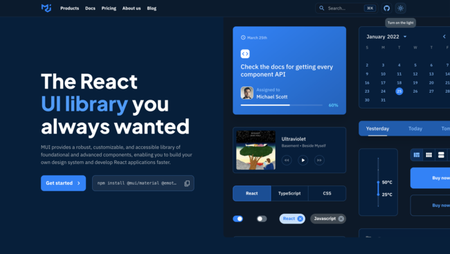
1. MUI (Material UI)
- GitHub Stars: 95k+
- Weekly npm Downloads: 4M+
- Styling: Emotion (CSS-in-JS) with design tokens; Pigment CSS for zero-runtime option
- Website: mui.com
MUI remains the most popular React component library in 2026. Built on Google’s Material Design system, it offers one of the broadest component sets available — from foundational elements like buttons and forms to advanced data grids, date/time pickers, tree views, and charts via MUI X.
Why teams choose MUI:
- Component breadth: 60+ core components plus premium MUI X additions for data-intensive applications
- Theming:
ThemeProviderand a design-token architecture make global theming straightforward. Override any component at the theme level or per instance. - Documentation: Best-in-class — every component has live demos, API reference tables, accessibility notes, and customisation guides
- Ecosystem: Massive community, thousands of templates, and deep integration with the React ecosystem
UXPin integration: MUI is available as a built-in library in UXPin. Designers can drag MUI components directly onto the canvas and build fully interactive prototypes with real code — no handoff gap. With Forge, UXPin’s AI design assistant, you can generate complete layouts using MUI components from a text prompt, image upload, or URL.
Best for: Full-featured applications, teams that want the broadest component coverage, and organisations already using Material Design.
2. shadcn/ui
- GitHub Stars: 80k+
- Approach: Copy-paste component collection (not a traditional npm package)
- Styling: Tailwind CSS + Radix UI primitives
- Website: ui.shadcn.com
shadcn/ui has become the fastest-growing component ecosystem in React. Instead of installing an npm dependency, you copy fully accessible, beautifully designed component source code directly into your project via a CLI tool. Components are built on Radix UI primitives for accessibility and styled with Tailwind CSS, giving you total ownership and zero dependency lock-in.
Why teams choose shadcn/ui:
- Full ownership: You own every line of code — no hidden abstractions or upstream breaking changes
- Excellent accessibility: Radix UI primitives provide robust ARIA, keyboard, and focus management
- Tailwind-native: Components are styled with utility classes, making customisation instant for Tailwind teams
- Rapid ecosystem growth: Community extensions, themes, and shadcn-compatible libraries are expanding rapidly
UXPin integration: Bring your shadcn/ui components into UXPin via Merge’s Git integration, or explore the pre-built shadcn/ui library in UXPin to start prototyping immediately.
Best for: Tailwind CSS teams, projects that need full component ownership, and developers who prefer composable, transparent code.
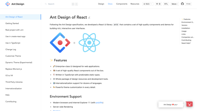
3. Ant Design (AntD)
- GitHub Stars: 93k+
- Weekly npm Downloads: 1.5M+
- Styling: CSS-in-JS with design tokens (v5+)
- Website: ant.design
Developed by Ant Group (the technology organisation behind Alibaba), Ant Design is purpose-built for enterprise applications. It excels at complex, data-heavy interfaces — dashboards, admin panels, CRM systems, and form-intensive workflows — with advanced components like ProTable, ProForm, and ProLayout that handle enterprise UI patterns out of the box.
Why teams choose Ant Design:
- Enterprise-grade components: Built-in data grids, form builders, and layout systems designed for complex back-office applications
- Design tokens: AntD v5’s CSS-in-JS token system makes theming far more flexible than previous versions
- Internationalisation: First-class i18n support with 60+ locale packages
- Stability: Backed by Ant Group with long-term maintenance commitments
UXPin integration: UXPin supports Ant Design via npm integration, so teams can design prototypes with the same components their developers deploy to production.
Best for: Enterprise applications, data-heavy dashboards, admin panels, and organisations that need deep internationalisation support.
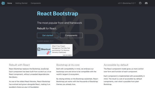
4. React-Bootstrap
- GitHub Stars: 22k+
- Weekly npm Downloads: 1.4M+
- Styling: Bootstrap CSS (utility classes + Sass variables)
- Website: react-bootstrap.github.io
React-Bootstrap replaces Bootstrap’s jQuery dependency with clean, idiomatic React components. If your team already knows Bootstrap’s class naming conventions and 12-column grid system, the learning curve is nearly zero.
Why teams choose React-Bootstrap:
- Familiar API: Teams with Bootstrap experience are immediately productive
- Massive template ecosystem: Thousands of free and premium Bootstrap themes and templates
- Responsive grid: Bootstrap’s battle-tested grid system, now with React component wrappers
- Lightweight: Small bundle with CSS-only styling — no JavaScript runtime overhead
UXPin integration: React-Bootstrap is available as a built-in library in UXPin. Designers can also use the Bootstrap UI kit for rapid prototyping with Bootstrap components.
Best for: Marketing sites, landing pages, content-driven web apps, and projects where Bootstrap’s template ecosystem saves time.
5. Chakra UI
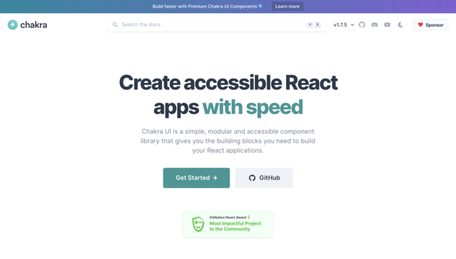
- GitHub Stars: 38k+
- Weekly npm Downloads: 600k+
- Styling: Style props (CSS-in-JS)
- Website: chakra-ui.com
Chakra UI prioritises developer ergonomics and accessibility. Its style-props API lets you apply responsive styles directly on JSX elements, and every component follows WAI-ARIA standards by default. Dark/light mode support is a first-class feature.
Why teams choose Chakra UI:
- Style props: Write responsive styles inline —
<Box p={[4, 6, 8]}>sets padding per breakpoint - Accessibility-first: Every component ships with correct ARIA attributes, focus management, and keyboard navigation
- Design tokens: Chakra’s theme object provides centralised control over colours, spacing, typography, and breakpoints
- Developer experience: Consistently rated as one of the most ergonomic React UI libraries to work with
Best for: Teams that prioritise developer experience, projects that need accessibility-first design, and applications where dark mode and theming are core requirements.
6. Radix UI
- GitHub Stars: 16k+
- Approach: Unstyled, accessible primitives + optional Radix Themes
- Website: radix-ui.com
Radix UI provides the accessibility primitives behind shadcn/ui as standalone packages. Each primitive (Dialog, Dropdown, Tabs, Tooltip, etc.) delivers fully accessible behaviour with correct ARIA attributes, focus trapping, keyboard navigation, and screen reader announcements — with zero visual styling.
Radix also offers Radix Themes, a styled component layer built on Radix primitives with a polished default design and token-based theming. This gives teams a choice: use Radix as bare-bones primitives and style them with your own CSS, or adopt Radix Themes for a complete, accessible, styled component set.
Best for: Teams building custom design systems from scratch, projects that need the highest level of accessibility compliance, and developers who want full styling control.
7. Headless UI
- GitHub Stars: 25k+
- Created by: Tailwind Labs
- Website: headlessui.com
Headless UI is created by the team behind Tailwind CSS. It provides a focused set of unstyled, fully accessible components — Menu, Listbox, Combobox, Dialog, Popover, Tabs, and more — designed to pair perfectly with Tailwind utility classes.
Where shadcn/ui gives you a complete component collection, Headless UI gives you the interactive building blocks to create your own. It’s a smaller surface area by design — fewer components, but each one is polished and deeply accessible.
Best for: Tailwind CSS projects that need accessible interactive patterns without adopting a full component library.
8. React Aria (Adobe)
- GitHub Stars: 13k+ (React Spectrum monorepo)
- Created by: Adobe
- Website: react-spectrum.adobe.com/react-aria
React Aria is Adobe’s hooks-based library for building accessible React components. Rather than providing component JSX, React Aria exposes hooks (useButton, useTextField, useComboBox, etc.) that handle all accessibility behaviour — ARIA attributes, keyboard events, focus management, and internationalisation — while you provide the JSX and styling.
React Aria also includes a companion library, React Aria Components, which wraps these hooks in ready-to-use, styleable components for teams that want accessibility without building every element from scratch.
Best for: Teams building highly custom design systems where accessibility and internationalisation are non-negotiable, and organisations with strict brand requirements that can’t use off-the-shelf styled components.
Quick Comparison Table
| Library | Best For | Styling Approach | TypeScript | Accessibility | Bundle Size |
|---|---|---|---|---|---|
| MUI | Full-featured apps | CSS-in-JS (Emotion) | Yes | Strong | Medium (tree-shakable) |
| shadcn/ui | Tailwind-native projects | Tailwind CSS | Yes | Excellent (Radix) | Minimal (you own the code) |
| Ant Design | Enterprise / data-heavy | CSS-in-JS tokens | Yes | Good | Medium-Large |
| React-Bootstrap | Marketing & content sites | Bootstrap CSS | Yes | Good | Small |
| Chakra UI | DX-focused, accessible apps | Style props | Yes | Excellent | Medium |
| Radix UI | Custom design systems | Unstyled (BYO CSS) | Yes | Excellent | Small |
| Headless UI | Tailwind interactive patterns | Unstyled (Tailwind) | Yes | Excellent | Very small |
| React Aria | Max a11y + i18n control | Hooks (BYO JSX + CSS) | Yes | Best-in-class | Small (per-hook) |
Styled vs. Headless Libraries: Which Approach Is Right for You?
The React component ecosystem in 2026 splits into two camps: styled libraries (MUI, Ant Design, Chakra UI, React-Bootstrap) and headless/unstyled libraries (Radix UI, Headless UI, React Aria). Understanding the trade-off helps you choose correctly.
Choose a styled library when:
- You want to ship fast with a cohesive visual design out of the box
- You don’t have a dedicated design system team
- Theming (rather than pixel-level custom styling) is sufficient
Choose a headless library when:
- You have a mature design system with strict visual requirements
- You want full control over HTML structure and CSS
- Accessibility compliance is a hard requirement (WCAG 2.2 AA or AAA)
- You’re using Tailwind CSS and want to style everything with utility classes
Many teams in 2026 use a hybrid approach: a styled library for standard UI (MUI or Chakra) plus headless components (Radix or React Aria) for highly custom interactive patterns like comboboxes, drag-and-drop, or complex menus.
Designing and Prototyping With Real React Components
One of the biggest challenges in product development is the gap between what designers create and what developers build. Static design mockups inevitably diverge from the production codebase, leading to costly back-and-forth, pixel-diff debates, and inconsistent UIs that erode user trust.
UXPin Merge eliminates this gap by letting designers work directly with production React components. Sync MUI, shadcn/ui, Ant Design, React-Bootstrap, or your own custom library into UXPin’s visual editor. Every prototype you create uses the exact same code that ships to production — including real props, states, and theme tokens.
With Forge, UXPin’s AI design assistant, teams can go even faster. Describe a layout in plain text, upload a wireframe image, or paste a URL — and Forge generates a complete interactive screen using your actual component library. Because Forge is constrained to your production design system, every AI-generated screen is brand-consistent and outputs production-ready JSX. Enterprise teams report 8.6x faster design-to-prototype cycles with this workflow.
This is why enterprise organisations like PayPal rely on UXPin Merge — their 5-person UX team supports 60+ products and 1,000+ developers, with a 50% reduction in engineering time compared to traditional design-to-development handoff.
Try UXPin for free and start designing with code-backed React components today.
Frequently Asked Questions
What is the most popular React component library in 2026?
MUI (Material UI) continues to be the most downloaded React component library, with over 4 million weekly npm downloads. It offers the broadest component set and the most mature theming system. shadcn/ui is the fastest-growing alternative, particularly among teams using Tailwind CSS — its copy-paste model and Radix UI foundation have made it extremely popular since 2024.
Is shadcn/ui a component library?
Technically, shadcn/ui is a component collection rather than a traditional npm package. Instead of installing a dependency, you use a CLI to copy component source code directly into your project. This gives you full ownership — you can modify any component without worrying about upstream breaking changes. Components are built on accessible Radix UI primitives and styled with Tailwind CSS.
Which React component library is best for enterprise applications?
Ant Design is purpose-built for enterprise use cases — data-heavy dashboards, complex multi-step forms, and admin interfaces. MUI is also an excellent enterprise choice, especially with MUI X’s advanced data grid, date pickers, and charting components. Both integrate with UXPin Merge for seamless design-to-code workflows.
Can designers use real React components without writing code?
Yes. UXPin Merge syncs React component libraries into a visual design editor. Designers drag and drop production components, configure props and variants, and build fully interactive prototypes — all without writing a single line of code. The output is production-ready JSX that developers can use directly.
What is the difference between a styled and a headless component library?
A styled library (like MUI, Chakra UI, or Ant Design) provides both component logic and visual design. A headless library (like Radix UI, Headless UI, or React Aria) provides only accessible behaviour and interaction logic — you supply all the CSS and visual styling yourself. Headless libraries give you maximum styling control; styled libraries give you faster time to a polished UI.
How do I choose between MUI and Chakra UI?
Choose MUI if you need the broadest component coverage, an established ecosystem, and advanced components like data grids and charts. Choose Chakra UI if developer experience, style-props ergonomics, and accessibility-first design are your top priorities. Both offer robust theming and full TypeScript support.


