Essential Microcopy Guide: How to Write Microcopy That Converts Users
Users have many fears and uncertainties that can hurt conversions. They might be afraid of being lied to, losing their money or they might not understand what they need to do. Microcopy irons out these kinks and empowers users to take action.
What is Microcopy?
Microcopy is the short words and phrases that are used in user interfaces to help users take the right action and interact with the product. Great microcopy converts users by:
- Motivating them to take an action
- Contextualizing their experiences
- Anticipating and addressing their issues
- Creating a delightful brand narrative
Microcopy is copy that is found in:
- Form fields and labels
- Error messages
- Confirmation messages
- Button copy
How Effective is Good Microcopy?
From microcopy’s definition (small bits of short copy), one might think that it has a small impact. Nothing could be further from the truth, good microcopy has a positive effect on conversions and positive user behavior.
In a case study by Yoast, an SEO optimization site, there was an 11.30% increase in conversions after revising microcopy. They added “there will be no additional costs” and a ‘continue shopping’ text link to the checkout form. They also did away with the ‘remove’ microcopy and replaced it with an ‘x.’
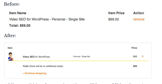
Yoast’s microcopy changes (source)
In another case study, a Danish e-commerce site increased its conversions by 17.18% by simply adding the words “view bundle” above its CTA button.
Where to Leverage Microcopy on Your Site or App
CTAs
Calls to Action (CTAs) ask users to take a very specific task such as signing up, buying a product, or starting a free trial. The microcopy in the CTA button and around it is very useful in getting users to take the desired action.
Within the CTA, the microcopy should be short, action-oriented, and descriptive. Around the CTA button, microcopy should anticipate and reduce any friction or barriers that the buyer might have towards taking action. Microcopy should be tailored according to context and customer data. Here are some tips to reduce friction:
Reduce fears the users might have: Users fear being spammed, losing their data, hidden charges, and their information being misused or sold. You alleviate these fears by using microcopy such as ‘no spam,’ ‘your data will not be sold,’ ‘free forever’, or explaining why you need their information.
For example, Facebook alleviates its users’ fears by assuring them that the service is “free and will always be” and by explaining why they need to know the user’s birthday.
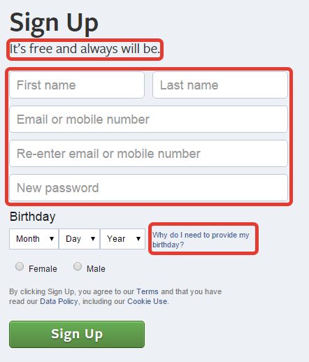
Facebook’s signup microcopy (Source)
Have useful error states: Errors are a significant barrier to conversion and many new users just give up. To prevent this, write error state microcopy that helps users correct their errors and move to the next stage of the customer journey. It’s not enough to just define the error, explain how users can solve it.
In the example below, the error is explained and alternative solutions are provided.
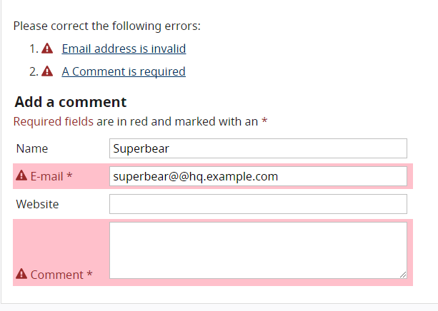
Helpful error state copy W3C
Use benefit-driven copy: Your CTA buttons will convert better if you show your users the benefits of taking the next action. In the example below, the benefit of convenience (many book formats and free reading apps and trials) is emphasized.
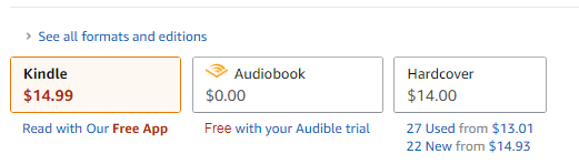
Benefit driven microcopy (Source)
Use social proof: Tip over unsure users by reassuring them that their friends or other people have already taken the action that you want them to take. Basecamp used social proof to convince people to sign up for their software.
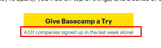
Social proof microcopy (Source)
Menu Copy
Menu copy is very prominent on websites and it pays to optimize it. The best practice is to use short phrases preferably a single command (verb like ‘save’ or ‘download’) or descriptive word (noun like ‘home’ or ‘about’) to reduce confusion.
Buttons
Button copy helps move users to take actions such as moving forward (‘next’, ‘save’) or moving backward (‘previous’, ‘cancel’). Optimize button microcopy by:
- Using short commanding phrases (‘create account’)
- Using descriptive and unambiguous copy (‘delete’ instead of ‘remove’)
- Using sentence case because it is easy to read
- Customizing microcopy according to context
Text Links
For text links use short descriptive microcopy that explains what users are going to get or do when they click on the link. This reduces anxiety and inertia.
Icons
Just like button microcopy, icon microcopy should use action verbs, describe the action being taken, and be short.
Writing Effective Microcopy
Understand Your “Voice” and “Tone”
Understanding your voice and tone is the first step in writing effective microcopy. They will determine what you will write and how you will write it.
For clarity, your brand voice is the unique way in which your company communicates. It might be cheeky, fun, or abrasive. Tone changes depending on the situation and your users’ needs.
Here’s how to find your tone and voice:
- Go through your company’s branding information to find out your voice together with the marketing department.
- Interview key leaders to find out your mission, vision, and brand personality.
- Research your target market so that you can understand their wants and needs.
- Do Voice of Customer research to understand how your users actually talk and use their language in your microcopy.
These steps will help you create a voice and tone guide that you can use as a point of reference every time you write microcopy.
Test Your CTAs
The only way to know if your CTAs and microcopy are converting is by testing them on real users. Do A/B testing to find out the winning CTAs and microcopy and then keep iterating it. The truth is that CTA and microcopy testing and optimization is a continuous process because the user’s needs change often.
Microcopy in UX and UI Design
Choosing the right font, size, and weight
Fonts determine the legibility of your microcopy. Users can’t act on it if they can’t see it! Here are some tips to improve the legibility of your microcopy:
- Don’t use too many font types. Use a style guide to maintain consistency between your microcopy and other UI elements
- Use a legible font size, don’t make it too small that readers can’t see it.
- Use bolding sparingly
- Increase font size and padding to emphasize text without bolding.
- Ensure that there is enough white space around your microcopy to make it stand out.
Choosing the right text color
You can use color to increase the conversion capabilities of your microcopy. Color contrast helps to draw attention to your microcopy. Ensure that the color contrast is high enough and it conforms to web accessibility guidelines.
You can use color language to nudge users towards or away from certain actions. The color green is associated with progress while the color red is associated with danger. Use green when you want to encourage users to take an action and use red when you want to discourage them from taking an action like canceling.
Write, Prototype, and Design With the Best Tools
Use UXPin to create microcopy that converts users. Use our color contrast checker to check for accessibility and out style guides and design patterns to ensure that your microcopy is consistent.

