Touchscreens have changed how we interact with digital content. Designing for touch requires larger, finger-friendly targets, avoiding hover states, and focusing on thumb-friendly zones. Here’s what you need to know:
- Finger Size Matters: Average fingertips are 0.6–0.8 inches wide, so touch targets should be at least 48 pixels with 8 pixels of spacing.
- Thumb Zones: Place key actions in the bottom third of screens for one-handed ease.
- No Hover States: Ensure all functionality is accessible via taps, not mouse hovers.
- Mobile-First Design: Start with mobile layouts to ensure usability on small touchscreens.
- Testing Is Key: Test designs on real devices to catch issues like small buttons or awkward layouts.
Mobile-First and Touch-First Design Principles
Why Mobile-First Works for Touch Devices
Mobile-first design emphasizes streamlining content and focusing on what truly matters. With limited screen space, it forces designers to create cleaner, more intuitive interfaces that highlight essential interactions.
One of the major benefits of this approach is its scalability. Interfaces designed for mobile – featuring larger buttons and ample spacing – translate smoothly to other devices. On the other hand, interfaces built for desktops often include small, tightly packed elements that can be frustrating to use on touchscreens.
Take the BBC‘s design philosophy as an example. Their Global Experience Language (GEL) team champions the idea of designing for touch-first:
"We should design for ‘touch-first’, and only when device detection can be guaranteed, make exceptions for people using non-touch where appropriate."
With hybrid devices like touchscreen laptops and tablets becoming more common, assuming users will stick to a single input method is no longer practical. A user might start navigating with a mouse and switch to touch moments later. By adopting a touch-first approach, you ensure the interface adapts seamlessly to these varied interaction modes.
This mobile-first mindset naturally leads to rethinking traditional interaction patterns to better suit touchscreens.
Touch-First Interaction Design Basics
Designing for touch-first requires challenging old habits. One of the most critical adjustments is moving away from hover-based interactions. On touchscreens, there’s no way to preview functionality before committing to a tap, so every action must be designed for direct interaction.
As the BBC GEL team advises:
"Avoid relying on hover states."
This doesn’t mean hover effects should be abandoned entirely – they can still enhance desktop experiences. However, they shouldn’t be the only way users access important functionality. Instead, focus on gestures that feel intuitive on touch devices: swiping to navigate, pulling down to refresh, or tapping to expand sections. Use media queries to optimize button sizes and padding for touchscreens, ensuring interactive elements meet the recommended minimum size of 48 pixels.
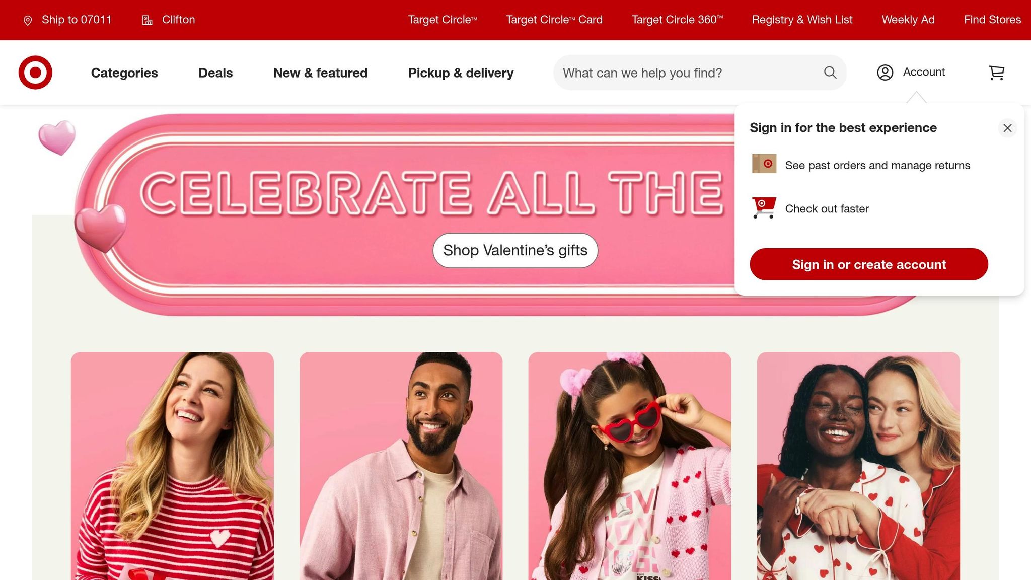
A great example comes from Target’s app redesign in 2019. They reworked their primary "Search" and "Scan" buttons to measure roughly 0.8 inches by 0.8 inches (about 2 cm by 2 cm). This change made the app easier to use with one hand, reducing user frustration and improving functionality in everyday scenarios.
Luke Wroblewski – Designing for Touch
Touch Targets and Layout Optimization
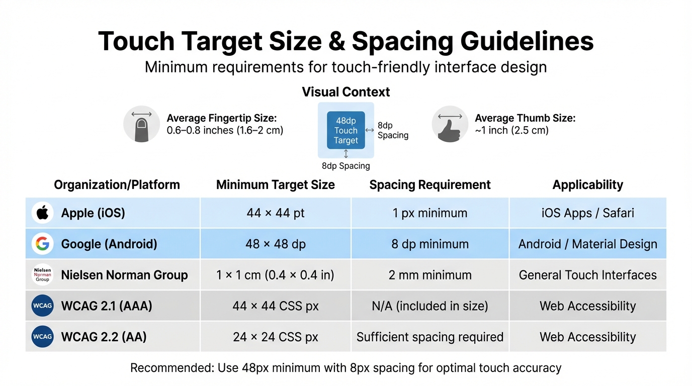
Touch Target Size Guidelines by Platform and Organization
When designing for mobile devices, refining touch targets and layouts is key to ensuring usability on touchscreens. Let’s dive into how proper sizing, spacing, and thoughtful layouts can make all the difference.
Touch Target Size and Spacing Guidelines
Unlike the pinpoint accuracy of a mouse, human fingers are far less precise. The average fingertip is around 0.6–0.8 inches (1.6–2 cm) wide, while thumbs measure about 1 inch (2.5 cm). This means finger taps cover a much larger area than a mouse click.
To address this, various platforms and organizations have established minimum size guidelines for touch targets. Here’s a quick comparison:
| Organization / Platform | Min. Target Size | Spacing Requirement | Applicability |
|---|---|---|---|
| Apple (iOS) | 44 x 44 pt | 1 px minimum | iOS Apps / Safari |
| Google (Android) | 48 x 48 dp | 8 dp minimum | Android / Material Design |
| NN/g | 1 x 1 cm (0.4 x 0.4 in) | 2 mm minimum | General Touch Interfaces |
| WCAG 2.1 (AAA) | 44 x 44 CSS px | N/A (included in size) | Web Accessibility |
| WCAG 2.2 (AA) | 24 x 24 CSS px | Sufficient spacing required | Web Accessibility |
Aurora Harley, a Senior User Experience Specialist at NN/g, emphasizes:
"Interactive elements must be at least 1cm × 1cm (0.4in × 0.4in) to support adequate selection time and prevent fat-finger errors."
Interestingly, touch targets don’t have to look large to perform well. For example, you can keep a sleek 24px icon while expanding its tappable area to 48px using padding. This approach maintains a clean design while meeting the roughly 9mm size of a typical fingertip. CSS media queries like @media (any-pointer: coarse) can help detect touchscreen users and dynamically adjust padding for buttons and links.
Spacing also matters. Keep at least an 8px gap between interactive elements. For smaller targets, surround them with an "exclusion zone" – a buffer area about 0.28 x 0.28 inches (7mm x 7mm) free of other interactive elements. For critical actions like "Submit" or "Checkout", go beyond the minimum size, especially since users might interact with your design while walking or multitasking.
Once touch targets and spacing are optimized, the next step is to ensure the layout aligns with these principles.
Designing Touch-Friendly Layouts
Creating layouts for touch devices starts with understanding thumb zones – the natural reach of your thumb during one-handed use. The bottom third of the screen is the most accessible area, making it the ideal spot for primary actions like navigation tabs or confirmation buttons. The center is generally comfortable, while the top corners require awkward stretching, especially on larger devices.
To maximize usability:
- Place frequently used controls in thumb-friendly zones.
- Reserve harder-to-reach areas for secondary actions.
- Avoid positioning critical buttons at the screen’s edges, as phone cases or bezels can make these spots tricky to tap.
Support gestures like swiping for navigation or pull-to-refresh, but always provide a tappable alternative. Gestures can be challenging for users with motor impairments, so direct button interactions are essential.
Additionally, use HTML5 input types like type="tel" or type="email" to bring up the appropriate virtual keyboard. This small detail saves users from the hassle of switching keyboard layouts manually.
Finally, test your design on real devices. Factors like screen protectors, hand size, and even the angle at which users hold their phones can all influence how they interact with your interface. Testing ensures your layout works in real-world conditions and provides the best possible experience.
Typography and Content Scaling for Touch Devices
When designing for touch devices, typography plays a crucial role in ensuring clarity and usability on smaller screens.
Start with a base text size of 16px (1rem) for better readability. Secondary text can go down to 14px, but avoid anything smaller, as it may strain the eyes. To make text flexible and responsive, use relative units like rem, em, or ch. For dynamic scaling, the CSS clamp() function is a great tool. For example, font-size: clamp(1rem, 0.75rem + 1.5vw, 2rem); adjusts text size seamlessly across devices, from smartphones to tablets. Pair this with a unitless line-height (e.g., 1.5) to maintain proportional spacing. This combination ensures that typography remains clear and adaptable, complementing touch-friendly layouts.
For readability, aim for a line length of about 66 characters (with an acceptable range of 45–75). You can use the ch unit to control text container width, such as max-inline-size: 66ch;, to maintain this ideal line length. Avoid using all-caps for body text, as it can slow down reading speeds by 13% to 20%.
To meet accessibility standards like WCAG 2.1 Level AA, ensure text contrast ratios are at least 4.5:1 for normal text and 3:1 for larger text. Additionally, line spacing should be at least 1.5, and letter spacing should measure 0.12 times the font size.
Interactive text, such as links, should be large enough for easy tapping – at least 44px in height. Use media queries like @media (pointer: coarse) to detect touchscreens and add extra padding around clickable elements. For images, applying max-width: 100% and height: auto ensures they scale fluidly without distortion.
sbb-itb-f6354c6
Feedback and Interaction States
Why Feedback Matters in Touch Interactions
When using touch interfaces, a finger often blocks the target, making it crucial to provide feedback that confirms an element has been selected. Immediate visual or tactile responses – triggered on touchstart – can significantly boost user confidence, especially when loading times are unpredictable.
"Adding ‘touch states’ can help an interface feel more responsive to someone’s actions. They give you a confirmation that something will happen, which is very important for when you have unpredictable loading times." – BBC GEL
Triggering feedback on the touchstart event, rather than waiting for the finger to lift, makes the interface feel much more responsive. This approach also addresses the historical 300ms delay some touch-optimized browsers introduced to differentiate single taps from double-taps or gestures.
Once feedback reassures users, the next step is designing interaction states that align with the unique characteristics of touch inputs.
Designing Interaction States for Touch Inputs
Effective interaction states for touch inputs should focus on immediate feedback and account for the distinct nature of touch-based interactions.
Unlike mouse and keyboard inputs, which typically operate with three states (up, down, and hover), touch inputs rely on a simpler two-state model: touched or not touched. This difference means that interactive elements must be designed to suit touch-specific behaviors.
Using the @media (hover: hover) CSS feature, you can apply hover styles exclusively to devices with hover-capable inputs. For touch devices, prioritizing clear visual changes for states like pressed or disabled ensures users can easily identify interactive elements.
For draggable elements, consider enlarging or slightly rotating them when active to keep them visible despite finger occlusion. Adding haptic feedback can also provide a tactile confirmation that an object has been engaged or moved. These adjustments create a more intuitive and accessible experience for touch users.
| Feature | Touch Interactions | Mouse/Keyboard Interactions |
|---|---|---|
| Precision | Low – interaction occurs over a fingertip | High – precise x-y coordinates provided |
| State Model | Two-state (on/off) | Three-state (up/down/hover) |
| Occlusion | High – fingers cover UI elements | None – cursor doesn’t obscure target |
| Hover | Generally unavailable | Standard – used for exploration |
Testing and Iteration for Touch Interfaces
Testing on Real Devices
To truly refine touch interfaces, testing on actual devices is a must. Simulators just don’t cut it when it comes to replicating real-world touch interactions. They miss critical details like how users grip their devices, the impact of protective cases, or how non-dominant hand usage affects interactions.
Physical testing reveals issues that desktop browsers can’t detect. For example, Safari on iOS requires a touchstart listener on the body to properly activate the :active state. Similarly, performance hiccups during touch events often arise only on real devices when code runs on the main thread.
It’s also essential to test in realistic scenarios. Consider how users interact with devices in one-handed mode, while walking, or using a tablet in "clipboard mode". Pay attention to subtle cues like a "focus face", which signals that users are struggling to tap accurately. Watch for "rage taps" – multiple quick taps in frustration – often caused by unresponsive or undersized buttons.
"The fat fingers are not the real culprit; the blame should lie on the tiny targets." – Aurora Harley, Senior User Experience Specialist, Nielsen Norman Group
These real-world observations are invaluable for making meaningful refinements.
Iterating Based on User Feedback
Testing on real devices provides the insights needed for precise adjustments. Heat maps can highlight where users intend to tap versus where they actually do, exposing issues like view-tap asymmetry – when elements are easy to read but too small or crowded to tap reliably.
To improve touch targets, expand them beyond their visible size using CSS padding or ::before pseudo-elements. Media queries like @media (any-pointer: coarse) can automatically scale up touch targets for touchscreen users. Tools like Chrome DevTools’ "Computed" pane or Firefox’s "Layout" panel can help you confirm the actual pixel dimensions of your adjustments.
Mark Figueiredo, Sr. UX Team Lead at T. Rowe Price, shared how faster feedback loops have transformed their process:
"What used to take days to gather feedback now takes hours. Add in the time we’ve saved from not emailing back-and-forth and manually redlining, and we’ve probably shaved months off timelines".
Conclusion
Creating responsive interfaces for touch devices means prioritizing a touch-first mindset. This approach should influence your design choices across all screen sizes, not just mobile. With touchscreens now a regular feature on laptops and hybrid devices, designing with touch as the default ensures a better experience for all users.
The cornerstone of effective touch design lies in physical dimensions. Touch targets should meet the appropriate size and spacing guidelines, as discussed earlier. Rory Pickering from BBC emphasizes this point: "Interfaces should be accessible for touch, by default, across all screen sizes from mobile to desktop". Proper sizing lays the groundwork for designs that offer immediate feedback and smooth interactions.
In addition to sizing, ditch reliance on hover effects and focus on delivering instant touch feedback. Incorporating natural gestures like swiping and pinching makes interactions feel intuitive and fluid. This aligns with the principles of Natural User Interfaces (NUI), where users interact directly with content instead of navigating through indirect controls.
Testing is vital – don’t rely solely on simulators. Real-world testing on actual devices ensures your touch interface performs as expected. Pair this with CSS media queries to fine-tune touch targets for different screen sizes. These steps help create a cohesive design that works seamlessly across devices.
Larger touch targets improve usability for everyone, regardless of whether they’re using a finger, thumb, or stylus. By embracing a touch-first approach, ensuring adequate spacing, using scalable typography, and thoroughly testing in real-world conditions, you can deliver interfaces that feel natural and reliable for all users. Focus on these touch-first principles to craft a user experience that truly works.
FAQs
What makes designing for touch devices different from desktop interfaces?
When designing for touch devices, it’s important to account for the way users interact – using their fingers instead of a mouse. Unlike the precision of a cursor, fingers require larger touch targets, ideally around 48 pixels wide, to make tapping easier and reduce mistakes. This is a noticeable shift from desktop design, where smaller, more precise clickable elements are the norm.
Another key consideration is creating spacious layouts. Touch interfaces need extra room between interactive elements to prevent accidental taps. This is where responsive design becomes essential. By using flexible grids and media queries, content can adapt seamlessly to different screen sizes and orientations. Touch devices also often incorporate intuitive gestures and simplified navigation, so prioritizing usability and clarity is critical for a smooth user experience.
How can I make my touch interface more accessible for users with motor impairments?
When designing a touch interface for users with motor impairments, prioritize larger and well-spaced touch targets. Buttons, links, and other interactive features should be easy to tap without triggering accidental presses. A practical guideline is to make touch targets at least 48 by 48 pixels, or about 7 x 7 mm, ensuring they’re comfortably sized.
It’s also crucial to provide adequate spacing between touch elements to prevent overlapping hit areas, which can cause unnecessary frustration. Extending the tappable area beyond the visible boundaries of an element can further assist users with limited motor control, making interactions smoother and more accessible. These small but thoughtful adjustments can significantly enhance usability and create a more inclusive experience for all users.
What are the best practices for testing touch interfaces on physical devices?
When working with touch interfaces on physical devices, keeping a few essential practices in mind can make a big difference:
- Design touch-friendly targets: Make sure buttons, links, or other interactive elements are big enough to tap easily. A minimum size of 44×44 pixels is recommended to reduce accidental taps and improve usability.
- Test across multiple devices: Try your interface on both iOS and Android devices with various screen sizes and resolutions. This helps you catch compatibility and responsiveness issues that might otherwise go unnoticed.
- Evaluate spacing and layout: Proper spacing between touch elements is key. Crowded layouts can lead to mis-taps, so testing on actual devices can highlight spacing problems that simulations might miss.
Thorough testing on real devices ensures your touch interface feels intuitive and user-friendly.

