Modal dialogs can disrupt user focus when they close, especially for keyboard and screen reader users. If focus isn’t managed correctly, it defaults to the top of the page or disappears, making navigation frustrating and inaccessible. This violates WCAG guidelines and creates significant usability issues.
Here’s how to fix it:
- Save the trigger element: Use
document.activeElementto store the element that opened the modal. - Shift focus to the modal: When the modal opens, move focus to an interactive element inside it.
- Trap focus within the modal: Prevent focus from escaping the modal by cycling through its elements with
TabandShift+Tab. - Restore focus on close: Return focus to the saved trigger element when the modal closes.
Testing with both keyboard navigation and screen readers ensures your solution works smoothly, maintaining accessibility and usability for all users.
Accessible Modal Dialogs — A11ycasts #19
How Focus Works in Modal Dialogs
Getting focus behavior right in modal dialogs is a must for ensuring accessibility. When a modal opens, focus needs to shift from the element that triggered it to something inside the dialog itself.
What Happens When a Modal Opens
When a modal opens, three key things happen to manage focus and accessibility. First, the keyboard focus moves directly into the modal, so users can start interacting with it right away – no need to tab through background elements. Second, focus becomes "trapped" within the modal. This means pressing Tab or Shift + Tab cycles only through elements inside the dialog, while everything outside the modal becomes "inert." In other words, background content is visually dimmed and inaccessible to both keyboard users and screen readers. The W3C Web Accessibility Initiative explains this clearly:
"When a dialog opens, focus moves to an element inside the dialog… When a dialog closes, focus returns to the element that triggered the dialog"
This focus trapping is crucial. It ensures users don’t accidentally interact with background content that remains in the DOM but shouldn’t be accessible while the modal is active. However, when the modal closes, failing to handle focus properly can lead to serious issues.
Problems with Focus After Closing Modals
Things can go wrong if focus isn’t managed when the modal closes. Without explicit instructions, browsers often reset focus to the top of the page – or worse, lose it entirely. For keyboard users, this means they’ll have to navigate through the page’s headers, menus, and other elements just to get back to where they were.
This oversight is more than just an inconvenience. It’s a significant accessibility failure and violates WCAG Success Criterion 2.4.3 (Focus Order). The fix is simple: when the modal closes, programmatically return focus to the element that originally triggered it. This way, users can pick up exactly where they left off, maintaining their "point of regard" and avoiding unnecessary frustration.
In the next section, we’ll go over the exact steps to make sure this process is implemented correctly.
How to Restore Focus After Modal Dialogs
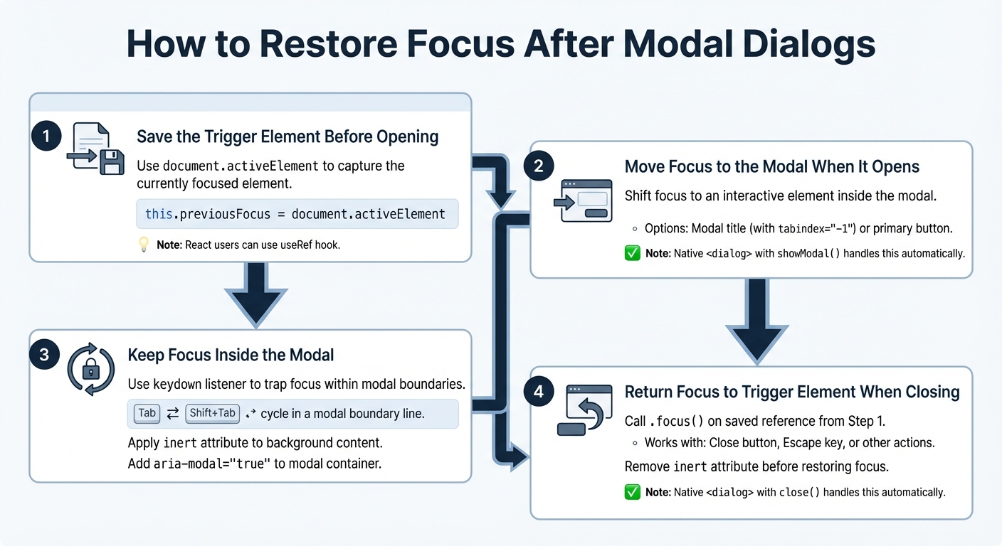
4-Step Process to Restore Focus After Modal Dialogs Close
Restoring focus after modal dialogs is crucial for creating an accessible experience. By following these four steps, you can ensure users can navigate your page without losing their place. Once implemented, test focus restoration using both keyboard navigation and screen readers to confirm it works smoothly.
Step 1: Save the Trigger Element Before Opening the Modal
Before the modal opens, capture the currently focused element using document.activeElement. If you’re working with React, the useRef hook can help store this reference. For example:
this.previousFocus = document.activeElement
If you’re using the native HTML <dialog> element, much of this focus management is handled automatically when you invoke showModal(). However, if the trigger element is removed during the interaction, focus should shift to a logical alternative. As the W3C advises:
"When a dialog closes, focus returns to the element that invoked the dialog unless… the invoking element no longer exists".
Step 2: Move Focus to the Modal When It Opens
Once the modal is open, immediately shift focus to an interactive element within it. This could be the modal’s title (with tabindex="-1") or a primary button. For native <dialog> elements, focus automatically moves to the first interactive item when showModal() is called. However, if you’re working with a custom modal using <div role="dialog">, you’ll need to manually call .focus() on the designated element. This ensures the focus is now contained within the modal.
Step 3: Keep Focus Inside the Modal
While the modal remains open, focus should not escape its boundaries. Use a keydown listener to trap focus within the modal, ensuring that pressing Tab or Shift+Tab cycles through only the modal’s focusable elements. To block interaction with background content, apply the inert attribute to the main page content. Additionally, include aria-modal="true" on the modal container to signal that the content outside the modal is inactive.
Step 4: Return Focus to the Trigger Element When Closing
When closing the modal – whether through a close button, the Escape key, or another action – return focus to the element saved in Step 1. This helps users maintain their place on the page and avoids confusion. For native <dialog> elements, calling close() will automatically restore focus to the trigger. For custom modals, manually call .focus() on the saved reference. If you used the inert attribute to trap focus, remove it before restoring focus to the trigger element; otherwise, the element may not be accessible.
In React, you can use the useEffect hook to watch the modal’s open/closed state and trigger .focus() on the saved reference when the modal closes. Additionally, ensure your Escape key listener follows the same focus restoration logic as the close button. After implementing these steps, thoroughly test your solution to ensure it meets accessibility standards.
sbb-itb-f6354c6
Testing Focus Restoration for Accessibility
Once you’ve implemented focus restoration, it’s crucial to test its functionality to ensure it works as intended. Proper testing with both keyboard navigation and screen readers will confirm your modal meets accessibility requirements and provides a seamless user experience.
Testing with Keyboard Navigation
Start by using only your keyboard. Navigate to the modal trigger element by pressing Tab. Once you’ve reached the trigger, press Enter or Space to open the modal. When the modal opens, check that the focus automatically moves to the first interactive element inside it, such as a close button or a form field.
Next, test the focus trap by pressing Tab and Shift+Tab repeatedly. The focus should stay confined within the modal, preventing it from moving to any background content. Close the modal using the Escape key and confirm that the focus returns to the modal trigger element. As BrowserStack highlights:
"When keyboard users close a modal, they expect the keyboard focus to return to the element that triggered the modal or the next element. If the keyboard focus shifts to a random element, users lose their flow when accessing the content on a website".
Finally, ensure that the trigger element has a visible focus indicator, making it easy for sighted keyboard users to identify. Once you’ve verified these behaviors with the keyboard, move on to testing with screen readers for a more comprehensive check.
Testing with Screen Readers
Use screen readers such as NVDA (for Windows) or VoiceOver (for macOS and iOS) to evaluate the modal. When the modal opens, the screen reader should immediately announce its title and identify it as a dialog. While the modal is active, try navigating with the screen reader’s controls (e.g., arrow keys or swiping). Ensure that background content is inaccessible during this time.
After closing the modal, confirm that focus returns to the trigger element. If the trigger element is no longer present in the DOM, programmatically move the focus to the next logical element. BrowserStack emphasizes the importance of this:
"The experience of users of assistive technologies like screen readers will be jarred if the keyboard focus shifts unexpectedly when they close a modal".
Conclusion
Ensuring focus is restored after closing modal dialogs is a key aspect of accessibility. It prevents keyboard and screen reader users from feeling lost or disoriented when focus unexpectedly resets or disappears.
To address this, follow a straightforward four-step approach: save the trigger element, move focus into the modal, trap focus within the modal, and restore focus to the trigger element when the modal closes. This method helps maintain the user’s point of interaction without confusion.
Equally important is thorough testing. Use both keyboard navigation and screen readers to confirm that focus behaves as expected. These tests are crucial for identifying and resolving issues that could violate WCAG 2.4.3 (Focus Order), which categorizes such problems as "Serious".
For developers, native HTML <dialog> elements simplify this process by managing focus automatically. However, if you’re working with custom modals, JavaScript can help ensure proper focus handling. While it may require extra effort, getting focus management right can turn a potentially frustrating interaction into a smooth and inclusive experience.
Whether you’re building intricate applications or experimenting with interactive prototypes in tools like UXPin, applying these focus management techniques will create a more accessible and user-friendly environment for everyone.
FAQs
Why should focus be restored after closing a modal dialog?
Managing focus after closing a modal dialog is essential for keeping your interface accessible and user-friendly. This practice ensures that keyboard users and screen reader users can effortlessly return to where they were, avoiding any confusion or disruption.
If focus isn’t handled correctly, users can lose track of their position within the interface, which can lead to frustration and a clunky navigation experience. By restoring focus properly, you help create a smoother and more inclusive experience for everyone.
How do I ensure focus is restored correctly after closing a modal dialog?
To make sure focus is handled correctly when a modal closes, here’s what you need to do:
- Start with the trigger element: Use your keyboard to navigate to the element that opens the modal – this could be a button or a link. Take note of this element for later.
- Open the modal: Activate the modal using your keyboard. Once it opens, check that focus automatically moves to the first focusable element inside the modal, like a close button or an input field.
- Close the modal: Close the modal using a keyboard action, such as pressing Escape or selecting the close button. Then, confirm that focus returns to the original trigger element or another logical fallback.
- Test with a screen reader: Use a screen reader to ensure the focus behavior is announced correctly. This step ensures the experience is accessible for all users and aligns with accessibility guidelines.
By running these checks on all modals across your site, you’ll help create a smooth and accessible experience while staying compliant with standards like WCAG 2.2 AA.
What are common focus management mistakes in modal dialogs?
Managing focus in modal dialogs can be tricky, and several common missteps often arise:
- Not shifting focus to the modal upon opening: If focus remains on the background content, users – especially those relying on screen readers or keyboard navigation – can get stuck and disoriented.
- Failure to trap focus within the modal: Allowing users to tab outside the modal breaks the flow and leads to confusion.
- Losing focus after closing the modal: Instead of returning to the element that triggered the modal, focus sometimes jumps to the top of the page, which frustrates users.
- Omitting critical ARIA attributes: Attributes like
role="dialog",aria-modal="true", andaria-labelledbyare essential for screen readers to correctly identify and announce the modal. - Lack of a visible focus indicator: Without a clear visual cue, keyboard users may struggle to navigate within the modal.
These issues not only disrupt the user experience but also fail to meet accessibility guidelines like WCAG 2.2 AA. Addressing these focus management problems ensures smoother navigation and fosters an inclusive environment for all users.

