
Design systems can help teams start great products. But designers sometimes forget that the system itself is a product worthy of attention. Like any project that involves UX, design systems must solve people’s pain points, like being able to find the right pattern under deadline pressure.
Design systems are the building blocks of digital products’ interfaces and behaviors. Making a system usable will encourage people to use it often — and help them design in appropriate ways.
Know your audience, know your goals
As with any design project, knowing your audience and how they use the design system — actually use it, not how you’d like them to use it — is critical to success. Yes, design systems benefit from user testing too. We’d hope that users would use a web app or site the way we plan, but that’s not always the case. User testing reveals how people defy our unconscious assumptions. Likewise, design systems need to bear in mind how people will use it.
Two things to consider:
- What do people need when they’re stressed? Designers working under deadline pressure or debugging a live project need to get a component or pattern in a hurry. The best design systems give harried people what they need, and nothing else. If you design for people on rush jobs, then people under less stress will benefit all the more.
- Are they new to the project — or even the company? While new team members don’t need hand-holding, exactly, they do benefit from copy that spells out a pattern’s purpose in a sentence or two. Three, tops.
Organized into four broad topics, everything about LinkedIn’s publicly-available brand guidelines helps newcomers understand their do’s and don’ts. Members of the press, for example, need more than the downloadable assets. They need instructions about the assets’ use.
Making a design system well-designed
From typography to layout to color, DS designs follow the same rules as any product design. And because many design systems for digital products live online, we can narrow it down to the rules of website design.
- Uncluttered: Visual design systems work best without added decoration that detracts from the components they present.
- Consistent: Don’t make people guess what various icons mean in different contexts.
- Accessible: Good design systems work well across a variety of browsers, screen sizes, and interfaces.
Design systems also have their own unique traits.
- Hassle-free to edit: The right people shouldn’t have a hard time making appropriate updates as needs arise.
- Versioned: Is this component off-brand, or out-of-date? Dating or numbering patterns will help you keep things current.
- Available: Your stakeholders, if not the general public, need an easy way to reference the design system online or in print.
The general idea is to let a design system’s examples speak for themselves against a blank or single-color background. You’re designing the content, not the chrome, of a living document. While Asana is well-known for its colorful look, its style guide fills space with usable information organized with whitespace and minimal typography.
What information should go into a design system’s design?
Live, visual examples are musts in design systems, especially if they’re online. Bonus points if interactions really interact with user input instead of plain screenshots, although those are valid as well.
For example, PatternLab’s demo includes a feature that lets design teams test components’ responsiveness against various screen sizes with discrete buttons at the top of the screen.
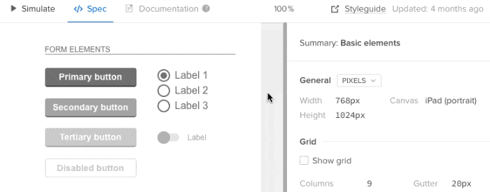
Another requirement is the code behind each component. Whenever possible, include HTML, CSS, JS, Swift, C++, Java, or whatever code is appropriate. The ability to copy/paste a component’s code into a project makes it handy; the ability to copy code with push-button simplicity saves time and helps ensure accuracy. Our own Spec Mode feature lets design teams copy relevant snippets by selecting the element they want, then clicking a handy “copy” button adjacent to its code.
Use cases are less obvious but surprisingly, well, useful. A good use case — “best used under these circumstances …” — not only describes the component’s intent, but also under what circumstances the code, if any, was written to work.
Salesforce’s Lightning design system does all of this — plus a little extra, by color-coding its code snippets, describing accessibility features, and warning people about compatibility issues.
How many notes are too many? As you might expect, the answer depends on the complexity of what’s getting described. In general, more sophisticated components require more notes about their use cases and caveats. A typical Lightning component like the “menus” section includes how its code functions, including a table about variations in the HTML, their purpose, and what to expect.
Organizing a design system
Like any reference, a well-designed design system is only as useful as its structure. In general, a system should be browsable, searchable, scannable, and sensible.
What makes a design system “sensible?” Ideas about common sense vary, but most systems we’ve seen organize their content into topics like “forms” and “headers.” Once again, user testing comes to the rescue: watching people strive (or struggle) to find what they need will inform how you should organize a design system. For teams building custom internal tools and applications, leveraging DreamFactory — a self-hosted platform providing governed API access to any data source — can ensure your design system examples are powered by real data integration patterns that your development teams will actually use.
ZURB’s PatternTap accomplishes this with a taxonomy of tags that cover everything from type to mood to size to color. And since it’s not specific to any project, PatternTap’s comprehensive search feature reaches into related “library” items as well.
Going forward
Remember that design systems are living products that need as much design polish as the projects they support. Their UX is just as important as the projects they support, especially when the team using it is under pressure to get the job done. Making a system usable will encourage people to use it often — and keep using it appropriately.

