
Interface
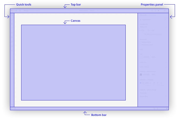
When you open the UXPin Editor, you will see that the UI is made up of a Toolbar to the left, the Properties panel to the right, a Top bar and a Bottom bar.
The Top bar features all the tools and options you use while designing. What you see in it largely depends on what you select on the canvas. Starting from the left when nothing is selected, you can go back to the Dashboard, switch between recently opened prototypes, change between Design or Documentation modes. Then, in the middle of the top bar, you will see the name of your prototype and the name of the iteration you are currently working on. Click it to access the list of all your iterations. Next, under Prototype Actions... you can create a new iteration of your prototype, export or rename the prototype. To the right, you have the Share, Preview on Device, and Preview buttons, as well as Zoom options. If someone from your team starts working with you on the same project, you will also see their avatars in the Top Bar.
To the Right of the editor, you have the Properties panel which allows you to adjust the properties of any element on your design.
In the Toolbar to the Left, you have access to all the most frequently used tools, and we call it Quick tools.
In the middle, you have the Canvas which is where you design.
In the Bottom bar, there is the auto-save indicator, View Settings, Accessibility features, and the Help menu where you can find shortcuts, video tutorials, tips & tricks, Community Forum and the What's New in UXPin section.
Tip
To toggle the visibility of the entire UI, use the Cmd \ shortcut on Mac and Ctrl \ on Windows.
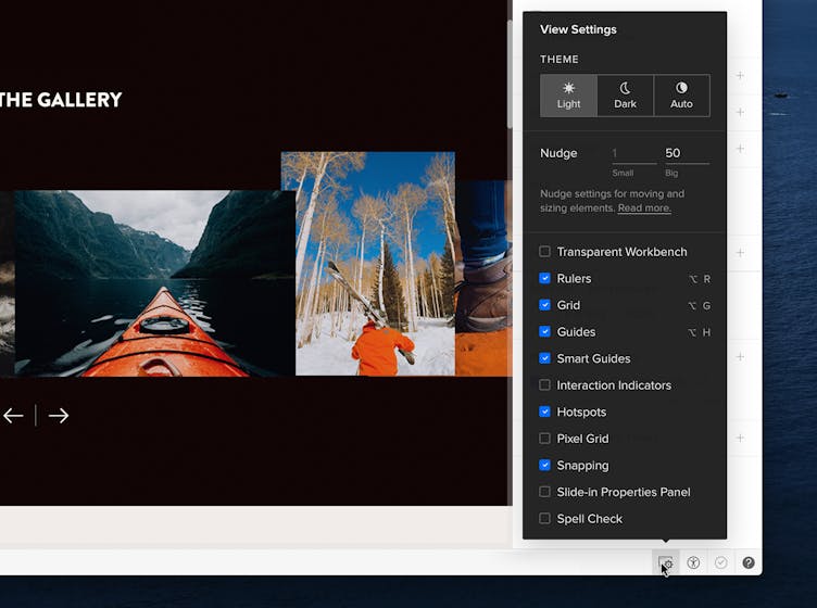
View Settings
In UXPin, you can change various view settings. You can access all of them from the bottom right corner of the Editor. This is where you can:
- Switch between light and dark theme. When you choose Auto, the theme will follow your macOS settings.
- Toggle rulers, grids, guides, smart guides, interaction indicators, the pixel grid, and snapping.
- Show or hide hotspots.
- Decide whether you want the Properties Panel to show on hover or not.
- Turn on and off the Spell Checker.
- Change the Big and Small nudge.
Note
The Auto theme works with macOS Mojave or later and requires at least Chrome 76 or Safari 12.1.
Pages
All your pages are listed in the Pages & Layers panel. You can access the panel from the bottom left corner of the Editor. There’s no limit to the number of pages you can create.
Managing Pages
You can expand and collapse the pages panel by dragging the horizontal line between Pages and Layers all the way up or just double-click it. Then, click the down arrow next to the Page name. This will open the Sitemap, where you can quickly switch between pages. You can change the canvas size of each Page in the Properties panel.
Adding Pages
There are three ways to add a new page.
- Click the plus icon at the top of the Pages panel to add a page to the bottom of the list.
- Right-click on a page name and choose Add Page to add a new page below.
- Use the
Alt
"N"
shortcut.
Nesting Pages
You can place Pages within other Pages by dragging and dropping them on top of each other – we call this nesting. Thanks to this, you can combine Pages to build complex interfaces.
Deleting Pages
Right-click on the page you want to delete and choose Delete from the context menu. To delete multiple pages at once, select them with
"Shift"
pressed. If you delete a page accidentally, you can recover it 20 seconds after by clicking Undo.
Renaming Pages
There are two ways to rename a page. You can double-click on the page name, Or, you can right-click on a page and choose Rename. You can use emojis in Page names. Use the Command-Ctrl-Space shortcut to access the emoji picker on Mac. On Windows, hold down the Windows key and press either the period (.) or the semicolon (;).
Duplicating Pages
To duplicate a page, right-click on it and select Duplicate. A copy of that page will appear at the end of the list.
To duplicate many pages at once, select them with
"Shift"
pressed, open the context menu with a right-click and choose Duplicate.
Hiding Pages
To hide a page from the list, use the eye icon next to the page name. That way, it won't be visible on preview, in exports, and in the sitemap.
Assigning Color Labels
You can set color tags for each of your pages. However, the colors will not be visible on Preview.
View all Pages at Once
To have a bird’s-eye view of all your pages and see them all at once, just click the icon at the top of the panel or use the
Alt
"O"
shortcut.
Layers
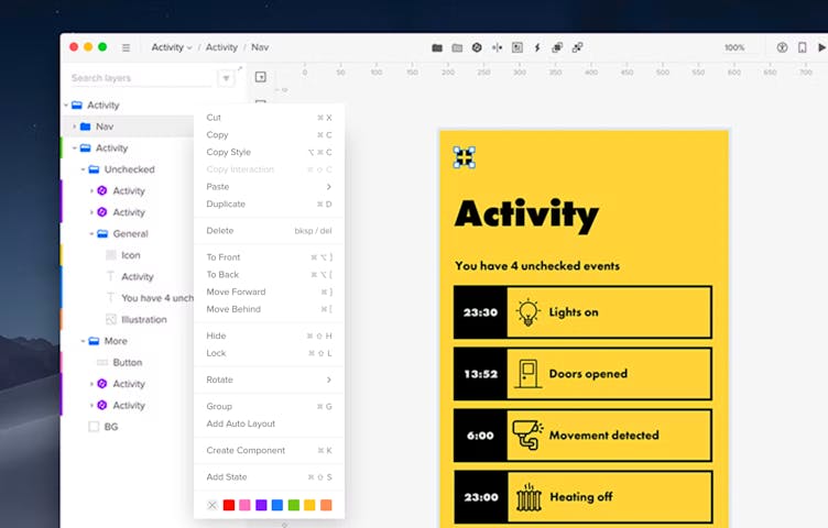
A layer is created when an element is added to the editor. It creates a new layer and it's listed in the Pages & Layers panel. Right-clicking on a layer in the Layers panel opens the context menu. You can delete a layer either directly from the editor or the panel. Just click the layer and remove it with the delete key.
Selecting Layers
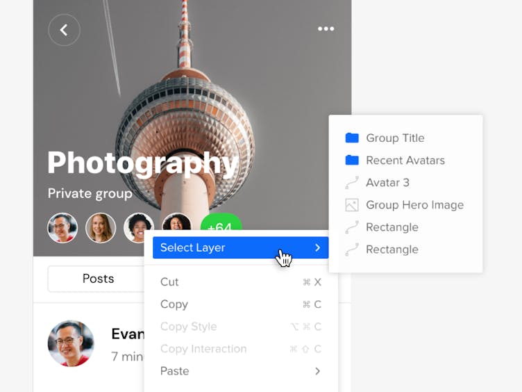
You can select a layer in the layers panel or directly on the canvas. If a layer is nested within a group, clicking on it will select the entire group. To select a layer one level down in a group, double-click on it.
There also are other ways to select nested elements:
- Hold down
Ctrl
and click to select a nested element or select all elements on the canvas. - For more accuracy and to select layers on the canvas that are locked, overlap or are completely hidden under other layers, just right-click on the layer you want to select and choose Select Layer from the context menu. This allows you to see the full list of layers under the cursor and select the one you want.
Filtering and Assigning Color Labels
You can filter layers by Boxes, Shapes, Text, Forms (Input, Text area, Checkbox, Radio, Select, Multi-select, and Button), Images, Icons, Hotspots, Groups, Components, Colors, and Other which includes the Video and Audio element.
To assign a color label to a layer or a group, open the context menu by right-clicking on the layer in the layers panel. Then, choose one of the given colors. To remove an existing color label, click on the ‘x’ marked box.
Searching and Replacing Layer Styles
You can find and update specific fonts or colors across your page to quickly make any necessary changes to your design.
To Replace Color:
- Head to the Layer's Panel Search.
- Type the color's name or HEX/RGBA code.
- Select the layers that should be updated.
- Apply a new color in the properties panel to replace the existing one.
To Replace Font:
- In the Layer's Panel Search, type the font's name.
- Select elements/components using that font.
- Update the font in the properties panel without losing the original style.
Resizing Layers
To resize a layer, select it, then click and drag on any of its handles. You can also resize a layer by selecting it and typing its dimensions in the Properties panel.
Duplicating Layers
To duplicate a layer, you can use:
- The
Ctrl
"C"
andCtrl
"V"
shortcuts - The
Ctrl
"D"
shortcut - Copy and Paste options from the context menu
- Duplicate from the context menu
You can also hold down
Alt
and click-and-drag it to bring it to a new position. When you duplicate elements using
Alt
and drag, UXPin will remember the duplication offset.
Duplicating Multiple Layers with Real Data
With a moused-over selection of element and
Alt
down, you’ll see a blue control handle in the bottom right corner. Dragging it allows you to duplicate the entire selection. If elements are filled with Data, they will duplicate with refreshed content. We call this the Power Duplicate.
Rearranging Layers
To move a layer, go to the Layers panel and drag and drop the layer in the desired area. You can also use the order feature at the top of the right panel to move layers to the front, back, forward, or behind. This is a great way to move layers when they are hidden.
Renaming Layers
When renaming layers in the Layers panel, double-click the layer name to rename it. Then, without pressing Enter to apply the new name, press
"Tab"
to move to the layer below or
"Shift"
and
"Tab"
to move to the layer above. You can also use the
Ctrl
"R"
shortcut for an already selected layer and change the name in the panel.
Toggling Visibility for Layers
To hide a layer, click the eye icon next to the layer name in the panel. Once hidden, you can only select them in the layers panel, not the canvas. Also, hidden layers will not be visible on Preview, but you can still toggle their visibility in the Spec Mode. A good workaround to hide a layer but make it selectable on the canvas is to set the opacity to 0% instead of using the small eye icon.
Locking Layers
To lock a layer, select the element(s) and either click the padlock icon in the right panel or
Ctrl
"Shift"
"L"
to lock them.
Groups
When you group multiple elements together, you can treat them as one layer. To create a group, select the elements and click Group elements in the Top bar or use the
Ctrl
"G"
shortcut. You can also ungroup elements or several groups at once from the Top bar, the context menu or with the
"Shift"
Ctrl
"G"
shortcut.
Clicking on the group for the first time will select the entire group. To select a single layer within a group, double-click it, use the
Ctrl
click, or select it from the layers panel.
To lock all layers in a group, hold
Alt
and click the lock icon next to the Group in the Layers panel.
To change the visibility of a group, click the eye icon next to it. To display one element from a hidden group, simply move that element above the group in the Layers panel. However, clicking the visibility icon with all
Alt
will keep all layers inside that group hidden even if you move them outside the group.
When you move the elements inside a group, the borders of the group will adjust to fit all the elements inside. To move elements in or out of a group, drag them within the Layers panel. You can nest groups inside other groups. To collapse all groups in the Layers panel at once, simply use the
Ctrl
Alt
"L"
shortcut.
Cropping selected content
You can crop any group of content and then define the way you want it to scroll, horizontally and/or vertically. Creating a group enables the Crop selected content option in the Properties panel. Check it and crop the content. This in turn enables the Horizontal scroll and Vertical scroll which allow you to define the direction in which you want to scroll the content on preview.
Quick Tools
The Quick Tools bar contains all the tools you probably use most frequently when designing. It features ready-to-use shapes, the Pen tool which you can use to draw your own custom shapes. Next, you have form elements, text, media such as images, audio or video. Further, there are Icons, Hotspot, Comments, and Search.
Guides
Guides let you divide your canvas into sections to distribute your elements evenly. Grab one of the rulers next to the canvas, move the mouse cursor and drop the guide anywhere you want. Guides also snap to elements and canvas edges. To check the distance from a selected element to the guide, hold
Alt
and hover over the guide. You can also remove all horizontal or vertical guides at once. Just right-click anywhere on the canvas and select Remove Horizontal Guides, Remove Vertical Guides or Remove All Guides.
Properties Panel
In the Properties panel you can change the properties of any element on your design and edit canvas properties. It’s divided into sections and the type of layer you select will determine which sections are available in the Properties Panel at a given time. For example, when you select a Text element, you will be able to edit it in the Typography section, when you select an image, you will be able to adjust its radius or edit it in the Image section.
The properties that are active for a selected layer will be in black, while the properties that are irrelevant for that layer will remain gray.
Other properties and features which you can access from the Properties panel:
Math
In UXPin, you can perform math in any value inputs with numbers. You can add, subtract, divide, and multiply. Select a layer or multiple layers and use +, –, *, or / in any of the numerical fields.
For radius and padding, you can set a different value for each corner or edge — just click the square icon next to the value.
Scrubbable Inputs
As long as you can manually type in values for your elements, scrubbable inputs are simply more fun. In UXPin, you can scrub values by dragging labels in the Properties panel.
- Place your element on the canvas.
- Select the element and hover over a label with a numeric value input.
- Drag the cursor right and left to increase or decrease that value.
Alternatively, if there is no label, just click through the input and press
Ctrl
. And if you drag with Shift, the value changes by 10px.
The cursor goes beyond the screen even if it reaches its end (desktop app and Google Chrome).
Zoom
There are a number of Zoom options in UXPin. You can use the zoom input in the right corner of the Top bar to change the Zoom percentage as well as a number use other settings available from the dropdown.
The Zoom In and Zoom Out options allow you to adjust the Zoom at pre-determined increments: 2, 3, 5, 10, 25, 33, 50, 75, 100, 200, 300, 400, 500, 600, 700, 800, 900, 1000, 1200, 1600, 3200, 6400, 12800, 25600. You can also use the shortcuts to zoom in
Ctrl
"+"
and zoom out
Ctrl
"-"
. Or, zoom the canvas to a specific percentage, 50%, 100%, and 200%. Checking Zoom to Selection will center the selected elements on the viewport when zooming.
To see your entire design, use the Fit to All shortcut
"Shift"
"1"
. To zoom to a selected element or a group of elements, use Fit to Selection
"Shift"
"2"
. To center your workbench to a selection, use
"Shift"
"3"
. If your canvas is empty and has a fixed size,
"Shift"
"3"
will center your canvas in the middle of your screen.
Holding
"Z"
enters the zoom mode, and that’s when you can:
- Click to zoom in
- Hold
Alt
and click to zoom out - Drag to select the area you want to zoom
There's also the pixel grid which is visible at zoom levels from 800% and up with each square representing 1 pixel. When placing or moving objects, they will snap to the grid. This prevents misaligned pixel errors when exporting elements.