Styling
The Properties panel is where you can edit your layers and change their style properties. You have a wide range of options and tools available to change the layer's fill, border, shadows and more.
Layer Opacity and Blending
You can use the numbers on your keyboard to adjust opacity. Number
"2"
gives you 20%,
"5"
gives you 50%, and
"0"
gives you 100%. If it’s already 100%, then it will change to 0% opacity.
To change the blend mode of an individual layer, click the Blending dropdown in the Layer section to the right and choose one of the available blend modes.
You can use one of the following effects:
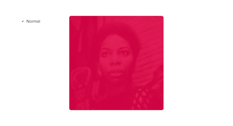
- Normal – no blending mode applied;
- Darken – selects the darker of two colors;
- Multiply – multiplies each pixel on the top layer by the pixels in the layers beneath;
- Color burn – darkens the background color and increases the contrast;
- Lighten – selects the lighter of two colors;
- Screen – removes the black color and replaces it with a color fill;
- Color dodge – lightens the background color to reflect the source color.
- Overlay – combines Multiply on darker colors with Screen on lighter colors.
- Soft light – applies a variant of Multiply on dark values and a variant of Screen on lighter values.
- Hard light – combines Multiply on lighter colors with Screen on darker colors (opposite to Overlay).
- Difference – takes the difference value between two colors (negative effect).
- Exclusion – acts as Difference but similar colors result in lower contrast middle value.
- Hue – applies the hue of the source layer to the luminance and saturation of the background color.
- Saturation – applies the saturation of the source layer to the hue and luminance to the background color.
- Color – applies the hue and saturation of the foreground to the luminance of the background.
- Luminosity – applies the luminosity of the source color with the hue and saturation of the background color.
Text Properties
When you click on a text, you’ll see a number of text properties in the Typography section of the Properties panel.
Changing font size
To resize a text element, you have to change the size manually by editing the text size value in the Properties panel. Resizing it on the canvas will not change it. You can also use the
Alt
"."
shortcut to increase the font size, and
Alt
","
to decrease it.
Line height
Line height lets you adjust the distance between lines of text in a paragraph. You can either enter the value in the Line height field, choose a value from the dropdown, or use the
Alt
"Shift"
"."
shortcut to increase it and
Alt
"Shift"
","
to decrease it.
Character spacing
Character spacing, also known as Letter spacing defines the space between characters in a word or a paragraph. You can either enter the value in the Character height field, choose a value from the dropdown, or use the
Alt
Ctrl
"."
shortcut to increase it and
Alt
Ctrl
","
to decrease it.
Fixed size
The size controls let you affect the size and behavior of your text box:
- If you don’t select anything, the text box grows both horizontally and vertically as you type.
- When the Fixed Width is set, the text wraps when you reach the end of the line and the text box grows vertically.
- As you type with Fixed Height and Width set, your text will fit only within its defined size.
Tip
Once you are in the Text edit mode, you can double-click on the resize handle to change the Text element from Fixed to Auto.
Horizontal and Vertical Alignment
You can align text both horizontally and vertically. Horizontal alignment defines how you align the text along the x-axis. You can set it to Left, Center, Right, and Justify. The vertical alignment defines how the text aligns within the text box. You can align it to Top, Middle, and Bottom.
Bold, Italicize, Strikethrough, and Underline
To view more properties for text, click the More Options icon. You will find the controls to bold, italicize, strikethrough or underline text. Underline and Strikethrough are also sometimes referred to as text decoration. Underline is used to emphasize the text or simply to indicate that a certain word is a hyperlink, whereas Strikethrough can be used to indicate an obselete piece of text.
Transform
You can change the case of your selected text with the Transform options, such as Uppercase, Lowercase, Small caps and Capitalize which is known as Title case.
Subscript and Superscript
Subscript is a character, usually a number or a symbol which is slightly below a normal line of text. It’s also written in a smaller font and it’s used for, i.e. chemical formulas like CO₂. Superscript refers to characters that are slightly above the rest of the text. Just like subscript, it’s also written in a smaller font and it’s used for, i.e. expression of dates, such as 1ˢᵗ or 2ⁿᵈ.
Fractions
The Fractions feature creates a fraction out of two numbers separated by a slash. The first number will become the top number and the second will go to the bottom. Not all fonts support fractions. To see how they work, select the Old Standard TT font (Google Web Font), click the 1/2 button, and type, for example 1/10 or 1/100.
Ligatures
Ligatures are multi-letter characters that perfectly solve the problem of pairs of characters that combine unattractively, such as f and i. To enable ligatures, select the text element first and click the ligature icon in the Properties panel. Not all fonts support ligatures. To see them in action, you can use the Old Standard TT font.
Spell Check
The Spell check in UXPin uses the spell checker and language settings from your browser (Google Chrome, Mozilla Firefox, Apple Safari).
In UXPin, the spell check is on by default and it checks the words on your prototypes for spelling mistakes and typos as you type. As you type misspelled words will be marked with a red underline. To see suggested corrections, right-click on a word and choose a suggestion. You can turn this behavior off in the View Settings in the bottom right corner of the editor.
Note
Changing your language preferences on Google Chrome may stop the spell check. If that happens, it's best to just reopen your browser.
Color Picker
The Color Picker allows you to view, select, and apply colors to selected elements in your designs, borders, and backgrounds.
Using the Color Picker
The asset and descriptions below take you through all the features of the Color Picker step-by-step:
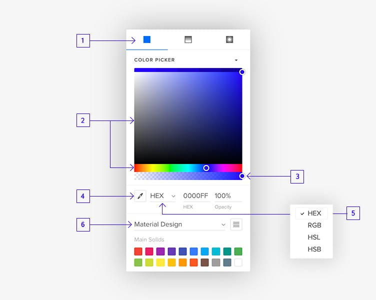
- In the top bar, you can choose whether you want to apply a Solid Color, the Linear Gradient, or a Radial Gradient.
- Then, there’s the main Color Picker with the current color indicated with a white circle. Drag the circle around to get your desired color. You can collapse and expand it using the arrow above it. To change the hue or tone, use the slider below.
- The bottom slider lets you change and adjust the selected color’s opacity.
- Below, you can access the Eye Dropper tool.
- To the right, there’s a dropdown that allows you to switch between different color profiles like HEX, RGB, HSL, and HSB.
- Any colors from your Design System Libraries will be available from the bottom dropdown. That’s also where your 20 recently used colors will show up. You can switch between list and grid views with the toggle to the right.
Tip
The Color Picker has a built-in contrast checker that evaluates the color contrast between the text and its background. See how it works in the Contrast Checker tutorial.
Gradients
Gradients are great for creating color blends or adding depth and shading to your vector drawings. You can create a linear gradient and a radial gradient in UXPin – just choose either one at the top of the Color Picker.
The Gradient color picker has a gradient editor that shows the gradient colors and color stops indicated by white circles. The colors change depending on the distance between color stops. There are two color stops by default but you can add more by clicking the gradient editors. Dragging the color stops along the gradient editor will change the spread of each color.
Applying a linear or radial gradient fill
- In the gradient editor, select the color stops and choose a color for each using the Color Picker.
- To move color stops, drag them along the gradient editor.
- To delete a color stop, drag it off the gradient editor.
- To shift between color stops, use the Swap Points icon.
- To change the orientation point and the angle of linear gradients, type in the value into the angle input or use the mouse scroll.
- Once you create a gradient, you can save it in your Design System Library for future use. Select the element with the gradient and click + Add in the Colors section of your library.
Border
To add a border, click the + button in the Border section. You’ll be able to further edit the following options:
- Color
- Type of border
- Size
You can set the different border size for the top, right, bottom, and left edge of the Box by clicking the button beside the input field. Please note that you cannot set different borders for the Rectangle.

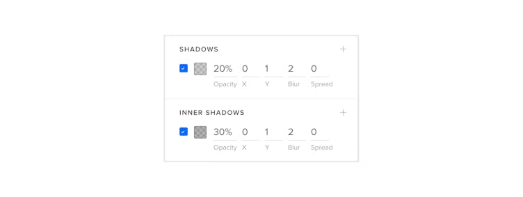
Shadows
There are two types of shadows in UXPin:
- Shadows which cast outside the element.
- Inner Shadows that are rendered inside the elements.
To add a shadow, click the + button in the Shadows section of the Properties Panel. You can then set its Color, Opacity, x and y Offset, Blur, and Spread.
The x and y Offset determines the distance you want the shadow to be offset from the object. The Blur blur specifies the distance from the edge of the shadow where you want any blurring to occur.
Adding a Spread will increase or decrease the size of the object casting the shadow. Please note that Shapes don't have the Spread option available.
Blur
Blur allows for bringing the element out of focus. To add blur, first, click the + button. Then specify the Radius to achieve the desired effect.

Note
Adding multiple shadow and blur effects may decrease the performance of the editor.
Background Blur
Similar to blurring entire layers in UXPin, you can also blur the background of a component. This blur softens or diverts attention from the background to the selected layer.
To add background blur, click the + button and adjust the Radius to control the blur level.

Note
Background Blur is available only for Box, Text, Input, Textarea, and Group.
Image Fill
To insert a custom image as fill, click the + icon in the Image fill section and select Upload. Once you upload an image, in the properties panel, you’ll see its preview and you’ll be able to position the image using the buttons next to it.
You can also specify the filling rules and choose from the following settings:
- Stretch – the default option, the image is stretched to fit the layer’s height and width ratio.
- Fit to fill – the image fills the height and width of its box. The aspect ratio is maintained but the image is usually cropped.
- Contain – increases or decreases the size of the image to fill the box while preserving its aspect-ratio.
- Don’t resize – image will ignore the height and width of the bounding box and retain its original size.